Nokia Lumia 630 Dual Sim tested on itself
I have long been eager to touch windows phone 8, but the number of SIM cards in such devices was equal to one, and the work required at least two slots. I went with a red (this is important) Philips Xenium 732 and was glad that at the end of the day I was charging at 40%. And here is the announcement of WP8.1 with support for two SIM cards. Dribbling at the reviews and, incidentally, shoveling happiness out of my pants, I began to wait.
And a month ago, this miracle appeared on sale on the n-store and, in awe, I pressed the “place an order” button (I think it doesn't matter that the n-store does not deliver to our backwater and I ordered it through other ways). A few days later I came to the store at the place of delivery and ...
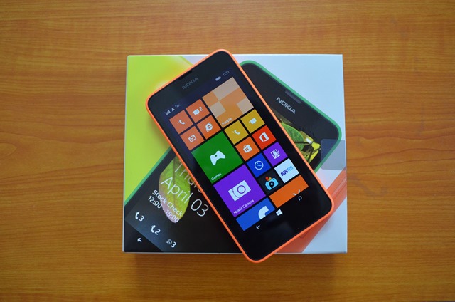
To begin, perhaps, with the fact that the set, in addition to the color back panel, is a classic black one. Red, unfortunately, does not happen (I told you that this is important) for this, I took the most close - orange.
')
Before I could get him out of the box, terrible fingerprints appeared on the screen. Immediately and much. There is so much that there is a desire to put it back, to hide hands behind your back and to yell with an arrogant air “it's not me!”. From the elements: on the back panel - an inconspicuous inscription “nokia”, a small black penny of the camera and in the lower corner with the core there is a hole for the speaker (the speaker itself is many times larger in area); on the front: a protective glass, just a soft “nokia”, a small speaker and a microphone (yes, soft buttons); top - jack 3,5; bottom - usb; on the right - the power button and volume rocker. Convenient button travel and positioning - all under the thumb and in easy accessibility. The device looks stylish, the buttons do not stand out, there is nothing superfluous on the front panel, the sides of the screen do not protrude - in general, handsome.
The package is scanty and terribly poor - a phone, a battery, two caps, a charger (one piece, not an adapter), waste paper. No headphones, no cable. It would be necessary to attach photos of components separately, but ... There should be a reservation: it has an excellent function - out-of-the-box screenshots (by pressing the power button and the volume up key), which means there will be enough of them in the article, but I warned about this.
Personal impression is only one: super! Loud and pleasant sound, light, moderately thin, no creaks, no backlash, in the hand is excellent, the availability of buttons and a bright socket (as I was told by the fair sex - the orange trend of this summer ). Charging lasts for 2 days (even longer than Xenium'a - although this is more likely a software merit). However, “super” is not “perfect”: there is no flash, front camera and light sensor. The flash is a real minus, the front camera is a controversial question for me: the possibility and impossibility to answer video calls are equally useful, the light sensor is in direct sunlight, you have to manually switch to maximum brightness. The absence of the proximity sensor is not felt, thanks to the cool decision to take into account the touch on the upper part of the screen with the ear - there were never any misfires.
Let's start with the good. Immediately make a reservation that I am pleased and comfortable with the idea of living tiles, so immediately:
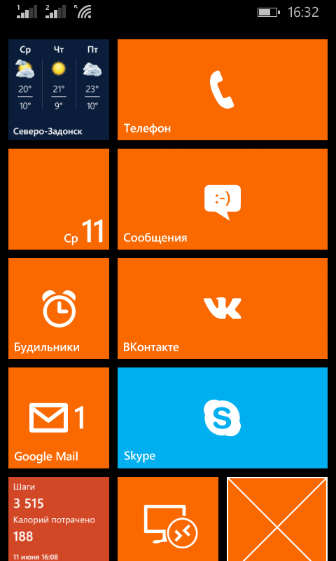
Yes, do not be afraid to put an additional row for tiles - everything is perfectly visible.
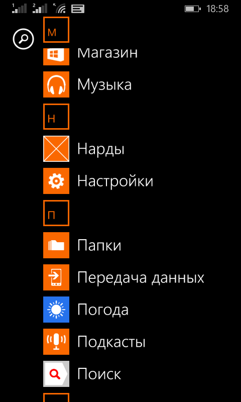
Let's go through the main "jambs" OS. I’ll start, perhaps, with the lack of a desktop and poke my finger in the picture above and exclaim “Yes, there he is!” He completely combines a convenient menu and several desktops with widgets. On Android, I did about the same thing: instead of going into the menu, I had one or even two screens of purely shortcuts; in most cases, informative widgets took up more space than they do now (example: weather widget); composing widgets and shortcuts was less convenient; everything was “heterogeneous”, whereas now everything is in flat rectangles (and squares, as a special case of a rectangle).
Now about the menu sheet - remember the favorite function of many "hide programs from the menu." Plus, as I said, it completely replaces the initial screen. And yes, in the menu you can see not only the inscription “new”, but also the installation status: progress bar or position in the queue.
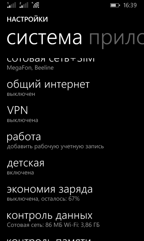
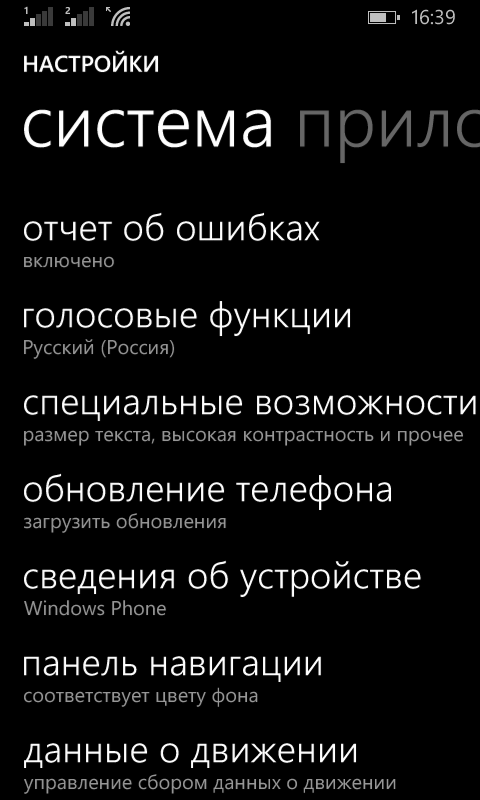
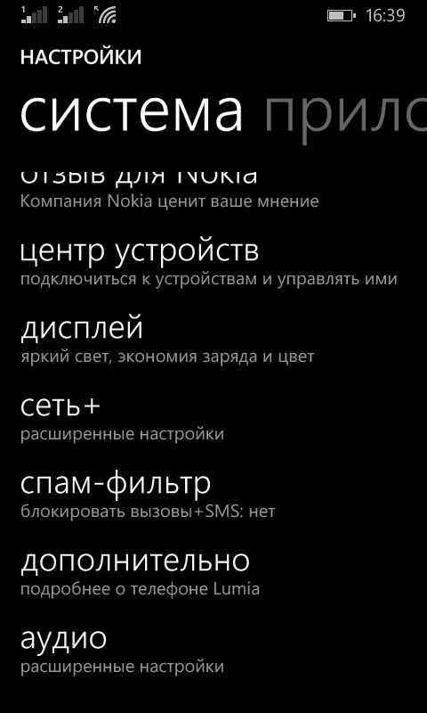
The settings, by the way, are no worse. than in the very same Android goal, the only thing is grouped weakly, but after the first couple of hundred times, the settings are almost completely unnecessary.


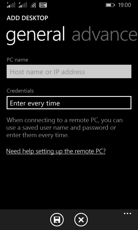
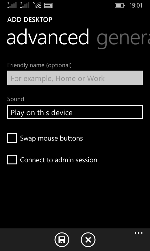
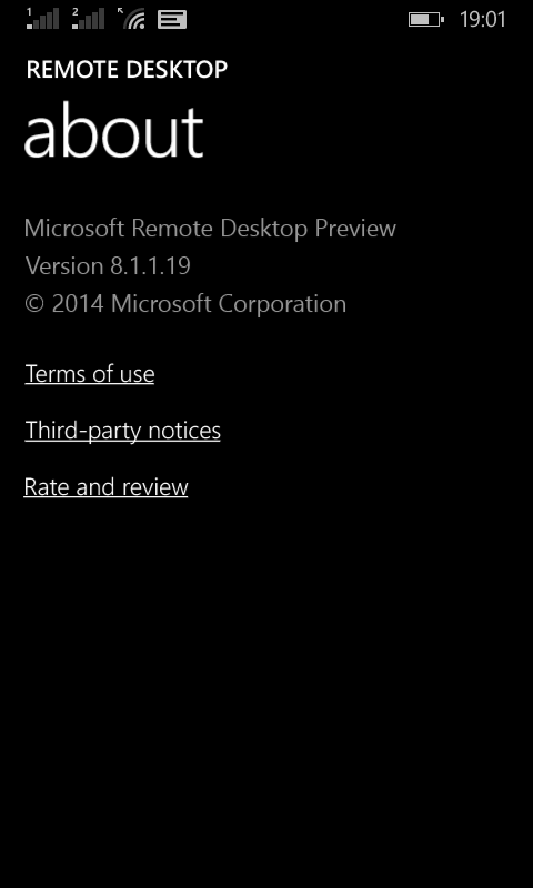
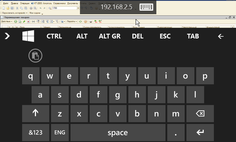
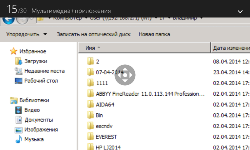
Now about the personal "chips" of this OS. More precisely, about one and not because she is alone, but because she is really cool: a full-fledged RDP. I piss boiling water when I realized how comfortable it is.
Application store. Here, the habraurier will mostly be grinning with the thought “let's see how it will justify the OS here!” - Yes, it can. No, I understand - a young OS, everything is developing, and the applications are not so few. However, the number of adequate applications - units, and most stupidly repeat the functionality of another. If on play.google.com I could find a working free application for every sneeze, then in this case it is problematic to find the application you really need under adequate requests. As a user, this is a big and fat drawback, but as a programmer, there is no need to search for an idea for a new project for a long time.
And the last paragraph is the most delicious - synchronization. Microsoft's “Three Screens” really works. Themes, SkyDrive, Office, third-party applications ... But there is no barrel of honey without a fly in the ointment - for the application to work everywhere it needs to be done everywhere. Yes, the code is almost 100% Ctrl + C - Ctrl + V and most often just a little adaptation of the interface, but it still needs to be done. Applications that work on all three types of devices - units. To be honest, I also do my projects only on smart and on desktop hammering on tablets.
UPD1. Work with two SIM cards
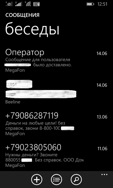
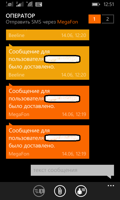
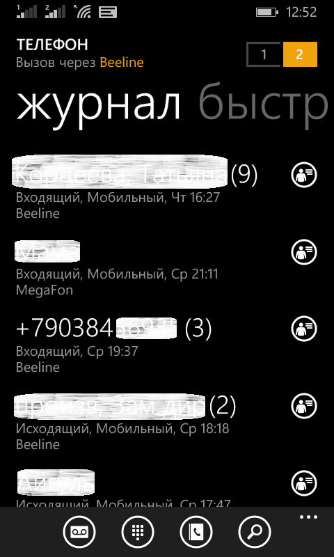
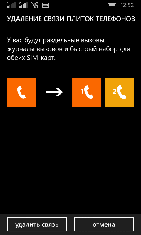
Messages and calls by default are separated into different icons. However, in the message menu and the phone, they can be combined / disconnected without abstruse settings, moreover, all separately. For example, you can leave two phone icons and a general message icon. In single-player mode, the name of a SIM card is written using a hyphen, for example “Phone - Megafon”, the color indication of SIM cards is preserved. In the combined mode about the belonging of the record to the SIM card, it is indicated by the signature of the name at the bottom of the list and color when viewing the dialog. Switching between SIM cards is carried out from the top right, right under the thumb. The only unpleasant moment - SMS delivery notifications come from the “Operator” subscriber, which is not always convenient.
And a month ago, this miracle appeared on sale on the n-store and, in awe, I pressed the “place an order” button (I think it doesn't matter that the n-store does not deliver to our backwater and I ordered it through other ways). A few days later I came to the store at the place of delivery and ...
Appearance, equipment and convenience
To begin, perhaps, with the fact that the set, in addition to the color back panel, is a classic black one. Red, unfortunately, does not happen (I told you that this is important) for this, I took the most close - orange.
')
Tip one - paste the film immediately
Before I could get him out of the box, terrible fingerprints appeared on the screen. Immediately and much. There is so much that there is a desire to put it back, to hide hands behind your back and to yell with an arrogant air “it's not me!”. From the elements: on the back panel - an inconspicuous inscription “nokia”, a small black penny of the camera and in the lower corner with the core there is a hole for the speaker (the speaker itself is many times larger in area); on the front: a protective glass, just a soft “nokia”, a small speaker and a microphone (yes, soft buttons); top - jack 3,5; bottom - usb; on the right - the power button and volume rocker. Convenient button travel and positioning - all under the thumb and in easy accessibility. The device looks stylish, the buttons do not stand out, there is nothing superfluous on the front panel, the sides of the screen do not protrude - in general, handsome.
Second tip - do you have a microUSB-B?
The package is scanty and terribly poor - a phone, a battery, two caps, a charger (one piece, not an adapter), waste paper. No headphones, no cable. It would be necessary to attach photos of components separately, but ... There should be a reservation: it has an excellent function - out-of-the-box screenshots (by pressing the power button and the volume up key), which means there will be enough of them in the article, but I warned about this.
Convenience by hardware
Personal impression is only one: super! Loud and pleasant sound, light, moderately thin, no creaks, no backlash, in the hand is excellent, the availability of buttons and a bright socket (as I was told by the fair sex - the orange trend of this summer ). Charging lasts for 2 days (even longer than Xenium'a - although this is more likely a software merit). However, “super” is not “perfect”: there is no flash, front camera and light sensor. The flash is a real minus, the front camera is a controversial question for me: the possibility and impossibility to answer video calls are equally useful, the light sensor is in direct sunlight, you have to manually switch to maximum brightness. The absence of the proximity sensor is not felt, thanks to the cool decision to take into account the touch on the upper part of the screen with the ear - there were never any misfires.
TTX
General characteristics
Screen
Multimedia features
Connection
Memory and processor
Nutrition
- GSM 900/1800/1900, 3G
- MS Windows Phone 8.1 operating system
- 2 micro SIM
Mode of operation is alternate - Weight 134 g
Dimensions (WxHxT) 66.7x129.5x9.2 mm
Screen
- color IPS, 16.78 million colors, touch multitouch, capacitive
- 4.5 inches
- 480x854
- PPI 218
- Corning gorilla 3
Multimedia features
- Camera 5 million pixels. autofocus, digital zoom 4x
- MP4 / H.264 max. video resolution 1280x720 30 frames / s
Connection
- Wi-Fi 802.11n, Bluetooth 4.0, USB
- GPS / GLONASS A-GPS
Memory and processor
- 4x1200 MHz
- 8 GB ROM
- RAM 512 MB
- microSD (TransFlash), up to 128 GB
Nutrition
- 1830 mAh battery capacity removable
- Talk time 16.4 h
Standby time 600 h
58 hours listening time
OS or "Yes Holivar will not start"
Let's start with the good. Immediately make a reservation that I am pleased and comfortable with the idea of living tiles, so immediately:
Yes, do not be afraid to put an additional row for tiles - everything is perfectly visible.
, . Let's go through the main "jambs" OS. I’ll start, perhaps, with the lack of a desktop and poke my finger in the picture above and exclaim “Yes, there he is!” He completely combines a convenient menu and several desktops with widgets. On Android, I did about the same thing: instead of going into the menu, I had one or even two screens of purely shortcuts; in most cases, informative widgets took up more space than they do now (example: weather widget); composing widgets and shortcuts was less convenient; everything was “heterogeneous”, whereas now everything is in flat rectangles (and squares, as a special case of a rectangle).
Now about the menu sheet - remember the favorite function of many "hide programs from the menu." Plus, as I said, it completely replaces the initial screen. And yes, in the menu you can see not only the inscription “new”, but also the installation status: progress bar or position in the queue.
The settings, by the way, are no worse. than in the very same Android goal, the only thing is grouped weakly, but after the first couple of hundred times, the settings are almost completely unnecessary.
Now about the personal "chips" of this OS. More precisely, about one and not because she is alone, but because she is really cool: a full-fledged RDP. I piss boiling water when I realized how comfortable it is.
Not bored?
Application store. Here, the habraurier will mostly be grinning with the thought “let's see how it will justify the OS here!” - Yes, it can. No, I understand - a young OS, everything is developing, and the applications are not so few. However, the number of adequate applications - units, and most stupidly repeat the functionality of another. If on play.google.com I could find a working free application for every sneeze, then in this case it is problematic to find the application you really need under adequate requests. As a user, this is a big and fat drawback, but as a programmer, there is no need to search for an idea for a new project for a long time.
And the last paragraph is the most delicious - synchronization. Microsoft's “Three Screens” really works. Themes, SkyDrive, Office, third-party applications ... But there is no barrel of honey without a fly in the ointment - for the application to work everywhere it needs to be done everywhere. Yes, the code is almost 100% Ctrl + C - Ctrl + V and most often just a little adaptation of the interface, but it still needs to be done. Applications that work on all three types of devices - units. To be honest, I also do my projects only on smart and on desktop hammering on tablets.
UPD1. Work with two SIM cards
Messages and calls by default are separated into different icons. However, in the message menu and the phone, they can be combined / disconnected without abstruse settings, moreover, all separately. For example, you can leave two phone icons and a general message icon. In single-player mode, the name of a SIM card is written using a hyphen, for example “Phone - Megafon”, the color indication of SIM cards is preserved. In the combined mode about the belonging of the record to the SIM card, it is indicated by the signature of the name at the bottom of the list and color when viewing the dialog. Switching between SIM cards is carried out from the top right, right under the thumb. The only unpleasant moment - SMS delivery notifications come from the “Operator” subscriber, which is not always convenient.
Source: https://habr.com/ru/post/226005/
All Articles