Ideas underlying responsive emails
* Translation of the article by Chris Koyer "Ideas Behind Responsive Emails"
Let's say you created a 3-column email layout. Due to limited and strange CSS support for email clients , emails are made up using tables. A three-column layout looks great on large screens, but clumsily flattened out on small ones. Theoretically, the
In this article, I just want to show some ideas for responsive email. They are not reliable, ready to produce ideas. I just thought it was fun to think about it. I was inspired by this recently heard speech by Fabio Carneiro. Fabio, working for MailChimp, made a cool email layout and shared some of the ideas behind responsive email letters in this conversation. He also has a Treehouse email course .
')
Jason Rodriguez has also written a little on this topic recently.
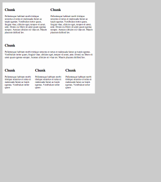
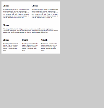
Here is one of the layout areas:

You might think: each of these blocks was created using
Let's say you created a 3-column email layout. Due to limited and strange CSS support for email clients , emails are made up using tables. A three-column layout looks great on large screens, but clumsily flattened out on small ones. Theoretically, the
@media query can save us, but since we cannot use float , we certainly cannot count on them. Although there is another way.In this article, I just want to show some ideas for responsive email. They are not reliable, ready to produce ideas. I just thought it was fun to think about it. I was inspired by this recently heard speech by Fabio Carneiro. Fabio, working for MailChimp, made a cool email layout and shared some of the ideas behind responsive email letters in this conversation. He also has a Treehouse email course .
')
Jason Rodriguez has also written a little on this topic recently.
Lines with align = "left"
Here is one of the layout areas:
You might think: each of these blocks was created using
. , , CSS .

, . Align , , email . - float , float . inline-block . , - .

:

<table class="main-wrapping-table"> <tr> <td> <table align="left" style="width: 33.33%"> </table> <table align="left" style="width: 33.33%"> </table> <table align="left" style="width: 33.33%"> </table> </td> </tr> </table>

css , , .

, :


, , email .

min-width
email min-width. , . .
CSS , :

<table align="left" style="width: 33.33% min-width: 200px;" class="chunk"><table>


. , .

media query
email @media query , , .

/* @media query */ @media (max-width: 400px) { .chunk { width: 100% !important; } }

- . , , , , .

max-width
, . max-width .

<table style="max-width: 600px; margin: 0 auto;" class="main-table"></table>


, , .
codepen.

, Email Blueprints MailChimp. , , . , . , .
. , , CSS .
, . Align , , email . - float , float . inline-block . , - .
:
<table class="main-wrapping-table"> <tr> <td> <table align="left" style="width: 33.33%"> </table> <table align="left" style="width: 33.33%"> </table> <table align="left" style="width: 33.33%"> </table> </td> </tr> </table>
css , , .
, :
, , email .
min-width
email min-width. , . .
CSS , :
<table align="left" style="width: 33.33% min-width: 200px;" class="chunk"><table>
. , .
media query
email @media query , , .
/* @media query */ @media (max-width: 400px) { .chunk { width: 100% !important; } }
- . , , , , .
max-width
, . max-width .
<table style="max-width: 600px; margin: 0 auto;" class="main-table"></table>
, , .
codepen.
, Email Blueprints MailChimp. , , . , . , . . , , CSS .
, . Align , , email . - float , float . inline-block . , - .
:
<table class="main-wrapping-table"> <tr> <td> <table align="left" style="width: 33.33%"> </table> <table align="left" style="width: 33.33%"> </table> <table align="left" style="width: 33.33%"> </table> </td> </tr> </table>
css , , .
, :
, , email .
min-width
email min-width. , . .
CSS , :
<table align="left" style="width: 33.33% min-width: 200px;" class="chunk"><table>
. , .
media query
email @media query , , .
/* @media query */ @media (max-width: 400px) { .chunk { width: 100% !important; } }
- . , , , , .
max-width
, . max-width .
<table style="max-width: 600px; margin: 0 auto;" class="main-table"></table>
, , .
codepen.
, Email Blueprints MailChimp. , , . , . , .. , , CSS .
, . Align , , email . - float , float . inline-block . , - .
:
<table class="main-wrapping-table"> <tr> <td> <table align="left" style="width: 33.33%"> </table> <table align="left" style="width: 33.33%"> </table> <table align="left" style="width: 33.33%"> </table> </td> </tr> </table>
css , , .
, :
, , email .
min-width
email min-width. , . .
CSS , :
<table align="left" style="width: 33.33% min-width: 200px;" class="chunk"><table>
. , .
media query
email @media query , , .
/* @media query */ @media (max-width: 400px) { .chunk { width: 100% !important; } }
- . , , , , .
max-width
, . max-width .
<table style="max-width: 600px; margin: 0 auto;" class="main-table"></table>
, , .
codepen.
, Email Blueprints MailChimp. , , . , . , .
. , , CSS .

, . Align , , email . - float , float . inline-block . , - .

:

<table class="main-wrapping-table"> <tr> <td> <table align="left" style="width: 33.33%"> </table> <table align="left" style="width: 33.33%"> </table> <table align="left" style="width: 33.33%"> </table> </td> </tr> </table>

css , , .

, :


, , email .

min-width
email min-width. , . .
CSS , :

<table align="left" style="width: 33.33% min-width: 200px;" class="chunk"><table>


. , .

media query
email @media query , , .

/* @media query */ @media (max-width: 400px) { .chunk { width: 100% !important; } }

- . , , , , .

max-width
, . max-width .

<table style="max-width: 600px; margin: 0 auto;" class="main-table"></table>


, , .
codepen.

, Email Blueprints MailChimp. , , . , . , .
. , , CSS .
, . Align , , email . - float , float . inline-block . , - .
:
<table class="main-wrapping-table"> <tr> <td> <table align="left" style="width: 33.33%"> </table> <table align="left" style="width: 33.33%"> </table> <table align="left" style="width: 33.33%"> </table> </td> </tr> </table>
css , , .
, :
, , email .
min-width
email min-width. , . .
CSS , :
<table align="left" style="width: 33.33% min-width: 200px;" class="chunk"><table>
. , .
media query
email @media query , , .
/* @media query */ @media (max-width: 400px) { .chunk { width: 100% !important; } }
- . , , , , .
max-width
, . max-width .
<table style="max-width: 600px; margin: 0 auto;" class="main-table"></table>
, , .
codepen.
, Email Blueprints MailChimp. , , . , . , . . , , CSS .
, . Align , , email . - float , float . inline-block . , - .
:
<table class="main-wrapping-table"> <tr> <td> <table align="left" style="width: 33.33%"> </table> <table align="left" style="width: 33.33%"> </table> <table align="left" style="width: 33.33%"> </table> </td> </tr> </table>
css , , .
, :
, , email .
min-width
email min-width. , . .
CSS , :
<table align="left" style="width: 33.33% min-width: 200px;" class="chunk"><table>
. , .
media query
email @media query , , .
/* @media query */ @media (max-width: 400px) { .chunk { width: 100% !important; } }
- . , , , , .
max-width
, . max-width .
<table style="max-width: 600px; margin: 0 auto;" class="main-table"></table>
, , .
codepen.
, Email Blueprints MailChimp. , , . , . , .. , , CSS .
, . Align , , email . - float , float . inline-block . , - .
:
<table class="main-wrapping-table"> <tr> <td> <table align="left" style="width: 33.33%"> </table> <table align="left" style="width: 33.33%"> </table> <table align="left" style="width: 33.33%"> </table> </td> </tr> </table>
css , , .
, :
, , email .
min-width
email min-width. , . .
CSS , :
<table align="left" style="width: 33.33% min-width: 200px;" class="chunk"><table>
. , .
media query
email @media query , , .
/* @media query */ @media (max-width: 400px) { .chunk { width: 100% !important; } }
- . , , , , .
max-width
, . max-width .
<table style="max-width: 600px; margin: 0 auto;" class="main-table"></table>
, , .
codepen.
, Email Blueprints MailChimp. , , . , . , .. , , CSS .
, . Align , , email . - float , float . inline-block . , - .
:
<table class="main-wrapping-table"> <tr> <td> <table align="left" style="width: 33.33%"> </table> <table align="left" style="width: 33.33%"> </table> <table align="left" style="width: 33.33%"> </table> </td> </tr> </table>
css , , .
, :
, , email .
min-width
email min-width. , . .
CSS , :
<table align="left" style="width: 33.33% min-width: 200px;" class="chunk"><table>
. , .
media query
email @media query , , .
/* @media query */ @media (max-width: 400px) { .chunk { width: 100% !important; } }
- . , , , , .
max-width
, . max-width .
<table style="max-width: 600px; margin: 0 auto;" class="main-table"></table>
, , .
codepen.
, Email Blueprints MailChimp. , , . , . , .
 .  ,     ,           CSS   .

   ,    . Align  ,  ,         email .  -  float ,      float .           inline-block .     ,            -  .

   :

 <table class="main-wrapping-table"> <tr> <td> <table align="left" style="width: 33.33%"> </table> <table align="left" style="width: 33.33%"> </table> <table align="left" style="width: 33.33%"> </table> </td> </tr> </table>

      css ,      ,    .

          ,  :


    ,   ,  email    .

     min-width
  email   min-width.        ,    .        .
    CSS   ,  :

 <table align="left" style="width: 33.33% min-width: 200px;" class="chunk"><table>


  .         ,         .

    media query
  email   @media query ,                ,     .

 /*        @media query */ @media (max-width: 400px) { .chunk { width: 100% !important; } }

  - .     ,  , ,       ,   .

     max-width
       ,      .         max-width .

 <table style="max-width: 600px; margin: 0 auto;" class="main-table"></table>


  ,       ,    .
     codepen.

       ,     Email Blueprints  MailChimp. ,   ,  .          ,       .  ,    .
. , , CSS .
, . Align , , email . - float , float . inline-block . , - .
:
<table class="main-wrapping-table"> <tr> <td> <table align="left" style="width: 33.33%"> </table> <table align="left" style="width: 33.33%"> </table> <table align="left" style="width: 33.33%"> </table> </td> </tr> </table>
css , , .
, :
, , email .
min-width
email min-width. , . .
CSS , :
<table align="left" style="width: 33.33% min-width: 200px;" class="chunk"><table>
. , .
media query
email @media query , , .
/* @media query */ @media (max-width: 400px) { .chunk { width: 100% !important; } }
- . , , , , .
max-width
, . max-width .
<table style="max-width: 600px; margin: 0 auto;" class="main-table"></table>
, , .
codepen.
, Email Blueprints MailChimp. , , . , . , . . , , CSS .
, . Align , , email . - float , float . inline-block . , - .
:
<table class="main-wrapping-table"> <tr> <td> <table align="left" style="width: 33.33%"> </table> <table align="left" style="width: 33.33%"> </table> <table align="left" style="width: 33.33%"> </table> </td> </tr> </table>
css , , .
, :
, , email .
min-width
email min-width. , . .
CSS , :
<table align="left" style="width: 33.33% min-width: 200px;" class="chunk"><table>
. , .
media query
email @media query , , .
/* @media query */ @media (max-width: 400px) { .chunk { width: 100% !important; } }
- . , , , , .
max-width
, . max-width .
<table style="max-width: 600px; margin: 0 auto;" class="main-table"></table>
, , .
codepen.
, Email Blueprints MailChimp. , , . , . , .. , , CSS .
, . Align , , email . - float , float . inline-block . , - .
:
<table class="main-wrapping-table"> <tr> <td> <table align="left" style="width: 33.33%"> </table> <table align="left" style="width: 33.33%"> </table> <table align="left" style="width: 33.33%"> </table> </td> </tr> </table>
css , , .
, :
, , email .
min-width
email min-width. , . .
CSS , :
<table align="left" style="width: 33.33% min-width: 200px;" class="chunk"><table>
. , .
media query
email @media query , , .
/* @media query */ @media (max-width: 400px) { .chunk { width: 100% !important; } }
- . , , , , .
max-width
, . max-width .
<table style="max-width: 600px; margin: 0 auto;" class="main-table"></table>
, , .
codepen.
, Email Blueprints MailChimp. , , . , . , .. , , CSS .
, . Align , , email . - float , float . inline-block . , - .
:
<table class="main-wrapping-table"> <tr> <td> <table align="left" style="width: 33.33%"> </table> <table align="left" style="width: 33.33%"> </table> <table align="left" style="width: 33.33%"> </table> </td> </tr> </table>
css , , .
, :
, , email .
min-width
email min-width. , . .
CSS , :
<table align="left" style="width: 33.33% min-width: 200px;" class="chunk"><table>
. , .
media query
email @media query , , .
/* @media query */ @media (max-width: 400px) { .chunk { width: 100% !important; } }
- . , , , , .
max-width
, . max-width .
<table style="max-width: 600px; margin: 0 auto;" class="main-table"></table>
, , .
codepen.
, Email Blueprints MailChimp. , , . , . , .
. , , CSS .

, . Align , , email . - float , float . inline-block . , - .

:

<table class="main-wrapping-table"> <tr> <td> <table align="left" style="width: 33.33%"> </table> <table align="left" style="width: 33.33%"> </table> <table align="left" style="width: 33.33%"> </table> </td> </tr> </table>

css , , .

, :


, , email .

min-width
email min-width. , . .
CSS , :

<table align="left" style="width: 33.33% min-width: 200px;" class="chunk"><table>


. , .

media query
email @media query , , .

/* @media query */ @media (max-width: 400px) { .chunk { width: 100% !important; } }

- . , , , , .

max-width
, . max-width .

<table style="max-width: 600px; margin: 0 auto;" class="main-table"></table>


, , .
codepen.

, Email Blueprints MailChimp. , , . , . , .
. , , CSS .
, . Align , , email . - float , float . inline-block . , - .
:
<table class="main-wrapping-table"> <tr> <td> <table align="left" style="width: 33.33%"> </table> <table align="left" style="width: 33.33%"> </table> <table align="left" style="width: 33.33%"> </table> </td> </tr> </table>
css , , .
, :
, , email .
min-width
email min-width. , . .
CSS , :
<table align="left" style="width: 33.33% min-width: 200px;" class="chunk"><table>
. , .
media query
email @media query , , .
/* @media query */ @media (max-width: 400px) { .chunk { width: 100% !important; } }
- . , , , , .
max-width
, . max-width .
<table style="max-width: 600px; margin: 0 auto;" class="main-table"></table>
, , .
codepen.
, Email Blueprints MailChimp. , , . , . , .Source: https://habr.com/ru/post/225637/
All Articles