Dan Saffer - Microinteractions (Microinteractions). Summary of the book
 “Details are not details. They create a design. ”- Charles Eames.
The success of digital products is determined by trifles. The book "Micro-interactions" by Dan Saffer will teach you how to design effective functional elements. And this detailed summary will help to better read the read or even replace the English original.
How can the user change the setting? How to enable silent mode or learn about receiving a new message?
')
Using vivid examples from real modern devices and applications, the author examines microinteractions into its component parts and shows how to use them in mobile applications, web widgets and home appliances.
Key points for those who have not mastered the entire post
- Micro-interactions are small pieces of functionality. Focus on them is very important. The quality of product design is determined by the quality of its smallest details.
- Micro-interactions consist of four parts: a trigger, rules, feedback, and cycles / modes.
- There are three approaches to working with micro-interactions: focus on each micro-interaction separately, simplifying the function to a key micro-interaction, and looking at the function as a set of related micro-interactions.
- The trigger initiates microinteraction. It can be user or system. The trigger should: do the same action every time, show data, not break Affordants (visual cues to direct manipulation), be more visible for more frequent actions.
- The rules determine what, how and in what order can occur. They should: define constraints, not start from scratch (use data from the environment, etc.), replace options with default values, determine the states of all objects, make more with fewer elements, prevent mistakes, use short “human” text.
- Feedback explains the user rules. Determine what information and when can be useful to the user. Use humor, existing elements to send messages, communication with the control. If possible, use the visual channel. If desired, enhance it with sound or vibration.
- Use modes for rare operations. If possible, use separate screens for them. For quick action, use spring-loaded or one-time modes.
- Cycles prolong the life of micro-interactions. Use long cycles to impart micro-interaction with memory or to gradually hide or expose aspects of micro-interaction.
Abstract
Table of contents
Chapter 1. Microinteraction Design
- Micro-interactions are not product functions, but are still important.
- Micro-interactions can be large.
- Secret history of microinteraction
- Structure of microinteraction
- Micro-interactions as a philosophy
Chapter 2. Triggers
- Custom triggers
- Show the data
- Trigger Components
- Controls
- Invisible Triggers
- Tags
- System triggers
Chapter 3. Rules
- Rule making
- Nouns and Verbs
- Screens and States
- Restrictions
- Do not start from scratch
- Cushion complexity
- Limited options and smart defaults
- Error prevention
- Microtext
- Algorithms
Chapter 4. Feedback
- Less is more
- Feedback as a transmission mechanism of individuality
- Feedback methods
- Visual
- Sound
- Tactile
- Feedback Rules
Chapter 5. Cycles and Modes
- Modes
- Spring-loaded and one-time modes
- Cycles
- Long cycles
- Progressive disclosure and hiding
- Example 1: Mobile Alarm Application
- Example 2: Shared online playlist
- Example 3: Dishwasher control panel
- Prototyping and documenting micro-interactions
- How to improve boring microinteraction
- Microinteraction Testing
Chapter 1. Microinteraction Design
In 2012, at the time of the concert, the alarm clock of the iPhone was activated by the famous patron of the New York Philharmonic Orchestra. The patron for a long time could not understand that this was his phone, as he was sure that the alarm clock could not work in silent mode. The concert was frustrated, the precedent made a lot of noise. Putting the phone in silent mode is an example of microinteraction.
Micro-interaction is a tiny piece of functionality that performs a single action.
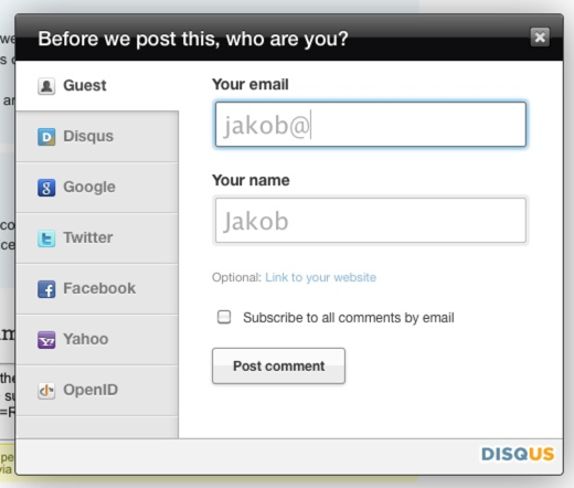
Another example is the autofilling of a name based on an e-mail upon registration:
Micro-interactions are not product functions, but are still important.
Micro-interactions are often invisible and are integral parts of product functions. For example, the music player is a function, and the volume setting is micro-interaction. A product is rarely bought because of its microinteractions, but at the same time they are very important. The quality of product design is determined by the quality of the design of its smallest details. The higher the competition in the market segment, the more important the micro-interactions, since they distinguish the product against the background of functional equality.
Micro-interactions can be large.
An example of a large microinteraction is a toaster.
Micro-interactions also allow you to link product versions across platforms. For example, the micro-interaction of sending tweets connects Twitter, mobile, desktop and web clients.
Secret history of microinteraction
In 1974, Larry Tesler began to develop a text editor Gypsy, whose goal was to reduce the modality of the user interface so that users do not need to switch modes to perform different actions. Pressing a key should always result in printing this key, and not be interpreted by the program differently depending on the current mode. Thus was born the “copy-paste” micro-interaction without a change of mode.
The whole history of human-computer interaction design is a history of microinteraction. Scrolling and opening windows, creating folders and files, connecting to WiFi, saving documents are all examples of micro-interactions that someone had to invent.
Structure of microinteraction
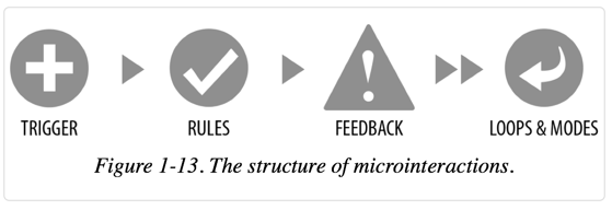
Microinteractions consist of four parts:
- trigger (initiates microinteraction);
- rules (determine how microinteraction works);
- feedback (OS, explains the rules);
- cycles and modes (meta-rules affecting microinteraction).
Micro-interactions as a philosophy
When designing a new or improving an existing product, determine which micro-interactions it contains. For each microinteraction, explicitly define its structure and try to improve each component.
Characteristics (Signature Moments) are micro-interactions that produce a product. Examples: the scroll wheel of the original iPod, the sound of “You've Got Mail!”, The unusual progress indicator “Loading ...”. Characteristic features improve product awareness and increase the loyalty of its users.
Micro-interactions are restrictive exercises. Use them as a product development strategy through the mantra “less means more.” Reduce the product to its essence, its Buddhist nature. A “minimally viable product” (MVP) can sometimes be reduced to a single microinteraction.
A product can also be viewed as a combination of micro-interactions working in harmony. Details - this is design. They are the standard by which product quality is measured.
In other words, there are three approaches to working with micro-interactions:
- focus on each microinteraction separately;
- simplification of the function to the key micro-interaction:
- a look at the function as a set of related microinteractions.
Chapter 2. Triggers
The first principle of triggers: the trigger must be recognizable by the user within the context. The user should immediately understand that something can be done with the trigger. For example, the subway map screensaver in New York is one big button. The interface of this machine was at one time a great success.
Custom triggers
Custom triggers must satisfy the user's need. Example: “I want to switch the phone to silent mode”, “I want to buy a subway card”. It is crucial to understand three things:
- what the user wants to do;
- when he wants to do it;
- in what context he wants to do it.
This understanding determines when and where the trigger will be displayed. For example, the formatting toolbar in Microsoft Office appears only after selecting text.
The second principle: the trigger should be the same every time. The Home button in iOS is an example of a violation of this principle. The first press switches to the home screen, the second - to search. ( Note by the author of the abstract: this is fixed in iOS 7 )
The most ineffective triggers are the triggers hidden in the drop-down menus.
Show the data
The third principle of user triggers: they must show data (Bring the data forward). Think about what kind of data a trigger can show about the internal state of microinteraction before it starts or during execution. For example, the Google Chrome icon displays the number and progress of downloads.
Trigger Components
Custom triggers consist of three components: the control itself (control), its states (default, roll-over, hover, active), and the text or iconographic label (label):

Controls
The goal of the trigger control (as well as the entire microinteraction) is to minimize the user's choice by offering smart default values and a limited set of options. Example: on / off switch.
The fourth principle of triggers: do not violate the visual affordans (visual cue to direct manipulation). If the trigger looks like a button, then it should work as a button - i.e. it is important that it can be clicked.
The fifth principle: the more often micro-interaction is used, the more noticeable should be its trigger. When we are looking for something, our field of view narrows to less than one degree (less than 1% of the normal state). Vision in this sense is like a searchlight. When recognizing objects, our eyes are looking for familiar figures - geons. Geons are simple shapes (squares, triangles, cubes, cylinders) that the brain unites in order to understand what kind of object is in front of it. Given this feature of the brain, it is important that the triggers, especially icons, have a geometric shape.
The sixth principle of user triggers: do not do false affordants. The user should not guess how the trigger works. Try to use only standard controls.
Invisible Triggers
Triggers may be invisible. Examples: gestures in touchscreen interfaces of smartphones, voice control by Apple Siri and Google Glass.
Invisible controls should, if possible, be detectable. For example, updating the list can be detected when you try to scroll through the list above the first item.
Tags
The seventh principle of custom triggers: do not use the label if it does not carry additional information. Example: five stars rating instead of a slider with five inscriptions.
It is important that the inscription was clear. An example of an incomprehensible caption: Google Search “I'm Feeling Lucky” button. Another example of an unsuccessful caption: the Submit button. Most usability problems are caused by bad labels (or lack thereof).
System triggers
Not all triggers are user defined. Moreover, we are probably entering an era when most of the triggers are initiated by the system, and not by the user. These are triggers that are triggered when certain conditions are met without the conscious participation of the user. For example, the delivery application determines that there is a tracking number in the buffer, and offers to track the delivery itself.

Typical conditions that can trigger a trigger:
- error (dialogue in case of loss of communication),
- location (Foursquare offers check-in),
- incoming data (“You've got mail!”),
- internal data (dimming the screen after several minutes of inactivity),
- other micro-interactions (in the wizard interface, the end of one step is the beginning of another),
- other people (alert when replying to a tweet).
The user should be able to turn off the system triggers through the setting and, preferably, for the first time when the trigger appears (“Do not show me this warning again”).
Chapter 3. Rules
In Mac OS X 10.7, Apple radically changed the logic of the microinteraction of the Save and Save As functions, faced negative and incomprehension and made new changes after that, which finally confused everyone.
Two lessons:
- If you cannot easily create a diagram of microinteraction rules, then users will not be able to create its speculative model.
- The use of radically new, unexpected micro-interactions is possible only when the benefits of them are significantly higher than those of old, familiar ones. Example: adding @ to the keyboard when entering email in iOS.
The key component of the rules is the user's goal. For example, the purpose of authorization is to enter, not enter an email and password.
The rules define:
- response when trigger is activated,
- the ability to control the user
- sequence of steps
- used data
- configuration of algorithms used
- feedback rules
- modes,
- repetition rate (if any),
- actions at completion.
On the example of a lamp with a motion sensor:
- Check for movement every 3 seconds.
- If there is movement, is it a person (judging by the size)?
- If yes, then turn on the light.
- Check for movement every 3 seconds.
- Is there any movement?
- If not, wait 10 seconds and turn off the lights.
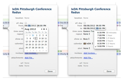
Example in Pages.app: Heading 3 heading appears in the style list only after Heading 2 heading has been used in the document.
Rule making
The rules are the easiest to form, writing out all the rules that you know about microinteraction. Usually these are micro-interaction steps in the order of their execution.
Example shopping cart:
- On the product page, the user clicks “Add to cart”.
- The item is added to the cart.
Nouns and Verbs
Microinteraction can be presented as a sentence. Verbs are user actions, nouns are action objects. Example: “the volume is increased or decreased by the slider”. The rules define the states and characteristics of nouns (for example, the maximum number of elements in the drop-down menu), as well as the state of verbs (for example, the time the action takes).
Screens and States
It is tempting to highlight a separate screen for each step of micro-interaction. But this approach works well only in special cases such as wizards. For most micro-interactions, it is not the screens that need to be changed, but the states of the objects within one screen.
For example, in the case of drag-and-drop, the initial state of an object looks like it is overtightened (by itself or when the cursor is pulled). In the process of dragging the state of the object changes. The state of the screen at the same time can also change, showing where you can drag the object. The state returns to the initial state at the end of the pull.
Restrictions
Rules must take into account restrictions (business logic, technical, environments). Examples: what input tools are available, what type and range of input data, what resources are expensive, what data is available (location, presence of WiFi, weather), what behavioral data can be collected for further use.
Do not start from scratch
The first question to ask when activating a trigger is: “What do we know about the user and the context?”. For example, Eventbright automatically increases the brightness of the device to scan a QR code from it.
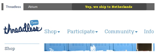
Examples of data that can be used: platform / device, time of day, noise in the room, time since the last use of this microinteraction, whether the user is in a meeting, whether it is one, battery charge, location and direction of movement, user actions in the past. For example, a threadless based on the user's location immediately shows whether delivery is possible. Pro Flowers shows the next holiday when choosing a delivery date. Dropbox shows different download instructions depending on the browser used.
Collecting data about the user, it is important to maintain a balance and not to invade his privacy.
Collecting and analyzing behavioral data can also help add features to advanced users. For example, in Waze there is a possibility to slide (instead of pressing) a button to save two clicks.
Cushion complexity
All actions have inherent complexity, i.e. there is a limit of simplification. The question boils down to whose shoulders this complexity falls - the system or the user. In the case of micro-interactions user is better to deprive the choice and the need for decision-making. For example, iCal, when selecting the end date of an event, shows its duration, removing the need for unnecessary computation from the user.
Limited options and smart defaults
The fewer decisions a user needs to make, the clearer the micro-interaction. It is good practice to select the next step or action either through reducing the number of alternatives or through a visual accent (for example, by selecting the size / color of the button).
It is even better to take this step for the user. For example, YouTube automatically stops playing video when you click on the Report button. Pintrest automatically inserts text from the buffer into the header field.
The choice of the default value should be determined by the frequency with which the value is used. Example: highlighting the OK button in the OK / Cancel dialog.
Error prevention
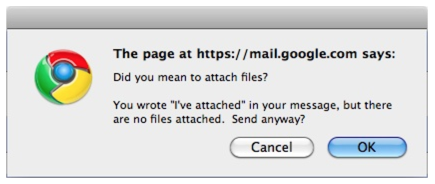
Products and processes must be designed so that the user does not have the opportunity to make a mistake. Lightning cable in iPhone can be connected by either side (as opposed to USB). Gmail warns about the absence of the attachment mentioned in the letter.
Errors should be shown only in cases where the system itself cannot correct them. For example, Meetup automatically expands the search radius if nothing has been found in the specified radius. Twitter does not send the same tweet twice in a row.
Microtext
In any microinteraction, the first thing to do is make sure that the text is binding. For example, the text “Please login” above the login form is superfluous, if it is clear what to do next. The text “Click to continue” is not needed if there is a “Continue” button.
Algorithms
In the case of a music recommendation service, the algorithm is determined by the following questions: Does the genre match? Should new tracks be higher than old ones? Did the user listen to these tracks before? If so, they should be deleted. Genre, album, performer, the ratio of new music and old - all are variable algorithm. It is useful for the user to know which variables are involved in the algorithm. For example, knowledge of the principle of scoring in the FuelBand can help the user to do actions that lead to the growth of points.
Chapter 4. Feedback (OS)
Gaming machines are a multi-billion dollar business, significantly superior to movies, video games and even pornography. And it is completely based on the OS, through which reinforcement occurs at variable intervals. People play without stopping, as payments are unpredictable, and there is a chance to hit the jackpot. Conclusion: OS is a very powerful tool.
With micro-interactions, the opposite is true - the OS should be predictable and should positively support the desired action.
The first principle of feedback in micro-interactions: do not overload the user. The OS should be as low as possible in order to clarify what is happening.
OS makes the rules of micro-interaction understandable to the user. Always look for an opportunity to add the OS where it can clarify what is happening. For example, Quora shows when someone is answering a question being viewed by a user right now. The Boxee logo changes to a sad face if there is no internet connection. Threadless basket smiles when there are goods in it.
Information transmitted by feedback can sometimes be obtained only through an action or an error. This is normal, as from a neuroscience point of view, learning occurs when the expectation does not correspond to the real outcome. It is important that the error does not have negative consequences. For example, opening a dishwasher door with a misunderstanding of the flashing indicator should not cause a burn with hot water.
The second principle of feedback: it should not be arbitrary. The OS must be associated with a trigger. For example, pressing the device power button should not lead to an arbitrary sound, since there is no direct connection between the sound and the button. It is much better if the click is accompanied by a typical click or sound characteristic of turning on the device (for example, a note with a growing height). Ideally, the OS should flow from the rule, which in turn follows from the trigger.
Less is more
The third principle of feedback: use existing elements to send a message. For example, in OS X, the window's resize cursor changes when it is only possible to change in one direction.
OS as a mechanism for transferring personality
Unlike more utilitarian triggers, feedback can be diluted with humor. For example, Dropbox offers to eat while a long download is in progress. Siri responds with a joke to questions like “What is the meaning of life?”.
Feedback methods
Visual
The visual OS should be as low as possible to transmit the message and should not be redundant. For example, a tooltip should not duplicate the text of an inscription.
If visual feedback is shown away from the scene, it can be attracted by movement (for example, through a gradual appearance).
Animation should be informative. For example, the spinner speed of the network connection in the iPhone depends on the speed of the network. It should also be short. A good rule of thumb is to make the animation two times shorter at once than you expected. After that, speed up the result by another two times, if possible.
Do not use the words “error” or “caution” in the feedback. They do not contain useful information and can annoy or frighten the user.
Do not use personal pronouns. The phrase “The password is incorrect” is better than “You entered the wrong password”.
The fewer the words, the better. Focus on the action that the user must do. Example: “Enter the password again.”
Sound
The response time of the brain to the sound OS is significantly higher than the visual one.
Sound is usually used in two cases: in case of an error and to emphasize an action (for example, a click when a button is pressed). In the case of emphasis sound OS is usually combined with the visual. It has been proven that such a combination is more efficient than just a visual OS.
With sound, as with other methods, it is important to consider the context. For example, sound may be undesirable at night.
For the sound transmission of the message, you can use either words or sound icons (earcons). It is desirable that the sound icon caused the association associated with the transmitted message. For example, the sound “flick!” Can be used when moving an item up the list.
If you want to make the sound icon memorable Characteristic feature of your product, then use from two to four consecutively playing notes.
Do not use similar sound icons for different actions.
When using voice instructions complete the sentence with the required action. Option: “To turn off the sound, say“ yes ”, - would be preferable to“ Say “yes” to turn off the sound ”.
Tactile
Tactile OS is capable of transmitting only 1% of audio information. Most people are able to distinguish only 3-4 levels of vibration.
The tactile OS is used in three cases: to supplement the action (for example, pressing a button), to alert when the sound is turned off, and to simulate a texture (for example, to slow down scrolling).
Feedback Rules
- Contextual dependency (for example, reducing the volume at night),
- duration (how long it lasts and when it ends),
- intensity (brightness / speed / volume / vibration),
- repetition (how often, what is the termination criterion).
Chapter 5. Cycles and Modes
In 2004, the Spirit rover entered emergency mode after a software update failure. He was overloaded, faced with the problem of lack of space and was overloaded again, trying to fix this shortage by rebooting.
The mode (in the case of Spirit - emergency mode) is a special state of the application in which its operation differs from the standard one. For example, actions such as keystrokes can lead to nonstandard results.
A loop (in the case of Spirit — endless reboots) is a repeating command or sequence of commands.
Modes
Mode is a branch in the rules. The fewer modes in microinteraction, the better. In most cases, modes are generally not needed.
The key drawback is that they lead to user errors. Especially in cases where the transition to the mode is invisible from the point of view of the interface. Good practice is to use separate screens for the modes. The change of mode is useful to highlight a noticeable transition. Example: selecting cities in a weather app in iOS.
Spring-loaded and one-time modes
A spring-loaded mode (also known as quasi-mode) is available at the time of a physical action, such as holding a key or mouse button. A classic example: holding Shift to enable caps lock mode.
In the one-time mode, performing an action automatically turns off the mode. For example, in iOS, when you double-click, cut-and-paste mode is turned on, which automatically turns off after you select a command.
Cycles
The cycle is governed by rules.For example, “receive data every 30 seconds” and “send a reminder after 10 days”.
The loop can be used to limit the duration of the action. For example, end an online banking session for security.
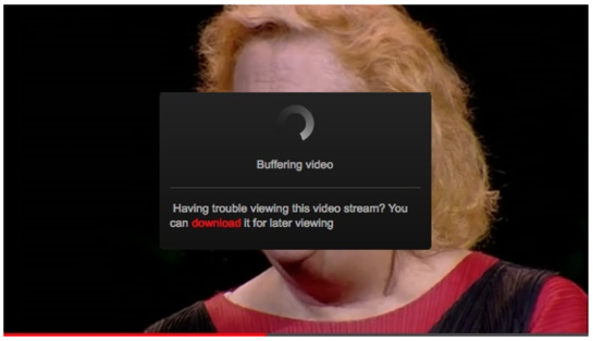
The loop can be used to determine the action. For example, in the case of a long pause at a certain step, assistance may be offered to the user. The TED application offers to download the video for viewing later if the buffering takes too much time.
Long cycles
Long cycles can improve micro-interaction with time. For example, player reuse may take into account the latest volume setting.
Progressive disclosure and hiding
Long cycles can be used to gradually reveal the possibilities of microinteraction. For example, after several uses, keyboard shortcuts or advanced features may be added. And, conversely, microinteraction can be simplified as one becomes acquainted with it. For example, in Layer-Vault, the caption button first has a large size and an inscription. As you use the inscription goes away, and the button itself is reduced.
Chapter 6. Putting It All Together

Example 1: Mobile Alarm Application
Design an alarm application for the iPhone. The entire application is one microinteraction of setting the alarm time.
Rules:
- The user selects the time.
- The alarm goes off at the selected time.
- The user turns off the alarm.
Trigger: application icon on the iPhone home screen.
The first question is how to show the data? iOS allows you to show only integers on the application icon. It would be logical to show the selected alarm time, but with integers it is not very clear. Clarity in the case of triggers can not be sacrificed, so we will show the number of alarms set.
The second question is how not to start from scratch? We know the platform, sensor data (camera, microphone, accelerometer, compass), location, set alarms, how often alarms were set in the past, the distribution of alarms by day, the actions when the alarm goes off. Based on this data, you can add new rules:
- Use the 24-hour format if it is selected in the phone settings.
- Snooze, .
- , 3 .
- . .
The penultimate rule is an example of a long cycle. The last is an example of preventing an error (the time before the trigger will indicate an error if the user confused AM and PM).
Go to the controls. The main one is the timing. On the one hand, you can use the standard toggle switch used in the Clock application. On the other hand, this is a great opportunity to add a feature. I always liked the old-fashioned tickers used at train stations on train schedules. Revive them using click and drop feedbacks due to gravity. Considering that the overwhelming majority do not set the time to within a minute, we will increase the step to five minutes.
Another possibility for memorable features is a non-standard alarm sound and a sound effect when it is turned off.
Go to the modes and cycles. One-time mode works well for setting the time: the user clicks on the alarm clock in the list, the alarm screen opens, the user changes the time, the screen closes. You could also add a Settings mode, but it’s better to replace them with smart defaults. At least in the first release.
The entire application is one conditional loop. An interesting improvement would be a cycle in which, 2 minutes before the alarm went off, an application through the camera would check the room illumination and gradually increase the backlight brightness if the room is dark. But in iOS it is impossible to do.
Example 2: Shared online playlist
Design a playlist that can be used by several people at the same time. Suppose that such a playlist will be part of an existing music service.
Let's start with the goals of users. There are two of them: discover new music and share music.
Initial rule set:
- When a new song appears, add it to the playlist.
- User can add songs to playlist.
- New songs appear on top of the playlist.
Triggers: adding a song by the user (user trigger) and adding a song to a friend (system trigger).
Since a song can be added from anywhere, adding through a tug looks like a logical decision. To make this feature visible, add a blank cell at the top of the list with the words “Drag a song here”. As you use the inscription, you can replace it with “What are you listening to now?” Or even show different inscriptions (“How does your day sound?”, “What is the song of the day today?”).
Are there any other custom triggers? Add an item to the menu and a keyboard shortcut to add several selected songs. It would be possible to add the ability to add a song by entering its name, but we already have many different ways, so it’s best not to complicate things. Also, entering the title is a non-standard way to add a song to the playlist.
Adding a song (especially if the song was added by a friend) is a great place for the OS and, in particular, animation. The added song should move the rest down. Since the application is musical, the addition can be accompanied by sound.
In the case of a system trigger (adding a song to a friend) you need a visual OS. We will show the note icon (a smiling Notesy character) on the browser tab.
When adding a song, the system may take a few seconds to find a match. A standard spinner could be shown to indicate progress, but it is better to try to use existing elements. Let Notesy look around when a search is in progress.
What data show? You can show the name of the user who added the song and the date of the addition. The total time of the playlist and the number of songs are also useful information. When adding a song, you can show a comment like “Please, just not another song from the eighties!”.
As a loop, you can use a reminder to add a song if the user hasn’t added anything for a long time. This can be done either through the unobtrusive indicator of the date of the last addition, or through a nudge of the “Feed me!” Type.
Example 3: Dishwasher control panel
We design the control panel for an inexpensive dishwasher. The goal is to wash the plates, glasses and silverware.
Rules:
- The user loads the dishes and detergent and closes the door.
- The user selects the wash cycle and turns on the machine.
- Machine washes dishes.
How not to start from scratch? We know the last settings that were set, as well as the history of setting the settings. Alternatively, you can choose the last used mode by default.
What data show? It is important to understand whether the machine is working and how much time is left before it is completed.
In accordance with the principle of highlighting the next action, the start button should attract attention after selecting a washing program.
Need the ability to reset the program. You can either add a new button or use the spring-loaded mode of the Start button. The second option is better, since dumping will be extremely rare. To make the function amenable to detection, add the inscription “Hold to reset” under the Start button.
Prototyping and documenting micro-interactions
There are three ways to describe microinteraction: prototype, video, and storyboard. The prototype is the most effective, but the most difficult to implement method.
The most inefficient way is static screenshots. They do not convey the dynamics of interaction and remove information about the context, making microinteraction incomprehensible.
How to improve boring microinteraction
If you already have an existing microinteraction that you want to improve, ask yourself the following questions:
- Should it be a feature? In other words, how memorable should micro-interaction be.
- Am I starting from scratch? What do I know about the user before the start of micro-interaction?
- What is the most important microinteraction data I can show? What should the user know right away?
- ? .
- ?
- ? UI, ?
- ? ?
- “” ? , ? ?
- ? ?
- ? ?
- , ? ? ?
Microinteraction Testing
The user testing process might look like this:
- Before testing, ask the user how microinteraction will work in his opinion. Did he see something similar before? What information would be useful to him before use?
- Offer him a micro-interaction on his own. Record all observations during or immediately after the passage.
- Go through the micro-interaction together in steps, asking the user to comment out loud all the impressions and decisions. Rate how well the user understood the rules.
- Ask what should change in micro-interaction if the user repeats it tomorrow.
- Complete the question: “What one improvement would you have made?”.
Source: https://habr.com/ru/post/225435/
All Articles