The development of STIX fonts version 2.0.0 has been announced, aimed at improving their textual component.
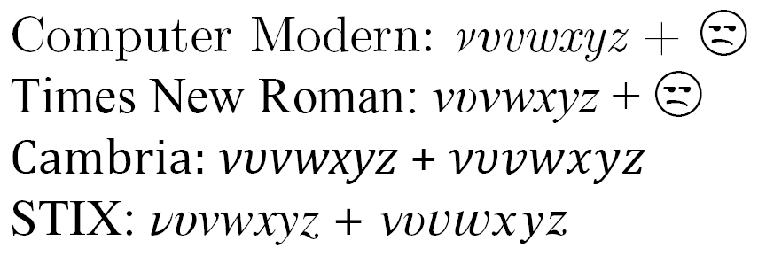
The creation of so-called "text" fonts is one of the most complex, subtlest and noblest arts. Indeed, in all situations, they are designed not only to stimulate a sense of respect for the typed text, but also to take into account the many small and not very technical and tactical nuances associated with the traditions of a particular language. In addition, depending on the specific sphere of use, tasks in such a font are truly ambitious: if it is a university textbook or even a school textbook, then in every possible way keep the mind of interest in science in the inquiring mind of the reader, not hesitate to take in elements of the “academic spirit”, giving signs of dryness and avoiding the slightest “aesthetic overload”; if a legally binding document is to strictly maintain the atmosphere of rigor and neutrality, avoiding rigidity and prickliness; in a work of art or publicism - to facilitate the fastest and gliding easy reading with minimal glimpse of the unusual details of the font design; Finally, in a scientific work, dictionary or encyclopedia - among other things, provide authors with all the necessary set of characters , taking care to prevent cases of undesirable similarities (O + 0, I + l + 1, v + ʋ + ν + υ ...). The latter category requires gigantic financial (for example, by 2007, to the beta stage with a rather limited set of characters, about a million dollars were spent on creating STIX fonts), organizational and human resources, and mega-corporations like Microsoft or Google in this case have to go for a compromise in terms of drawing up the images: for example, the unit symbol in the Segoe UI - the main Microsoft font for interfaces and web documentation - was such a horror that, by the release of Windows 8, it was radically changed .
In Soviet times, solutions to all these problems were assigned to research institutes that developed separate headsets approved by GOSTs with unassuming names ( School , Ordinary , Encyclopedic , Literary , Journal ), and in modern realities at the front edge of the front, they were designed in the style of "Times »Creations under the leadership of" Times New Roman "and STIX (various modifications of the unforgettable Knut Computer Modern , which are not very suitable for typing at least something different from mathematical ab Stratification and quantum mechanical calculations have nothing to do with web designers: they are excessively dry in direct drawing, and heavy in weight in italics like an old-fashioned one; as for Cambria, then ... this is a separate conversation. But if the first is not free from licensing and often frankly careless from artistic and typographical points of view, then the second at this point in time embodies the main hope of those who seek to observe the aesthetic quality of texts relating to exact sciences.
')
And honestly speaking, I, for a long time and with impatience following the development of the project, thought that we had to go another fifty years, until STIX, recently available both in the web and in the LaTeX version, will reach that level of equipment OpenType-features, which is now the font Times New Roman version 6.80, but last week suddenly a ray of hope flashed !
... we are pleased to announce that version 2.0.0 - a new generation of STIX - is currently under development. In this release, attention will be paid mainly to a significant refinement of the text portion of the font and bringing it in line with the high demands of professionals in the field of scientific and technical publishing and scientists ...
The approximate term is the beginning of 2015, but from previous experience I can say that I will be glad if the real product comes out at least by the end of 2015.
In general, first of all, to imagine the level of the STIX font - I recommend, in addition to Wikipedia , to look at the history of its development and read this pdf-document (unfortunately, as early as 2007).
Without repeating what is stated there, I will only draw attention to the “funny” fact: the birth of a star back in 1995 was made possible by ... Elsevier (a person named Arie de Ruiter) - an organization whose activities, I remember, were mentioned at least last year in two articles on Habrahabr, but, alas, in a somewhat negative aspect ...
It is STIX that is the main workhorse of the javascript project of MathJax, which came as a standard for displaying mathematical formulas in browsers and used both in Wikipedia and Stackexchange . Chrome developers, who are not yet able to implement MathML support in their offspring, are forced to refer to MathJax, and in Firefox, the creation of normal MathML rendering became possible only thanks to STIX.
So the first question is: what is the “text part” of STIX at the moment? So far, nothing of what would have been useful for a Russian text: kerning pairs for Latin, suitable for use on sizes from 8 to 12 points (from the web designer’s point of view, this is equivalent to the complete absence of kerning) and a few standard ligatures.
Question two: what is the desired (only from the point of view of the author of these lines, of course) the level of the text part? For a visual demonstration, the best will probably be to bring the source text in HTML + CSS format and a picture of what Firefox will render it into. I will do this in order of my own priorities: stress, kerning, superscript and subscript indices, fractions and case-sensitive mode, and since Times New Roman is devoid of the last three features, you have to use, say, Constantia:
<p><span style="font-family: Times New Roman">́ ́</span><br><span style="font-family: STIXRegular">́ ́</span></p> <p><span style="font-family: Times New Roman; -moz-font-feature-settings: 'kern'"> = DEVASTATING</span><br><span style="font-family: STIXRegular"> = DEVASTATING</span></p> <p style="font-family: Constantia; -moz-font-feature-settings: 'lnum'"> <i>A</i>₁ <i>B</i>₂<br> <i>A</i><sub>1</sub> <i>B</i><sub>2</sub><br> 7⁴⁰ 17³⁵<br> 7<sup>40</sup> 17<sup>35</sup></span></p> <p style="font-family: Constantia; -moz-font-feature-settings: 'lnum'"><span style="-moz-font-feature-settings: 'frac'"> 4/5 1/8 </span><br> 4/5 1/8 </p> <p style="font-family: Constantia; -moz-font-feature-settings: 'lnum'"><span style="-moz-font-feature-settings: 'case', 'lnum'"> – ! -34</span><br> – ! -34</p> 
What are we seeing?
- With accents everything is clear. Well still, if this sign went a separate symbol, but, having zero width, it absolutely impudently climbs on the neighbor. And I don’t understand why designing such characters in this way, knowing that there is no proper positioning in the font. The result is simply the absence of a fallback mode: the same combination of characters in the case of display in the “pumped-out” font looks like it should, but otherwise either something meaningless is displayed, or the user will not notice at all that the authors in This place was covered by some kind of additional sign.
- The failure after “U” gapes with a glaring gap, but compare also the combinations VA, TAT with, I repeat, the formal presence of kerning!
- Obviously, the axiom manifests itself: embedded indices look much better than rendering a user-agent (in this case, a browser). It must be said, this is not always pronounced and Constantia here is not the most typical example, but in some cases, the browser can give out such indices that will look like an elephant in a china shop. Well, if the program allows you to give them a style, but in this case, with an elementary font change, all harmony will collapse. However, in the official document distributed with the archives of STIX fonts, a phrase that is not completely clear to me about the preference for using markup in such situations is given about superscript signs (as well as fractions). But wait, because any font already contains a superscript unit, a deuce and a triple: ¹, ², ³. Is it not logical to complete this series, especially since the corresponding places are already reserved in Unicode? And then the user himself decides whether to use artificial, or built-in indexes.
- And this feature (frac) is one of the unconditional signs of typographic font advancement. Unfortunately, too often it remains overboard: suffice it to say that even in Cambria, a font that, by its nature, should not do without it, it exists only formally, truncated (I will not go into specific details now)! And nevertheless, I insist: “human” fractions quite significantly increase the attractiveness of the text in comparison with the usual figures, separated from each other by a fractional symbol.
- Pay attention to the position of the dash and hyphen.
The development of the Open Type MATH Table is undoubtedly relevant, but the development of the Open Type MATH Table (the main obstacle will still be support by browsers or MathJax) and the addition of small caps, whose presence in Times-like type is generally casuistic rare.
And with the caller, the problem of creating a web version suitable for presentation to the mass user is presented. Yes, formally, the font seems to be released in a web format, but the main task - to display everything smoothly, clearly and cleanly at any size on any screen in all statistically significant OS (especially in the Windows environment) - is not solved. Alas, I'm afraid this direction is not in the priorities of the developers ...
This is how I imagine development priorities, knowing that, of course, this announcement itself is not a reason to jump for joy to the authors of Russian-language texts, since the details of what the developers understand by “refining the text part” are unknown. I, for example, would not be very pleased if they decide to continue the practice of kerning only for certain physical dimensions in print or do not add support for Cyrillic stresses (including the letter “e”). And nevertheless, I think that professionals and enthusiasts can already begin to get accustomed to and try on STIX, directing complaints about noticed shortcomings, for example, here .
Source: https://habr.com/ru/post/225165/
All Articles