Mail Improvement: Solutions to the Russian Design Cup 2013 Challenge
We continue to analyze the tasks of the past year, and the next step is about the mail.
“Not only letters from friends have come to the mail for a long time. Most of the boxes are filled with mailings, receipts, airline and film tickets, orders from online stores, coupons, notifications from social networks and other "useful" letters from robots. A dry and boring list is clearly not the best way to display such content. Figure out how to adapt the web version of any popular mail to the existing reality. And, of course, do not forget about letters from people - they are the most important. ”
Several solutions were commented on by the chief designers of the three largest posts in Russia: Tomilov Sergey (Yandex), Alexey Kandaurov (Mail.Ru) and Alexander Kovbovich, who developed the latest version of the design for Rambler Mail. Let's see what the pros said to our contestants.
')

All solution
 Sergei
I really like the solution with the removal of notifications from social networks into a separate entity. True, they should not be letters, but should continue the history of notifications on mobile devices.
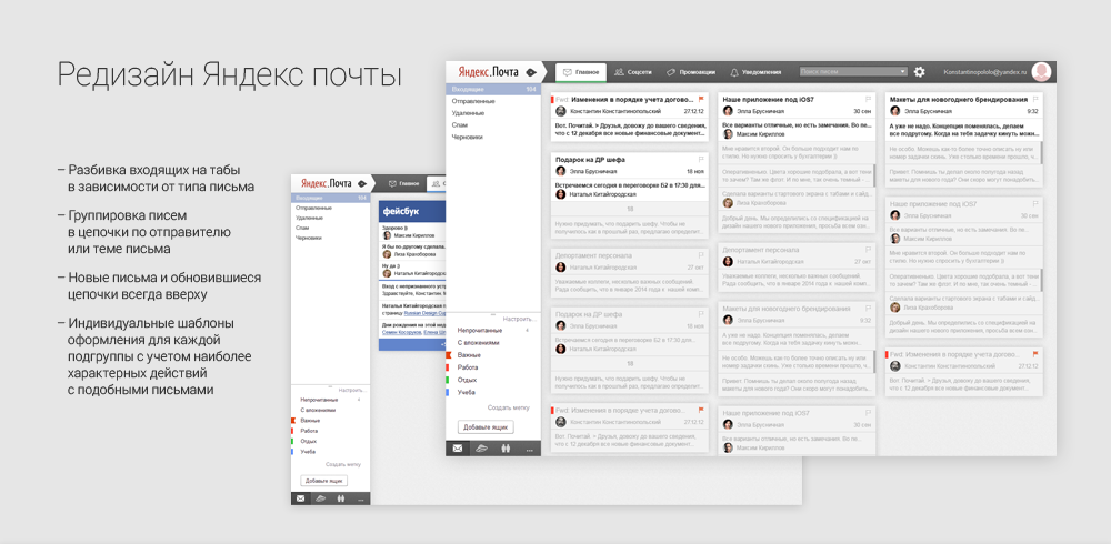
Anton first shows the Gmail solution, and compare with it. So, Gmail's main feature is that only people are left in the Inbox. And Anton, in order to highlight people in the list of letters, had to remove accents from letters from services. If we talk about aesthetics, it looks neat, branding has become stronger. True, he lost advertising and communication with other services. But perhaps this will only make people happier. Tile view is a terrible thing. We do not read the information, we scan it. Our brain works very quickly with structured data. And there is no structure in the card interface. The Pinterest model does not fit here: we do not need to stick, we need to separate the wheat from the chaff.
Tags, tags, categories, you can call them whatever you like, are solved poorly - icons always work worse than text. This is always a charade. In general, this part of the concept is not thought out at all. The idea of pinning recipients is interesting: in fact, this is Favorites. And if you develop a thought, then this is a substitution of rules for ordinary people.
 Alexey
Anton did a good job. But there are a few comments:
Automatic grouping of notifications in the top bar and creating stacks for individual senders in the same place is a very cool thing. It is a pity that doing the read alerts in social networks will not work. Think yourself, do they need you to go to their site or not? ;)
Well, the last. Your layout would never have been approved, because you dismissive of the existing style of the Post, and also bankrupt it. But one good idea is there. And this is very good.
 Alexander

All solution
Sergei
This is a great concept application for the tablet. This layout and visualization of the designer encourages not to get anything extra, just letters on the case, and there are fewer cases. After entering the mail page, you need to make three clicks before reading the letter. In the current interfaces - one. I do not know what else to comment on here. Sorry, I apparently did not understand. And the layouts on the first screen are different from the layouts on the second.
Alexey
“When society has no color differentiation of pants, then there is no goal!” Thought Ivan Korzun and made an additional, useless adjustable screen on which he placed color envelopes with no name. This unfortunate decision generates a bunch of unnecessary clicks. In fact, the Gmail filters and tags (folders) were simply swapped. And in vain, because there are always more tags, and a limited number of filters. Therefore, labels (folders) and placed in the left column so that their number does not affect the interface. Again, cards that are harder to navigate than in the list. In general, the Google interface is badly flawed in this concept. And you can describe it endlessly, but one mistake - the wrong case. The user is bored / flat is boring / animations are few / if they are boring, they will not use / need to be given to set up mail for themselves and for this you can sacrifice everything.
Alexander
In the presented concept, I liked several solutions:
Perhaps this decision will motivate users not to accumulate a mountain of unread emails, because they constantly remind about themselves.

All solution
Sergei
The idea with two lists is fun. The second column will be updated all the time, unlike the first. And what about the tablets, mobile and that's it? I don’t understand why the designer has complicated the current Gmail logic. They are the only ones so far who have abandoned two folder / tag entities. And then they come back.
Alexey
Ayrat, bravo! You have perfectly separated the grain from the chaff. Excellent non-standard concept. He certainly harbors a lot of problems that are not visible at first glance. But I was pleased with the following: we do not hide mailing. They do not accumulate trash and do not lose letters. Important mailings can get lost among the unimportant, BUT it provokes the user to at least occasionally unsubscribe from the unnecessary. If the user does not receive letters from living people, then the left column can be not displayed at all, and if vice versa, then the right one. And by the same principle, you can make the column formatting style less or more noticeable. Super!
Alexander
The streaming tape on the right, at first glance, allows you to be aware of all the events to which the user is subscribed. Such a case can work effectively. But there may be a couple of problems:
All solution
Sergei
I would go further and in different “pockets” I sharpened the design for the contents more strongly. As in the first work, navigation through the rationing system is worse than the list one. I do not understand why this is done. I really like the idea of displaying letters over the Inbox. Here you can simply return to the list of letters.
Alexey
Alexey, I will first say about the obvious disadvantages, and then about the pros. In no case can not force the user to understand who sent this or that letter. Letters should be clearly separated from each other by names and avatars. Highlighting your own letters with a stripe on the right is very unnoticeable. Imagine a one-to-one correspondence with a length of 30 letters. Distinguish something will be impossible. The choice of the main opponent in the branch is a very controversial point. Imagine a case when the secretary of the general sent a letter to all the participants of the future correspondence and became its main person involved, although it performed only a technical function.
And now for the good: branded caps of mailing stacks, that's great. Counters in them, I think, can be convenient. This is all complicated, but in Mail.Ru, for example, we drew logos for all mailing services in the “vector” and show them in place of avatars. So branded caps - it is difficult, but possible. The idea is good.
Alexander
The idea to show social widgets in the mail service is worth it to at least check, as far as I know, it is even easy to do. Such a thing can be interesting for particularly busy people who use several web-based communication tools at work. All the rest - not sure. Chatting in the mail is boring. There must be another motivation. In social networks, users are pushed to communicate by the general movement - comments, likes, new photos, statuses, videos, games, and there is nothing more than folders in the mail service.
All solution
Sergei
I also think that mail should be something like a messenger with an additional function: a thoughtful answer. There is an overdiscipline here, but if you don’t look at it, then the ideas are excellent: splitting into just two categories (I don’t consider favorites as a category), file storage in the cloud. A total simplification, perhaps, will benefit the mail, this is such a home mail. No folders, no tags, no topics messages - great.
Alexey
The case chosen by Alexander about “hello and bla-bla-bla” is incorrect. For such communication there are a lot of other services, and mail now exists as a recipient of mailings and social notifications on the one hand and a tool for business communication on the other. In this concept and with attachments it is inconvenient to work, and to rake the rubble of business correspondence and mailings.
But, even considering this moment, I am sure that such mail would find its user. This is such a slightly expanded messenger format. I would definitely try such a thing, and accept the inconvenience. For a while. It is a pity that Alexander did not show the layout of a group chat (correspondence with several senders).
Alexander
The variant of the mail presented by the author can cope well with the main mail scenarios of the average user, who is used to communicate in an informal way, using short messages, most likely with already familiar people, using a minimum of information types - text and image. The result was especially interesting due to the fact that a different sorting model of letters is used here - by people. And all correspondence with the person is saved in the form of a dialogue. This way of presenting correspondence is allowed to bypass a bunch of barriers and speed up communication between people several times. For example, instead of the usual branches with letters and endless quotations, the correspondence is collected into uniform blocks of information, for access to which it is enough to scroll the page.
Also, in my opinion, an effective solution to simplify and speed up interaction with the interface is a quick response form. The user can simultaneously write a message and not forget the context. The study shows that more than 30% of human letters are written in several lines, about the same number do not respond at all, the remaining 40% include forwarding, long letters, letters with attachments. Therefore, such a format of the form, by the way, solves the problem of quick correspondence. If we talk about the working audience, the interface is not adapted for group correspondence. Other content formats come into play - bigger, heavier, unmanaged. For convenience of work with which more space and less decorative elements will be required.
Sergei
None of the participants, except the first (he thought), approached the fulfillment of the task: to take the next convenience step after Google. Nobody thought that you could do something with the letters themselves, and that is sad.
Alexey
All guys have the same blunder: they look at the problem from one point of view, looking a little at other user cases. Some of them spat on the corporate style and did not even try to explain the design change. Of all the works, perhaps only one has an opportunity to monetize (selling branded hats with notifications), the rest just decided to bankrupt their companies and did not even show contextual advertising in the interface. If you are thinking about grocery design, then you should think about everything.
“Not only letters from friends have come to the mail for a long time. Most of the boxes are filled with mailings, receipts, airline and film tickets, orders from online stores, coupons, notifications from social networks and other "useful" letters from robots. A dry and boring list is clearly not the best way to display such content. Figure out how to adapt the web version of any popular mail to the existing reality. And, of course, do not forget about letters from people - they are the most important. ”
Several solutions were commented on by the chief designers of the three largest posts in Russia: Tomilov Sergey (Yandex), Alexey Kandaurov (Mail.Ru) and Alexander Kovbovich, who developed the latest version of the design for Rambler Mail. Let's see what the pros said to our contestants.
')
Anton Tyulenev
All solution
I really like the solution with the removal of notifications from social networks into a separate entity. True, they should not be letters, but should continue the history of notifications on mobile devices.
Anton first shows the Gmail solution, and compare with it. So, Gmail's main feature is that only people are left in the Inbox. And Anton, in order to highlight people in the list of letters, had to remove accents from letters from services. If we talk about aesthetics, it looks neat, branding has become stronger. True, he lost advertising and communication with other services. But perhaps this will only make people happier. Tile view is a terrible thing. We do not read the information, we scan it. Our brain works very quickly with structured data. And there is no structure in the card interface. The Pinterest model does not fit here: we do not need to stick, we need to separate the wheat from the chaff.
Tags, tags, categories, you can call them whatever you like, are solved poorly - icons always work worse than text. This is always a charade. In general, this part of the concept is not thought out at all. The idea of pinning recipients is interesting: in fact, this is Favorites. And if you develop a thought, then this is a substitution of rules for ordinary people.
Anton did a good job. But there are a few comments:
- The add folder button is too noticeable, although this is a super-rare case. Most people do not create folders at all, some people create them a couple of times during the life of the mailbox and a very small part of users work with them actively. The button must be removed, so as not to occupy too much space.
- Anton removed everything except the avatars of people. But many users do not communicate with people by mail. For them, it serves as a notification collector from social networks and other services. Ha, you thought these were unnecessary letters? Wrong.
- Automatic tagging by type of letters. What for? They still fall into the main box, and if you need Spotify, then you type in the search for "Spotify". Why complicate things?
- If people are more important than notifications and mailings, then why is it the other way around in a tile format? ;)
- Account management - faceless user profile? I would like to see my face there.
- Grouping letters in the manner suggested will necessarily create problems for the loss of the necessary letters.
Automatic grouping of notifications in the top bar and creating stacks for individual senders in the same place is a very cool thing. It is a pity that doing the read alerts in social networks will not work. Think yourself, do they need you to go to their site or not? ;)
Well, the last. Your layout would never have been approved, because you dismissive of the existing style of the Post, and also bankrupt it. But one good idea is there. And this is very good.
- Filtering types of letters. 90% of letters in the mailbox of the average user - advertising mailings, reports, invoices, tickets, notifications, etc. Case is gaining popularity when users register a second email address in another service to receive mailings from sites where they buy goods or subscribe to something. The problem is obvious - they do not want to mix, for various reasons, letters from people with "robotized", which are 10 times more. I think if you mix “robotized” letters with “human” letters, then you will additionally optimize them with algorithms to determine their importance and screw up personalization. For example, a fresh bill for the Internet, tickets, an appointment, obviously, need to be visually withdrawn, and the next mailing from the coupon system can be hidden, if we know that there is nothing interesting for the user to send this mailing.
- The proposed notification system. The idea is very interesting, but there is a problem with the implementation. The mail service can receive notifications from other services if they are included there. When a notification is marked viewed in the mail, it is far from a fact that it will be marked viewed in the service too, since Not all services give the right to manage a user account. On the one hand, this function greatly simplifies and speeds up work with information, but on the other hand, connected services will receive less traffic, so it is difficult to agree with them so far.
Ivan Korzun
All solution
Sergei
This is a great concept application for the tablet. This layout and visualization of the designer encourages not to get anything extra, just letters on the case, and there are fewer cases. After entering the mail page, you need to make three clicks before reading the letter. In the current interfaces - one. I do not know what else to comment on here. Sorry, I apparently did not understand. And the layouts on the first screen are different from the layouts on the second.
Alexey
“When society has no color differentiation of pants, then there is no goal!” Thought Ivan Korzun and made an additional, useless adjustable screen on which he placed color envelopes with no name. This unfortunate decision generates a bunch of unnecessary clicks. In fact, the Gmail filters and tags (folders) were simply swapped. And in vain, because there are always more tags, and a limited number of filters. Therefore, labels (folders) and placed in the left column so that their number does not affect the interface. Again, cards that are harder to navigate than in the list. In general, the Google interface is badly flawed in this concept. And you can describe it endlessly, but one mistake - the wrong case. The user is bored / flat is boring / animations are few / if they are boring, they will not use / need to be given to set up mail for themselves and for this you can sacrifice everything.
- The user is not bored, and if bored, then he goes to the social network or simply changes the subject.
- The user solves the problem and the need to simplify the solution of these problems, and not to complicate.
- The user sends and receives letters, but does not customize the design and filtering of mail.
Alexander
In the presented concept, I liked several solutions:
- The transfer of the general mood - brightness, comfort, dynamics, liveliness.
Users love custom themes - upload their photos to the background, choose color schemes, styles and everything that is on the territory of personal aesthetics. This confirms the feedback. But there is a problem: the more you give the user a personal space, the more difficult and more expensive it is to support developers, over time, the main thing is not to overdo it. - Control buttons everywhere in the context of functions and related to the content of the meaning. In most mail interfaces, controls are moved somewhere separately. And it is not always clear, especially for new users, which element they will affect when pressed.
- Display only new or unread letters on the main page.
Perhaps this decision will motivate users not to accumulate a mountain of unread emails, because they constantly remind about themselves.
Ayrat Gafiyatullin
All solution
Sergei
The idea with two lists is fun. The second column will be updated all the time, unlike the first. And what about the tablets, mobile and that's it? I don’t understand why the designer has complicated the current Gmail logic. They are the only ones so far who have abandoned two folder / tag entities. And then they come back.
Alexey
Ayrat, bravo! You have perfectly separated the grain from the chaff. Excellent non-standard concept. He certainly harbors a lot of problems that are not visible at first glance. But I was pleased with the following: we do not hide mailing. They do not accumulate trash and do not lose letters. Important mailings can get lost among the unimportant, BUT it provokes the user to at least occasionally unsubscribe from the unnecessary. If the user does not receive letters from living people, then the left column can be not displayed at all, and if vice versa, then the right one. And by the same principle, you can make the column formatting style less or more noticeable. Super!
Alexander
The streaming tape on the right, at first glance, allows you to be aware of all the events to which the user is subscribed. Such a case can work effectively. But there may be a couple of problems:
- In the reading mode of the letter, in order to switch to the list, it is required to put extra effort to go back. This long distance transition can start annoying users.
- It is not yet clear how the newsletter will behave, if 20-30-30 new letters are added to it daily. It is likely that users will lose contact with her at some point and stop tracking updates.
Alexey Antonov
All solution
Sergei
I would go further and in different “pockets” I sharpened the design for the contents more strongly. As in the first work, navigation through the rationing system is worse than the list one. I do not understand why this is done. I really like the idea of displaying letters over the Inbox. Here you can simply return to the list of letters.
Alexey
Alexey, I will first say about the obvious disadvantages, and then about the pros. In no case can not force the user to understand who sent this or that letter. Letters should be clearly separated from each other by names and avatars. Highlighting your own letters with a stripe on the right is very unnoticeable. Imagine a one-to-one correspondence with a length of 30 letters. Distinguish something will be impossible. The choice of the main opponent in the branch is a very controversial point. Imagine a case when the secretary of the general sent a letter to all the participants of the future correspondence and became its main person involved, although it performed only a technical function.
And now for the good: branded caps of mailing stacks, that's great. Counters in them, I think, can be convenient. This is all complicated, but in Mail.Ru, for example, we drew logos for all mailing services in the “vector” and show them in place of avatars. So branded caps - it is difficult, but possible. The idea is good.
Alexander
The idea to show social widgets in the mail service is worth it to at least check, as far as I know, it is even easy to do. Such a thing can be interesting for particularly busy people who use several web-based communication tools at work. All the rest - not sure. Chatting in the mail is boring. There must be another motivation. In social networks, users are pushed to communicate by the general movement - comments, likes, new photos, statuses, videos, games, and there is nothing more than folders in the mail service.
Alexander Pavlov
All solution
Sergei
I also think that mail should be something like a messenger with an additional function: a thoughtful answer. There is an overdiscipline here, but if you don’t look at it, then the ideas are excellent: splitting into just two categories (I don’t consider favorites as a category), file storage in the cloud. A total simplification, perhaps, will benefit the mail, this is such a home mail. No folders, no tags, no topics messages - great.
Alexey
The case chosen by Alexander about “hello and bla-bla-bla” is incorrect. For such communication there are a lot of other services, and mail now exists as a recipient of mailings and social notifications on the one hand and a tool for business communication on the other. In this concept and with attachments it is inconvenient to work, and to rake the rubble of business correspondence and mailings.
But, even considering this moment, I am sure that such mail would find its user. This is such a slightly expanded messenger format. I would definitely try such a thing, and accept the inconvenience. For a while. It is a pity that Alexander did not show the layout of a group chat (correspondence with several senders).
Alexander
The variant of the mail presented by the author can cope well with the main mail scenarios of the average user, who is used to communicate in an informal way, using short messages, most likely with already familiar people, using a minimum of information types - text and image. The result was especially interesting due to the fact that a different sorting model of letters is used here - by people. And all correspondence with the person is saved in the form of a dialogue. This way of presenting correspondence is allowed to bypass a bunch of barriers and speed up communication between people several times. For example, instead of the usual branches with letters and endless quotations, the correspondence is collected into uniform blocks of information, for access to which it is enough to scroll the page.
Also, in my opinion, an effective solution to simplify and speed up interaction with the interface is a quick response form. The user can simultaneously write a message and not forget the context. The study shows that more than 30% of human letters are written in several lines, about the same number do not respond at all, the remaining 40% include forwarding, long letters, letters with attachments. Therefore, such a format of the form, by the way, solves the problem of quick correspondence. If we talk about the working audience, the interface is not adapted for group correspondence. Other content formats come into play - bigger, heavier, unmanaged. For convenience of work with which more space and less decorative elements will be required.
Total
Sergei
None of the participants, except the first (he thought), approached the fulfillment of the task: to take the next convenience step after Google. Nobody thought that you could do something with the letters themselves, and that is sad.
Alexey
All guys have the same blunder: they look at the problem from one point of view, looking a little at other user cases. Some of them spat on the corporate style and did not even try to explain the design change. Of all the works, perhaps only one has an opportunity to monetize (selling branded hats with notifications), the rest just decided to bankrupt their companies and did not even show contextual advertising in the interface. If you are thinking about grocery design, then you should think about everything.
Source: https://habr.com/ru/post/225113/
All Articles