Problems with the layout of sites and games. Features of sites for mobile phones
Hi, Habra!
This article is a continuation of the previous article (JavaScript to APK. Http://habrahabr.ru/company/ifree/blog/214531/ ). I will try to give some tips on the development of mobile sites that have developed from my experience with services and products in i-Free.
For developers of mobile sites, all phones are divided into three groups:
')
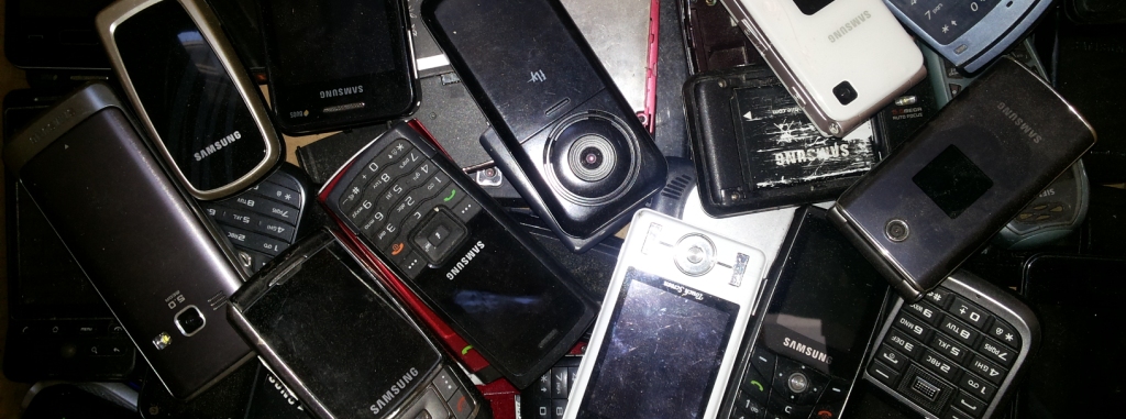
Where do old push-button phones come from in 2014?
Legacy of past years. Previously, phones could be quite high-quality and serve for a very long time. For example, there are many stories about the Nokia 3310, which could be thrown on concrete and hammer nails in the literal sense of the word. Since these phones work, and they have been sold in large numbers, there are still people who use them.
Where do new push-button phones come from in 2014?
Production of new J2ME phones fills the lowest segment of the market. These phones have several qualitative differences:
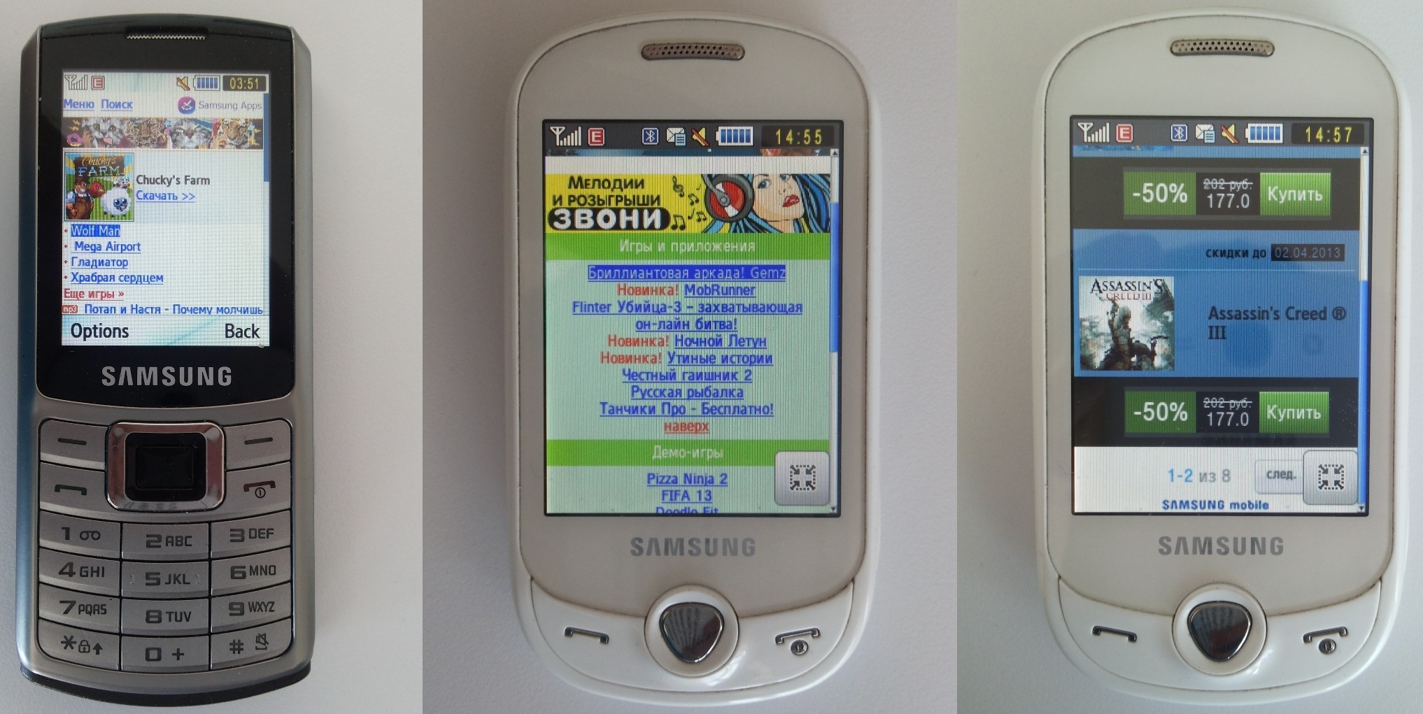
Who makes websites for these phones?
As a rule, these are very large companies that are trying to make their services as accessible as possible (for example, Google, Yandex, Mail). The price of the issue in this case does not matter. In addition, all phones have standard bookmarks in which the site of the operator, manufacturer or vendor company is sewn. On such sites you can buy various content (games, pictures, melodies) or arrange any services. Since There are a lot of phones produced, then such sites can have a very large load.
Features of layout for simple phones:
How to avoid idle cookies?
In such cases, as a rule, at the CMS level, a mechanism is implemented that automatically appends the user's session number as a parameter to all links on the page. For example, before:
And after:
Screen size
As a rule, the screen width of most push-button telephones corresponds to the numbers: 120, 176, 240, 320 with a DPI equal to one. But in any case, typeset rubber. It is not known what display will be on the phone. In addition, Blackberry and Nokia manufacturers like to produce phones with an “landscape” aspect ratio, in which the display width is greater than the height.
Touch screen devices behave much better, but they are also far from ideal. Moreover, entering something into the input form on a bad touch screen is much more difficult than on a push-button telephone.
Smartphones are still better, and often they do not differ in behavior from the PC, but standard browsers can carry small bugs. For example, our test Nokia Lumia could not do position: fixed and crashed if we output anything to the console (console.log / console.dir should not be in the assembly production code).
Also often there is an error in which a non-touch version is given to the touch phone. The problem is that getting into tightly located links from a bad touch-screen is very difficult, because the size of the finger is many times the size of the link. Or, when the layout of the touch-version, forget about the features of the browser, and the page element falls under the control interface of the browser.
Operators and Content
The mobile operator is usually determined by the range of IP addresses from which users come to the site. In the case of wi-fi connection, it is almost impossible to determine the operator. It is necessary to determine the operator in order to be able to display different content to different subscribers at different prices.
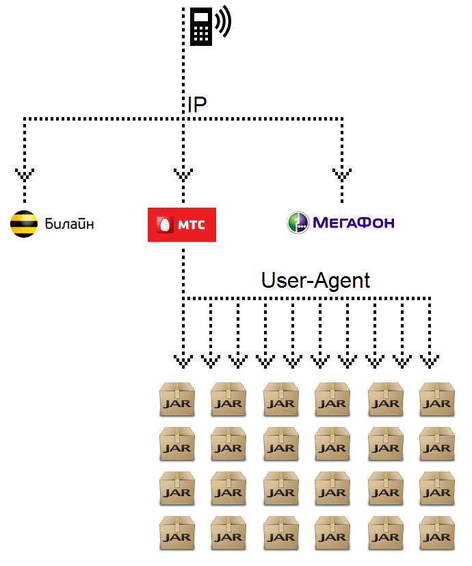
The content itself can have so many presentations. For example, game manufacturers should take into account that phones differ in screen size and operating system. In addition, everyone wants to minimize the weight of the final build of the game. Therefore, one game for a J2ME phone can have up to 20 different builds depending on the phone model. The phones themselves, in such cases, are usually divided by the User-Agent and, for compactness, are combined into groups, depending on the functionality. Each game in the database is assigned a range of supported groups.
A similar situation begins to appear for modern smartphones. Currently on sale you can find phones with OSes: Android (versions 2 and 4), iOS, Windows Phone, etc. Also preparing to launch Tizen and FireFox OS. In addition, for tablets and small phones, they are already starting to assemble different assemblies, since tablets need resources of much higher quality, and it makes no sense to make a build for small phones heavy. Also, phone manufacturers can make their changes and modify operating systems for their devices. Therefore, it is likely that the game runs easily on Nokia phones, but does not work on Fly or Huawei, and vice versa.
When using touch-screens, users, as a rule, do not use point presses, but gestures. As a result, the text on the page as well as the controls can be highlighted. To avoid this, in CSS you should disable selection for everything:

But this rule should not apply to input fields:
In addition, you should disable resize from <textarea>, because she should not change her size:
If you want to completely control the design of your application, do not forget to also disable the auto-reduction of fonts:
Brakes and stop drawing when you touch the screen.
If you have any animation using DOM elements, the browser can stop rendering the page when you click on the display and continue when the event is completed.
This happens by the fact that usually only click events are hung on the elements, forgetting about touch. The phone, in turn, waits until the event is completed, to try to recognize it, and only after that it continues to work with the page.
To remove the delay, you need instead of a click event, hang a similar touch event, as well as related events, such as touchmove and touchend. Even if you do not have callback functions for them, at least you should call stopEvent. Thus, when you click on the display, the phone will see that JavaScript wants to independently handle the touch and immediately returns control to the page.
Yellow and blue selection when clicked.
When you click on any page element, all devices with Android OS ~ 2 seek to highlight the element with yellow fill, and devices with OS Android ~ 4 - with blue.

The yellow fill is removed by using the following code in CSS:
The blue fill will disappear when all the touch events on the element are intercepted (see the item “Brakes and stop drawing when you touch the screen”).
Protective screen
When you hold your finger in the picture, all smartphones currently offer to save it, thereby preventing the user from interacting with our system. In order to eliminate such situations, use a protective transparent block stretched across the entire screen and having a z-index more than all other animation elements, and stopping all click and touch events falling on it.
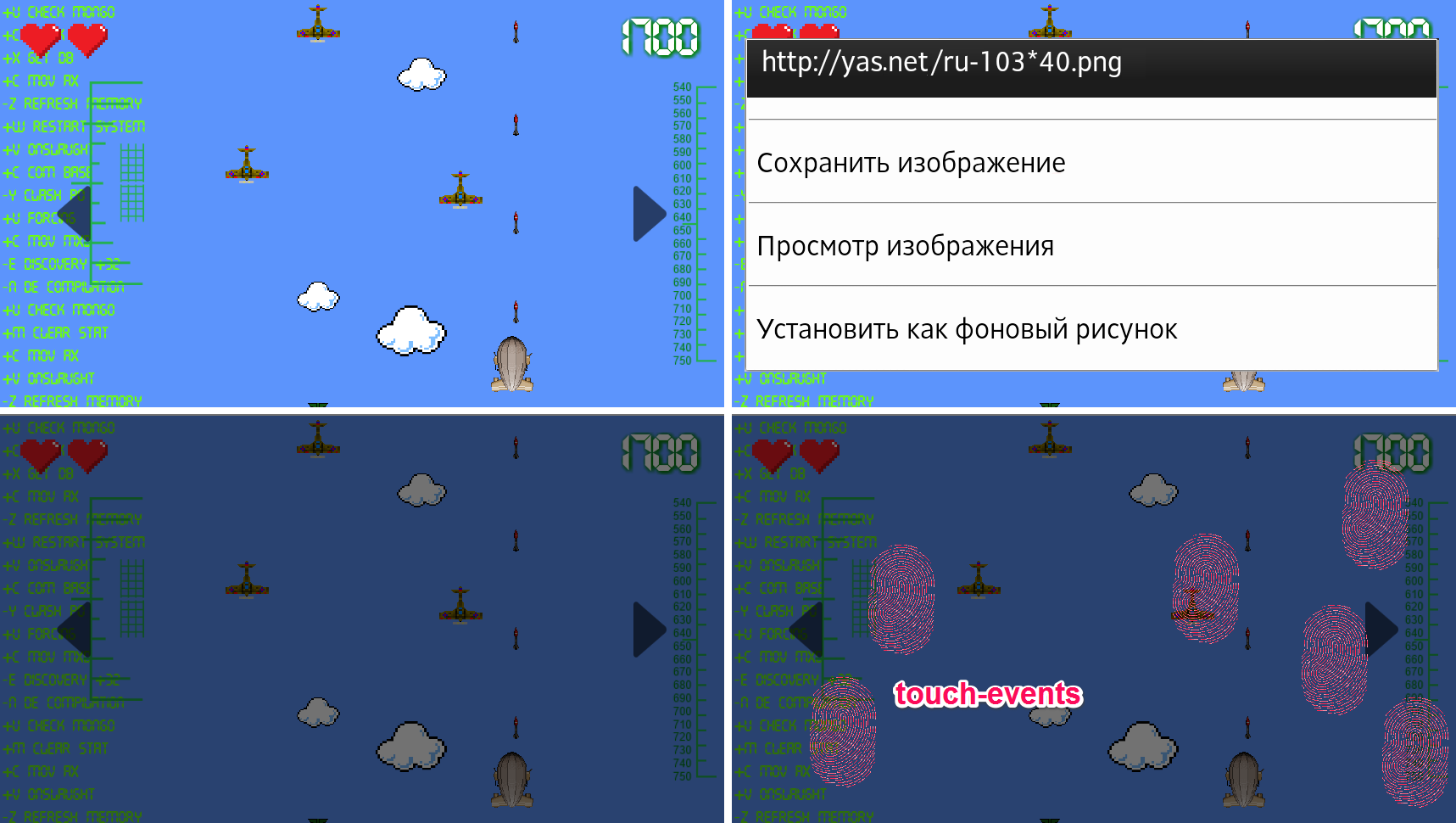
When creating an application, the elements of the controller, which are evenly distributed over the entire screen, usually act as a protective screen, preventing events from falling on the underlying elements.
Screen keyboard
When developing mobile applications and websites, many developers and interface designers forget about the on-screen keyboard. Therefore, very often there are situations in which the input fields when the water is not visible to the user.
If the design initially assumed a portrait mode, then the probability of such an error is significantly lower. It is also necessary to take into account the fact that on different devices the on-screen keyboard is different and can appear from different sides of the display and occupy both part of the screen and the entire screen.

When using input elements, set their type according to semantics. For example:
The difference between them is that when you enter an e-mail, the phone will change the keyboard and put the @ sign in a prominent place. The same scheme works when you enter the site address in the address bar - phones usually make small changes to the layout and display ".com" for speed dialing. At the time of this writing, the best results were given by smartphones with the operating system from Yandex. They had a standard qwerty keyboard with simultaneous output of Russian and English characters. This is very convenient for users, because Many are accustomed to typing Russian passwords on the English layout.
Hide address bar
To hide the address bar on Android phones, you need to increase the minimum document height, scroll up one pixel and return the minimum height to the normal position. I have no logical explanation for this, it just works that way.
Delayed events
The bottom line is that touching the screen is a long process. If you go to the previous page, it can quickly recover from the cache and then the screen touch will work twice: on the original page and on the new one (the bug does not play on all touchscreen devices). To solve this problem, you need to hang handlers with a slight delay. At the first moment you initialize all the scripts, then wait half a second, and only then hang handlers for clicks and touch-events. As a rule, this time is enough and the problem disappears.
Scroll problem
Another problem that web developers on phones often forget to solve is memorizing a position on page scrolling.
Suppose you have a large list. You are at its end. Open a new page, and then for some reason decide to go back to the list. As a rule, developers forget to write down the value of the scroll in localStorage and instead of returning to the same place, we return to the top of the list.
This article is a continuation of the previous article (JavaScript to APK. Http://habrahabr.ru/company/ifree/blog/214531/ ). I will try to give some tips on the development of mobile sites that have developed from my experience with services and products in i-Free.
For developers of mobile sites, all phones are divided into three groups:
- Push-button, without support for touch-events
- Touchscreen, touch-enabled
- Smartphones
')
Where do old push-button phones come from in 2014?
Legacy of past years. Previously, phones could be quite high-quality and serve for a very long time. For example, there are many stories about the Nokia 3310, which could be thrown on concrete and hammer nails in the literal sense of the word. Since these phones work, and they have been sold in large numbers, there are still people who use them.
Where do new push-button phones come from in 2014?
Production of new J2ME phones fills the lowest segment of the market. These phones have several qualitative differences:
- They are very cheap. Often they are bought by children so that it is not so pitiful to lose or break.
- These phones consume very little energy, and their charge may be enough for a week.
- As a rule, the build quality and simplicity allow these phones to work in rather extreme conditions. They can be thrown into walls, dropped from a great height, buried and heated without much damage to working capacity.
Who makes websites for these phones?
As a rule, these are very large companies that are trying to make their services as accessible as possible (for example, Google, Yandex, Mail). The price of the issue in this case does not matter. In addition, all phones have standard bookmarks in which the site of the operator, manufacturer or vendor company is sewn. On such sites you can buy various content (games, pictures, melodies) or arrange any services. Since There are a lot of phones produced, then such sites can have a very large load.
Features of layout for simple phones:
- JavaScript may not work. Try to use it at a minimum.
- Positioning in CSS may not work (and indeed many CSS properties)
- Even the cookie mechanism may not work.
- Users always have slow internet. Make the pages as small and simple as possible.
- The user moves exclusively on the links (at least, this is most convenient). So try to use “anchors” for quick navigation through the page.
- Since a lot of things may not work, then you may have to impose standards for HTML3
- On some phones it is very difficult, or it is impossible to switch the language layout at all or reply to SMS without closing the browser page. Therefore, in response SMS there should always be a link to return to the page, the input fields should be as small as possible.
- Practically on all simple phones it is impossible to see / change the address bar.
How to avoid idle cookies?
In such cases, as a rule, at the CMS level, a mechanism is implemented that automatically appends the user's session number as a parameter to all links on the page. For example, before:
http://wap.samsung.ru/games/index.do And after:
http://wap.samsung.ru/games/index.do?id=8592387483239423722732 Screen size
As a rule, the screen width of most push-button telephones corresponds to the numbers: 120, 176, 240, 320 with a DPI equal to one. But in any case, typeset rubber. It is not known what display will be on the phone. In addition, Blackberry and Nokia manufacturers like to produce phones with an “landscape” aspect ratio, in which the display width is greater than the height.
Touch screen devices behave much better, but they are also far from ideal. Moreover, entering something into the input form on a bad touch screen is much more difficult than on a push-button telephone.
Smartphones are still better, and often they do not differ in behavior from the PC, but standard browsers can carry small bugs. For example, our test Nokia Lumia could not do position: fixed and crashed if we output anything to the console (console.log / console.dir should not be in the assembly production code).
Also often there is an error in which a non-touch version is given to the touch phone. The problem is that getting into tightly located links from a bad touch-screen is very difficult, because the size of the finger is many times the size of the link. Or, when the layout of the touch-version, forget about the features of the browser, and the page element falls under the control interface of the browser.
Operators and Content
The mobile operator is usually determined by the range of IP addresses from which users come to the site. In the case of wi-fi connection, it is almost impossible to determine the operator. It is necessary to determine the operator in order to be able to display different content to different subscribers at different prices.
The content itself can have so many presentations. For example, game manufacturers should take into account that phones differ in screen size and operating system. In addition, everyone wants to minimize the weight of the final build of the game. Therefore, one game for a J2ME phone can have up to 20 different builds depending on the phone model. The phones themselves, in such cases, are usually divided by the User-Agent and, for compactness, are combined into groups, depending on the functionality. Each game in the database is assigned a range of supported groups.
A similar situation begins to appear for modern smartphones. Currently on sale you can find phones with OSes: Android (versions 2 and 4), iOS, Windows Phone, etc. Also preparing to launch Tizen and FireFox OS. In addition, for tablets and small phones, they are already starting to assemble different assemblies, since tablets need resources of much higher quality, and it makes no sense to make a build for small phones heavy. Also, phone manufacturers can make their changes and modify operating systems for their devices. Therefore, it is likely that the game runs easily on Nokia phones, but does not work on Fly or Huawei, and vice versa.
Touch Screens
When using touch-screens, users, as a rule, do not use point presses, but gestures. As a result, the text on the page as well as the controls can be highlighted. To avoid this, in CSS you should disable selection for everything:
*, body { -moz-user-select: -moz-none; -o-user-select: none; -khtml-user-select: none; -webkit-user-select: none; user-select: none; } But this rule should not apply to input fields:
input, textarea { -moz-user-select: text; -o-user-select: text; -khtml-user-select: text; -webkit-user-select: text; user-select: text; } In addition, you should disable resize from <textarea>, because she should not change her size:
input, textarea { resize: none; } If you want to completely control the design of your application, do not forget to also disable the auto-reduction of fonts:
*, body { -webkit-text-size-adjust: none; } Brakes and stop drawing when you touch the screen.
If you have any animation using DOM elements, the browser can stop rendering the page when you click on the display and continue when the event is completed.
This happens by the fact that usually only click events are hung on the elements, forgetting about touch. The phone, in turn, waits until the event is completed, to try to recognize it, and only after that it continues to work with the page.
To remove the delay, you need instead of a click event, hang a similar touch event, as well as related events, such as touchmove and touchend. Even if you do not have callback functions for them, at least you should call stopEvent. Thus, when you click on the display, the phone will see that JavaScript wants to independently handle the touch and immediately returns control to the page.
Yellow and blue selection when clicked.
When you click on any page element, all devices with Android OS ~ 2 seek to highlight the element with yellow fill, and devices with OS Android ~ 4 - with blue.
The yellow fill is removed by using the following code in CSS:
*, body { -webkit-tap-highlight-color: rgba(0,0,0,0); -webkit-focus-ring-color: rgba(0,0,0,0); outline: none; } The blue fill will disappear when all the touch events on the element are intercepted (see the item “Brakes and stop drawing when you touch the screen”).
Protective screen
When you hold your finger in the picture, all smartphones currently offer to save it, thereby preventing the user from interacting with our system. In order to eliminate such situations, use a protective transparent block stretched across the entire screen and having a z-index more than all other animation elements, and stopping all click and touch events falling on it.
When creating an application, the elements of the controller, which are evenly distributed over the entire screen, usually act as a protective screen, preventing events from falling on the underlying elements.
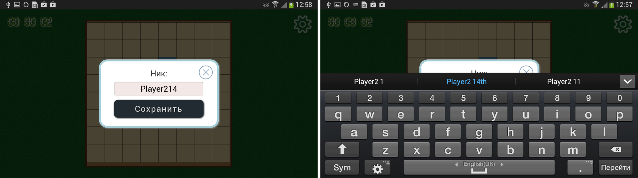
Screen keyboard
When developing mobile applications and websites, many developers and interface designers forget about the on-screen keyboard. Therefore, very often there are situations in which the input fields when the water is not visible to the user.
If the design initially assumed a portrait mode, then the probability of such an error is significantly lower. It is also necessary to take into account the fact that on different devices the on-screen keyboard is different and can appear from different sides of the display and occupy both part of the screen and the entire screen.
When using input elements, set their type according to semantics. For example:
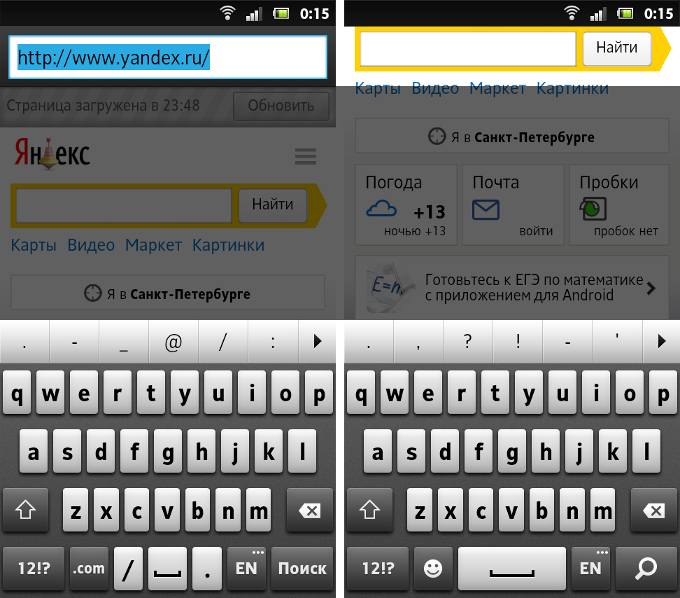
<input type="text"/> <input type="email"/> The difference between them is that when you enter an e-mail, the phone will change the keyboard and put the @ sign in a prominent place. The same scheme works when you enter the site address in the address bar - phones usually make small changes to the layout and display ".com" for speed dialing. At the time of this writing, the best results were given by smartphones with the operating system from Yandex. They had a standard qwerty keyboard with simultaneous output of Russian and English characters. This is very convenient for users, because Many are accustomed to typing Russian passwords on the English layout.
Hide address bar
To hide the address bar on Android phones, you need to increase the minimum document height, scroll up one pixel and return the minimum height to the normal position. I have no logical explanation for this, it just works that way.
Delayed events
The bottom line is that touching the screen is a long process. If you go to the previous page, it can quickly recover from the cache and then the screen touch will work twice: on the original page and on the new one (the bug does not play on all touchscreen devices). To solve this problem, you need to hang handlers with a slight delay. At the first moment you initialize all the scripts, then wait half a second, and only then hang handlers for clicks and touch-events. As a rule, this time is enough and the problem disappears.
Scroll problem
Another problem that web developers on phones often forget to solve is memorizing a position on page scrolling.
Suppose you have a large list. You are at its end. Open a new page, and then for some reason decide to go back to the list. As a rule, developers forget to write down the value of the scroll in localStorage and instead of returning to the same place, we return to the top of the list.
Source: https://habr.com/ru/post/224853/
All Articles