How do users behave on the site?
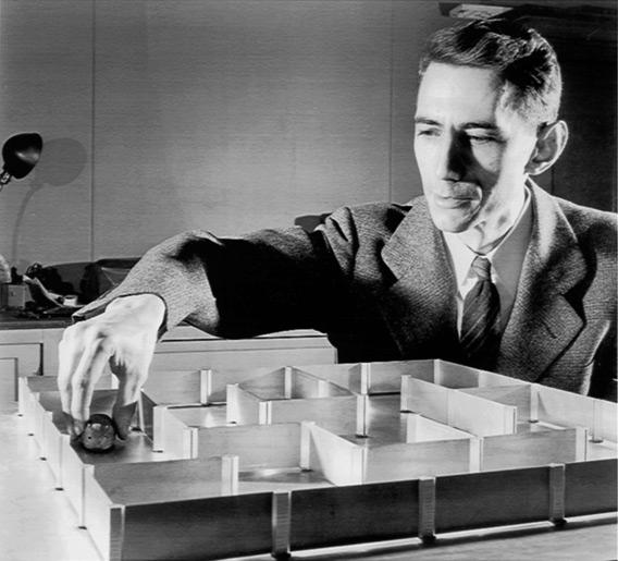
Let us imagine that the user's behavior on the site is similar to the behavior of a laboratory mouse in a maze: the mouse must go through the maze and find a piece of cheese. From the point of view of the creator of the site, the task is to create such a convenient mouse maze that allows you to find your piece of cheese without fail. The question touches on three aspects: usability, conversion and site ranking. Therefore, it is necessary to consider this task in a complex way, and to see the “labyrinth” with the eyes of a “mouse” allows a number of tools.
')
In the foreign Internet this topic is already covered from various points of view. You can read about it interestingly (but in English) here , here and here . In RuNet, this topic is covered either from the point of view of increasing conversions, or - due to updates of the Yandex algorithm - from the point of view of the so-called user behavior or behavioral factors. However, the topic is much broader. Its essence boils down to the need to create a user-friendly site. However, "convenient" - the concept is too vague. In order to know what is convenient for the user - you need to see how he behaves on the site. Only then can behavioral factors (PF) be effectively influenced.
PF analysis: How to see?
1. Charts in analytics: a transition map
Customizable conversion map in analytics allows you to see the routes that users use on the site, to assess the correct site structure and the sanity of internal linking. Here are the answers to the questions.
• Why users are not registered?
For example: at a B2B company selling a number of services, visitors come to the site and watch a line of services. Then they can leave their details if they want to get more detailed information. This action is performed by a few. Why? Perhaps they do not even go to the registration page? If it is visible on the transition map that many people come to the registration page, but not all are registered, a problem is found in the form itself: perhaps it is inconvenient, too long, or simply not submitted. And so it turned out in our case - the long registration form dumped almost everything entered into its fields after an incorrectly entered captcha. We removed the captcha and cut the form in half - the number of registrations increased by one third.
• What are the most popular routes on the site? Is this what was conceived?
On the website of the online store with good traffic there were few orders. Somewhere, most users fell off our well-thought-out sales funnel scheme.
The transition map showed that people go to the blog and never return from it. They did the obvious: they removed a link to the blog from the product pages and added a small “showcase” to all the thematic blog pages. Users began to come to the blog from the search and go shopping. And those that came from other sources began to shop 15% more.
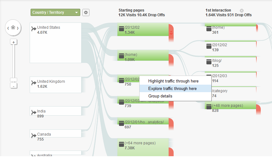
This is what Google Analytics conversion map looks like.
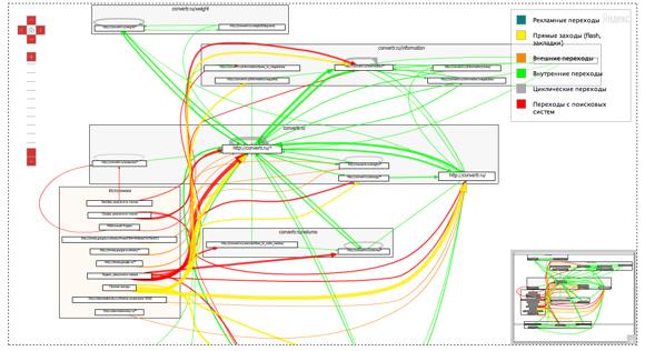
It looks like a map of transitions from Yandex. Metrics
2. Visualization in analytics
Visualizing clicks “as if sitting at the user's shoulder” is another way to see user behavior on the site. When creating a nightclub site, we used this service and saw that the very first click that a user makes on the site is to turn off the sound in the automatically turned on player that played the background music. This argument helped us convince customers that sites with automatically playing music would scare the user rather than tune them to the desired mode. Conversion cards later confirmed the correctness of the solution: users began to spend more time on the site.
You can visualize it in different ways, like ClickTale does:

Visualization is also provided to Yandex.Metrica clients, as an alternative, MouseFlow or CrazyEgg .
3. Heat Clicks Card
We were unable to find free tools that visualize mouse movements, except Yandex.Metrics. But the tools that provide heat maps for free - a lot. You can search for something in the list below, in the meantime, a few words about what the heat map can give. In the first place, of course, successfully did you arrange the most important parts of the site material. Also - does your linking work - click on links or forget them? But there are other facts from particular cases.
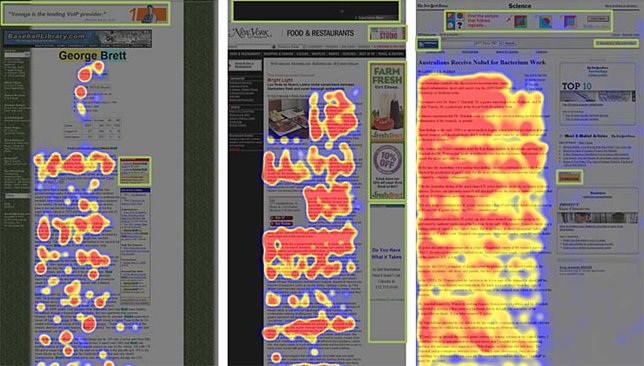
An example of subliminal "banner blindness" on the click map.
For example, if you hang banners across the entire page leading to other material on the site - would it be a good idea? No, the heat map is responding. If users subconsciously perceive the arrangement of banners as just an advertisement, they ignore them. You can read more here (unfortunately, English again).
An interesting gender study of heatmaps at the deyting service showed that the male audience of the service looks more at the images, while the women - the text (though not too surprising). Therefore, you can post images and text on the site depending on the gender focus on the audience.
The heat map can be seen with the following tools:
Yandex.Metrica
Crazy egg
OpenWebAnalytics
Feng-gui
Wordpress plugin
Clickheat
Corunet
Clickdensity
Mouseflow
Visualwebsiteoptimizer
Google Analytics doesn’t have heatmaps per se, but there is an opportunity to look in-page analytics, which is not immediately available - so we attach this video, which clearly shows where the developers hid this option in the interface:
4. Usability Testing
The heat map, which is obtained as a result of usability testing, is very similar to the click map. About it it is possible to esteem on Habré, for example, here . However, the map differs in that it is not built on the basis of mouse clicks, but on the basis of the movement of the experimental user’s eyes, which are recorded by a special camera. The so-called eye-tracking testing allows you to get even more data about the successful placement of material on the site, and a standard heat map built in click-based analytics is often called a cheaper alternative to eye-tracking.
Findings:
User behavior on the site gives information about the effectiveness of the site map, individual pages, sales funnel. Allows you to diagnose and improve the "non-working" areas. To identify patterns of user behavior and their compliance with selected targets, you can use transition maps, heat maps of clicks and visualization. It should be remembered that behavioral factors influence not only the perception of the site and its effectiveness, but also directly on its position in the search . Those. improving usability, we improve the site "on all fronts".
More on the topic:
How to set up Google Analytics to track user behavior broken down by User ID
Checklist for usability of online stores
Sites. Yandex puts an estimate for the behavior
Clicks on the map (from the Yandex company blog)
10 Google Analytics Tricks
Source: https://habr.com/ru/post/224847/
All Articles