Over the weekend, Google changed its logo, and you did not even notice
If you spent some time on the Internet last weekend, you most likely had a chance to meet with the omnipresent Google logo during your travels. But, nevertheless, you hardly noticed that Google slightly corrected the letters on its logo, and although the changes are insignificant in the “quantitative” plan - they significantly change the quality.
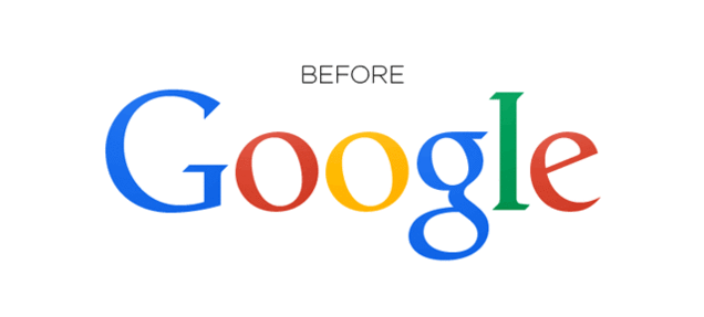
As every designer knows well, careless kerning can cause significant problems. And nothing can be better than to watch letters, pixel by pixel, become their “correct” places. In the case of Google, the bottom edges of the letters "l" and "e" did not exactly match, and, as a user of reddit.com nal1200 noted, "[This] should have caused fits of insanity in some employees." To fix this, Google moved the letter “g” one pixel to the right, and the letter “l” one pixel down and to the right.
However, the correction of the Google logo can not be called unprecedented. Reddit's kerniting threads also draw attention to the fact that you can track the evolution of the logo by changing the number at the end of the URL (in the link to the logo www.google.com/images/srpr/logo11w.png we change 11 to a lower value and admire the early version of the logo). Since last :
')
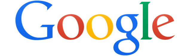
And returning to the very first :

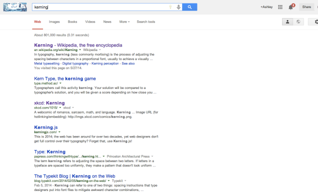
Therefore, if you still have doubts about the importance of correct kerning, just browse Google search results for the word kerning. Each mention of this term is accompanied by a lot of tips and discussions, which makes kerning a kind of science.
Regardless of whether you perceive it on a conscious level or not - the correct placement of characters can really play a significant role in how neat and complete your text looks - achieving perfect results here is not an easy task. In the end, even Google continues to try to find the best option. [Reddit via Daily Dot]
A Google representative has provided a comment for Gizmodo:
We are happy to see that people notice and even appreciate positively changes related to individual pixels - we recently changed our logo a little to make it look as clearly as possible at any monitor resolutions.
Source: https://habr.com/ru/post/224431/
All Articles