Sense 6.0 Update for HTC One M7

Today Sense 6.0 for HTC One M7 update is available for some countries.
Personally, I have a Ukrainian machine, but judging by the information on the network, the update is available in some European countries and in Russia.
Declared changes:
OS and power system improvements:
- update HTC Sense to version 6;
- Dynamic theme color change to simplify interface navigation
- ability to customize the interface font;
- new maximum power saving mode;
- button to clear the list of recently launched applications.
Improvements in working with images:
- The interface of the Camera and Gallery applications has been updated;
- quick and easy search for similar photos;
- adding a display of points of interest when displaying pictures on the map.
Improvements in the BlinkFeed program:
- smoother scrolling tape;
- intuitive interface for adding new channels;
- improved scroll bar;
- recommendations about the nearest restaurants.
Improvements in HTC Sense TV:
- show real-time sports results, statistics and comments from social networks;
- improved, more user-friendly interface.
Other fixes:
- new themes have been added to the “Music” program;
- corrections and improvements in the programs "Mail", "Messages", "Calendar" and "Phone";
- The ability to customize the work schedule has been added to the Do Not Disturb mode.
')
More details with the changes can be found here .
The size of the firmware is more than 500 megabytes.
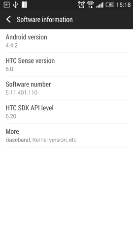
After updating the firmware information screen will look like this:
But HTC will not be HTC if it doesn’t add a scoop of tar to the update. Next, a few screenshots and my comments expressing my personal opinion.
Main screen:
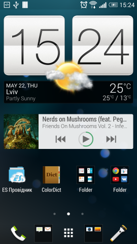
Here we see above the shortcut line and below the application icons the empty space reserved for the indicator of the current desktop position.
Unfortunately now I don’t have a screenshot to show how it was before, but I’ll say this - the indicator occupied only a few pixels in height while remaining fairly informative. For the sole purpose of proof, I bring in a video . There you can see how much more space was left for the widgets.
Screen with widget "Frequent contacts":
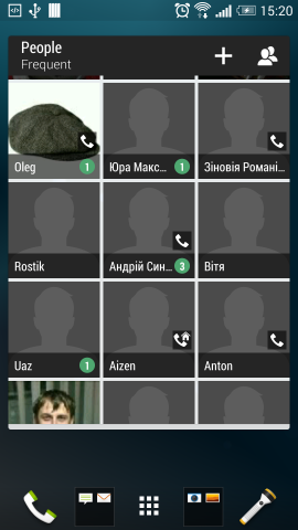
Here, contact icons are separated by white lines, the color of which cannot be changed. Previously, they were black translucent.
And the last thing that caught my eye was the BlinkFeed screen (yes, I use it):
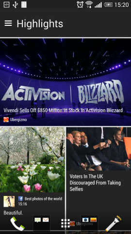
Here again the white lines. By the same now, the news feed occupies the entire screen there by driving into the shortcut buttons. And yet - now it uses smooth scrolling instead of page by page, while page scrolling remains in the application menu. As for me - page by page scrolling is more convenient despite the fact that HTC is positioning smoothly as an improvement in this version of the firmware.
The question why this was all done I will leave open.
Source: https://habr.com/ru/post/223799/
All Articles