Our checklist for forms on sites
This is the second part of our checklists. In the first, we detailed the filter requirements. Unlike filters, user form requirements are more versatile. However, it took us some heated discussions to develop a more or less uniform format. Video from HolyWarModeOn tells about typical usability errors in projects. Immediately under the roller look for a detailed checklist for forms on the site.
□ Save the form.
□ The form is saved in web forms (admin panels) or SQL tables.
')
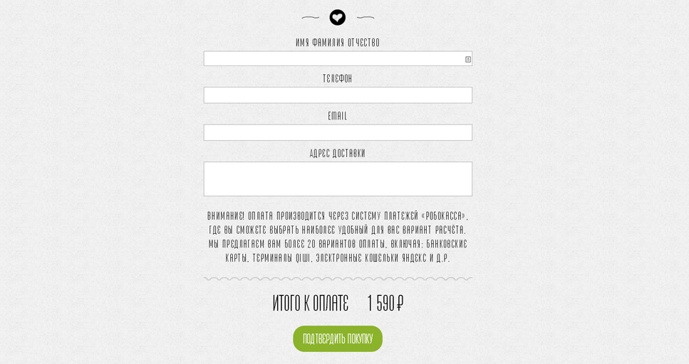
□ Change the shipping address.
□ E-mail, which receives data from the web form, can be changed in the administrative panel.
□ Relevance of the shipping address.
□ A real e-mail address of the person responsible for processing applications has been registered.
Why so. Situation from typical everyday technical support: owner
online store vomits and mosques - no applications from customers. We open admin panel, we look: the address svetochek1988@mail.ru is entered, where all requests get. Further explanation does not make sense.
□ Submit the form.
□ Data from the completed form is sent to the administrator by e-mail.
□ Send notification to user.
□ Optional. The user receives a notification to his e-mail about the successful receipt of the application and the subsequent actions that are required of him.
□ Placeholders are provided for the fields.
□ If the field names are not signed, a hint is displayed inside the fields, which disappears when the text is entered.
Why so. Users need instructions, and designers and designers need a compact way to provide information.
Example: Uniplast .

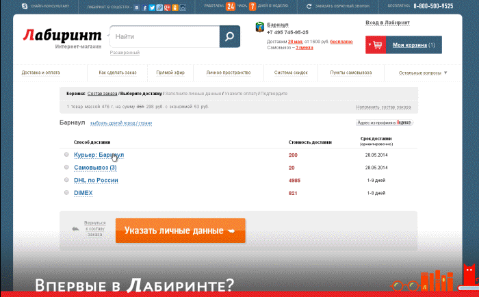
□ The autocomplete attribute is registered for fields supporting this value.
The autocomplete attribute substitutes previously entered user data in the field, if the function is not disabled in the browser.
Why so. The faster the user fills out the form, the higher the likelihood that he will send it.
Example: Labyrinth .
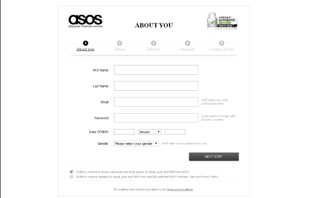
□ Correct work of multi-step forms.
□ Navigation next to the form shows the current stage and the number of remaining steps.
Why so. Uncertainty scares visitors and reduces the likelihood of complete filling volumetric form. A positive example is Asos. The form contains five steps, but in fact the registration is five times faster - the main functions of the site are available immediately after filling out the first registration screen.
Example: Asos .
Comment. On some projects, we have abandoned standard registration in favor of authorization through social networks.
Example: Restlook .
□ Multi-step forms work correctly when navigating using the “Forward” and “Back” buttons in the browser.
□ For numeric values from a certain range, there are limiters for the minimum and maximum number of characters.
□ Check for dates, times, and other similar characteristics.
Why so. A simple safety net against entering outright lies or errors due to inattention - the date of birth in the future or the time of delivery ahead of the time of the application.
□ For fields that require files to be loaded, the accept attribute is specified, which determines the type of documents to be loaded.
Why so. If the accept attribute is specified, when selecting from the hard disk, the user sees only the appropriate file types for downloading - for example, doc and txt. This excludes sending documents in a format that is not suitable for processing.
□ For fields whose validation passes through a regular expression, the pattern attribute is specified.
Validation is the verification of user input for compliance with system requirements. Information is verified by checking with a regular expression specified in a special format.
For example, the regular expression [0-9] {5,10} for a password means that it can consist of only numbers, and its length ranges from five to ten characters. If the pattern attribute is registered for the field, the form is not sent until the data is entered correctly.
□ The required data format that the user must enter is obvious to him.
Why so. The user must understand what is expected of him when entering data. For this purpose, brief explanations are provided, such as "The password consists of at least 8 characters and includes numbers and Latin letters."
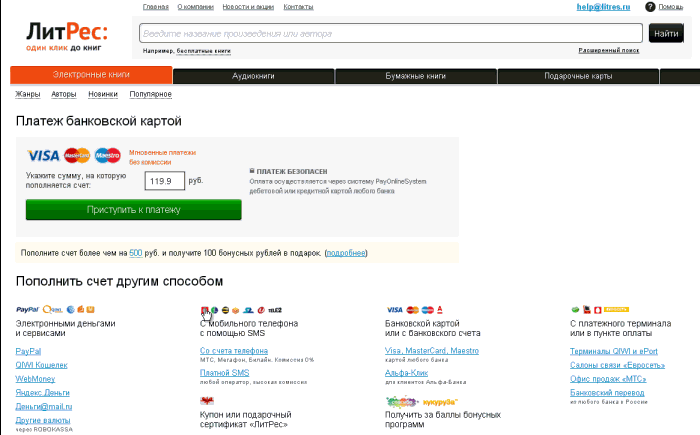
□ Available instructions on the format of the input data in the human language.
Why so. The obvious and understandable hint allows you to quickly understand the causes of the error and not feel stupid when filling out the form fields.
Example: liters .
□ The user does not see the regular expression as a hint to the action.
Why so. The hint for the index field, which is a regular expression [0-9], is not very informative. The phrase "The index consists of numbers from 0 to 9" is much clearer to the user.
□ Error messages are understandable to ordinary users and logical.
Example: ZimZum .

Is important . A typical error is a regular expression in a message about incorrect form filling.
□ The form asks the user for the necessary data
Open the form, visually make sure that you only need to enter the minimum information.
Why is it important. Bulk forms kill conversions. Registration, purchase or feedback should be as simple as possible so as not to confuse users.
Example: Sumprint .

□ If all fields are required, asterisks are not displayed next to their names - the * symbol.
Open the form and see it visually. It is desirable to have an explanatory text on the mandatory filling of all fields.
□ For an authorized user, all known data about the visitor is automatically inserted in the form fields.
Make sure visually that the information specified by the user in the profile is automatically displayed in the fields of the forms requesting this data.
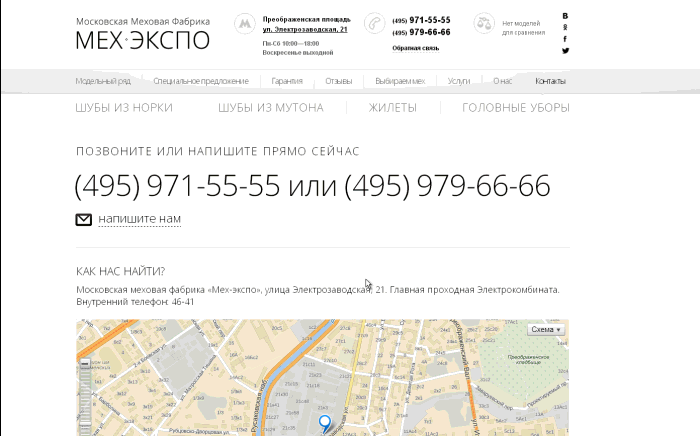
□ The text multi-line field changes the height when entering a voluminous message, or a scrollbar appears on the right side to view the entire contents.
Open a form with a multiline text field, enter as many characters as possible into it.
Why so. Many users reread what is written before sending. You need to give them the opportunity to use the scroll bar or view the entire message in the expanded field instead of moving through the text using the keyboard arrows.
Example: Fur Expo .
□ A valid TYPE attribute is registered in the form fields, informing the browser of the form element type.
□ The types of dates, time, phone numbers, ranges, url, e-mail, numbers are correct.
□ While the form is submitted on a slow channel, the user cannot change the data in it.
Important. Valid for AJAX forms.
Why so. With a low connection speed, the ajax form is not sent immediately, while remaining on the screen with all the information entered. The user should not change his mind at this moment and change all the data. More precisely, he can just change his mind, but he no longer has to realize his idea: it is necessary to block changes until a response is received from the server.
In this case, it is desirable to visually show that the form is blocked. One of the options is the preloader:

□ Display hints and errors made with animation effect.
Comment. This parameter is design dependent and is not required.
Next - three controversial stories that need to be addressed with the manager at the design stage.
□ Send data button is inactive until the “Accept rules”, “User agreement” checkbox is not activated.
Example: Ebazaar .

□ Send data button is inactive until all entered data have passed a positive validation.
Open the form with fields for input, enter incorrect data, check whether the button is active.
It is important. In some cases, incorrectness is a relative concept. The setup is a validation of phone numbers in the form of feedback. In short - turn it off.
□ If the data has not passed a positive validation, when you hover the cursor on the button to send data, an informational message is displayed.
Open the form, enter incorrect data, hover the cursor on the button to send data, check whether the message is displayed.
The list can be printed - use for usability testing. The same is in the Google document .
Importance: Extra High
□ Save the form.
□ The form is saved in web forms (admin panels) or SQL tables.
')
□ Change the shipping address.
□ E-mail, which receives data from the web form, can be changed in the administrative panel.
Importance: High
□ Relevance of the shipping address.
□ A real e-mail address of the person responsible for processing applications has been registered.
Why so. Situation from typical everyday technical support: owner
online store vomits and mosques - no applications from customers. We open admin panel, we look: the address svetochek1988@mail.ru is entered, where all requests get. Further explanation does not make sense.
□ Submit the form.
□ Data from the completed form is sent to the administrator by e-mail.
□ Send notification to user.
□ Optional. The user receives a notification to his e-mail about the successful receipt of the application and the subsequent actions that are required of him.
Navigation
□ Placeholders are provided for the fields.
□ If the field names are not signed, a hint is displayed inside the fields, which disappears when the text is entered.
Why so. Users need instructions, and designers and designers need a compact way to provide information.
Example: Uniplast .
□ The autocomplete attribute is registered for fields supporting this value.
The autocomplete attribute substitutes previously entered user data in the field, if the function is not disabled in the browser.
Why so. The faster the user fills out the form, the higher the likelihood that he will send it.
Example: Labyrinth .
□ Correct work of multi-step forms.
□ Navigation next to the form shows the current stage and the number of remaining steps.
Why so. Uncertainty scares visitors and reduces the likelihood of complete filling volumetric form. A positive example is Asos. The form contains five steps, but in fact the registration is five times faster - the main functions of the site are available immediately after filling out the first registration screen.
Example: Asos .
Comment. On some projects, we have abandoned standard registration in favor of authorization through social networks.
Example: Restlook .
□ Multi-step forms work correctly when navigating using the “Forward” and “Back” buttons in the browser.
Validation
□ For numeric values from a certain range, there are limiters for the minimum and maximum number of characters.
□ Check for dates, times, and other similar characteristics.
Why so. A simple safety net against entering outright lies or errors due to inattention - the date of birth in the future or the time of delivery ahead of the time of the application.
□ For fields that require files to be loaded, the accept attribute is specified, which determines the type of documents to be loaded.
Why so. If the accept attribute is specified, when selecting from the hard disk, the user sees only the appropriate file types for downloading - for example, doc and txt. This excludes sending documents in a format that is not suitable for processing.
□ For fields whose validation passes through a regular expression, the pattern attribute is specified.
Validation is the verification of user input for compliance with system requirements. Information is verified by checking with a regular expression specified in a special format.
For example, the regular expression [0-9] {5,10} for a password means that it can consist of only numbers, and its length ranges from five to ten characters. If the pattern attribute is registered for the field, the form is not sent until the data is entered correctly.
□ The required data format that the user must enter is obvious to him.
Why so. The user must understand what is expected of him when entering data. For this purpose, brief explanations are provided, such as "The password consists of at least 8 characters and includes numbers and Latin letters."
□ Available instructions on the format of the input data in the human language.
Why so. The obvious and understandable hint allows you to quickly understand the causes of the error and not feel stupid when filling out the form fields.
Example: liters .
□ The user does not see the regular expression as a hint to the action.
Why so. The hint for the index field, which is a regular expression [0-9], is not very informative. The phrase "The index consists of numbers from 0 to 9" is much clearer to the user.
□ Error messages are understandable to ordinary users and logical.
Example: ZimZum .
Is important . A typical error is a regular expression in a message about incorrect form filling.
Other
□ The form asks the user for the necessary data
Open the form, visually make sure that you only need to enter the minimum information.
Why is it important. Bulk forms kill conversions. Registration, purchase or feedback should be as simple as possible so as not to confuse users.
Example: Sumprint .
□ If all fields are required, asterisks are not displayed next to their names - the * symbol.
Open the form and see it visually. It is desirable to have an explanatory text on the mandatory filling of all fields.
□ For an authorized user, all known data about the visitor is automatically inserted in the form fields.
Make sure visually that the information specified by the user in the profile is automatically displayed in the fields of the forms requesting this data.
□ The text multi-line field changes the height when entering a voluminous message, or a scrollbar appears on the right side to view the entire contents.
Open a form with a multiline text field, enter as many characters as possible into it.
Why so. Many users reread what is written before sending. You need to give them the opportunity to use the scroll bar or view the entire message in the expanded field instead of moving through the text using the keyboard arrows.
Example: Fur Expo .
□ A valid TYPE attribute is registered in the form fields, informing the browser of the form element type.
□ The types of dates, time, phone numbers, ranges, url, e-mail, numbers are correct.
□ While the form is submitted on a slow channel, the user cannot change the data in it.
Important. Valid for AJAX forms.
Why so. With a low connection speed, the ajax form is not sent immediately, while remaining on the screen with all the information entered. The user should not change his mind at this moment and change all the data. More precisely, he can just change his mind, but he no longer has to realize his idea: it is necessary to block changes until a response is received from the server.
In this case, it is desirable to visually show that the form is blocked. One of the options is the preloader:
Importance: Low
□ Display hints and errors made with animation effect.
Comment. This parameter is design dependent and is not required.
Next - three controversial stories that need to be addressed with the manager at the design stage.
□ Send data button is inactive until the “Accept rules”, “User agreement” checkbox is not activated.
Example: Ebazaar .
□ Send data button is inactive until all entered data have passed a positive validation.
Open the form with fields for input, enter incorrect data, check whether the button is active.
It is important. In some cases, incorrectness is a relative concept. The setup is a validation of phone numbers in the form of feedback. In short - turn it off.
□ If the data has not passed a positive validation, when you hover the cursor on the button to send data, an informational message is displayed.
Open the form, enter incorrect data, hover the cursor on the button to send data, check whether the message is displayed.
The list can be printed - use for usability testing. The same is in the Google document .
Source: https://habr.com/ru/post/223777/
All Articles