ZenComment and overcoming the "mad tile" on Habré
Recently, very large buttons provided for a finger interface on phones and tablets do not always occupy the traditional niche of computer monitors. For the convenience of working with the Habr site in a traditional desktop-notebook environment, the tiled design was removed from there with the help of the new edition of the ZenComment 4+ user styles . All new menus fit 3 inexpressive buttons in the upper corners of the window, constantly in sight. This approach was traditional for ZenComment user styles. And in the new design of Habr, they traditionally chew on cumbersome controls, leaving drop-down menus.
The movement of the site interface to the headless one is commendable, but along with it, the site has a “left menu” - a wide vertical bar with several buttons full height of the window, deserving the laurels of the Unuty interface in Ubuntu.
Laurels are laurels, and this band eats up the place on the screen, which is never superfluous. After all, the buttons of circulation occur, according to the experience of working with the site, relatively infrequently, therefore reducing the area of open buttons does not lose much in the cost of pressing them, but gives more useful screen area. In addition, userssty refute the opinion of the authors of the site that he needs to view the width of at least 1030 pixels, not counting the scrollbar. The site easily fits into a 380-400 pixel width, even with a sidebar.
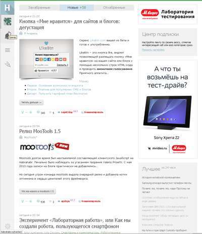
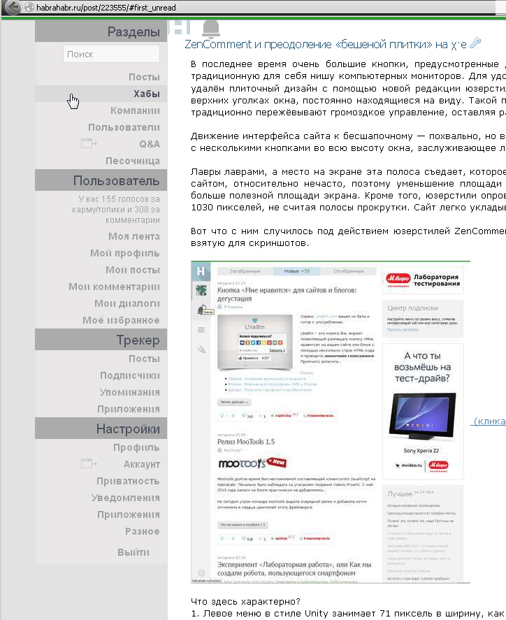
This is what happened to him under the influence of the ZenComment users version 4.02 of May 20, 2014. Let's take a look at the original page taken for screenshots.
')
 (clickable)
What is characteristic here?
1. The left Unity style menu is 71 pixels wide, as impassive web inspector says.
2. Site cap - hurray! - began to occupy those same 20 pixels that the cap occupied in previous versions of ZenComment and the HabrAjax script. But it is empty.
3. Sidebar starts working from the 800th pixel from the header.
4. Typical article - 500-800 pixels of height.
5. All free space of the left menu is assigned to the “Scroll up” button (it is known that the authorized can disable the action in the settings).
6. The minimum width of the window is 1030 pixels, when horizontal scrolling does not appear yet.
Next, without being surprised at the smaller width of the window, we look at the look of the page under the action of ZenComment, without any user scripts (you can put it without previewing the page).

The screenshot area is about 2.5 times smaller, but the same articles plus the entire first block of the sidebar fit. Stunned witness reviews:
1. Stop, where did the menu go ???
2. What are the 3 icons on the top of the curb?
3. Oh, and the sidebar can be squeezed so? That would be so in my smartphone!
4. In the articles, the “Next” buttons do not loom.
5. Images are reduced in proportion to compression and no wider than 50% of the column width.
6. Article - 300-600 pixels, despite the fact that the column is already.
7. The adaptability of the fields to the width of the window is visible, in a narrow window - smaller field gaps.
8. There are marks of visited links (color).
Open the riddles.
In previous versions of the menu ZenComment fit into 1 line and repeated two menu site: navigation and user data.
This version was no exception. Menus on the site are repeated as they are written in HTML. But the second menu levels are scattered in more convenient places. By tradition, the user menus are on the right, the rest are on the left.
They did not do anything with the behavior of the menu. Now you need to click on the left menu to use. The whole page is darkened, the user is going through a shock, his attention is completely switched to several lines of a submenu. In total there are 4 submenus items and 2 action buttons - the main one and the creation of your post. About the shortcomings of this menu have already been described in detail before. But we will not do that to styles it is unusual. Something they open on: hover, thanks to which they managed to reduce the number of start buttons to 3 - the ones that are in the top row, “on the curb”.
Having brought the mouse to the button, you will have to click to see one of the menus or do one of 2 “very important” actions: go to the main page or write an article. In general, just as the creators of the site offer now. But some points are smoothed out:
1. Blackout of the page - not strong, so that you can continue to read.
2. The menu does not strive to occupy the whole brain of the reader and the area of the page. It is exactly what it is.
3. The menu types, as mentioned, are spaced apart in different angles.
By hovering the mouse over 2 of 3 elements, 3 more buttons will open, and the induced ones will become more contrast:

If events have occurred on the site, the visible buttons are lit up with red circles with the number of events (letter, comment, action monitored). They will always be visible, only when you open the menu of the 2nd level they become paler. Open, for example, the user menu:
The whole window is obscured, but not as disastrous as the original site. There are no opaque elements, the page can be read, although the readability of the menu above the page is reduced.

But the transition to the menu is infrequent, and the page is perfectly scrolled with the mouse wheel, so the transparency of the menu is less evil than the partially invisible page content.
Finally, there is another small tracker menu (to the left), and with this the epic with the scrolling down of the submenu is limited. From tiled design, we came out with a minimum of losses.
So, with the minimum of work and 100 lines of styles, mad tiles were driven out of the page. The script has about 1100 lines for the design of articles, blocks and other styles. But if someone needs to use the work from the menu - see these 100 lines with the keywords "#navbar". This is the main thing that needs to be done, plus some small work on stretching the layout (layout). If you want to leave the pages more similar to Habr, but without a tile, you need 150-200 lines of styles.
Not all dreams come true, due to the limited possibilities of styles compared to scripts. But “shredding” the site with scripts is the next stage of the action, in which some shortcomings will be eliminated. In particular, it is necessary to remove the edit button away. But, due to the styles, I had to leave it “on the aisle”, under the mouse - these are the realities of the HTML of other sites.
Similarly, it would be better to have an open button, not alerts, but a menu. But the alerts go above the menu in HTML, and I wanted to make more hidden icons. As a result, the path to the menu and the search string is somewhat complicated (mouse loop with a click along the path), but tolerable and shorter than the original path from the tile, from the plow.
In order to have fewer lines in the sidebar, it was abandoned from underscores 1.5 years ago. Now the site also refused to underline in the sidebar. In order not to waste little information, space between lines is reduced in the sidebar - keywords are important there. Removed from the sidebar irrelevant for the regular reader repeating blocks. Only new current information. Permanent links are minimized. The sidebar width is relatively less (26%) than the original site (31%), but the information does not suffer due to the compaction of lines and fields.
Small buttons are moved to the right side of the comment heading, and they open on hover. The answer buttons are rotated 90 degrees so as not to interfere with reading. The best processing of the details will give scripts. This is how comments with styles only look:
The scripts will allow you to view images with a zoom mouse (install HabrAjax ), they also help you view articles without reloading the page, in the text editing menu, filtering blank lines in texts and other trifles. Fully adapted to the new site scripts will soon be, and the existing version has some insignificant bugs (for example, autorost of the input field by pressing each key).
The fields, as mentioned, are adaptive, and the footer and 3 subscript links to articles were roughly doubled at one time. The maximum width of the site is set at 1420 pixels, which is more than the official site, so that the pictures look better.
To the delight of perfectionists, a site error has been fixed (middle blue block in the title with the word “New”).
Nobody forbids users to improve the design - the license is open, the author does not mind. I can help in the implementation of interesting design ideas, if they are at the level of the layout. For example, you can improve the look and usability of menus and buttons.
Habr-ZenComment, version 4 (now - 4.02).
They will be hosted on Github hosting, and read out, there will be versioning, bugtracker, cloning, documentation. In sum, more convenient than the no longer working userscripts.org.
Scripts and styles are best used together (if they are comfortable with the approach and format), because they were developed primarily for sharing.
UPD 05/21/2014: Adaptability is added to a wide window, which looks like this:
(View of the left side of the screen with a window width of more than 1520 pixels.)

UPD2 05/31/2014: Made by HabrAjax (docs, code, repo) (new hosting on Github), tweaked HabrPercentageRing , added substitution of icons with long shadows in the ufoCorrect script on 2 new sites.
The movement of the site interface to the headless one is commendable, but along with it, the site has a “left menu” - a wide vertical bar with several buttons full height of the window, deserving the laurels of the Unuty interface in Ubuntu.
Laurels are laurels, and this band eats up the place on the screen, which is never superfluous. After all, the buttons of circulation occur, according to the experience of working with the site, relatively infrequently, therefore reducing the area of open buttons does not lose much in the cost of pressing them, but gives more useful screen area. In addition, userssty refute the opinion of the authors of the site that he needs to view the width of at least 1030 pixels, not counting the scrollbar. The site easily fits into a 380-400 pixel width, even with a sidebar.
This is what happened to him under the influence of the ZenComment users version 4.02 of May 20, 2014. Let's take a look at the original page taken for screenshots.
')
(clickable)What is characteristic here?
1. The left Unity style menu is 71 pixels wide, as impassive web inspector says.
2. Site cap - hurray! - began to occupy those same 20 pixels that the cap occupied in previous versions of ZenComment and the HabrAjax script. But it is empty.
3. Sidebar starts working from the 800th pixel from the header.
4. Typical article - 500-800 pixels of height.
5. All free space of the left menu is assigned to the “Scroll up” button (it is known that the authorized can disable the action in the settings).
6. The minimum width of the window is 1030 pixels, when horizontal scrolling does not appear yet.
Next, without being surprised at the smaller width of the window, we look at the look of the page under the action of ZenComment, without any user scripts (you can put it without previewing the page).
The screenshot area is about 2.5 times smaller, but the same articles plus the entire first block of the sidebar fit. Stunned witness reviews:
1. Stop, where did the menu go ???
2. What are the 3 icons on the top of the curb?
3. Oh, and the sidebar can be squeezed so? That would be so in my smartphone!
4. In the articles, the “Next” buttons do not loom.
5. Images are reduced in proportion to compression and no wider than 50% of the column width.
6. Article - 300-600 pixels, despite the fact that the column is already.
7. The adaptability of the fields to the width of the window is visible, in a narrow window - smaller field gaps.
8. There are marks of visited links (color).
Open the riddles.
ZenComment menu
In previous versions of the menu ZenComment fit into 1 line and repeated two menu site: navigation and user data.
This version was no exception. Menus on the site are repeated as they are written in HTML. But the second menu levels are scattered in more convenient places. By tradition, the user menus are on the right, the rest are on the left.
They did not do anything with the behavior of the menu. Now you need to click on the left menu to use. The whole page is darkened, the user is going through a shock, his attention is completely switched to several lines of a submenu. In total there are 4 submenus items and 2 action buttons - the main one and the creation of your post. About the shortcomings of this menu have already been described in detail before. But we will not do that to styles it is unusual. Something they open on: hover, thanks to which they managed to reduce the number of start buttons to 3 - the ones that are in the top row, “on the curb”.
Having brought the mouse to the button, you will have to click to see one of the menus or do one of 2 “very important” actions: go to the main page or write an article. In general, just as the creators of the site offer now. But some points are smoothed out:
1. Blackout of the page - not strong, so that you can continue to read.
2. The menu does not strive to occupy the whole brain of the reader and the area of the page. It is exactly what it is.
3. The menu types, as mentioned, are spaced apart in different angles.
By hovering the mouse over 2 of 3 elements, 3 more buttons will open, and the induced ones will become more contrast:
If events have occurred on the site, the visible buttons are lit up with red circles with the number of events (letter, comment, action monitored). They will always be visible, only when you open the menu of the 2nd level they become paler. Open, for example, the user menu:
The whole window is obscured, but not as disastrous as the original site. There are no opaque elements, the page can be read, although the readability of the menu above the page is reduced.
But the transition to the menu is infrequent, and the page is perfectly scrolled with the mouse wheel, so the transparency of the menu is less evil than the partially invisible page content.
Finally, there is another small tracker menu (to the left), and with this the epic with the scrolling down of the submenu is limited. From tiled design, we came out with a minimum of losses.
So, with the minimum of work and 100 lines of styles, mad tiles were driven out of the page. The script has about 1100 lines for the design of articles, blocks and other styles. But if someone needs to use the work from the menu - see these 100 lines with the keywords "#navbar". This is the main thing that needs to be done, plus some small work on stretching the layout (layout). If you want to leave the pages more similar to Habr, but without a tile, you need 150-200 lines of styles.
Not all dreams come true, due to the limited possibilities of styles compared to scripts. But “shredding” the site with scripts is the next stage of the action, in which some shortcomings will be eliminated. In particular, it is necessary to remove the edit button away. But, due to the styles, I had to leave it “on the aisle”, under the mouse - these are the realities of the HTML of other sites.
Similarly, it would be better to have an open button, not alerts, but a menu. But the alerts go above the menu in HTML, and I wanted to make more hidden icons. As a result, the path to the menu and the search string is somewhat complicated (mouse loop with a click along the path), but tolerable and shorter than the original path from the tile, from the plow.
Sidebar
In order to have fewer lines in the sidebar, it was abandoned from underscores 1.5 years ago. Now the site also refused to underline in the sidebar. In order not to waste little information, space between lines is reduced in the sidebar - keywords are important there. Removed from the sidebar irrelevant for the regular reader repeating blocks. Only new current information. Permanent links are minimized. The sidebar width is relatively less (26%) than the original site (31%), but the information does not suffer due to the compaction of lines and fields.
Comments
Small buttons are moved to the right side of the comment heading, and they open on hover. The answer buttons are rotated 90 degrees so as not to interfere with reading. The best processing of the details will give scripts. This is how comments with styles only look:
Pictures, fields, footer
The scripts will allow you to view images with a zoom mouse (install HabrAjax ), they also help you view articles without reloading the page, in the text editing menu, filtering blank lines in texts and other trifles. Fully adapted to the new site scripts will soon be, and the existing version has some insignificant bugs (for example, autorost of the input field by pressing each key).
The fields, as mentioned, are adaptive, and the footer and 3 subscript links to articles were roughly doubled at one time. The maximum width of the site is set at 1420 pixels, which is more than the official site, so that the pictures look better.
To the delight of perfectionists, a site error has been fixed (middle blue block in the title with the word “New”).
.content_left table.menu tr td.active{border-bottom: 1px solid transparent} Improving custom design
Nobody forbids users to improve the design - the license is open, the author does not mind. I can help in the implementation of interesting design ideas, if they are at the level of the layout. For example, you can improve the look and usability of menus and buttons.
User Styling
Habr-ZenComment, version 4 (now - 4.02).
Scripts
They will be hosted on Github hosting, and read out, there will be versioning, bugtracker, cloning, documentation. In sum, more convenient than the no longer working userscripts.org.
Scripts and styles are best used together (if they are comfortable with the approach and format), because they were developed primarily for sharing.
UPD 05/21/2014: Adaptability is added to a wide window, which looks like this:
(View of the left side of the screen with a window width of more than 1520 pixels.)
UPD2 05/31/2014: Made by HabrAjax (docs, code, repo) (new hosting on Github), tweaked HabrPercentageRing , added substitution of icons with long shadows in the ufoCorrect script on 2 new sites.
Literature
- New navigation and other changes on χ · e - the original post innovation.
- What is wrong with the χ · χ · design - analysis of usability of new solutions.
Source: https://habr.com/ru/post/223555/
All Articles