What is wrong with the Habrahabr design
It happened: Habr received a new design in the style of the rest of TM products.
Actually, I love change, and the redesign of familiar things causes primarily optimism. This is like a rearrangement of furniture in the apartment: the furnishings should be refreshed. But besides the pleasant feeling of novelty, some changes raise questions. It is clear that Habr is no longer a cake and we will always remember its warm old lamp logo, but I want to talk about what can be assessed quite objectively - about the usability of the new design.
The function "create post" has now received a separate button in the main menu. Previously, it was a whole story - to learn the algorithm by which you can find a button with a pencil to write a post. Perhaps this was its own lack of truth - Habr is not a LJ, as we are reminded in the rules, so before you write something, you need to think. But the intentional complication of navigation, of course, is not the path that leads to high-quality content, so removing the “Write Post” button to a prominent place is an absolute plus and most important (for me) positive achievement of the redesign.
')
The only thing that confuses is the selected icon: plus means adding something, but it’s not at all obvious that this is something - a post. More often in such interfaces behind him hide the deployment of additional menu items. Good old pencil would be much clearer - not only is the icon familiar to all the authors of Habr, it is also universal.
The second spoon of honey is an adaptation of the design for a touch interface. This is a victory with tears in his eyes, because as far as mobile device users urgently need a web that is normally adapted for them, so many more users still read websites from desktops and laptops. Those. Explain why you do not need to sharpen the design for the tablets - this is correct and thanks for that. But it is worth mentioning why you can not forget about the users of traditional devices. Therefore, I repeat this point in the shortcomings of the redesign.
Some year and a half ago, I wrote an exceptionally popular post “ What's wrong with Windows 8 ”. And one of my main complaints about the design of the new OS was the excessive enthusiasm for touch-pieces. I wrote that it’s too early to give up the taskbar and on the desktops of the application in full screen is a waste of space. Time has confirmed that I was right: in the last update of Windows 8.1, applications in Metro mode received a display on the taskbar and the usual attributes of traditional windows - the “minimize” and “close” buttons.
Now the same rake came Habr. Tablets are an extremely important part of the gadget ecosystem, but they complement the PC world (I mean devices with NOT input from the screen, but with a physical keyboard, mouse, etc.), and not replace it. We must not forget about the bored office plankton, which gives the majority of views during working hours from their desktops and laptops, and not tablets and smartphones. Yes, this is a rather conceptual claim. But an error in the strategy necessarily comes out with a mass of minor inconveniences in daily activities. Therefore, as urbanists say Sobyanin - remember the immobile citizens.
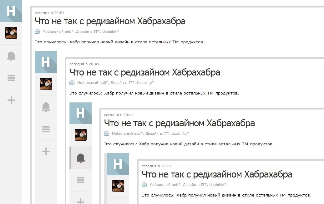
This is pure usability-moment: on the site, where many posts retain their relevance for years, you can not hide the search. For Habr, internal search is just as important as for Google, and should be always available. Now it was hidden by as many as two clicks, and the search search is completely unintuitive - I just had to go through all the tabs. And this is the next claim.
The desire to hide the menu and submenu behind endless tabs is a great solution for a caring hostess who seeks order and knows what and where she is located. But for a guest, open transparent display cases are more convenient than all these cabinets with drawers inside the drawers.
Theoretically, the value of icons can be solved:

The first, of course, leads to the main. The second is in the user profile. The third - the notice, the fourth - is an example of discrimination of users of the PC, because a similar menu icon is used in mobile devices, respectively, if you log into Habr from the tablet - the environment will help, and you will probably guess that this is a menu. But in desktop OS this icon is not used, so the intuitiveness of the solution is instantly lost. And about the fifth icon - adding a post - I already wrote above. Return the pencil!
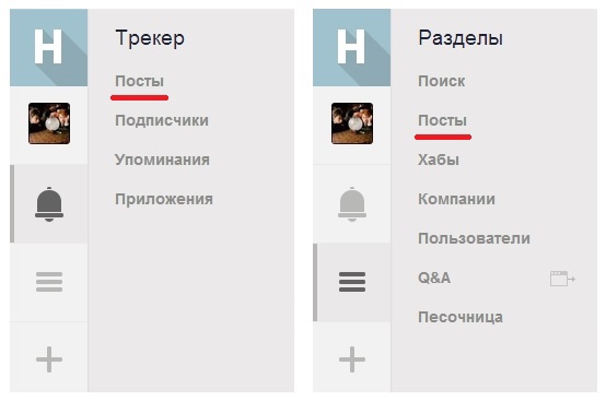
But to guess exactly what functions are hidden in these boxes is almost impossible. You can only poke at all the tabs in turn, until you learn by heart where what is or what the “Posts” in the “Tracker” tab differ from the “Posts” link in the “Menu” tab:
This is a strange solution even for a mobile interface - firstly, all these menu items can be hidden behind a single button. Splitting 18 menu items into 3 tabs is clearly an excessive passion for order. Secondly, they can be made more informative by adding icons, thumbnails, notifications.
And one more minus of the new menu - all 5 buttons in it look the same, but they act differently. Buttons number 1 and number 5 - links to the main page and create a post. Buttons №№ 2-4 - call the submenu without reloading the page. As a result, poking links to the left, I left the page of this unfinished post twice - fortunately, autosave on Habré works reliably. But equally looking buttons with different functions is a joint that turns into an unpleasant guessing game. And what if text autosave goes down? Obviously, you need to figure out how to visually distinguish the link buttons from the menu buttons.
The overall account of change is in favor of retrogrades:
 Write link
Tabletting
 Tabletting
Too far hidden search
Too many tabs with incomprehensible content.
Confusion with the actions of the buttons in the main menu
But the result is still positive: the main thing is the desire to change, and most of the deficiencies are treated completely painlessly.
PS Official post .
PPS Deniskin took on a pencil:

PPS The process went: in TM, they are looking for a UI / UX designer .
Actually, I love change, and the redesign of familiar things causes primarily optimism. This is like a rearrangement of furniture in the apartment: the furnishings should be refreshed. But besides the pleasant feeling of novelty, some changes raise questions. It is clear that Habr is no longer a cake and we will always remember its warm old lamp logo, but I want to talk about what can be assessed quite objectively - about the usability of the new design.
Two spoons of honey
▌Link to create a post
The function "create post" has now received a separate button in the main menu. Previously, it was a whole story - to learn the algorithm by which you can find a button with a pencil to write a post. Perhaps this was its own lack of truth - Habr is not a LJ, as we are reminded in the rules, so before you write something, you need to think. But the intentional complication of navigation, of course, is not the path that leads to high-quality content, so removing the “Write Post” button to a prominent place is an absolute plus and most important (for me) positive achievement of the redesign.
')
The only thing that confuses is the selected icon: plus means adding something, but it’s not at all obvious that this is something - a post. More often in such interfaces behind him hide the deployment of additional menu items. Good old pencil would be much clearer - not only is the icon familiar to all the authors of Habr, it is also universal.
▌ Planchetization
The second spoon of honey is an adaptation of the design for a touch interface. This is a victory with tears in his eyes, because as far as mobile device users urgently need a web that is normally adapted for them, so many more users still read websites from desktops and laptops. Those. Explain why you do not need to sharpen the design for the tablets - this is correct and thanks for that. But it is worth mentioning why you can not forget about the users of traditional devices. Therefore, I repeat this point in the shortcomings of the redesign.
Tar barrel
▌ Planchetization
Some year and a half ago, I wrote an exceptionally popular post “ What's wrong with Windows 8 ”. And one of my main complaints about the design of the new OS was the excessive enthusiasm for touch-pieces. I wrote that it’s too early to give up the taskbar and on the desktops of the application in full screen is a waste of space. Time has confirmed that I was right: in the last update of Windows 8.1, applications in Metro mode received a display on the taskbar and the usual attributes of traditional windows - the “minimize” and “close” buttons.
Now the same rake came Habr. Tablets are an extremely important part of the gadget ecosystem, but they complement the PC world (I mean devices with NOT input from the screen, but with a physical keyboard, mouse, etc.), and not replace it. We must not forget about the bored office plankton, which gives the majority of views during working hours from their desktops and laptops, and not tablets and smartphones. Yes, this is a rather conceptual claim. But an error in the strategy necessarily comes out with a mass of minor inconveniences in daily activities. Therefore, as urbanists say Sobyanin - remember the immobile citizens.
▌ In search of search
This is pure usability-moment: on the site, where many posts retain their relevance for years, you can not hide the search. For Habr, internal search is just as important as for Google, and should be always available. Now it was hidden by as many as two clicks, and the search search is completely unintuitive - I just had to go through all the tabs. And this is the next claim.
▌Time to get out of the closet
The desire to hide the menu and submenu behind endless tabs is a great solution for a caring hostess who seeks order and knows what and where she is located. But for a guest, open transparent display cases are more convenient than all these cabinets with drawers inside the drawers.
Theoretically, the value of icons can be solved:
The first, of course, leads to the main. The second is in the user profile. The third - the notice, the fourth - is an example of discrimination of users of the PC, because a similar menu icon is used in mobile devices, respectively, if you log into Habr from the tablet - the environment will help, and you will probably guess that this is a menu. But in desktop OS this icon is not used, so the intuitiveness of the solution is instantly lost. And about the fifth icon - adding a post - I already wrote above. Return the pencil!
But to guess exactly what functions are hidden in these boxes is almost impossible. You can only poke at all the tabs in turn, until you learn by heart where what is or what the “Posts” in the “Tracker” tab differ from the “Posts” link in the “Menu” tab:
This is a strange solution even for a mobile interface - firstly, all these menu items can be hidden behind a single button. Splitting 18 menu items into 3 tabs is clearly an excessive passion for order. Secondly, they can be made more informative by adding icons, thumbnails, notifications.
▌Press the button - you will get the result
And one more minus of the new menu - all 5 buttons in it look the same, but they act differently. Buttons number 1 and number 5 - links to the main page and create a post. Buttons №№ 2-4 - call the submenu without reloading the page. As a result, poking links to the left, I left the page of this unfinished post twice - fortunately, autosave on Habré works reliably. But equally looking buttons with different functions is a joint that turns into an unpleasant guessing game. And what if text autosave goes down? Obviously, you need to figure out how to visually distinguish the link buttons from the menu buttons.
Summary
The overall account of change is in favor of retrogrades:
Write link Tabletting Tabletting Too far hidden search Too many tabs with incomprehensible content. Confusion with the actions of the buttons in the main menuBut the result is still positive: the main thing is the desire to change, and most of the deficiencies are treated completely painlessly.
PS Official post .
PPS Deniskin took on a pencil:
PPS The process went: in TM, they are looking for a UI / UX designer .
Source: https://habr.com/ru/post/222965/
All Articles