Application interface: our mistakes and 16 tips on how not to repeat them
As soon as we made the first version of the iOS application, I began to stubbornly pester people on the football fields and basketball courts asking them to install the Topic and click it right in front of me.
There is nothing more valuable than watching live how users interact with the interface. According to the results of observations, it became clear that we did not do many things quite rightly. Further about our mistakes, how we corrected them, and tips on how to not repeat these mistakes.
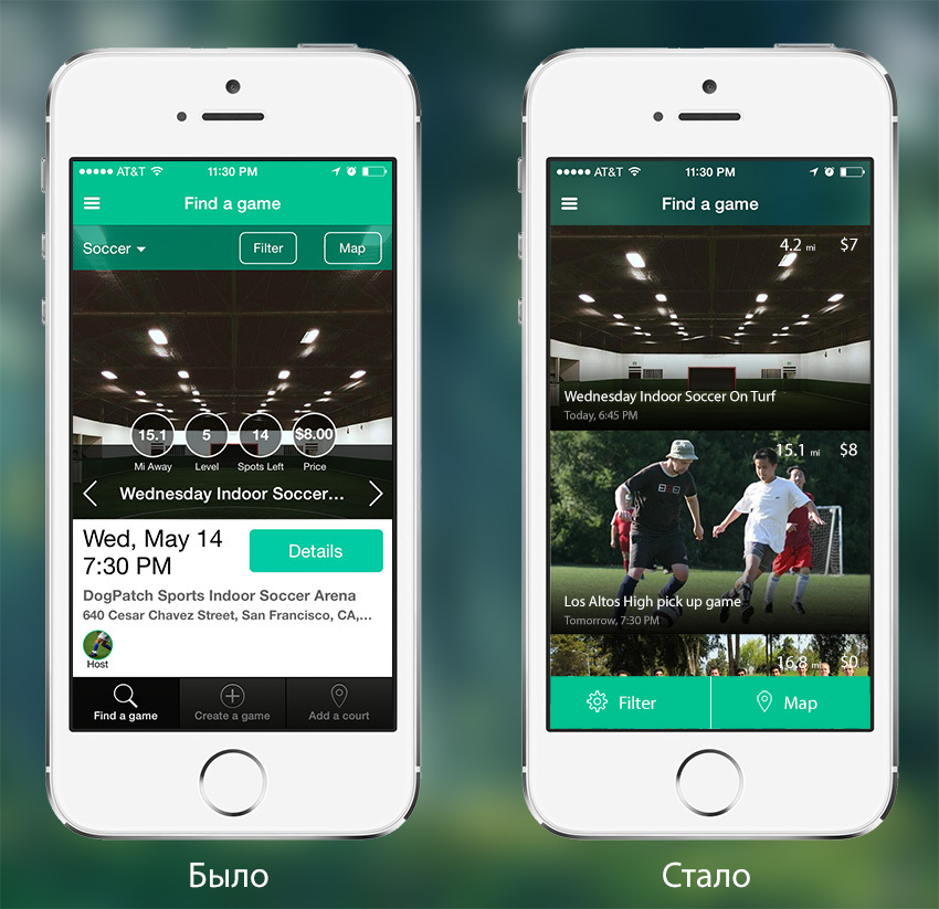
Image number 1: search for games (Find a game in the application menu)
Most importantly, what Topic is for is finding the right game. In this case, the main criteria for players are:
- Location of the playground
- Game time (day of the week and time period)
- game level
')
In the first version of the application, we tried to display all these (and some other) data in the list of games. But faced with the fact that the information turned out to be too much, the user is hard to navigate. Also unclear was the method of displaying the list of games we chose - horizontal paging.
Hence the conclusions:
1. Use familiar UI elements.
Horizontal paging allows you to display more information, but it was not obvious. A vertical news feed / ads / products used in many popular applications.
2. Try to reduce the "noise" interface
In order not to disperse the user's attention, it is necessary to display only the most important data. Secondaries must be hidden deeper. We removed the address, level (even if the player chooses the range of levels in the settings), the number of empty seats (if there are no places, the game is not displayed), the organizer's and registered avatars, the buttons for creating the game and adding a site.
3. Important controls need to be large enough, unimportant - hide deeper
The typical behavior was switching one user between 1-3 favorite sports. Therefore, we decided that it was better to ask from the outset what kinds of sports are interesting to the user, save it in his profile and display the default list of games for selected sports (see more on this below).
In this case, the control of the choice of sport loses importance and goes deeper into the general filtering settings. That allows you to make important buttons to go to the filtering settings (Filter) and search on the map (Map) is much more noticeable and larger.
4. Try to display data in a format that is easier to read.
If the price is flat, without cents / kopecks, then it is not necessary to withdraw 00 cents. If the game is today or tomorrow, then you need to write like this, without forcing the user to remember what date and day of the week it is today.
5. Do not wake the user into a dead end with a zero result
If nothing has been found in the search for games, we will display the best nearest courts, where you can create a game so that the user can correct the situation.

Image №2: search for games, nothing was found (set all ranges from 0 to 0 in the application filter settings)
6. Gently push the user to the action you need: If You Don'T Ask, You Don'T Get
We would like as many users as possible to create games on Topic. Therefore, at the end of the tape with games, display the button to create a new game.
The problem that has not yet been resolved is that the list of games does not give a clear idea of the location of the game on the map. But the map does not give a visual representation of other game parameters, for example, the date and time. Perhaps the default screen should not be a list of games with photos (List), but a map with markers (Map). I will be glad to hear your advice.

Image number 3: search for games (scroll to the very end of the game search tape)
7. Use introductory screens: minimum text, maximum clarity
In order to quickly orient the user where he got, what value he will get from using the application, on the first launch we show him two introductory screens. The screens hint that we can find games for different sports and that games can be filtered by different criteria.
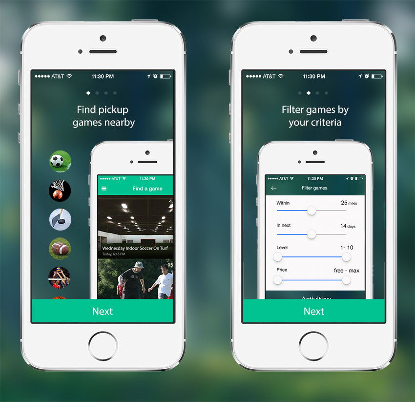
Image # 4: introductory screens when you first start the application
8. The first user experience should be cool. Customize your content to make the experience as cool as possible.
As soon as we had more than 5 sports in one city, the conversion from the screen with the search for games to the viewing of a particular game became lower. It is highly desirable that the list of games that we show to the user is relevant to his preferences. Therefore, immediately after the introductory screens and the request for rights to determine the location, we suggest choosing your favorite sports, which we will write to him in the profile later after registration.
Previously, we requested favorite sports after registration. The choice of pre-registration increases the relevance of the games ribbon, makes it possible to focus on other more important elements of the interface.
If the user has not chosen sports, then in the ribbon we show him all sports.
9. Simplify entry and selection of options.
After our previous article on Habré, many asked to add the most unexpected sports to the topic. At first we struggled with this and took only popular ones (otherwise, choosing a sport from a huge list turned into a nightmare).
But in the end they gave up and decided to just add to the list a form for filtering by name. Nothing entered - all sports are shown as soon as we start typing - the list is filtered.
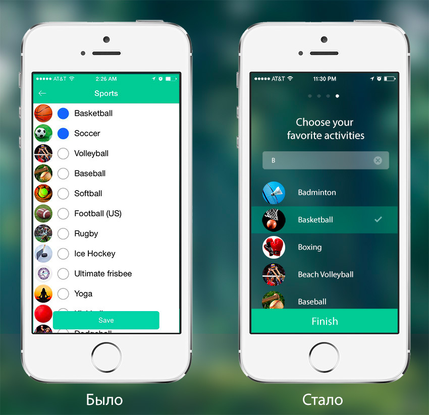
Image number 5: Choosing your favorite sports (fourth introductory screen when you first start the application)
It is not necessary to request all the rights required by the application in a pack at the first start. With this approach, the user does not understand why he should give them to the application - we do not explain anything. And if you refuse, giving the rights is no longer so easy, you have to dig into the phone settings rather deeply.
10. Request rights only before they are needed.
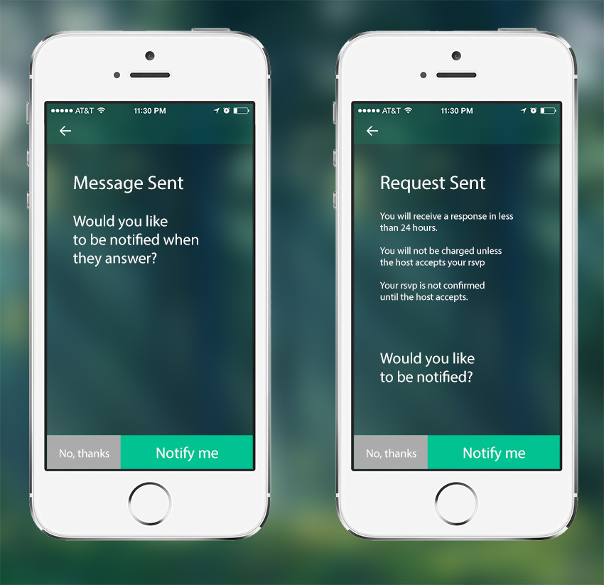
Image №6: Request for rights to send push-notifications (after the first sending a message to someone or after sending a request to participate in the game with the need to confirm the record by the organizer)
11. Transparently communicate what the user will receive, giving rights
12. Show the iOs dialog box only when the user clearly expresses his intention to give rights. Give the user a choice
For example, if a user refuses a pre-request of rights to determine a location, then we suggest that he enter the city manually + show a button with the option to still give rights.

Image number 7: Pre-request rights to determine the location of the user (the third introductory screen when you first start the application)
13. If the rights are not already granted, show a visual hint how to issue them.

Image No. 8: If the request for the right to send push notifications has already been rejected by the user, but the user on the screen of image No. 6 clicked on “Notify me”
14. Use social graph data or other supporting data to improve user experience.
Going to a meeting with a stranger is a cognitively uncomfortable situation. Going to a group event is much easier, the degree of awkwardness subsides. If the event is sporting - even easier. But the most comfortable is to go there with friends or acquaintances.
The data that three of my Facebook friends are going to play football next day will significantly improve my experience using the app. Of course, data on social connections of users will help not all applications. But, for sure, there are other supporting data that you can use to make users a little happier.
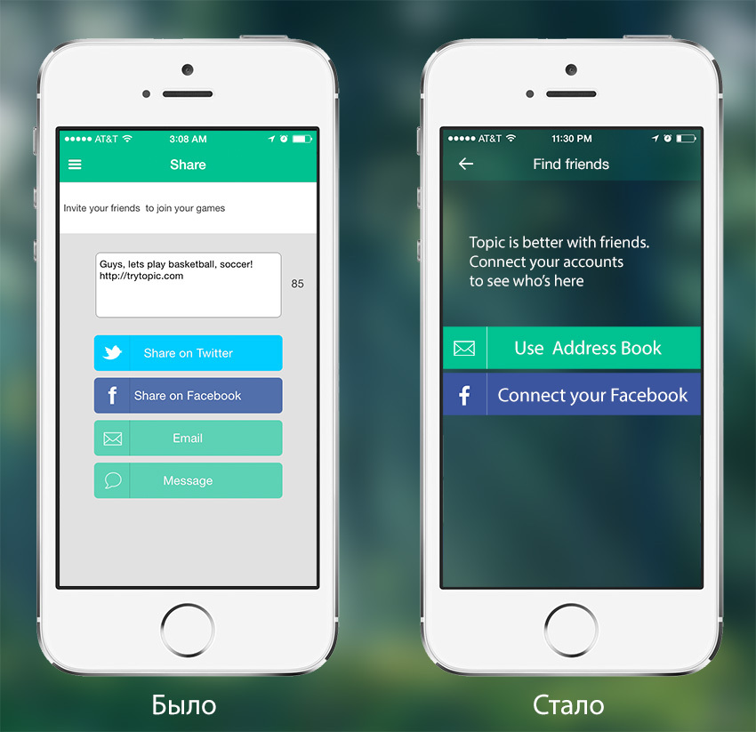
Image №9: Offer to find friends registered on the Topic (appears on the second day of using the application)
15. Make visible the data that affect the user to perform the desired actions.
We noticed a steady pattern of behavior: many people look at the pages of those who have already signed up for the game before they sign up. To make it easier for them to do, we have increased the size of the photos of those who signed up. Most likely, the next step for each recorded other summary data - what is the level of the game, how many games played.

Image number 10: Game page (Click on any game in the Find a game section)
Rekvestiruyu advice habravchan: there was a problem, how to give the user the opportunity to change the list of “My activities”, which he enters when you first start the application. If it is registered, then everything is not so bad, sports are edited in the profile. Although it is not so obvious a way as we would like.
If unregistered, it is still more difficult. It may be worthwhile to add a separate control for editing “My activities” in the list. If the user is not registered, then ask him to register for editing. If registered, then send to edit the profile. I will be glad to hear your advice.

Image number 11: Filter games (Click on the appropriate button in the section Find a game)
16. Do not make a multifunctional combine from the application, focus on the main functionality
For the main part of users, creating a game and adding a site is not so important.
therefore, we removed these buttons from the bottom bar and selected them separately in the menu.
Perhaps later we will allocate the functionality of the organizer in a separate application, as did Eventbrite.

Image number 12: Menu (click on the icon in the upper left corner)
And finally, the finalized registration / authorization page:

Image №13: Authorization page (click on the link "Sign in" in the menu)
Almost all of the above improvements are still baked, they are not yet in the version that now lies in the upstate . I ask habrovchan to support us and advise here that we can further improve the application, and in the upstate - to note that there is already a good one;)
For your convenience, I numbered all the images so that it was convenient to refer to in the comments. I registered briefly how to get to the screen in the application .
There is nothing more valuable than watching live how users interact with the interface. According to the results of observations, it became clear that we did not do many things quite rightly. Further about our mistakes, how we corrected them, and tips on how to not repeat these mistakes.
Image number 1: search for games (Find a game in the application menu)
Tape games
Most importantly, what Topic is for is finding the right game. In this case, the main criteria for players are:
- Location of the playground
- Game time (day of the week and time period)
- game level
')
In the first version of the application, we tried to display all these (and some other) data in the list of games. But faced with the fact that the information turned out to be too much, the user is hard to navigate. Also unclear was the method of displaying the list of games we chose - horizontal paging.
Hence the conclusions:
1. Use familiar UI elements.
Horizontal paging allows you to display more information, but it was not obvious. A vertical news feed / ads / products used in many popular applications.
2. Try to reduce the "noise" interface
In order not to disperse the user's attention, it is necessary to display only the most important data. Secondaries must be hidden deeper. We removed the address, level (even if the player chooses the range of levels in the settings), the number of empty seats (if there are no places, the game is not displayed), the organizer's and registered avatars, the buttons for creating the game and adding a site.
3. Important controls need to be large enough, unimportant - hide deeper
The typical behavior was switching one user between 1-3 favorite sports. Therefore, we decided that it was better to ask from the outset what kinds of sports are interesting to the user, save it in his profile and display the default list of games for selected sports (see more on this below).
In this case, the control of the choice of sport loses importance and goes deeper into the general filtering settings. That allows you to make important buttons to go to the filtering settings (Filter) and search on the map (Map) is much more noticeable and larger.
4. Try to display data in a format that is easier to read.
If the price is flat, without cents / kopecks, then it is not necessary to withdraw 00 cents. If the game is today or tomorrow, then you need to write like this, without forcing the user to remember what date and day of the week it is today.
5. Do not wake the user into a dead end with a zero result
If nothing has been found in the search for games, we will display the best nearest courts, where you can create a game so that the user can correct the situation.
Image №2: search for games, nothing was found (set all ranges from 0 to 0 in the application filter settings)
6. Gently push the user to the action you need: If You Don'T Ask, You Don'T Get
We would like as many users as possible to create games on Topic. Therefore, at the end of the tape with games, display the button to create a new game.
The problem that has not yet been resolved is that the list of games does not give a clear idea of the location of the game on the map. But the map does not give a visual representation of other game parameters, for example, the date and time. Perhaps the default screen should not be a list of games with photos (List), but a map with markers (Map). I will be glad to hear your advice.
Image number 3: search for games (scroll to the very end of the game search tape)
Intro Screens
7. Use introductory screens: minimum text, maximum clarity
In order to quickly orient the user where he got, what value he will get from using the application, on the first launch we show him two introductory screens. The screens hint that we can find games for different sports and that games can be filtered by different criteria.
Image # 4: introductory screens when you first start the application
8. The first user experience should be cool. Customize your content to make the experience as cool as possible.
As soon as we had more than 5 sports in one city, the conversion from the screen with the search for games to the viewing of a particular game became lower. It is highly desirable that the list of games that we show to the user is relevant to his preferences. Therefore, immediately after the introductory screens and the request for rights to determine the location, we suggest choosing your favorite sports, which we will write to him in the profile later after registration.
Previously, we requested favorite sports after registration. The choice of pre-registration increases the relevance of the games ribbon, makes it possible to focus on other more important elements of the interface.
If the user has not chosen sports, then in the ribbon we show him all sports.
9. Simplify entry and selection of options.
After our previous article on Habré, many asked to add the most unexpected sports to the topic. At first we struggled with this and took only popular ones (otherwise, choosing a sport from a huge list turned into a nightmare).
But in the end they gave up and decided to just add to the list a form for filtering by name. Nothing entered - all sports are shown as soon as we start typing - the list is filtered.
Image number 5: Choosing your favorite sports (fourth introductory screen when you first start the application)
Requests for rights
It is not necessary to request all the rights required by the application in a pack at the first start. With this approach, the user does not understand why he should give them to the application - we do not explain anything. And if you refuse, giving the rights is no longer so easy, you have to dig into the phone settings rather deeply.
10. Request rights only before they are needed.
Image №6: Request for rights to send push-notifications (after the first sending a message to someone or after sending a request to participate in the game with the need to confirm the record by the organizer)
11. Transparently communicate what the user will receive, giving rights
12. Show the iOs dialog box only when the user clearly expresses his intention to give rights. Give the user a choice
For example, if a user refuses a pre-request of rights to determine a location, then we suggest that he enter the city manually + show a button with the option to still give rights.
Image number 7: Pre-request rights to determine the location of the user (the third introductory screen when you first start the application)
13. If the rights are not already granted, show a visual hint how to issue them.
Image No. 8: If the request for the right to send push notifications has already been rejected by the user, but the user on the screen of image No. 6 clicked on “Notify me”
14. Use social graph data or other supporting data to improve user experience.
Going to a meeting with a stranger is a cognitively uncomfortable situation. Going to a group event is much easier, the degree of awkwardness subsides. If the event is sporting - even easier. But the most comfortable is to go there with friends or acquaintances.
The data that three of my Facebook friends are going to play football next day will significantly improve my experience using the app. Of course, data on social connections of users will help not all applications. But, for sure, there are other supporting data that you can use to make users a little happier.
Image №9: Offer to find friends registered on the Topic (appears on the second day of using the application)
15. Make visible the data that affect the user to perform the desired actions.
We noticed a steady pattern of behavior: many people look at the pages of those who have already signed up for the game before they sign up. To make it easier for them to do, we have increased the size of the photos of those who signed up. Most likely, the next step for each recorded other summary data - what is the level of the game, how many games played.
Image number 10: Game page (Click on any game in the Find a game section)
Filtration
Rekvestiruyu advice habravchan: there was a problem, how to give the user the opportunity to change the list of “My activities”, which he enters when you first start the application. If it is registered, then everything is not so bad, sports are edited in the profile. Although it is not so obvious a way as we would like.
If unregistered, it is still more difficult. It may be worthwhile to add a separate control for editing “My activities” in the list. If the user is not registered, then ask him to register for editing. If registered, then send to edit the profile. I will be glad to hear your advice.
Image number 11: Filter games (Click on the appropriate button in the section Find a game)
16. Do not make a multifunctional combine from the application, focus on the main functionality
For the main part of users, creating a game and adding a site is not so important.
therefore, we removed these buttons from the bottom bar and selected them separately in the menu.
Perhaps later we will allocate the functionality of the organizer in a separate application, as did Eventbrite.
Image number 12: Menu (click on the icon in the upper left corner)
And finally, the finalized registration / authorization page:
Image №13: Authorization page (click on the link "Sign in" in the menu)
Almost all of the above improvements are still baked, they are not yet in the version that now lies in the upstate . I ask habrovchan to support us and advise here that we can further improve the application, and in the upstate - to note that there is already a good one;)
For your convenience, I numbered all the images so that it was convenient to refer to in the comments. I registered briefly how to get to the screen in the application .
Source: https://habr.com/ru/post/222647/
All Articles