Sketch.app site design. Part 2.2: Final Layout

The last part on working with the site in the sketch.
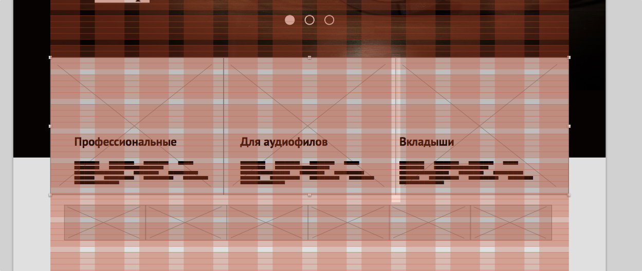
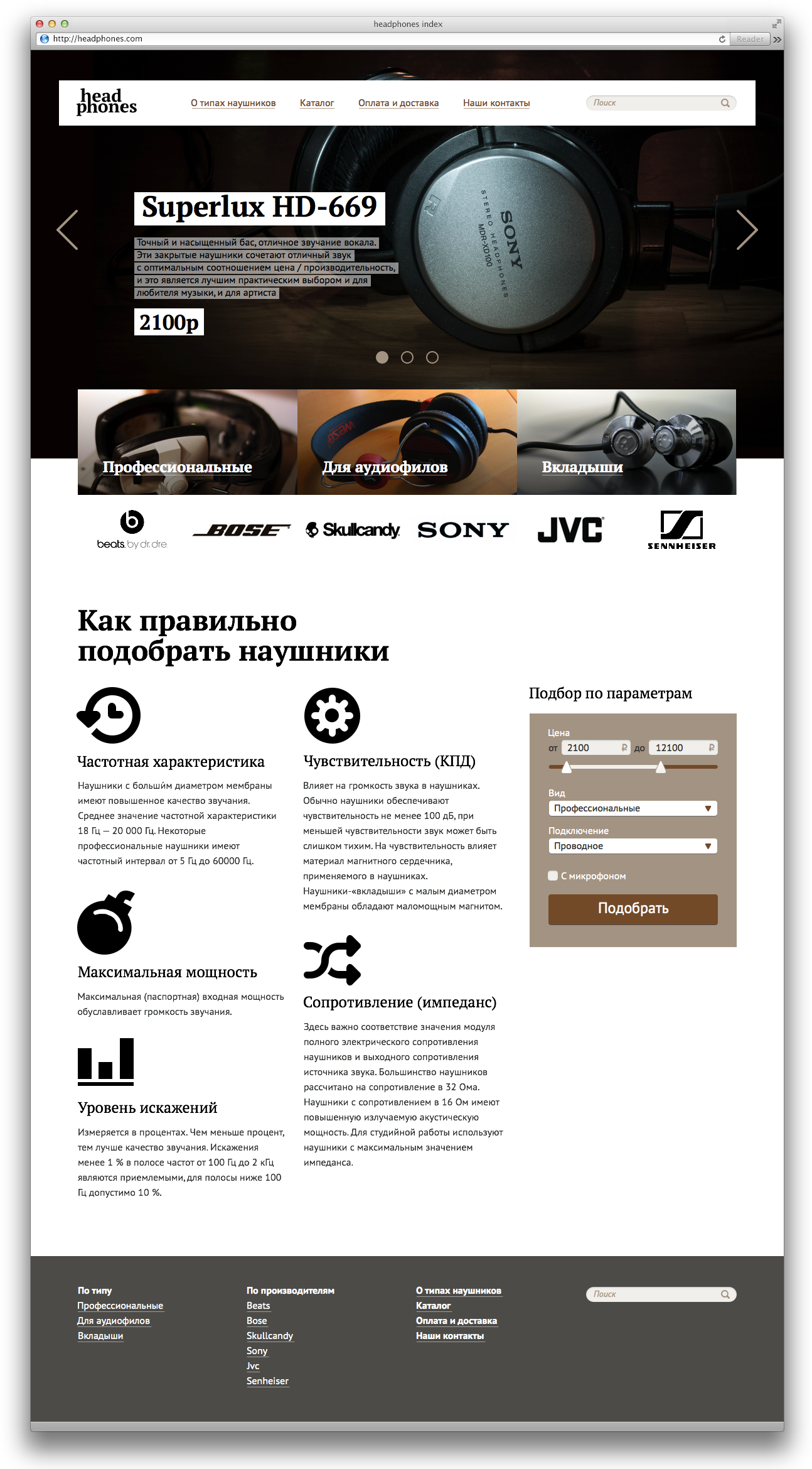
For the three main categories of headphones we will make small descriptions and put pictures (Flickr will help us here).
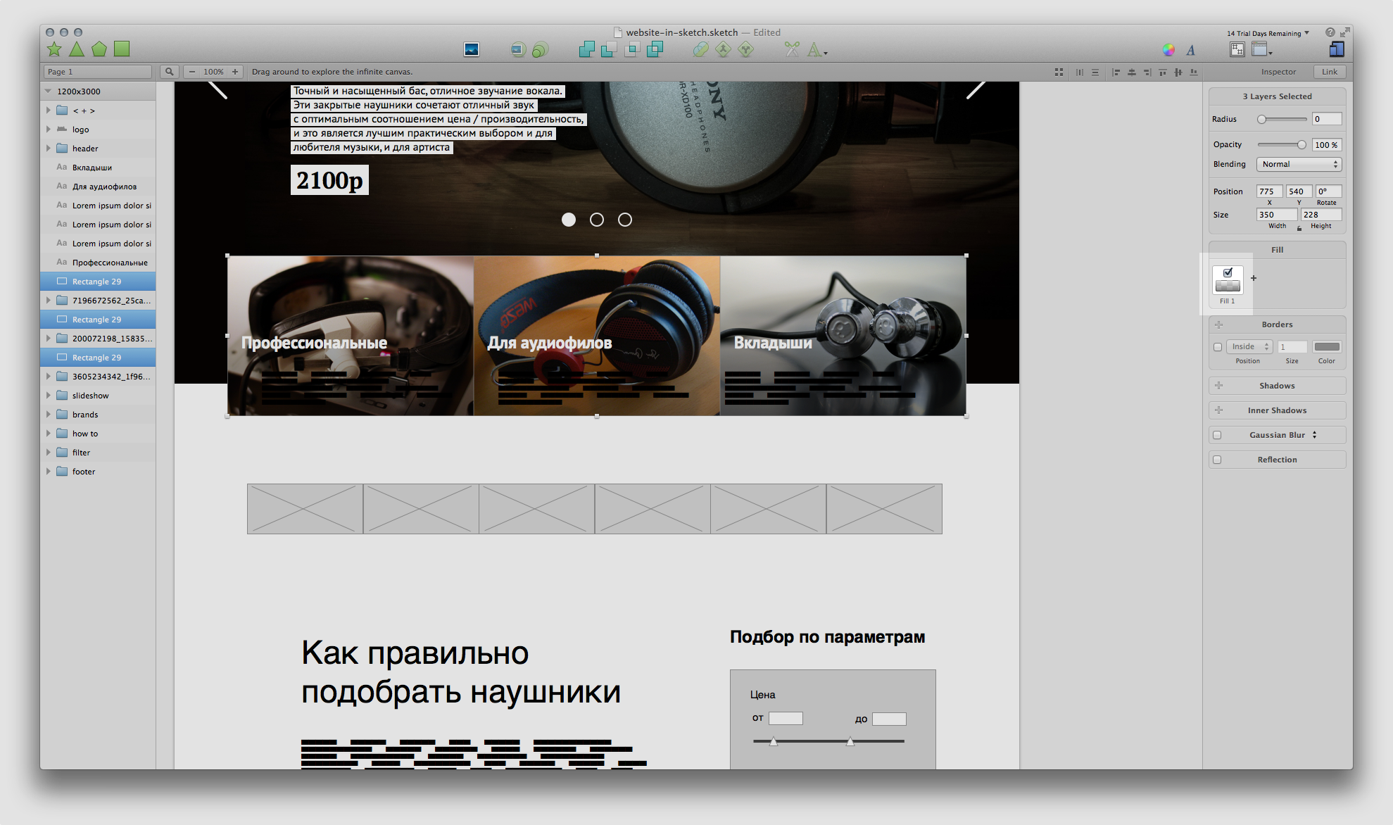
To stretch the caps over the entire width of the grid, while maintaining a zero distance between them, select all three and simply stretch as usual in any graph. the editor. The stretching with the clamped Option also works - the block expands to both sides at once.
')
Put the blocks on the grid. The second and third blocks we have a little overlap (in the picture above), so we slightly correct the distance with the help of the Space Horizontal plugin. Move it to 0 pixels, i.e. "Glue" the blocks.
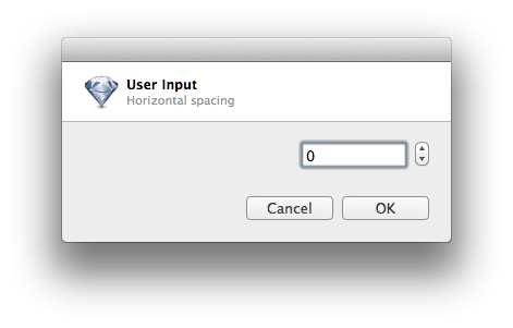
The plugin asks you how far to move the selected objects. The default is 10pcs. Moves from the left edge and from the bottom of the selected layers.
Put "on top" of the headphone photo.
The titles of the categories will be painted in white and we will try to make a plate for all occasions so that the text always remains readable. But first, let's move each heading to the edge of the corresponding photo: select text and photo and click “Align Left” in the upper right.
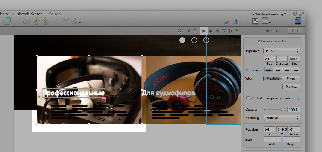
Then select all three headers and move “two shifts” to the right - indent it, i.e.
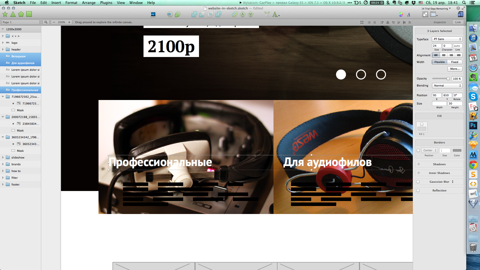
Select the photo category and draw a rectangle on top. We paint it with a gradient from black to black (!), But with different transparency.
And replace the font in the names. The sketch shows the current text styles used in the panel.
Trade marks
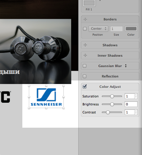
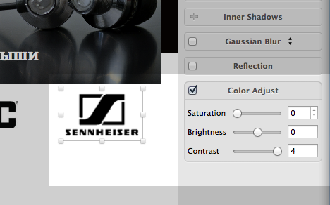
For example, just find on the Internet 6 "headphone" brands. If possible, we are looking for black and white logos, but we will also correct the color logos, if that.
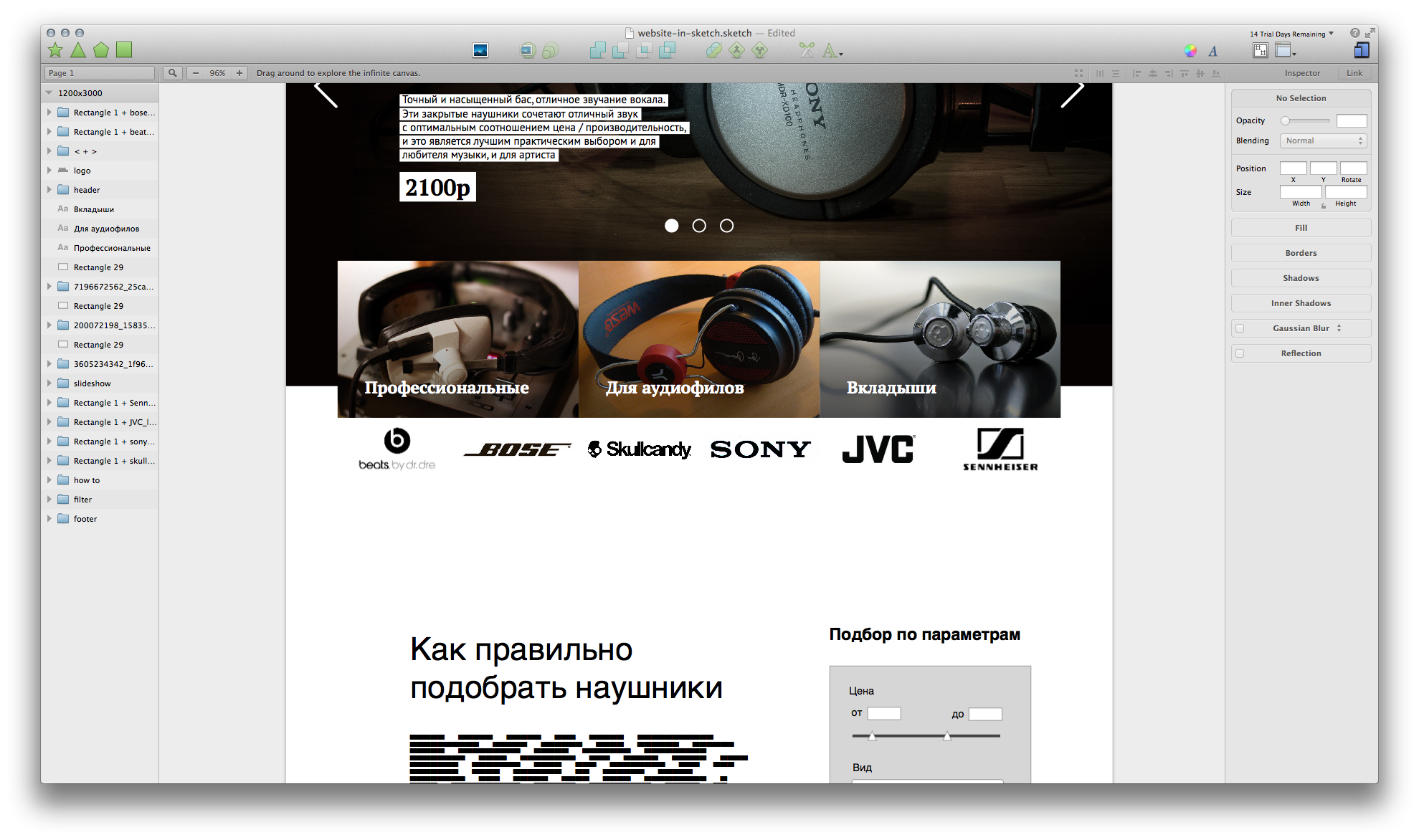
"Senheyzer" here is color. But we have primitive image editing tools (in the right properties panel). Put a tick in the "Color Adjust". There are three sliders that we will use to make black and white color pictures.
↓
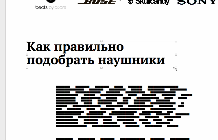
"How to choose the right"
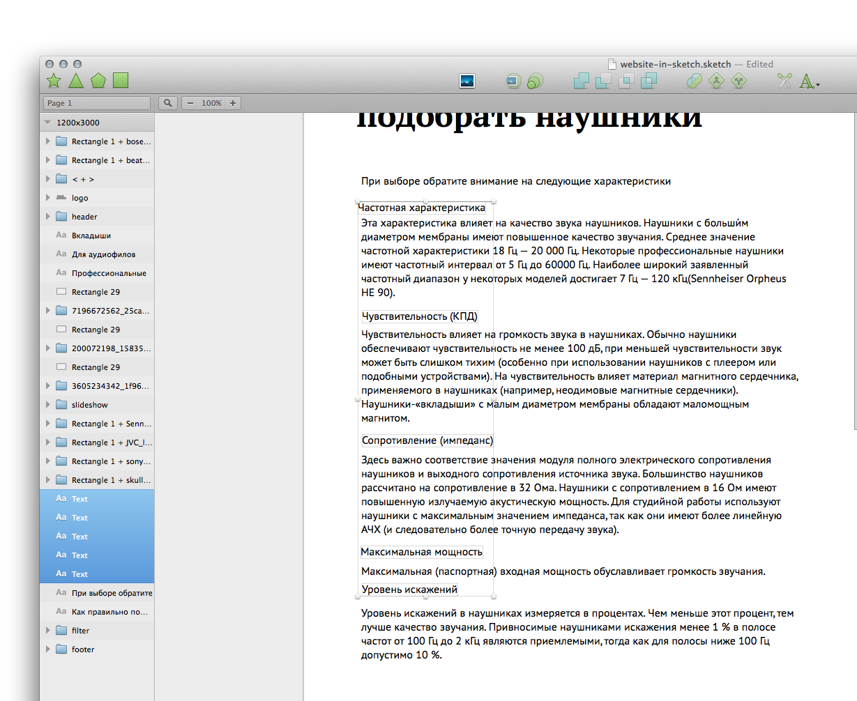
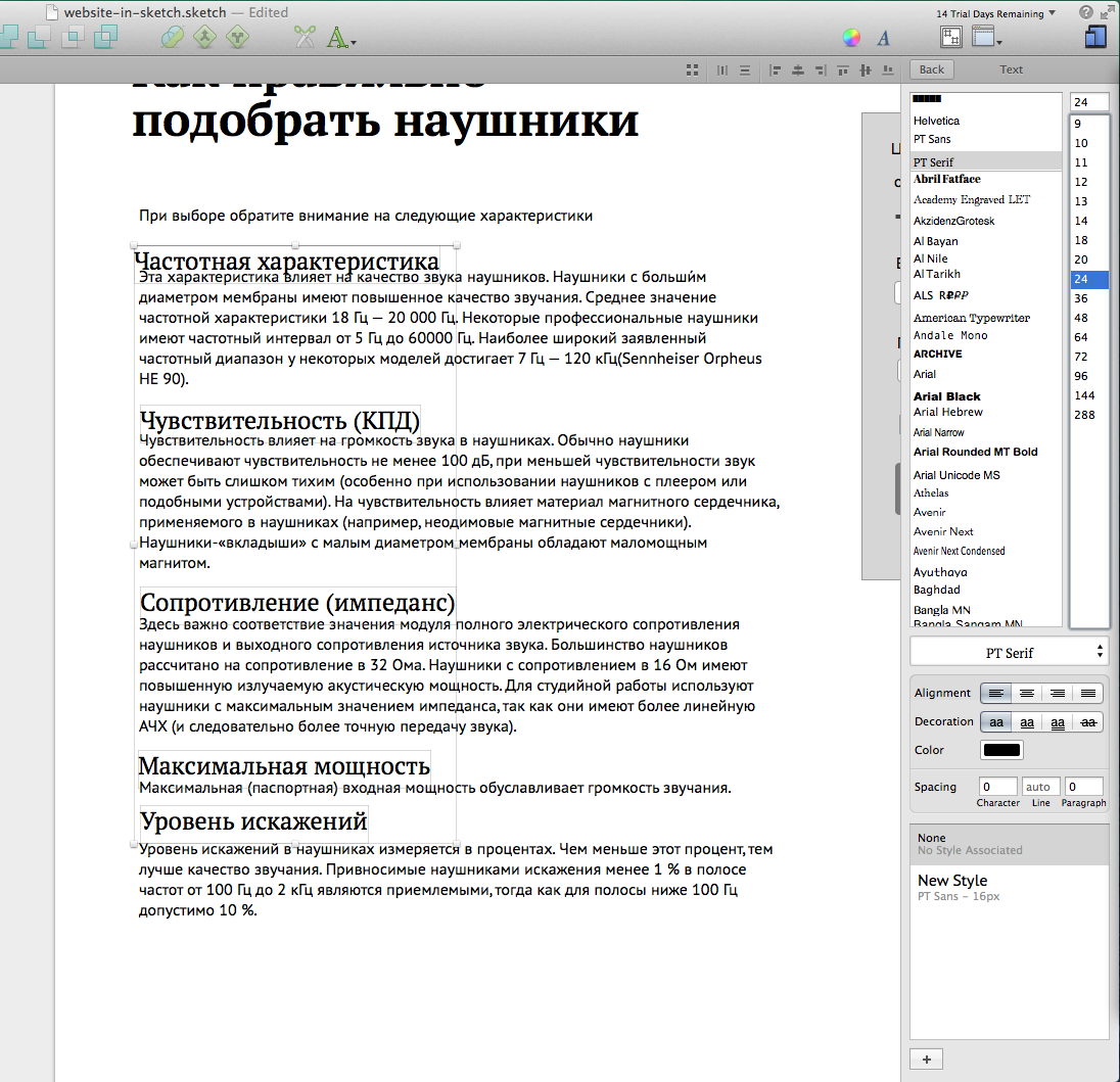
A small paragraph about what to focus on when choosing. To begin with, let's change the header font to our PT Serif and stretch it to the desired width. Look for something more or less appropriate on Wikipedia.
If you pull the text block by the bottom edge, it will increase downwards. If the middle - and up and down. If the top edge - up.
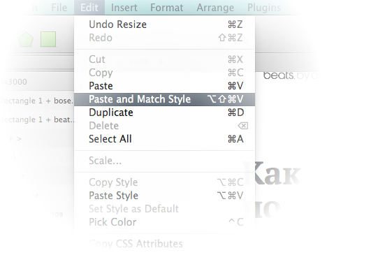
In Sketch, like many other programs, besides “Paste” there is also a command “Paste and replace style”. The second is in case you want to add text to a block that has styles already set up.
We carry out the names of the items on separate layers (cut / paste). We make of them subtitles.
↓
The text is a bit much, we will try to minimize everything that we can.
↓
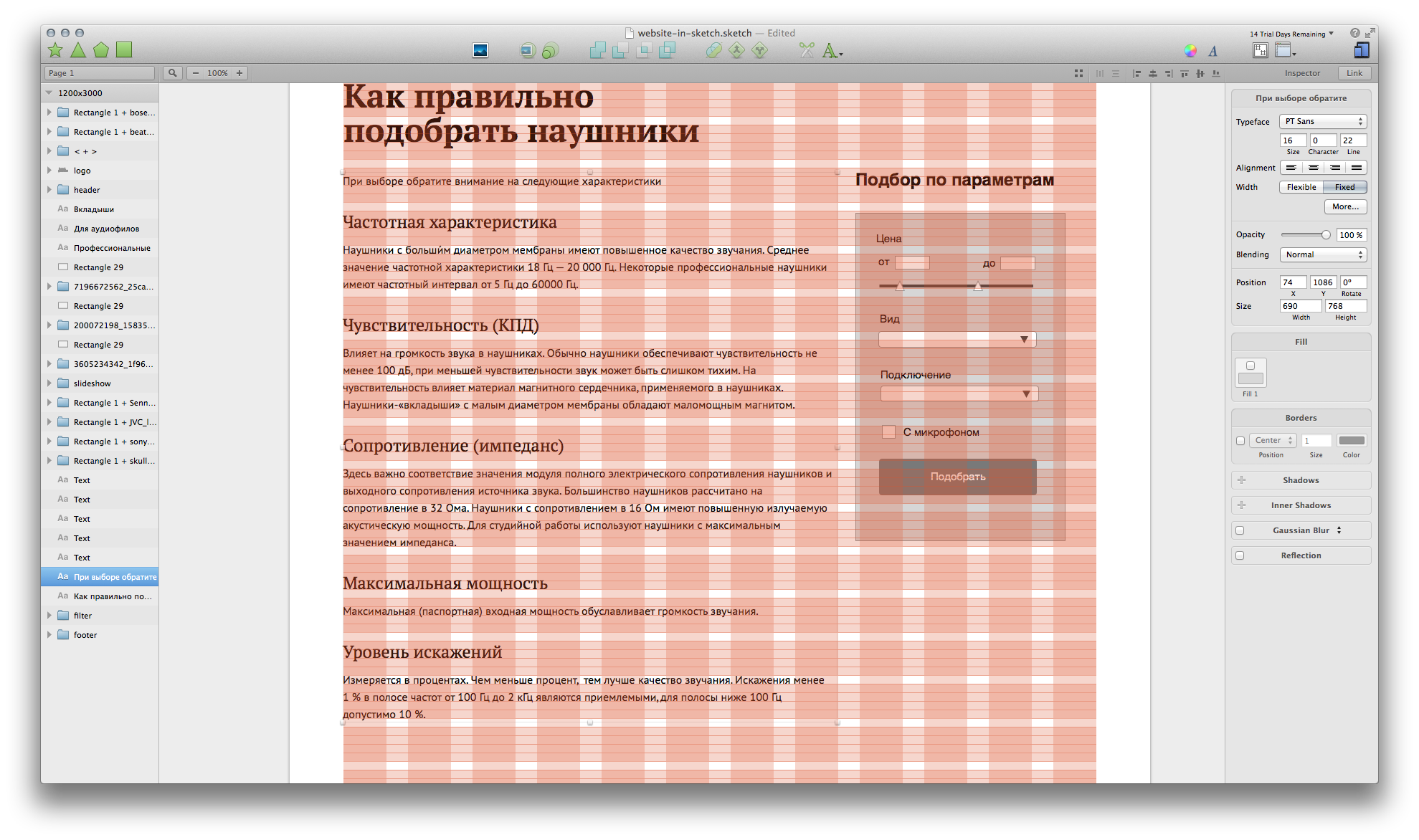
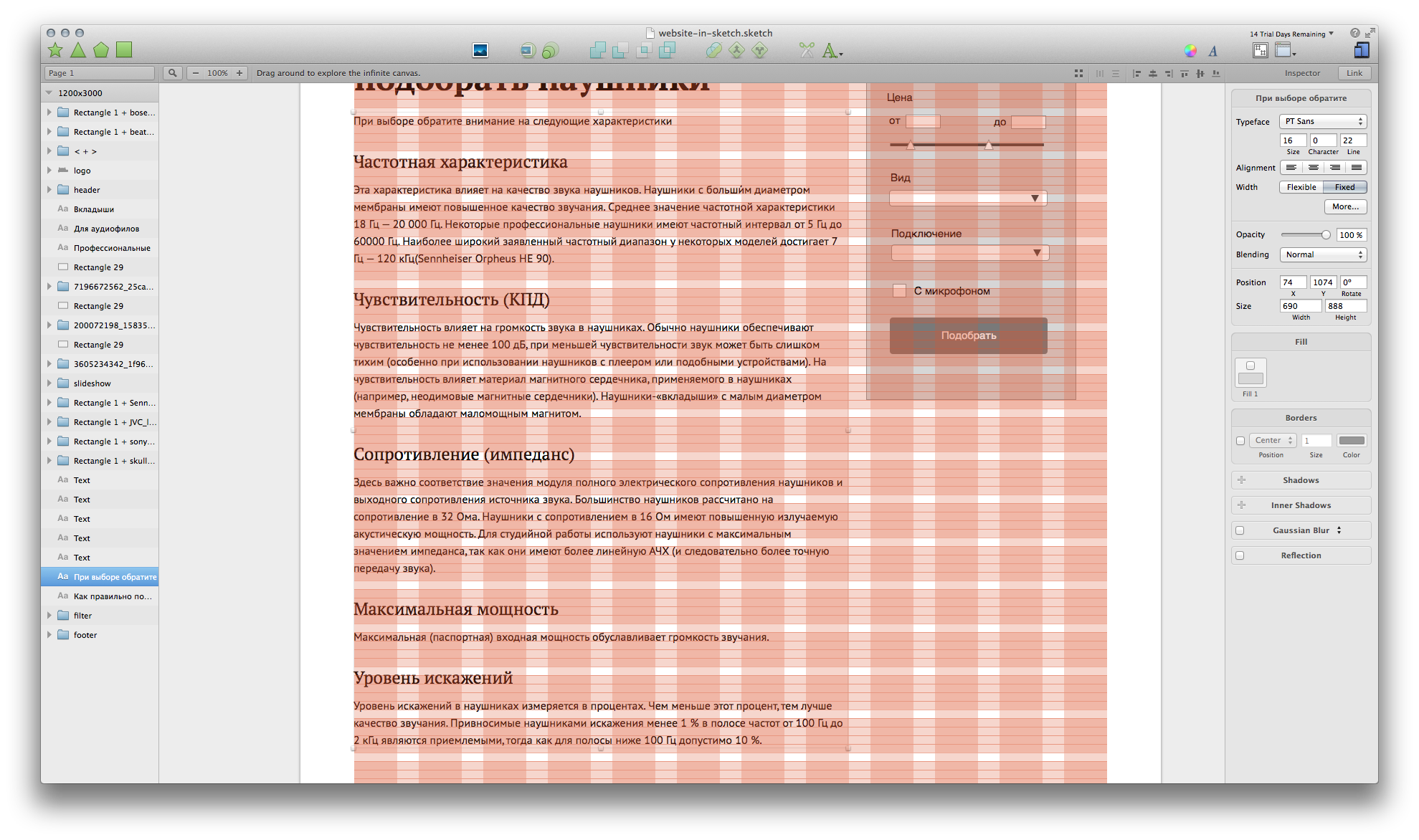
The filter on the right will be slightly lowered, so that the text is noticeable first, and therefore people have already moved on to the selection. In the layout, it would be possible to simply fix this block so that it would not scroll with the text on the left.
Filter
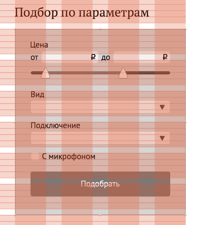
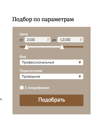
Determine how much will take place. Change the title style.
Then - styles for the field names and buttons.
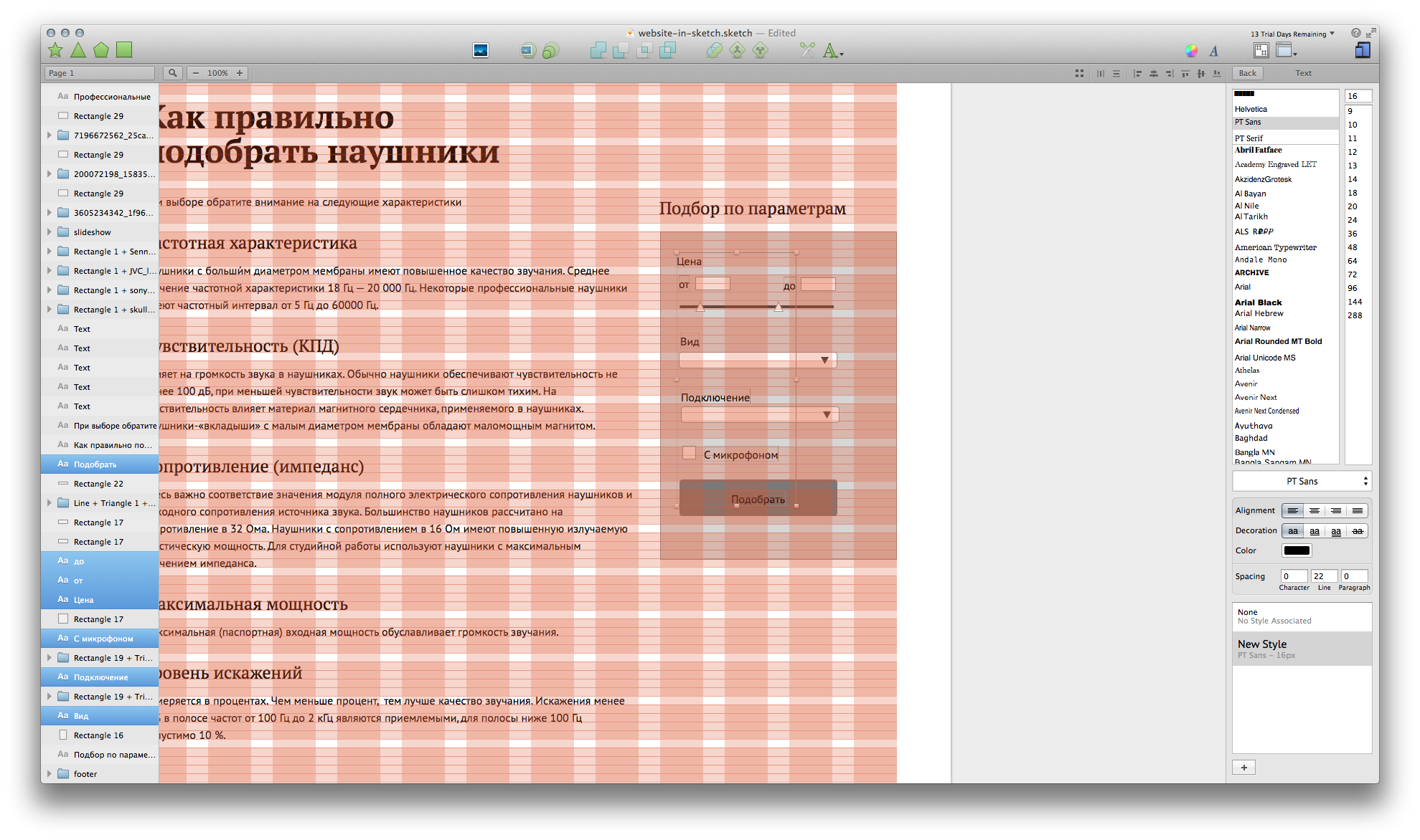
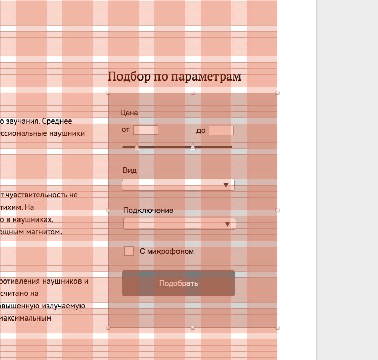
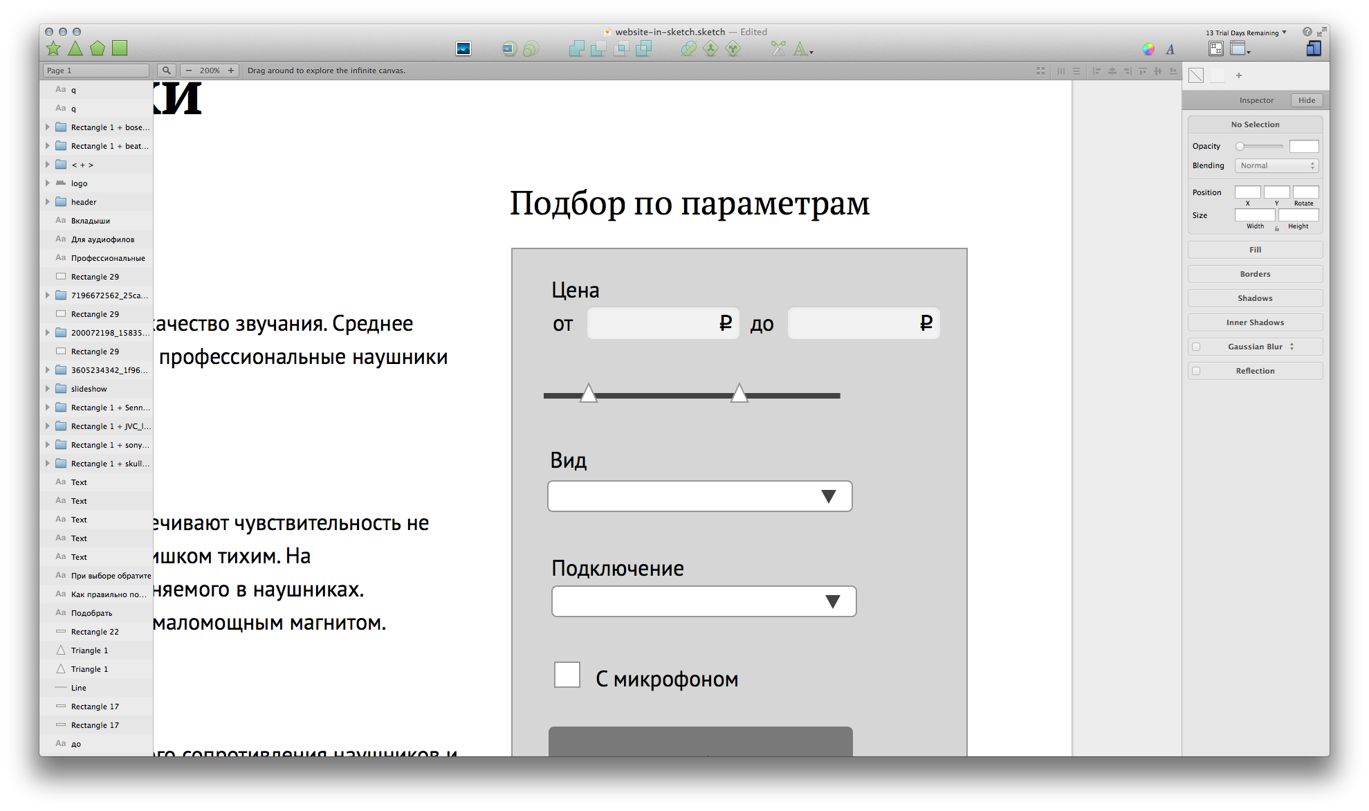
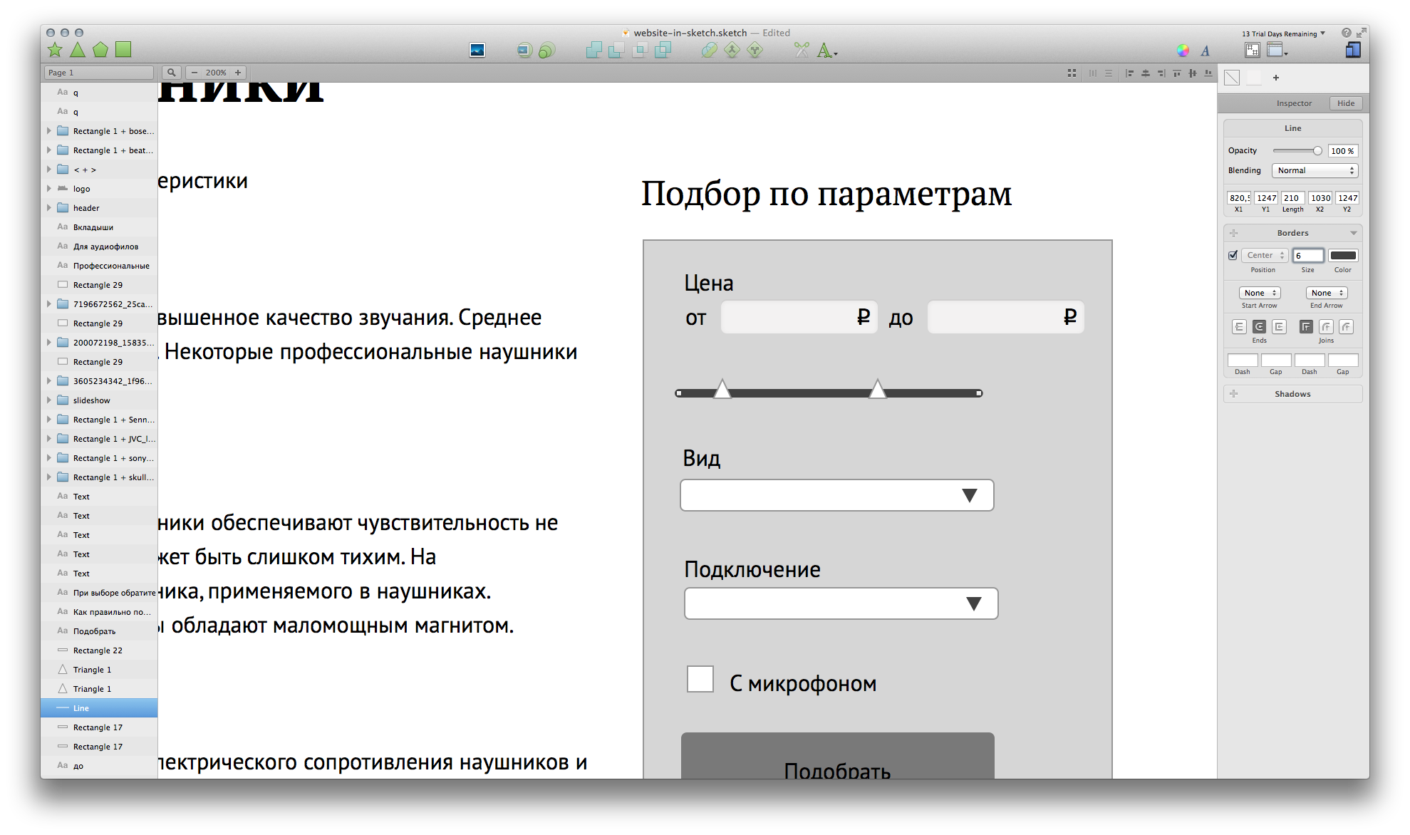
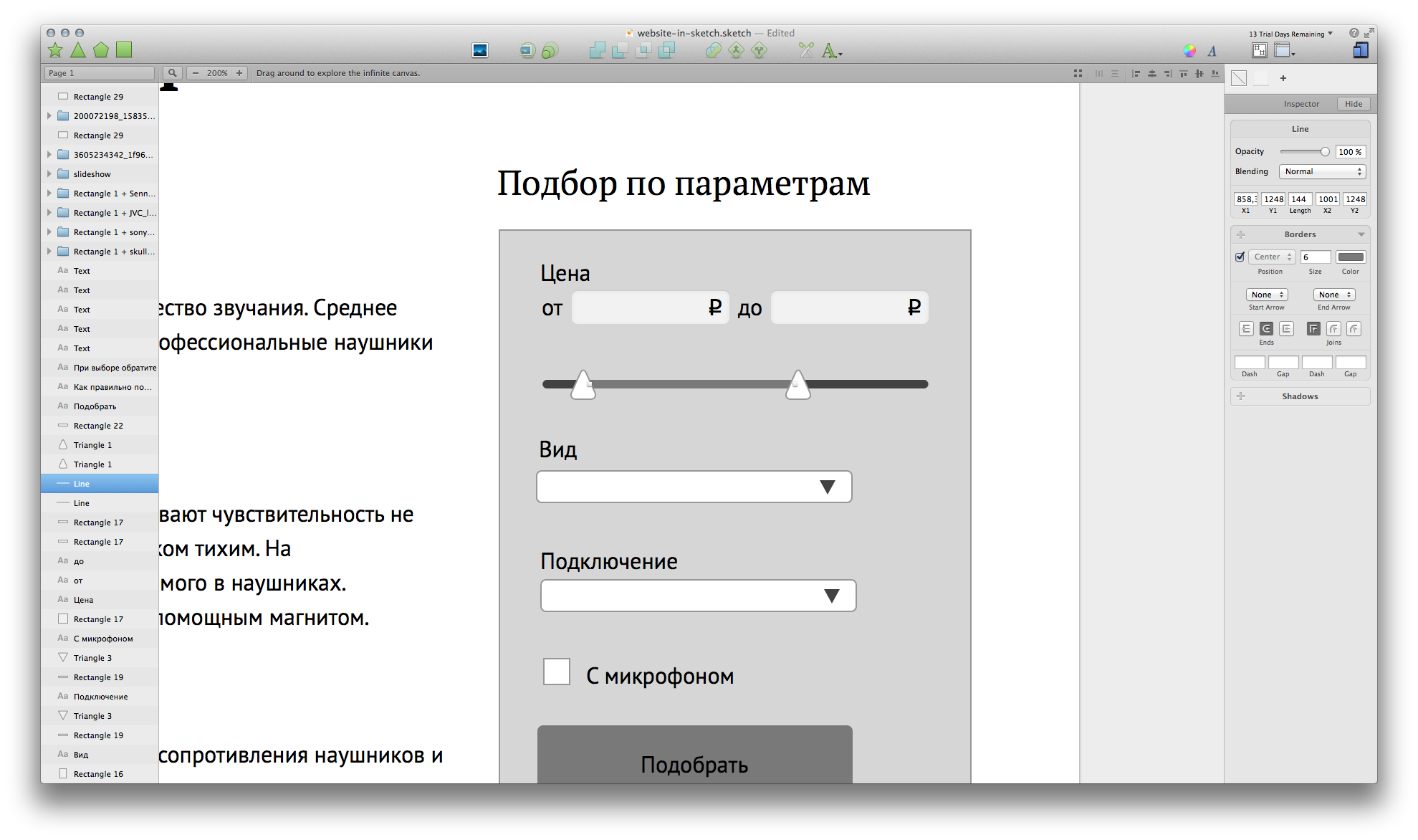
Now we will deal with input fields. Adjust the height of the grid, make rounded corners and select the previously saved graph style.
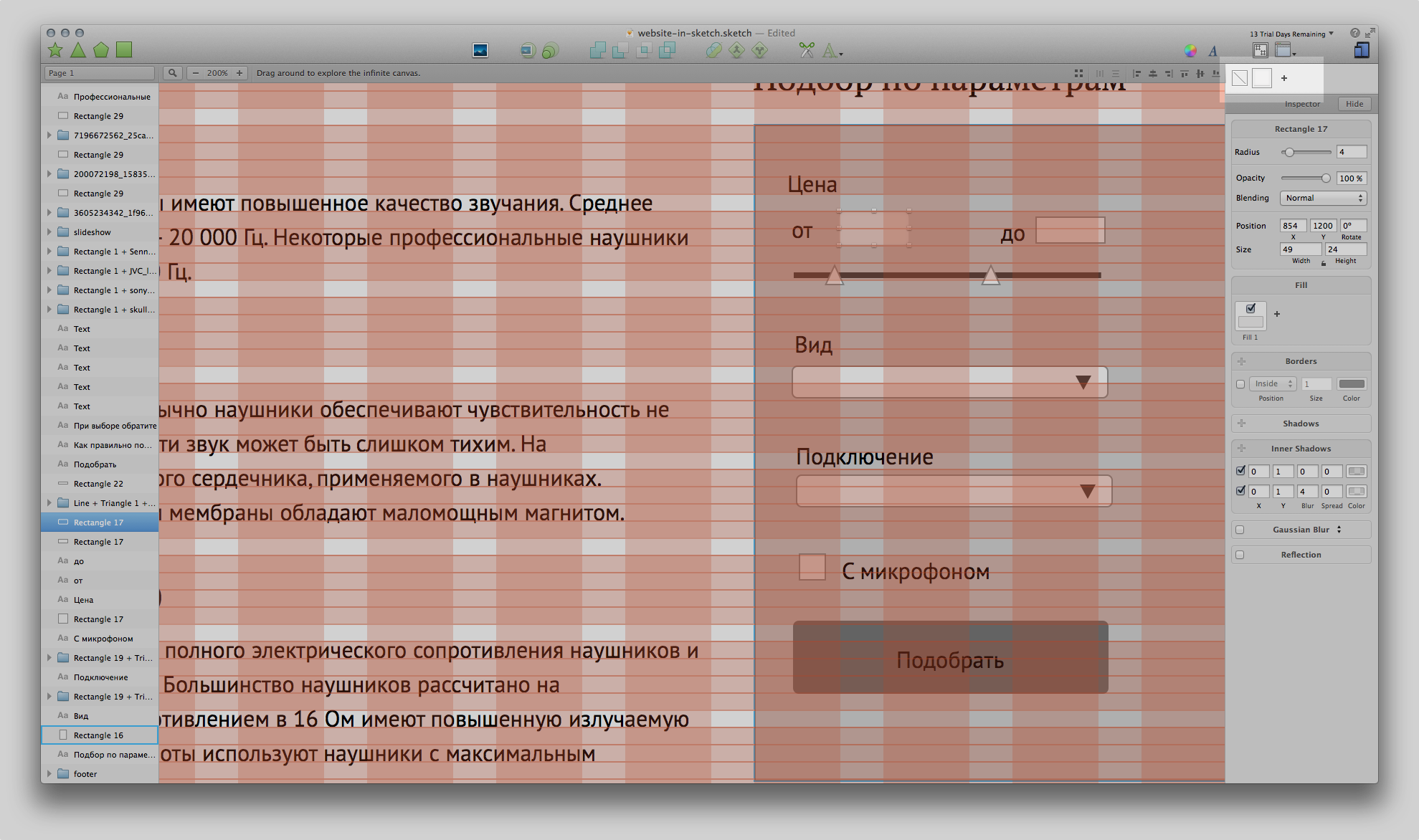
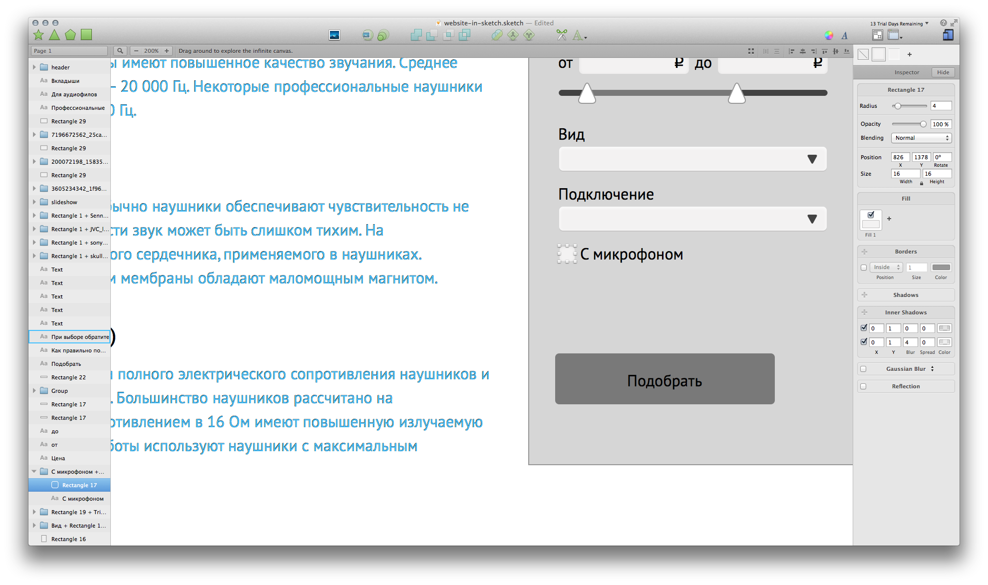
You can set the corner radius in the properties panel (on the right) or with the help of the “ Set Radius ” plugin
It is good to add a ruble icon to the price parameters. Use the font " ALS Rubl ".
Range slider
We have a line with a stroke in the center. It remains for us to round it off and (possibly) tint up the prettier. Stroke options are all right there.
Triangles have a rounded edge. If you select a point in the shape, the options for attaching a point to pixels (to a whole pixel, half-pixel, or no binding at all) appear on the top panel. In the same place, we can adjust the rounding only at this selected point.
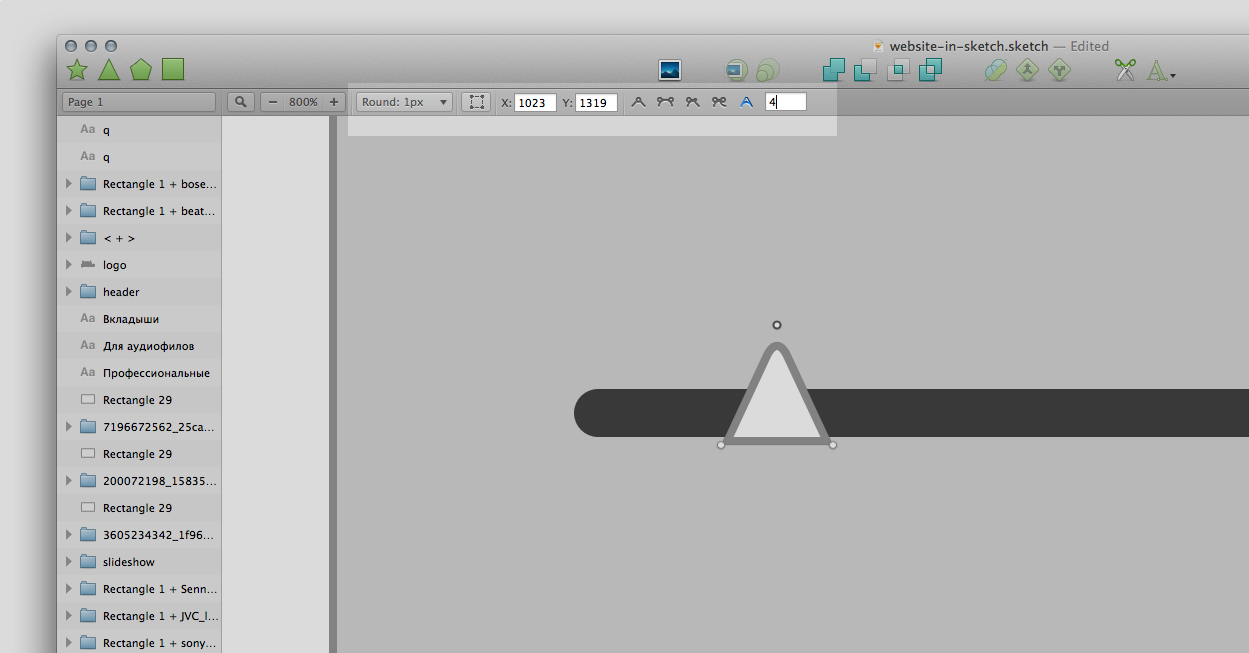
We can do this with all points of the triangle. Moreover, if we stretch it, then the radius at the points will not increase with increasing size of the whole figure.

We make the triangle approximately equal or with a slightly larger cursor so as not to aim later on the site. And add another line - the display of the selected range.
Drop down lists
To begin with, we will copy the style of the input fields, but instead of an internal shadow, we will make an external one - the list is not “depressed”, but “convex”. And keep the style.

We draw the checkbox - the style is already there, we only rule the size.
Button left
First we adjust the size to the grid. And we do the entire width of the filter, but taking into account the indents of 30pcs.
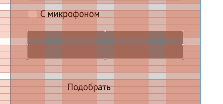
"Pick up" put in the center and paint in white (well, even while white). Before that, do not forget to remove the style from him, otherwise repaint all text objects.
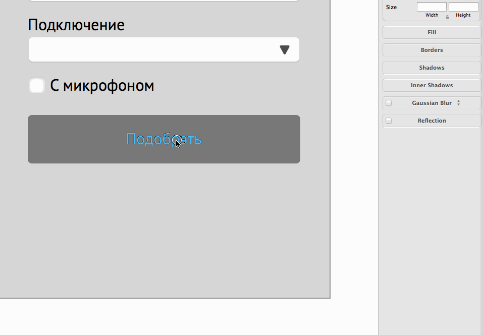
And adjust the height of the substrate:
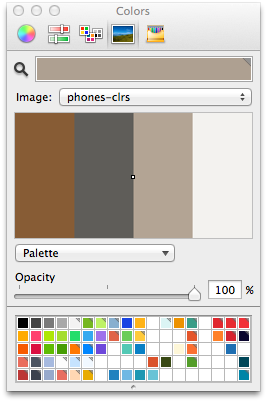
It is necessary to determine the colors. We are all black and white, but there are photos. Save the top of the page in the picture on the desktop. Then open the picture in the application Spectrum - this thing will help us in the selection of colors (Spectrum is not required, suitable and Cooler , for example, or even the system color bar).

Next, choose 3-4 colors and save to the picture.
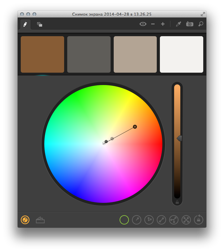
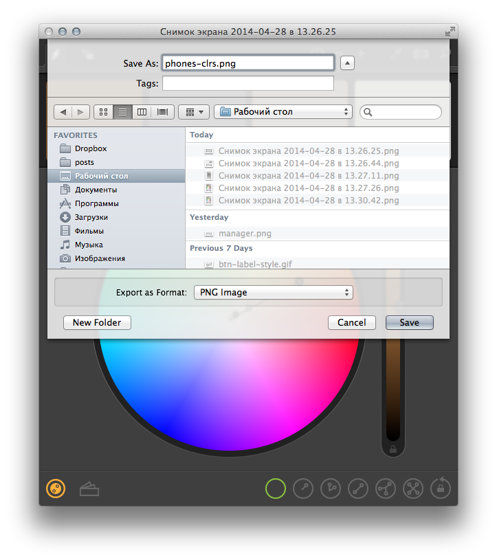
Then in the system color panel in the sketch, open the picture
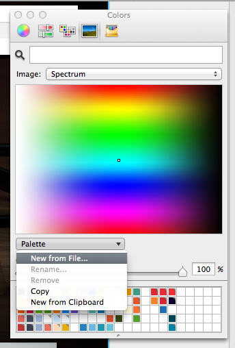
And, in fact, everything - we have a palette for future use.
Paint the filter
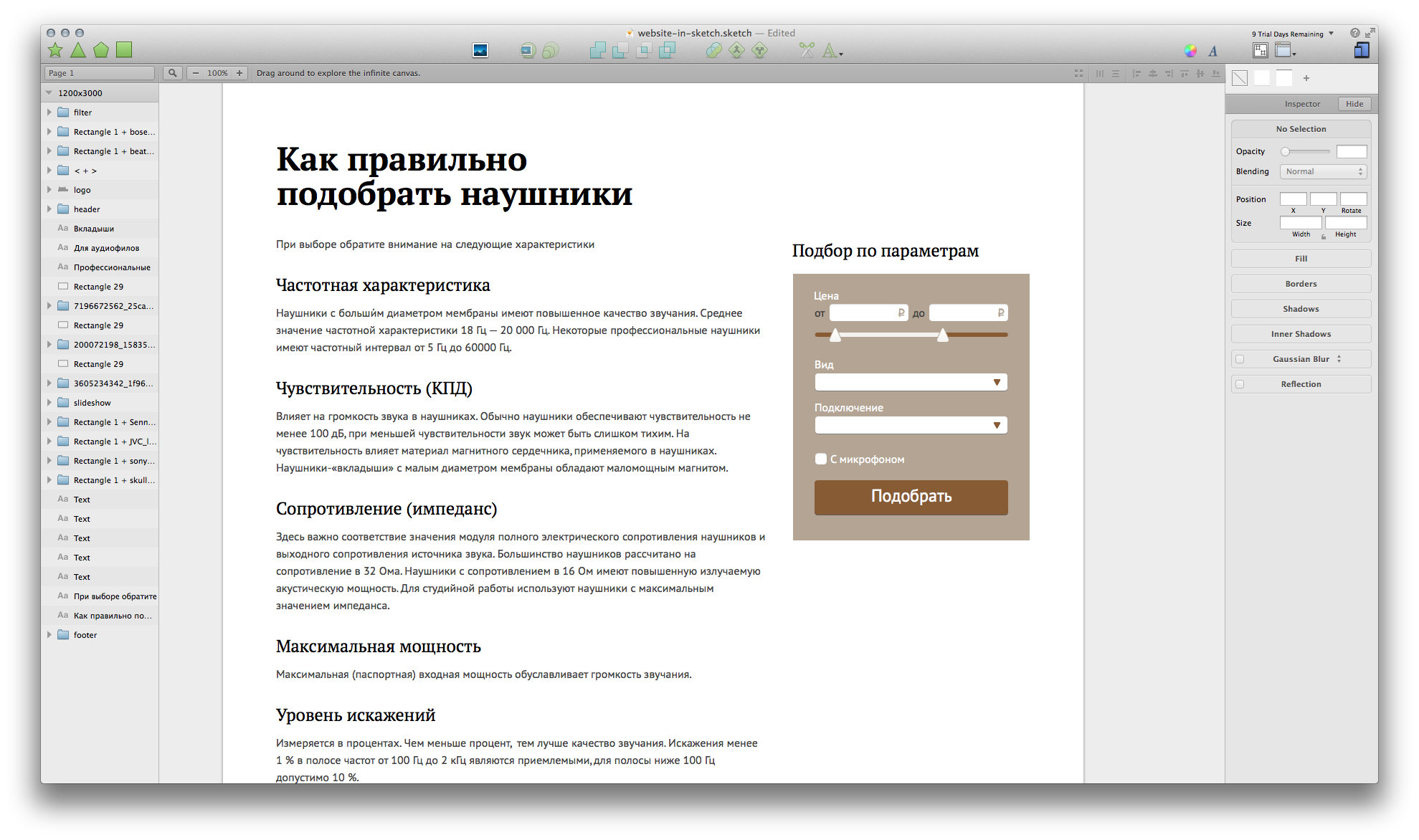
The text block about “How to pick up” turned out to be boring, it would be necessary to submit information more lively. Let's try to add icons and arrange paragraphs “tiles”. For example, you can take any icons that come handy.
So a little more fun:

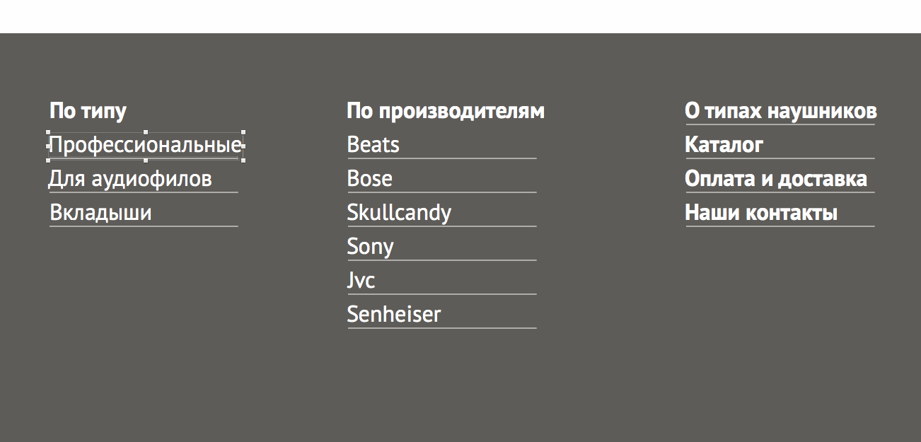
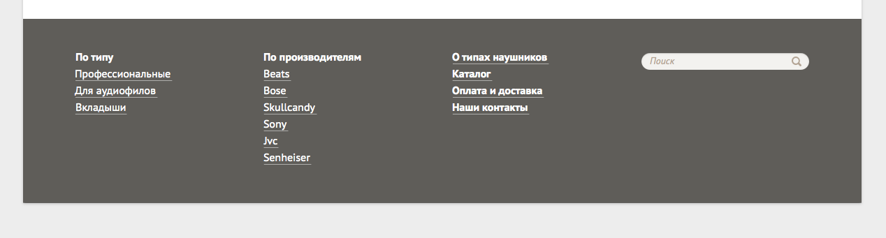
Footer
Actually, everything is simple: we make links to sections and copy the search from the header.
I think it’s worth adding an underline to the links. Thin underlining will have to do manually: draw a line, fill with color with opacity about 50% and save the style.
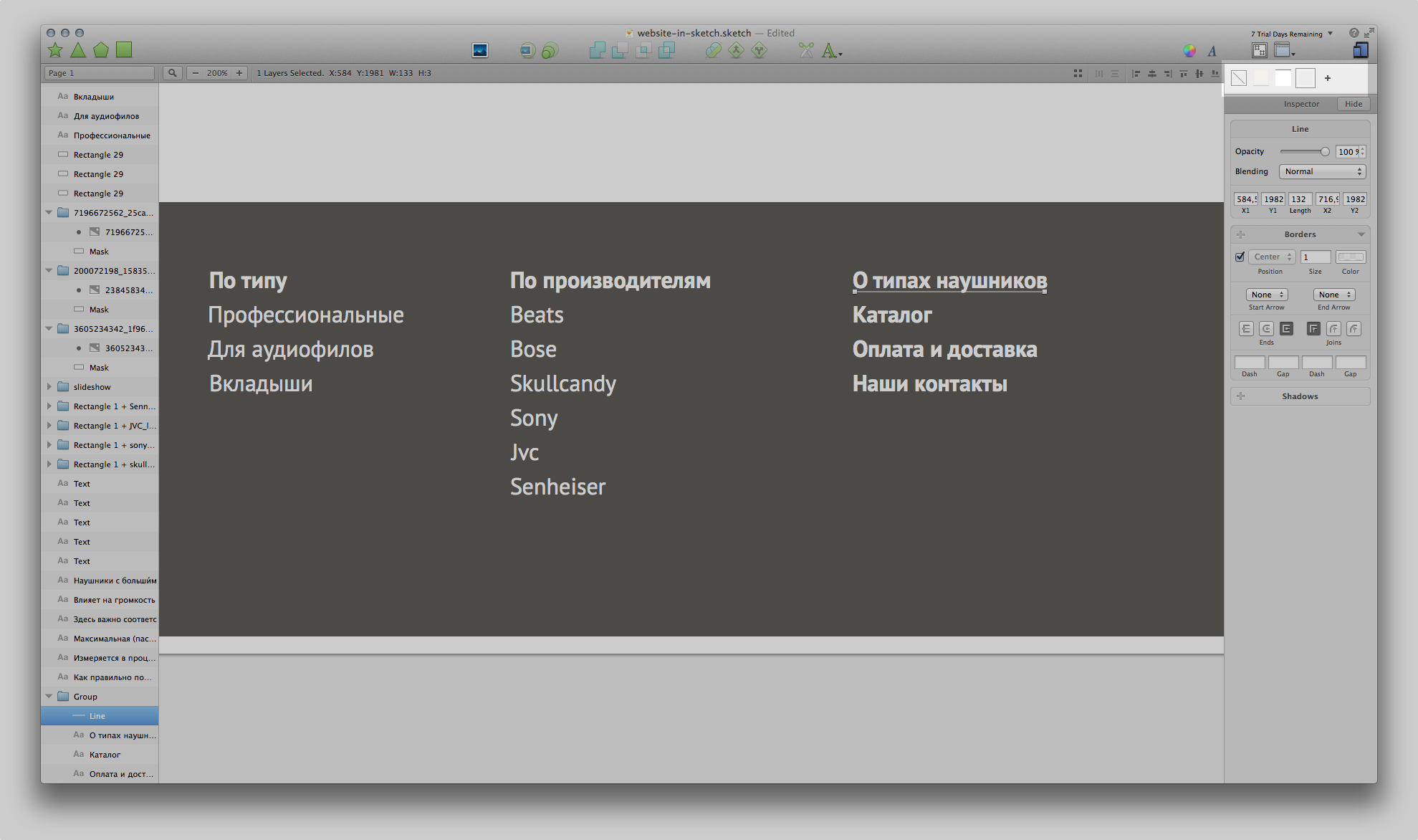
Then we duplicate the line for each link:
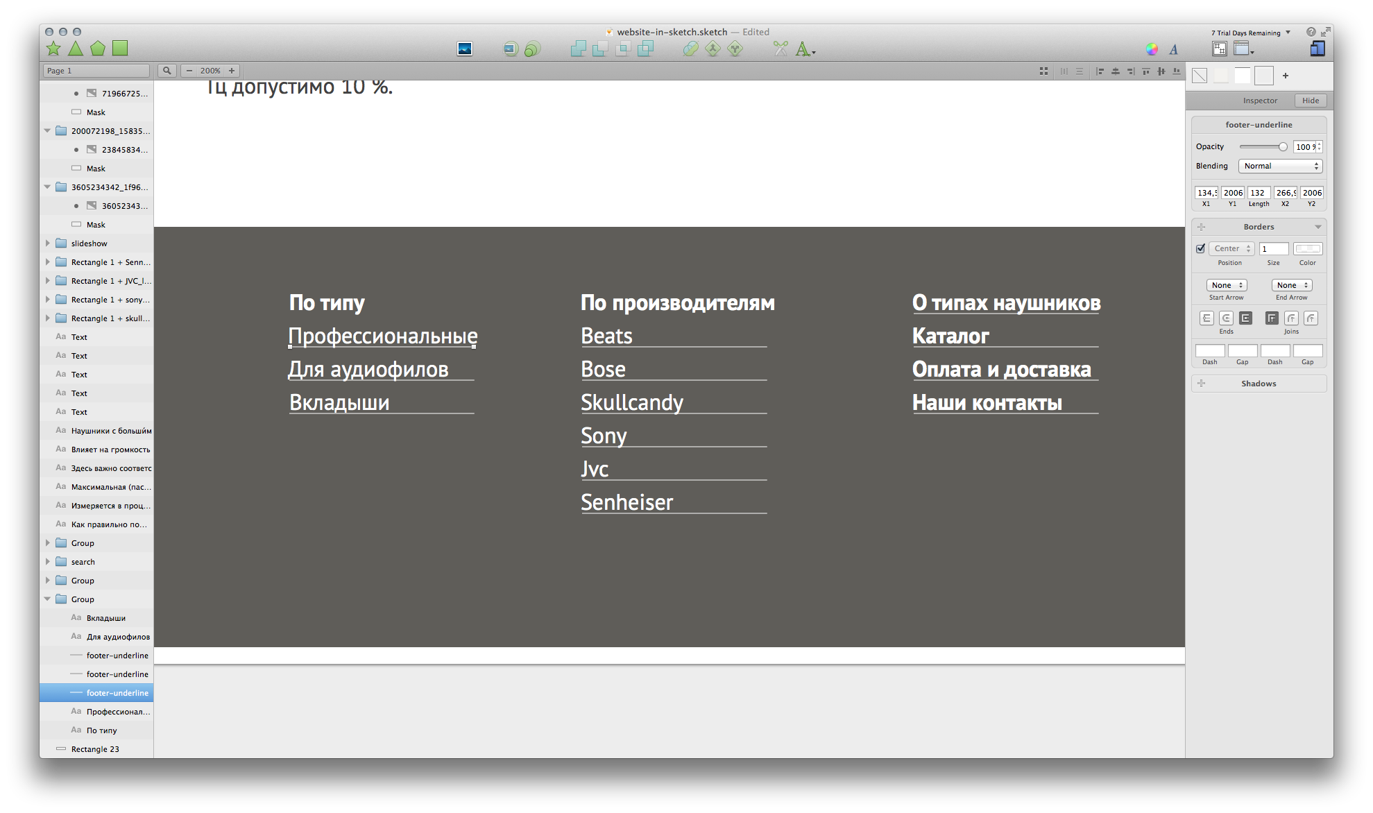
I strongly advise in the process to clearly name the layers. At least the most important. The search built into the layers panel (Cmd + F) can then be very useful if you need to fix something in several objects at the same time. For example, move the underline of links in the footer down. In the search we are looking for our underscores, select everything at once and move down a couple of pixels.
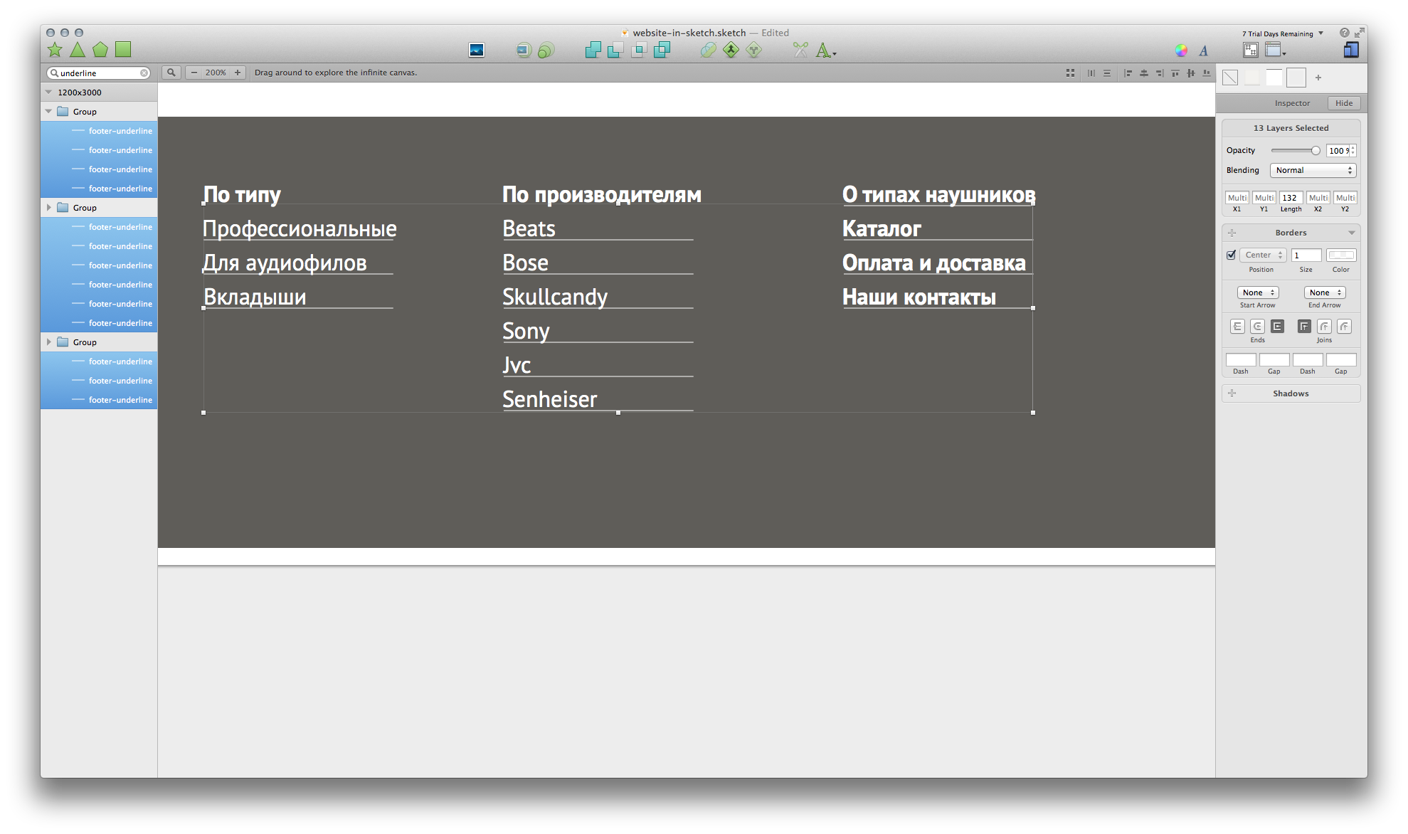
You also need to align the length of the lines with the links. We use the plugin " Equalize Width ... ". Choose a word, a line and, depending on what is longer, use “Equalize Width Down” or “Equalize Width Up” - i.e. or reduce or increase the length of the underline.
With footer everything.
Now add an underscore to the other links on the layout.
Fill in the fields in the filter:
And that's all, the layout is ready.
Website-in-sketch.sketch
Epilogue
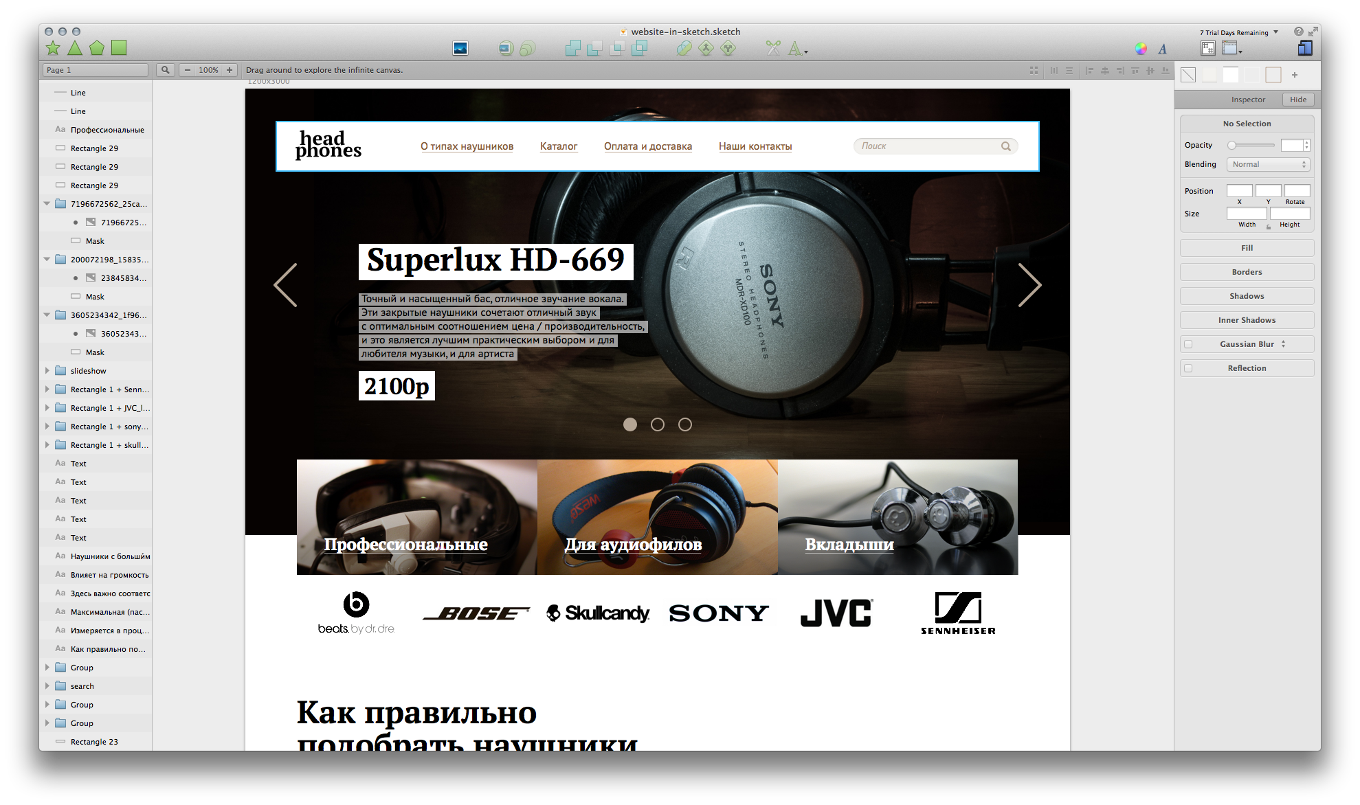
While I was giving birth to an article, the 3rd Sketch was released. And if the old coped quite well, then the new one needs to run straight and take. In conjunction with plug-ins , which are already like mushrooms, this is still the most powerful tool on the Mac for interface design (if we take into account that Firewall has been long since).
All labor success and see you soon.
Previous posts on the topic:
Sketch.app website design (Mac OS). Part 1: Plugins and Prototype
Sketch.app site design. Part 2.1: we suggest beauty
Source: https://habr.com/ru/post/222433/
All Articles