Cross-platform mobile application: Navigation
Tabs
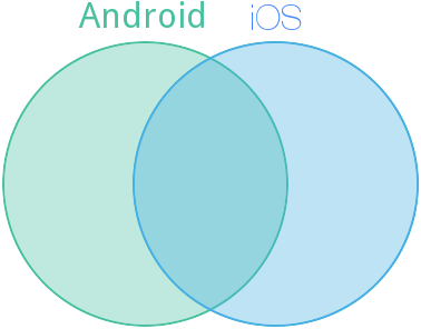
 iOS : tab bar located at the bottom, allows you to go to each of the four to five main screens of the upper level. Each tab is labeled with a signature. The standard and most common approach on this platform.
Android : there is no full-fledged analogue of iOS-like tabs; moreover, there is an explicit indication that navigation elements cannot be located below, because the space there is reserved for the split action bar . On the other hand, the standard tabs still exist: they are located solely on top, they can contain either only a drawing, or only an inscription in capital letters. Should represent a lower level navigation, being an analogue of the mode switch ( segmented control ) from iOS (which has similar recommendations for location, design, and functions).

Conclusion: you should avoid direct transfer of tabs from iOS, on the other hand, tabs / switches can be used when navigating the lower level on all platforms, but for consistency, small changes in appearance are necessary.
')
Back button
Despite the similarity of the location and designation, the "back" button in iOS is closer in behavior to the hardware "back" button in Android than to the software " up ". Unlike iOS, the button should not be explicitly signed; if there is a title, it is shifted to the left.

Navigation Drawer (Hamburger Menu)
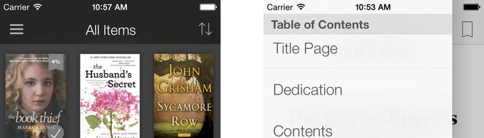
iOS : non-standard, but from no less than the "native" element of the interface. It is a sidebar of the menu, which is shown on the left, as if under the screen of the application. Sometimes there are implementations showing this element on top of the screen. But be that as it may, the ≡ icon (Unicode character U + 2261 Identical To), located in the upper left corner, is used as the opening icon. Another common way to call is to swipe right. The element allows you to save vertical space, holds much more points compared to the usual tab bar, but the extra touch to call the menu becomes a price to pay for it.
With the arrival of iOS 7, the top status bar was not displayed on a separate black bar, but directly on top of the application, without any background. Because of this, designers have to go for some tricks to avoid a sharp transition.
Android : the concept is implemented through a standard library element, it is logical that the same call icon is used. The icon should be displayed on each screen specified in the menu, but a call with a swipe can occur from any screen. The difference is that the pull-down menu is always on top of the main screen, and the top action bar should not overlap.
Conclusion : the element is quite universal, suitable for top-level navigation, it may require some adaptation due to the features of iOS 7.
PS Excellent article with analysis of the main navigation errors in Android.
Source: https://habr.com/ru/post/222021/
All Articles