CSS 3 Timing Functions and what they eat
Hey folks, fasten your seat belts and hold on tight, for the really exciting moment has come: you have to understand the intricacies of the extremely interesting CSS time functions!
Okay, your blood, of course, is hardly boiling away from the subject of this article, but the jokes aside: temporary functions are a kind of hidden gem when it comes to CSS, and it is quite likely that you will be surprised how many interesting things you can do. .
First of all, we need to clearly understand when temporary functions are used in CSS. So, this functionality is designed to work with CSS animation: transitions (transitions) and frame-by-frame animation (keyframes).
About temporal function in CSS
This property is one of the most obscure in CSS animations, while most of the properties in this category are quite self-explanatory. However, its essence is to control and change the speed of the animation: it determines the points of acceleration and deceleration for a specified period of time.
')
With this property, you can achieve a different perception of the user animation speed , while its actual duration remains unchanged. So if you have not decided to run away without thinking, let's go further, because the temporary functions conceal much more interesting than does the dry specification.
Note: the
timing-function property does not exist. Calling this property, in fact, I mean transition-timing-function and animation-timing-function .Before we go further, let's get acquainted with the syntax and see how it fits into the whole process of defining CSS animation. For the sake of simplicity, let's use the CSS transition and write all the transition properties separately:
div { transition-property: background; transition-duration: 1s; transition-delay: .5s; transition-timing-function: linear; } /* This could, of course, be shortened to: */ div { transition: background 1s .5s linear; } The abbreviated transition entry does not have a strict order of values, but requires that the
transition-delay value be after the transition-duration value (not necessarily immediately after). In addition, the transition-duration value is the only one needed to define a function. And since the default values for the other parameters are quite acceptable, to determine the transition you rarely need more than: div { transition: 1s; } /* , : */ div { transition: all 1s 0s ease; } But it's boring. Despite the fact that the default values are enough for some ordinary hover when you are working on something more substantial, the temporary functions are a serious tool for fine-tuning your animations!
Now that you know what temporary functions do, it's time to find out how they do it.
Look under the hood
Many of you have certainly not focused on the valid values of the
timing-function property. So, there are five: ease (default), ease-in , ease-out , ease-in-out and linear . At the same time, these values are just a short record of the definition of a Bezier curve.Uh, what ?!
You may be unfamiliar with this term, but I bet you actually saw the Bezier curve. Damn it, if you used any graphics package, then surely even created it yourself! That's right, because when you use the Pen or Path tool to create a smooth curve, what you get is the Bezier curve! In our case, it is the "magic" of the time function, describing the type of acceleration on the graph.

This Bezier curve corresponds to the value of ease (image belongs to Smashing Magazine)
If your reaction to the first-seen Bezier curve was similar to mine, you probably had a question: how can such a curve be built on four points on the graph at all ?! I can hardly explain it to you in words, but I have a fantastic gif that will help me with this:
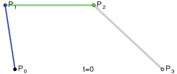
Drawing a Bezier curve (image taken from Wikipedia)
Since this curve is constructed on four points, we call it a cubic (cubic) Bezier curve, in contrast to a quadratic curve (quadratic, on three points) and a fourth-order curve (quartic, on five points).
cubic-bezier() function
But now you will be even more interesting, for I will say that you can set a cubic curve using the
cubic-bezier() function, using it instead of the key values of the timing-function property. I guess you need some time to contain the excitement.With the
cubic-bezier() function, you can manipulate the curve as you like, while setting absolutely any acceleration parameters for your animation! So let's see how this function works and how it allows you to create your own Bezier curves.First, we already know that the cubic curve is built on four points: 0, 1, 2, 3. Secondly, it is important to remember that the first and last points (0 and 3) are already defined on the graph, where the point 0 is always has a value of
0;0 (bottom left), and a point 3 - 1;1 (top right).This condition leaves us with only two points that need to be placed on the chart, and this can be done using the
cubic-bezier() function! It takes four arguments: the first two are the x, y coordinates of the first point; the second two are the x, y coordinates of the second point. transition-timing-function: cubic-bezier(x1, y1, x2, y2); To help you understand the syntax and how this function creates a curve, as well as its physical impact on the animation, I’ll show you the five key values of the
timing-function property, their equivalent for cubic-beizer() and the resulting animation effect.EASE-IN-OUT
Let's start with this key value, since it is probably the easiest to understand the logic of plotting a curve and shifting it to animation now.
/* ease-in-out */ transition-timing-function: cubic-bezier(.42, 0, .58, 1); 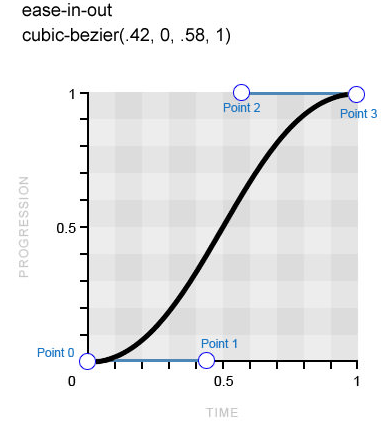
A completely symmetrical Bezier curve, which means that the acceleration and deceleration of the animation will be performed at the same speed (the image belongs to Smashing Magazine)
Point 1 is located at
0,42 on the x axis and on 0 on the y axis, while point 2 is at 0,58 and 1 respectively. The result is a perfectly symmetrical Bezier curve: the acceleration and deceleration of the animation will occur at the same speed. Hence the name of the keyword.Look at the demo and you will see the physical effect of the value of
ease-in-out , compare it with other values.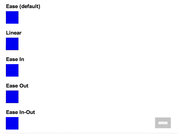
Original Codepen animation
EASE
This key value is the default value of the
timing-function property. In fact, it is very similar to the previous one, although the acceleration of the animation is faster, and the slowdown is more gradual. /* ease */ transition-timing-function: cubic-bezier(.25, .1, .25, 1); 
The
ease curve has a cool start and a much smoother sequel (image belongs to Smashing Magazine)Pay attention to a clearer slope of the curve at the beginning, while the end of the curve is more elongated - this directly has the physical effect of the time function on the animation. When you study all the examples, remember to return to the demonstration at the beginning to compare the effects with each other.
EASE-IN AND EASE-OUT
As it is not difficult to guess, these key values have the opposite meaning.
ease-in smoothly accelerates the animation by developing maximum speed to its completion, while ease-out gradually reduces the initial maximum speed before the end of the animation. Following logic, the key value of ease-in-out , which we looked at earlier, is a great combination of these two Bezier curves. /* ease-in */ transition-timing-function: cubic-bezier(.42, 0, 1, 1); /* ease-out */ transition-timing-function: cubic-bezier(0, 0, .58, 1); 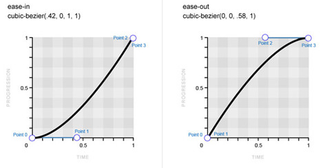
Bezier curves:
ease-in on the left, ease-out on the right (image belongs to Smashing Magazine)LINEAR
The last key value, which generally does not apply to curves. Based on the name, the
timing-function value of the timing-function property sets the same speed for the entire animation, which means that instead of the Bezier curve, we get a straight line. That is, in this case there is no acceleration model for the image on the graph. /* linear */ transition-timing-function: cubic-bezier(0, 0, 1, 1); 
The
linear value means the same speed throughout the entire animation (the image belongs to Smashing Magazine)If you watch the demo again at the beginning, you will surely notice that despite the same overall duration, some of the animations seem slower than the others. Why is this happening? Well, for example, at
ease-in-out beginning and end of the animation is delayed. Therefore, in order to meet the specified duration, in the main part, the animation speed is significantly higher. In view of this behavior, we perceive it both shorter and faster, whereas, for example, linear animation seems to be long and stretched.Perhaps at this point you already have the feeling that this article is too slowly approaching its true nature, so let's move on to the
cubic-bezier() function and create your own temporary functions with its help right now.Creating your own acceleration models using cubic-bezier()
Now that we have learned the key values of the
timing-function property and their corresponding Bezier curves, as well as we have observed their effect on animation, let's learn how to create our own acceleration models using curve manipulations.By now, it is assumed that you already know how to locate points 1 and 2 on the graph using the
cubic-bezier() function, and also clearly understand how this affects the animation. Although, if you do it “blindly,” it is not surprising that this occupation can get bored very quickly.Fortunately, there are people on Earth like Lea Verou who probably won't calm down until coding with CSS becomes even easier! Lee developed the Cubic Bezier app to create her own Bezier curves and compare them with standard ones. So instead of driving
cubic-bezier() tricks back and forth, go to Cubic Bézier , play around with the curve and look at the result. This is much cooler!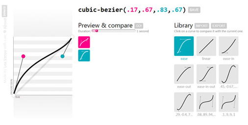
Screenshot of the Cubic Bézier website (image is owned by Smashing Magazine)
At the initial stage, the standard curves of the time function are what is needed, only the differences between them are not so obvious. But as soon as you begin to create your own Bezier curves, you will feel how powerful their influence on the resulting animation can be.
Just take a look at the following examples and notice the significant difference between animations with their same total duration.
Original Codepen animation
Well, now let's look at the very first of the examples above and try to understand how the effect was so different from the rest.
/* cubic-bezier() */ transition-timing-function: cubic-bezier(.1, .9, .9, .1); 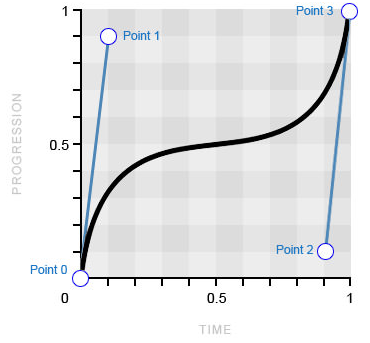
An example of a non-standard Bezier curve (image belongs to Smashing Magazine)
The main difference of this time function from the default values is a sharp deviation of the curve from the “progression” scale (along the y axis). This causes a quick start and end of the animation, but a long pause in the middle (at the point where the curve aligns). This model contrasts sharply with the one to which we are accustomed to the usual temporary functions that use the opposite approach, slowing down the animation at the beginning and end, and not in the middle.
And now let's be creative
Yes, yes: Bezier curves are becoming even more exciting! And who would have thought? In the meantime, the boundaries of imagination expand with the discovery that only the time scale (along the x axis) is limited on the graph from zero to one, while the scale of the progression (along the y axis) can go beyond it as well as above. .
The scale of the progression is exactly what you think: the lower end (0) is the beginning of the animation, and the upper end (1) is the end. As a rule, a cubic Bezier curve always follows from below upwards on a given scale with different intensity until it reaches the end point of the animation. Nevertheless, the ability to locate points 1 and 2 outside the interval 0-1 allows the curve to go beyond its limits, which causes movement in the opposite direction! As usual, the best way to understand this is to look:
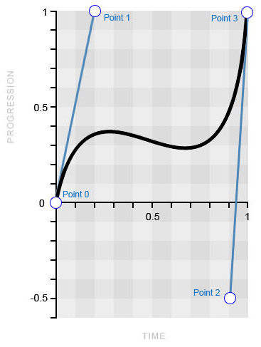
Bezier curve with values outside
0-1 (image belongs to Smashing Magazine)Point 2 is located outside the usual
0-1 interval at -0,5 , which in turn pulls the curve down. Check out the following demo and see the “bounce” effect in the middle of the animation.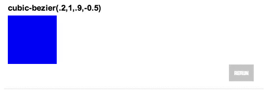
Original Codepen animation
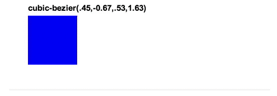
Conversely, you could put this “movement back” at the beginning of the animation, and also make the curve “run out” a little for the intended end point. Imagine taking a few steps back for a run; then, at the end, you rush past the finish line, as a result of which you have to return a little to find out the time shown by the chronometer. See an example to really understand what is being said. Also, look at the Bezier curve that creates this effect.
Original Codepen animation
Bezier curve with values outside
0-1 (image belongs to Smashing Magazine)You should now have a very clear idea of how
cubic-bezier() values beyond 0-1 can physically affect the behavior of the animation. Of course, we can stare at the moving cubes all day, but let's finish this section with an example that will clearly show the inventive approach in using the time function.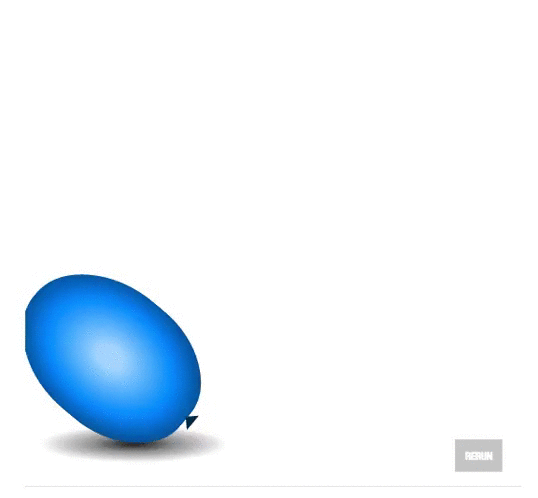
Original Codepen animation
That's right: we are animating a balloon! What? .. Is this what you always wanted to do with CSS?
The essence of the animation in the "inflation" of the ball by clicking in such a way that it will fly up to the "ceiling" and slightly bounce off of it, as if it were real. The value of
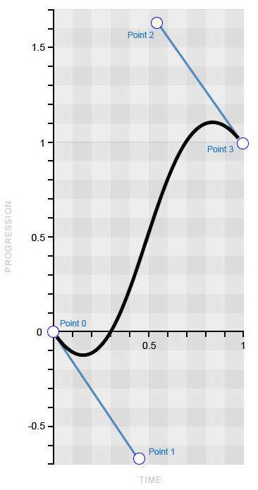
cubic-bezier() abroad 0-1 is the tool that will allow us to create this “rebound” effect, repeating realistic behavior. In the presented code snippet, the coordinates shown in the cubic-bezier() function are shown, and the resulting curve is shown below. /* The cubic-bezier() values for the bouncing balloon */ transition-timing-function: cubic-bezier(.65, 1.95, .03, .32); 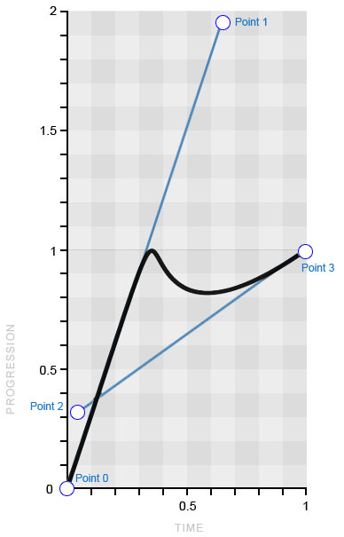
Bezier curve, emulating "bouncing" ball (image belongs to Smashing Magazine)
This example perfectly shows how the curve transforms into the final animation, because the curve reflects it almost perfectly. First, the curve passes from the beginning of the scale of the progression in a straight line, causing the ball to move from its beginning to the end with the same speed. Then, like a slowing ball, the curve sharply bends in the opposite direction before starting to gradually return to the top. In fact, everything is very simple!
So as soon as you master the curve and the art of manipulating it, you will be a good girl!
Temporary functions and frame by frame animation CSS
Before we go further, we should mention the behavior of temporary functions when using them in frame-by-frame animation. The general meaning is the same (in comparison with transitions [transition]), however there is one exception that you should remember: when you apply a temporary function to several frames, it is performed on every single frame , rather than throughout the entire animation.
That is, if you have four frames that move a square from one corner to another inside the container, and you apply a temporary function with a “bounce” (the same as we used for the ball), each of the four movements will be subject to this “rebound” "Rather than the whole animation. Let's see this behavior in action and in code.
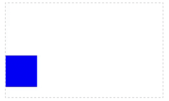
Original animation on Codepen (gif turned out to be crooked)
@keyframes square { 25% { top:200px; left:0; } 50% { top:200px; left:400px; } 75% { top:0; left:400px; } } div { animation: square 8s infinite cubic-bezier(.65, 1.95, .03, .32); top: 0; left: 0; /* Other styles */ } Note that when the frame is
100% undefined, the element simply returns to its initial state. In this case, this is what we need, so we will not define this frame. From the example it is quite clear how the time function works on all four frames by the way the square on each of them bounces off the walls of the frame.If for any particular frame you need to define your own time function, then define it directly in the code of this frame, as shown in the following example:
@keyframes square { 50% { top: 200px; left: 400px; animation-timing-function: ease-in-out; } } Time function steps()
Did you think that our adventures are over on this? No matter how wrong! I already told you that CSS is not limited to the built-in temporary functions!
In this section, we will explore the concept of “step-by-step” functions and replace the curves with straight lines using the
steps function.This feature is very useful, despite its specificity. It allows you to split the animation into segments, which will distinguish it from the usual animated movement. For example, if we need to move a square 400 pixels to the right in 4 steps within 4 seconds, then instead of a smooth movement, it will “jump” 100 pixels every second. Now let's take a look at the code for this example. It must be just a whiff of freshness after immersing in the subtleties of the
cubic-bezier() function!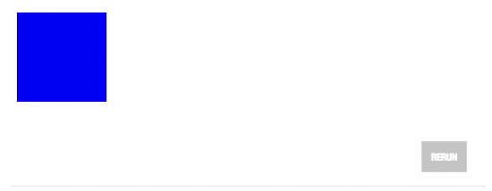
Original Codepen animation
div { transition: 4s steps(4); } div:target { left: 400px; } As you can see, the whole thing is in determining the number of segments of the animation. But keep in mind that it cannot be a negative or decimal number. There is also a second, optional, argument, the possible values of which are
start and end (the latter is the default value). transition-timing-function: steps(4, start); transition-timing-function: steps(4, end); The start value starts the animation at the beginning of each step, and the end at the end. In relation to the "moving square", this picture will help to better explain the difference between these two values.
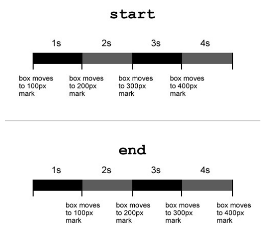
The difference in the
start and end values of the steps() function (image belongs to Smashing Magazine)As you can see, with the
start value, the animation starts immediately, and at end - with a delay of one (in this case) second.Well, for the sake of greater comprehensiveness of the material, we note that the
step() function has two predefined arguments: step-start and step-end , equivalent to the steps(1, start) and steps(1, end) entries steps(1, end) respectively.Inventive approach to "step-by-step" functions
Surely, from everyday tasks, you will hardly ever be able to drop the animation of a moving square, however, using the
steps() function, you can make a lot of other cool things. Suppose if you have several cartoon sprites at your disposal, then you can use the technique you have already learned to create animation using just a couple of CSS properties! Let's look at the demo and code.
Original Codepen animation
div { width: 125px; height: 150px; background: url(images/sprite.jpg) left; transition: 2s steps(16); /* The number of steps = the number of frames in the cartoon */ } div:target { background-position: -2000px 0; } So, we have a rectangle 125 pixels wide with a background image of 2,000 pixels containing 16 frames. , , , — , 16 «» . «» ,
steps() 16 , . - CSS !
, «» ( Smashing Magazine)
steps() ( ?), . .
Original Codepen Animation
To begin with, you need some text. And also, unfortunately, you need to know how many characters it contains, for you will have to use this amount in CSS. Another condition: the font must be monospaced so that all characters have the same width.
<p>smashingmag</p> .text { width: 6.6em; width: 11ch; /* Number of characters */ border-right: .1em solid; font: 5em monospace; } Our text consists of 11 characters. We specify the length of the line using the unit of measure
ch, and for browsers that do not have its support, we write another value. Next, on the right side of the line, we put a black frame, which will become the cursor. And now that everything is in place, we only need to animate the text, and this is extremely simple.We need two separate animations: one for the cursor, the other for printing. To make the cursor, you just need to make the black frame blink.
@keyframes cursor { 50% { border-color: transparent; } } .text { /* existing styles */ animation: cursor 1s step-end infinite; } As expected, the frame simply changes its color from black to transparent and back. In this case, the function
steps()has a certain meaning: remove it, and the cursor, instead of "blinking", will smoothly appear and disappear.Finally, typing animation is just as simple. All we need to do is to reduce the length of the string to zero, and then gradually build it up over 11 steps (by the number of characters).
@keyframes typing { from { width: 0; } } .text { /* existing styles */ animation: typing 8s steps(11), cursor 1s step-end infinite; } «» , «» (
border-right ) . , ., — .
from to animation-fill-mode forwards , , «» (. . ), «». .
Codepen
<div id="go"> <p class="text">smashingmag</p> </div> @-webkit-keyframes typing { to { width: 0; } } @keyframes typing { to { width: 0; } } @-webkit-keyframes cursor { 50% { border-color: transparent; } } @keyframes cursor { 50% { border-color: transparent; } } .text { width: 6.6em; width: 11ch; /* Number of characters */ border-right: .1em solid; overflow: hidden; font: 5em monospace; margin-top: 50px; -webkit-animation: cursor 1s step-end infinite; animation: cursor 1s step-end infinite; } #go:target .text { -webkit-animation: typing 4s steps(11) forwards, cursor 1s step-end infinite; animation: typing 4s steps(11) forwards, cursor 1s step-end infinite; } , , , , . , . ,
steps() , CSS ., CSS, CSS . , .
CSS TRANSITIONS
| Internet Explorer | Not | 10+ |
| Firefox | 4+ ( -moz- ) | 16+ |
| Chrome | 4+ ( -webkit- ) | 26+ |
| Safari | 3.1+ ( -webkit- ) | 6.1+ |
| Opera | 10.5+ ( -o- prefix) | 12.1+ |
, , -
-webkit- . , , , -moz- -o- .CSS
| Internet Explorer | Not | 10+ |
| Firefox | 5+ ( -moz- ) | 16+ |
| Chrome | 4+ ( -webkit- ) | Not supported |
| Safari | 4+ ( -webkit- ) | Not supported |
| Opera | 12 ( -o- prefix), 15+ ( -webkit- prefix) | 12.1 ( WebKit) |
, - , , , .
Total
CSS? .
- ,
- ,
- «» cubic-bezier(), 0-1
- /
, - , CSS 3, . : , , , , , .
! !
Source: https://habr.com/ru/post/220715/
All Articles