How we increased conversion
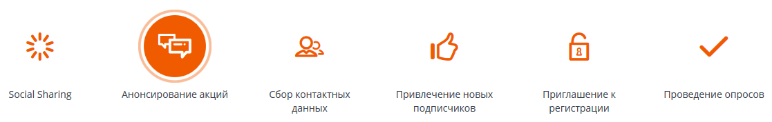
Hello friends. We are a small young startup Witget.com , creating the designer of conversion enhancement tools. This is all a variety, including, but not limited to, application forms or contact collection, special offers, banners, various pop-up windows, callback forms and much more.
We would like to share some of our first user cases from the experience of using our products by enthusiastic customers. In this article there are only four, although in reality there are several dozen. We did not become wise when choosing which ones to talk about, and took those that seem most popular to us.
Immediately I would like to note that this article is not intended for Internet marketing gurus and advanced webmasters, because surely they will not find anything new or interesting for themselves. Described below is open and understood by professionals a long time ago. It is rather for those who are taking the first steps in this direction and would like to expand their horizons by learning from the experience of others or sharing their, as a rule, not very rich experience. So please do not throw stones at us like “trivially”, “have not seen and done this” and so on, because we do not pretend to the discovery of America.
')
We addressed our customers with questions. And what are the needles? What is it, witget of a dream? Most of our clients answered us in a small survey. But not everyone could describe the wittht of their dreams.
Opinions were:
"The perfect wittzhet is the one that gives the maximum conversion to the target action."
"A beautiful window with fields for contacts."
"Beautiful such =)"
“Whitt of my dream is whit of my buyer’s dream.”
"The description is very simple: the one that is guaranteed to raise the conversion :)"
Receiving such answers, we understood that the client has a problem, but we have to offer a solution ourselves.
That is why we took up the analysis of specific common problems that arose at once among several of our clients in order to offer the perfect solution.
Problem and solution number 1
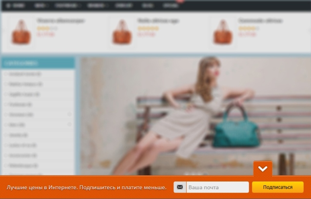
Who: A content site that actively attracts subscribers.
Problem and wishes: Clients did not want to use pop-up windows, understanding that they can both play for the benefit and become an annoying factor. In addition, the witth should be on all pages of the site so that the visitor can subscribe at any time when he realizes that he really needs it when the confidence in the site and content is high. Also the whitelled should be concealed so as not to distract those who have already signed up. On the website, the form at the first call is open, so that the subscriber can perform the target action in literally 1-2 clicks.
Solution: Since the pop-up windows were rejected, we suggested a solution in the form of dynamic flora in a bright design (the color of the flora and the buttons can be changed). Flor "glued" to the bottom of the page, without overlapping the main content of the site. In this case, you can subscribe to the newsletter in 2 steps: by entering the e-mail and clicking on the button. If desired, the flora can be hidden by clicking on the arrow, and expanding, also by clicking on it.
The disadvantages of the solution are that it is not yet possible to replace the collection of e-mail with a telephone, and also the color change of the yellow button has not yet been implemented, which limits the choice of colors. But we are working on it!
Problem and solution number 2
Who: Commercial site that makes sales through the phone
Problem and wishes: It is necessary to draw attention to the phone, specifying what preferences the customer will receive from the call. Whitet should be noticeable, but not intrusive. If desired, it can be removed from the field of view, but you can make a “cross” or other element for hiding less obvious and noticeable.
Solution: We created a witget tag that is attached to the bottom of the screen and depicts a girl with a sign. On the plate you can place any motivating text, as well as a phone number, the essence of the action, work time, etc. You can close the screen by clicking on the “cross”, which is visible on the right side of the screen and appears only when you hover on the screen. The whole page is clickable, so you can lead the user to a promotion page, a contact page, etc. A customer can use a unique (only for this promotion) phone number in a vitge to measure the effectiveness of an advertising message. You can also measure performance by clicking on the landing page.

Problem and solution number 3
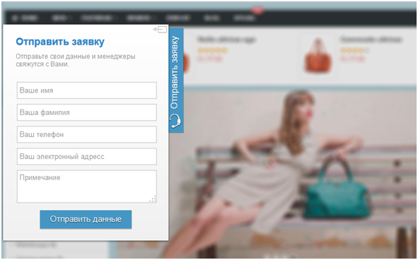
Who: Commercial site that collects applications for the provision of services through the site
Problem and wishes: The client’s problem is that the company provides rather complex services, which, among other things, differ greatly in cost. The visitor on the site can not put services in the basket and pay for it due to the multifactorial nature of the price. Therefore, the scheme of work with the visitor is as follows: he finds out on the site about typical services, leaves a request, by phone or e-mail. Managers must promptly receive applications for communication with a potential client, as the market is fairly high in competition.
Solution: We created a witget tag that is attached to the left side of the screen. In closed form, the site visitor sees the call "Leave an application", but the form is closed. Thus, the Witget does not distract from acquaintance with the content, but always at the ready. When disclosing a form, a site visitor may get acquainted with the title, description (why he needs to fill out the form) and a list of fields to fill out. Optionally, the site owner can select the fields to display, which is very convenient. After all, as you know, every extra field reduces the conversion to filling out the form entirely by 10%.
After filling in the application form closes, giving the opportunity to the site visitor to continue working with content.
The completed data is immediately sent to the mail manager, who proceeds to the processing of the application.
However, the solution has a small drawback. It can not be "collapse", but you can only "close". Therefore, the repeated call of the label girl is not yet implemented.
Problem and solution number 4
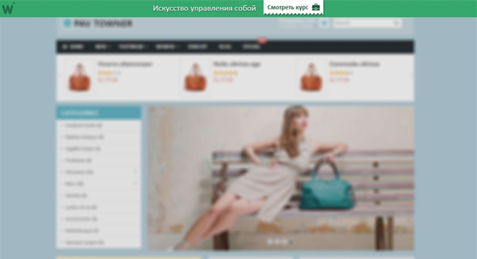
Who: Commercial site of the agency, where sales take place through webinars
Problem and wishes: The client’s problem is that he needs to announce a free webinar every month. Webinars are the main sales channel for the customer. It is necessary to make sure that every visitor immediately saw the information about the upcoming webinar, could, if desired, read the detailed description. However, the call should not be intrusive. The message must be constant, i.e. pop-up window is absolutely not suitable.
Solution: We created a witth-topper, which is located at the top of the screen above the site, i.e. does not cover the content. In this case, the strip can be arranged so that it coincides with the design of the site, thus, the visitor perceives it as part of the top menu. Topper is visible on any page of the site. One of the interesting properties of the topper, that when scrolling and viewing the page down, it seems to “stick” to the top edge of the monitor, which allows the visitor to access it as needed. But at the same time, the topper does not interfere with the perception of content, and therefore does not cause irritation and does not affect the bounce rate.
A brief announcement of the event can be posted on the vitzhet: “April 28 - a free webinar“ 10 tips on creating a landing page ”- and the“ Register ”button.
By button, the visitor goes to a more complete description.
One of the drawbacks of our decision is that the topper is demonstrated at each entry of the visitor, even if he has already taken advantage of the offer, i.e. committed target action. Therefore, in the near future plans to listen to the settings of this cuff so that a) it is possible to hide the topper, b) it will be possible not to show it to those who have already contacted it, c) show it to those who have already been in contact with this cuff, another one. For example, one that will remind you that “you are enrolled in a webinar on April 28th. Before the start there are 3 days left! Do not forget!"
Do you have any stories when you managed to solve some business problem with the help of the whiters or other additions to the site?
We would like to share some of our first user cases from the experience of using our products by enthusiastic customers. In this article there are only four, although in reality there are several dozen. We did not become wise when choosing which ones to talk about, and took those that seem most popular to us.
Immediately I would like to note that this article is not intended for Internet marketing gurus and advanced webmasters, because surely they will not find anything new or interesting for themselves. Described below is open and understood by professionals a long time ago. It is rather for those who are taking the first steps in this direction and would like to expand their horizons by learning from the experience of others or sharing their, as a rule, not very rich experience. So please do not throw stones at us like “trivially”, “have not seen and done this” and so on, because we do not pretend to the discovery of America.
')
We addressed our customers with questions. And what are the needles? What is it, witget of a dream? Most of our clients answered us in a small survey. But not everyone could describe the wittht of their dreams.
Opinions were:
"The perfect wittzhet is the one that gives the maximum conversion to the target action."
"A beautiful window with fields for contacts."
"Beautiful such =)"
“Whitt of my dream is whit of my buyer’s dream.”
"The description is very simple: the one that is guaranteed to raise the conversion :)"
Receiving such answers, we understood that the client has a problem, but we have to offer a solution ourselves.
That is why we took up the analysis of specific common problems that arose at once among several of our clients in order to offer the perfect solution.
Problem and solution number 1
Who: A content site that actively attracts subscribers.
Problem and wishes: Clients did not want to use pop-up windows, understanding that they can both play for the benefit and become an annoying factor. In addition, the witth should be on all pages of the site so that the visitor can subscribe at any time when he realizes that he really needs it when the confidence in the site and content is high. Also the whitelled should be concealed so as not to distract those who have already signed up. On the website, the form at the first call is open, so that the subscriber can perform the target action in literally 1-2 clicks.
Solution: Since the pop-up windows were rejected, we suggested a solution in the form of dynamic flora in a bright design (the color of the flora and the buttons can be changed). Flor "glued" to the bottom of the page, without overlapping the main content of the site. In this case, you can subscribe to the newsletter in 2 steps: by entering the e-mail and clicking on the button. If desired, the flora can be hidden by clicking on the arrow, and expanding, also by clicking on it.
The disadvantages of the solution are that it is not yet possible to replace the collection of e-mail with a telephone, and also the color change of the yellow button has not yet been implemented, which limits the choice of colors. But we are working on it!
Problem and solution number 2
Who: Commercial site that makes sales through the phone
Problem and wishes: It is necessary to draw attention to the phone, specifying what preferences the customer will receive from the call. Whitet should be noticeable, but not intrusive. If desired, it can be removed from the field of view, but you can make a “cross” or other element for hiding less obvious and noticeable.
Solution: We created a witget tag that is attached to the bottom of the screen and depicts a girl with a sign. On the plate you can place any motivating text, as well as a phone number, the essence of the action, work time, etc. You can close the screen by clicking on the “cross”, which is visible on the right side of the screen and appears only when you hover on the screen. The whole page is clickable, so you can lead the user to a promotion page, a contact page, etc. A customer can use a unique (only for this promotion) phone number in a vitge to measure the effectiveness of an advertising message. You can also measure performance by clicking on the landing page.
Problem and solution number 3
Who: Commercial site that collects applications for the provision of services through the site
Problem and wishes: The client’s problem is that the company provides rather complex services, which, among other things, differ greatly in cost. The visitor on the site can not put services in the basket and pay for it due to the multifactorial nature of the price. Therefore, the scheme of work with the visitor is as follows: he finds out on the site about typical services, leaves a request, by phone or e-mail. Managers must promptly receive applications for communication with a potential client, as the market is fairly high in competition.
Solution: We created a witget tag that is attached to the left side of the screen. In closed form, the site visitor sees the call "Leave an application", but the form is closed. Thus, the Witget does not distract from acquaintance with the content, but always at the ready. When disclosing a form, a site visitor may get acquainted with the title, description (why he needs to fill out the form) and a list of fields to fill out. Optionally, the site owner can select the fields to display, which is very convenient. After all, as you know, every extra field reduces the conversion to filling out the form entirely by 10%.
After filling in the application form closes, giving the opportunity to the site visitor to continue working with content.
The completed data is immediately sent to the mail manager, who proceeds to the processing of the application.
However, the solution has a small drawback. It can not be "collapse", but you can only "close". Therefore, the repeated call of the label girl is not yet implemented.
Problem and solution number 4
Who: Commercial site of the agency, where sales take place through webinars
Problem and wishes: The client’s problem is that he needs to announce a free webinar every month. Webinars are the main sales channel for the customer. It is necessary to make sure that every visitor immediately saw the information about the upcoming webinar, could, if desired, read the detailed description. However, the call should not be intrusive. The message must be constant, i.e. pop-up window is absolutely not suitable.
Solution: We created a witth-topper, which is located at the top of the screen above the site, i.e. does not cover the content. In this case, the strip can be arranged so that it coincides with the design of the site, thus, the visitor perceives it as part of the top menu. Topper is visible on any page of the site. One of the interesting properties of the topper, that when scrolling and viewing the page down, it seems to “stick” to the top edge of the monitor, which allows the visitor to access it as needed. But at the same time, the topper does not interfere with the perception of content, and therefore does not cause irritation and does not affect the bounce rate.
A brief announcement of the event can be posted on the vitzhet: “April 28 - a free webinar“ 10 tips on creating a landing page ”- and the“ Register ”button.
By button, the visitor goes to a more complete description.
One of the drawbacks of our decision is that the topper is demonstrated at each entry of the visitor, even if he has already taken advantage of the offer, i.e. committed target action. Therefore, in the near future plans to listen to the settings of this cuff so that a) it is possible to hide the topper, b) it will be possible not to show it to those who have already contacted it, c) show it to those who have already been in contact with this cuff, another one. For example, one that will remind you that “you are enrolled in a webinar on April 28th. Before the start there are 3 days left! Do not forget!"
Do you have any stories when you managed to solve some business problem with the help of the whiters or other additions to the site?
Source: https://habr.com/ru/post/220699/
All Articles