Common Web Designer Mistakes or How to Please the Layout Designer
In this post we will discuss the mistakes that designers make in layouts designed for layout. Consider the most common problems faced by the coder when working with psd layouts. If you are a designer, and you often have to transfer your design into the hands of colleagues, then perhaps this post will help you to better understand what troubles the layout designers have and avoid some mistakes in the future, for which colleagues will be very grateful to you.
First of all, I’ll note that here I’ll look at the technical aspects of preparing layouts and in no case will I teach designers how to do their work. The ground for writing the post was a three-year experience in a web studio.
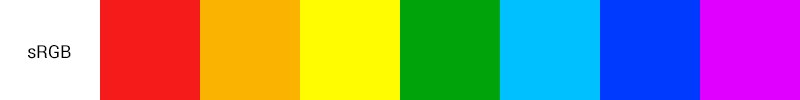
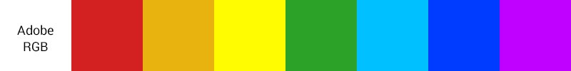
The problem with color profiles most often arises due to the lack of understanding of the designer, what is a color profile and how to choose it. The most common profiles are Adobe RGB (1998) and sRGB IEC61966-2.1 (hereinafter referred to simply as sRGB), which you can read about, for example, here .
For the web, the sRGB profile is usually used - it is the default profile, for example, in Windows. This means that we see the image on the screen in colors defined by the sRGB standard IEC61966-2.1. The difference between Adode RGB and sRGB is the width of the color spectrum.
')
What is the problem? The designer, creating a new project in Photoshop, does not indicate the color profile, and, as a result, Photoshop leaves the default value - Adode RGB. In turn, the layout designer, having received the layout, cuts it, and at some point notices that the colors in the layout and on the page are different by several tones.
What happened? Even at the stage of saving the cut images, the layout designer used the remarkable feature Save for Web & Devices, which by default converts the image to sRGB. As a result, we see some colors in the Photoshop workspace and completely different colors on the finished site.
For one customer, a slight difference in the background color on the site may be uncritical, while for another it is a cause for scandal. I think there will be people who had to completely redo the design or layout because of such an omission as a forgotten color profile.
Problem solving - always at the beginning of work to make sure that the correct profile is established.
Installing guides - it would seem a simple matter. But even here there are problems. Inattentive maker-up, using the guides set by the designer, cuts images and gets something like this at the output:
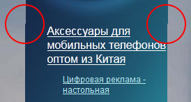
Why did this happen? On closer examination, it can be seen that the guides themselves do not become attached to the pixel boundaries, respectively, when the designer puts the guide "by eye", then, most likely, it will not fall exactly between the pixels.
The selection, on the contrary, binds to the pixels:
Even if the layout designer was attentive and noticed this, the question still arises: where did the designer still want to put the guide - to the left or to the right?
Simple advice on how to avoid this problem: first perform the selection, and then set the guide to the selection line.
The typesetter needs to give exactly the layout prepared for the layout, and not the working draft weighing under 100 MB.
What does “prepared for layout” mean?
Let's return to the problems with colors. For elements that are designed to have the same color of the border / fill / font, you must specify, as you might guess, the same color in the blending parameters, character properties, etc.
What kind of nonsense? And so it is clear that the color is the same.
But not when, for example, the color of one inscription differs from the other by only half a tone. Picky customer can easily spoil the coder who chose the wrong version of the two possible, the mood before the end of the day, if you notice this difference. And the designer in fact will have nothing to do with it.
Advice to designers: use palettes or in any way prepared sets of colors to avoid controversy.
Gone are the days of layout of the rounded corners with pictures. Every self-respecting browser is able to round corners with the help of CSS-properties
But sometimes there are design layouts in which rounds are “not completely rounded.” What does it mean? Just the designer at some point changed the size of his rounded rectangle using the Transform function, changing its proportions. As a result, the corners were not rounded at all, but “oval”.
Of course, the layout designer will not cut the block into pictures because of this. But it speaks of the inappropriate attitude of the designer to work.
Having solved the issue of cornering, the coder again faced the problem:
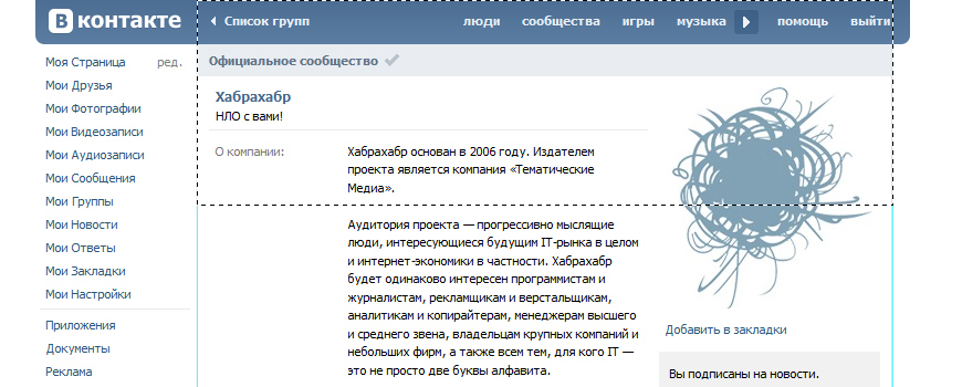
When it comes to pixel-perfect layout, such inaccuracies in the design can cause a lot of trouble to the coder. In this case, the left edge of the block has a fuzzy border, and because of this it is impossible to accurately determine the width of the block.
To prevent blurring of the borders of shapes in Photoshop 13 there is a special option “align edges”.
Most often on the web we have to deal with pixels. In most cases, there is no reason to use any other units of measurement, such as points, inches, and so on. It is desirable that the designer set pixels in the settings of Photoshop as the main unit of measurement.
As in the case of colors, for the design of text blocks, the designer should adhere to strictly fixed size values. For each paragraph, you must uniquely specify the size and leading.
If you change the size of the text using Transform, then the pin or other properties of the symbol can then take a fractional value (for example, 14.5 px). When preparing a layout for layout, it is imperative that all dimensions be converted to integer values. Otherwise, there will again be a dilemma before the coder: 14 or 15 pixels?
As for the line off (alignment), the designer should remember: browsers fully support only 3 options: left, right or center. The switch on the format in the browser is often very different from what we see in Photoshop.
Every designer should know at least a little bit about what features modern browsers have. This knowledge can greatly facilitate the life of both the designer and the coder.
Let's see which layer styles in Photoshop have full or partial ability to implement using CSS (without using pictures):

You can find out about browser support for one or another property here .
It is worth remembering: browsers do not support any of the blending modes, such as Overlay, Screen, etc. This must be taken into account and if necessary, dispense with the normal blending mode in combination with transparency and gradients.
This article has reviewed some of the nuances of preparing a psd layout for the layout designer. I hope someone will get something new out of it for themselves or simply find in it a reason to remind their designers of simple rules, sticking to which they are considered pedants in a good sense of the word, and their work will strike with accurate execution.
First of all, I’ll note that here I’ll look at the technical aspects of preparing layouts and in no case will I teach designers how to do their work. The ground for writing the post was a three-year experience in a web studio.
1. Color profile
The problem with color profiles most often arises due to the lack of understanding of the designer, what is a color profile and how to choose it. The most common profiles are Adobe RGB (1998) and sRGB IEC61966-2.1 (hereinafter referred to simply as sRGB), which you can read about, for example, here .
For the web, the sRGB profile is usually used - it is the default profile, for example, in Windows. This means that we see the image on the screen in colors defined by the sRGB standard IEC61966-2.1. The difference between Adode RGB and sRGB is the width of the color spectrum.
')
What is the problem? The designer, creating a new project in Photoshop, does not indicate the color profile, and, as a result, Photoshop leaves the default value - Adode RGB. In turn, the layout designer, having received the layout, cuts it, and at some point notices that the colors in the layout and on the page are different by several tones.
What happened? Even at the stage of saving the cut images, the layout designer used the remarkable feature Save for Web & Devices, which by default converts the image to sRGB. As a result, we see some colors in the Photoshop workspace and completely different colors on the finished site.
For one customer, a slight difference in the background color on the site may be uncritical, while for another it is a cause for scandal. I think there will be people who had to completely redo the design or layout because of such an omission as a forgotten color profile.
Problem solving - always at the beginning of work to make sure that the correct profile is established.
2. Guides
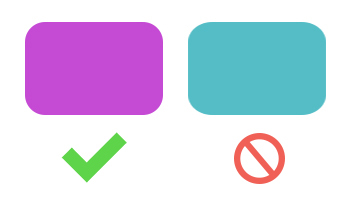
Installing guides - it would seem a simple matter. But even here there are problems. Inattentive maker-up, using the guides set by the designer, cuts images and gets something like this at the output:
Why did this happen? On closer examination, it can be seen that the guides themselves do not become attached to the pixel boundaries, respectively, when the designer puts the guide "by eye", then, most likely, it will not fall exactly between the pixels.
The selection, on the contrary, binds to the pixels:
Even if the layout designer was attentive and noticed this, the question still arises: where did the designer still want to put the guide - to the left or to the right?
Simple advice on how to avoid this problem: first perform the selection, and then set the guide to the selection line.
3. Groups, layers, masks
The typesetter needs to give exactly the layout prepared for the layout, and not the working draft weighing under 100 MB.
What does “prepared for layout” mean?
- Groups and layers are named: it is desirable to name the main design elements in accordance with their purpose (preferably in Latin)
- If there are grouped layers, then the grouping is performed in accordance with the logical structure of the page:
header, content, banner, button, list, etc., and nesting does not exceed reasonable limits, and it is better to avoid nesting groups altogether. - Hidden, but not playing any role in the design layers should be removed
- Cropping photos (rounding corners, etc.) should be done while preserving the original images - it is best to do this with masks
- The size of the canvas should correspond to the maximum possible width / height of the design.
4. Colors
Let's return to the problems with colors. For elements that are designed to have the same color of the border / fill / font, you must specify, as you might guess, the same color in the blending parameters, character properties, etc.
What kind of nonsense? And so it is clear that the color is the same.
But not when, for example, the color of one inscription differs from the other by only half a tone. Picky customer can easily spoil the coder who chose the wrong version of the two possible, the mood before the end of the day, if you notice this difference. And the designer in fact will have nothing to do with it.
Advice to designers: use palettes or in any way prepared sets of colors to avoid controversy.
5. Transformations, figures
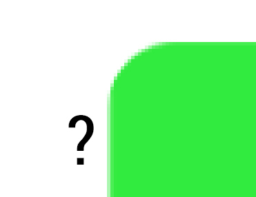
Gone are the days of layout of the rounded corners with pictures. Every self-respecting browser is able to round corners with the help of CSS-properties
border-radius , which is what designers use.But sometimes there are design layouts in which rounds are “not completely rounded.” What does it mean? Just the designer at some point changed the size of his rounded rectangle using the Transform function, changing its proportions. As a result, the corners were not rounded at all, but “oval”.
Of course, the layout designer will not cut the block into pictures because of this. But it speaks of the inappropriate attitude of the designer to work.
Having solved the issue of cornering, the coder again faced the problem:
When it comes to pixel-perfect layout, such inaccuracies in the design can cause a lot of trouble to the coder. In this case, the left edge of the block has a fuzzy border, and because of this it is impossible to accurately determine the width of the block.
To prevent blurring of the borders of shapes in Photoshop 13 there is a special option “align edges”.
6. Units, symbols, paragraphs
Most often on the web we have to deal with pixels. In most cases, there is no reason to use any other units of measurement, such as points, inches, and so on. It is desirable that the designer set pixels in the settings of Photoshop as the main unit of measurement.
As in the case of colors, for the design of text blocks, the designer should adhere to strictly fixed size values. For each paragraph, you must uniquely specify the size and leading.
If you change the size of the text using Transform, then the pin or other properties of the symbol can then take a fractional value (for example, 14.5 px). When preparing a layout for layout, it is imperative that all dimensions be converted to integer values. Otherwise, there will again be a dilemma before the coder: 14 or 15 pixels?
As for the line off (alignment), the designer should remember: browsers fully support only 3 options: left, right or center. The switch on the format in the browser is often very different from what we see in Photoshop.
7. Overlay options, layer styles
Every designer should know at least a little bit about what features modern browsers have. This knowledge can greatly facilitate the life of both the designer and the coder.
Let's see which layer styles in Photoshop have full or partial ability to implement using CSS (without using pictures):
- Shadows and Glow (internal and external)
text-shadow- shadow for textbox-shadow- block shadow - Stroke
border- line strokebox-shadow- single pixel shadow stroke is possibleoutline- strictly rectangular stroke - Fill
background-color- fill color (possibly translucent)background-image- fill pattern / picturebackground-image: linear-gradient()- linear gradientbackground-image: radial-gradient()- radial gradient - Transparency
opacity- the transparency of the entire element[color:] rgba(r,g,b,a)is the transparency of the rgb color, where a is the opacity from 0 to 1[color:] hsla(h,s,l,a)is the transparency of the hsl color, where a is the degree of opacity from 0 to 1
You can find out about browser support for one or another property here .
It is worth remembering: browsers do not support any of the blending modes, such as Overlay, Screen, etc. This must be taken into account and if necessary, dispense with the normal blending mode in combination with transparency and gradients.
Summarizing
This article has reviewed some of the nuances of preparing a psd layout for the layout designer. I hope someone will get something new out of it for themselves or simply find in it a reason to remind their designers of simple rules, sticking to which they are considered pedants in a good sense of the word, and their work will strike with accurate execution.
Source: https://habr.com/ru/post/220681/
All Articles