Plan-fact, dynamics and profits in one diagram with R
Every time when the financial results of the past year are summed up and the corresponding presentation is being prepared, people are puzzled how to fit the main figures on a single diagram. Whatever the field of activity of the organization, summing up, as a rule, begins with an analysis of the main financial indicators, separately for each of the business areas:
Professionals familiar with R can use ggplot2 to programmatically build the desired diagram, such as here. For example, the figures for 2012 are taken from the annual report of Unilever. The targets are not public data, so I had to invent them from the head, setting, for certainty, at the level of "last year + 5%."
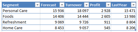
The original figures are in Excel and look like this (data in millions of euros):
The diagram constructed in RStudio looks as follows:

Check the diagram for intuitiveness, and without looking at the numbers, suppose which indicator corresponds to which element of the diagram, and the explanations will be further.
The idea is that the main parameter — Turnover — is shown in the form of color-filled columns, last year’s figure (LastYear) —as a contour that is visually behind, planned figures (Forecast) in the form of slats, and profitability (more precisely, the opposite value - costs) - a small mark.
To read data from Excel, use the XLConnect package. From the Excel file, from the specified sheet, the named table is loaded into R.
The colors for the chart are taken from the Unilever corporate color table.
So code
Baseline: Univeler Annual Report and Accounts 2012 , page 92.
- turnover in the year ended (actual figures);
- previously established plans for the past year (for review of implementation);
- turnover a year earlier (to understand the dynamics);
- profitability.
Professionals familiar with R can use ggplot2 to programmatically build the desired diagram, such as here. For example, the figures for 2012 are taken from the annual report of Unilever. The targets are not public data, so I had to invent them from the head, setting, for certainty, at the level of "last year + 5%."
The original figures are in Excel and look like this (data in millions of euros):
The diagram constructed in RStudio looks as follows:
Check the diagram for intuitiveness, and without looking at the numbers, suppose which indicator corresponds to which element of the diagram, and the explanations will be further.
The idea is that the main parameter — Turnover — is shown in the form of color-filled columns, last year’s figure (LastYear) —as a contour that is visually behind, planned figures (Forecast) in the form of slats, and profitability (more precisely, the opposite value - costs) - a small mark.
To read data from Excel, use the XLConnect package. From the Excel file, from the specified sheet, the named table is loaded into R.
The colors for the chart are taken from the Unilever corporate color table.
So code
require(XLConnect) require(data.table) require(ggplot2) require(scales) indata <- readTable(loadWorkbook("Unilever.xlsx"), sheet = "FinResults", table = "Unilever2012", useCachedValues = TRUE) finreport <- data.table(indata)[, list( Segment = reorder(Segment, -Turnover), Cost = (Turnover - Profit), Forecast, Turnover, LastYear )] turnover_format = function(...){ function(x) paste("€B ", format(x/1000, ..., nsmall = 1L, scientific = FALSE, trim = TRUE)) } chart <- ggplot(finreport, aes(x = Segment)) + geom_bar(aes(y = LastYear), stat = "identity", color = "#004976", fill = "white", width = 0.9) + geom_bar(aes(y = Turnover), stat = "identity", color = "white", fill = "#0085CA", width = 0.6) + geom_crossbar(aes(ymin = Forecast, ymax = Forecast, y = Forecast), color = "#ED8800", width = 0.4, size = 0.7) + geom_point(aes(y = Cost), shape = 25, color = "#cedc00", fill = "white") + scale_y_continuous(breaks = pretty_breaks(20), labels = turnover_format()) + theme_bw() + theme ( panel.border = element_blank() , axis.line = element_line() , axis.title.x = element_blank() , axis.title.y = element_blank() , axis.text = element_text( size = 13, color = "#3C1053") ) print(chart) Baseline: Univeler Annual Report and Accounts 2012 , page 92.
')
Source: https://habr.com/ru/post/220135/
All Articles