10 steps to create the perfect infographic
Tiffany Farrant-Gonzalez and Jarred Romley from JESS3 will tell you in detail about the 10 basic steps needed to create meaningful and attractive infographics.
Although the term “infographics” is relatively new, the idea of transmitting information in graphic form has been around for a very long time. For thousands of years, people have tried to explain the phenomena of the world around them by visual means. This is evidenced by the cave drawings created 30,000 years ago, the ancient Egyptian hieroglyphs, surprisingly conveying the most complex stories using simple iconography, the evolution of Chinese writing, and, finally, the very first samples of cartography and histograms.
By nature, we are endowed with the ability to see. We tend to learn and perceive something new best when the information is presented in a visual form.
Modern infographics has undergone some changes compared to its predecessors. However, the essence remains the same. The combination of clarity of presentation with the transfer of information, here lies the popularity of infographics. In an era when information surrounds us everywhere, infographics have become vital. In this article we will discuss in detail the 10 basic steps that will help you create not only meaningful, but also attractive infographics.
')
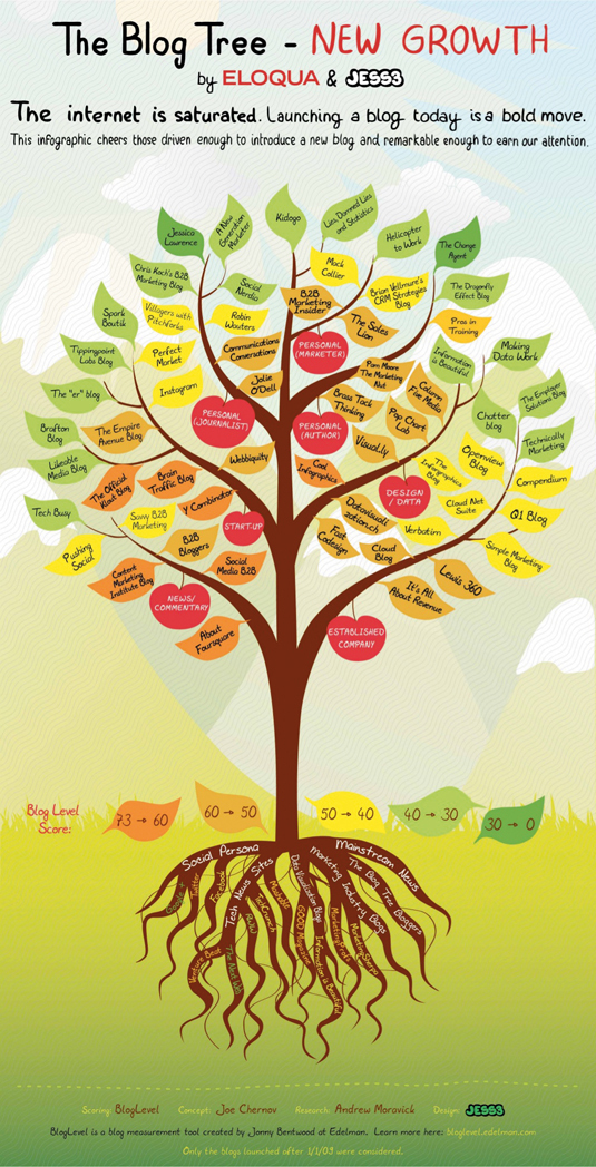
The picture shows a blog in the form of a tree, where different colors indicate a circle of readers.
The best story-tellers of any generation are interlocutors gifted by nature, able to control the attention of the audience. They know how to interest and inspire listeners no matter where they are: in a close friendly company around a campfire, on the stage in front of a crowd of thousands of people or on the monitor screen. Our generation of large amounts of information had no effect on the ability to tell stories. Now large amounts of information is not just a number on the monitor screen, it is a story that needs to be revealed.
To convey information to the target audience, you need to take into account three factors: reasoning, reliability and inconsistency.
If you want to attract attention, you need to argue the information. It should stand out from other available sources. Ask yourself: “Will it be interesting for the target audience?”.
Information must come from a knowledgeable and reliable source. This is extremely important in order to gain the trust of its readers. In addition, it will play a significant role when your readers decide whether to share this material with their friends on social networks.
Contradiction is never redundant. If the information you have chosen for your presentation provokes an emotional response from your readers, it means that you have reached your goal. Disputes are good, as conflicting information can cause a lengthy discussion that will allow you to expand your influence in this area and increase the reach of the infographic you created.
When you have a topic and a set of data to get started, your brain begins to "explode" from the influx of brilliant ideas regarding the presentation of facts and the use of visual tools. However, before going forward, you need to take a step back. Who will you contact? How to ensure that the information you transmit is valuable for your already busy readers? What do you think a person who has read your infographic should think or do?
Knowledge of your audience should be in the first place when setting a goal and working on a future illustration. To succeed, thoroughly examine your customer, market and media space. So you will have the potential to make contact with a predetermined audience that will “hear” your message. After you define your audience, it will be time to set a goal and align your graphic call to action with it. Regardless of whether your goal is to sell a product or position a brand as an ideological leader, the way you send a call to action directly affects the success of the created infographics. The purpose of infographics should be to involve readers at the level of generally accepted values, and not just ordinary product advertising.
When you compile a consistent presentation of the story based on the facts, remember: the main thing is not the amount of your information, but how you use it. The success of your story will depend directly on your ability to empathize with readers. Therefore, you need to constantly think: who are they? what they believe about your topic; what they already know about it; where they read your infographics; how easily they can be distracted from the topic; how they want to look on social networks by sharing this or that material.

Here we see the rich history of Wikipedia, depicted by the methods of animation and visual presentation.
Having your own idea of your readers, do not forget that hundreds of bits of other information falls upon them from the screens of monitors. Think about how much information they can learn in those few precious minutes when you have captured their attention. Think about what you can say in this short period of time so important that it changes their view of the world. To attract the interest of readers there are several ways:
1. Enlightenment (suppose you do not know what XYZ is , and I can tell you about it).
2. Potential opportunities (let's say you think that XYZ cannot be applied here, and I will tell you why you can).
3. Fears (let's say you think that you can use XYZ here, and I will explain to you why you shouldn't).
4. Calm (suppose you think that XYZ cannot be applied here, and I will tell you why you can).
5. Finally, humor (let's say you think penguins play football badly, and here you are absolutely right).
The magic of information is that it can show us hidden patterns and systems that cannot be seen with the naked eye. It is also capable of disclosing mass-scale data, which we cannot even comprehend until they are translated into a form that is understandable. Ultimately, you have to set yourself the task to make this data open to public understanding.
Once you analyze your data and come up with the story you want to tell, you need to start thinking about how to present the information in a visual form. Even if the original format of your data was very complex, your task is to make this information available to a wide audience.
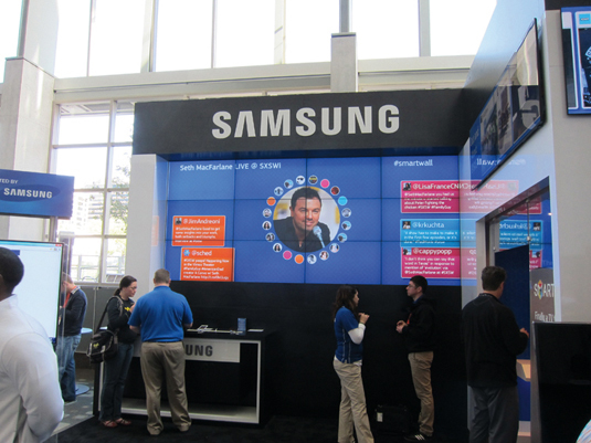
Samsung Smart Wall enjoyed incredible success during the SXSW 2012 festival, thanks to the most complex visual installation, consisting of 23 screens, which featured the most talked about speakers, venues and topics for discussion.
Not a single spreadsheet or passage of text can help the viewer understand the essence of the matter in a way that a visual representation of information makes. Do not limit your illustration to tables, present it in a format that will reveal hidden patterns, emphasize the main points, and at the same time will look attractive.
Strive to ensure that your visual presentation has the following qualities:
• credibility: use reliable sources and be as frank as possible;
• transparency: strive for maximum clarity;
• accessibility: uncover hidden patterns and highlight key points;
• informative: extract the essence, train and inspire;
• value: your illustration should bring the viewer to the point;
• optimized: your presentation method should correspond to the interests of the environment in which the information will be placed (Internet, mobile communication, video, front panel of the car, etc.);
• Attractiveness: use fonts, colors, sizes and shapes to develop your plot.
The work of an information designer is not limited to creating a beautiful cover for communicating information. It is much more important to make information accessible. Informative graphics can be both attractive and informative. But in order to achieve real success, it is necessary to find a middle ground between creating a magnificent work of art and bringing benefits to society.
A clear and understandable structure is the key to the success of informative graphics. Thanks to the basic structure, it is possible to organize information, manage the presentation and ensure the integrity of all facts. By focusing on the structure, you will achieve that the information will directly affect the image, and not on its visual design.
The main characteristics that will affect the accessibility of the structure for perception will be the following:
• the amount of information you have (too much or too little?);
• information classification - various classifications require the use of appropriate visual formats. Richard Saul Wurman outlined 5 ways to systematize information: by location, alphabetically, chronologically, by categories and hierarchically;
• the environment where the information will be placed (static, interactive or dynamic);
• the place where information will be mainly posted (on the Internet, in print, on a TV screen);
• size of information.
When developing the basic principles for building a structure, constantly ask yourself: does this structure allow us to make the information more understandable? This may seem obvious, but since the main purpose of the graphic image is to convey information, its success will depend on this circumstance. At some point you will want to put the design above functionality. But remember that even an incredibly beautiful graphic image, worthy to hang it on the wall and admire, will be just a dummy that does not make any sense. Your infographics can be considered successful if the viewer, looking at it, can understand what is being said. If the structure of the infographic is too complicated, and the viewer must make a lot of effort to understand the meaning of the information presented, then your work has failed.
At its core, a good structure should perform the following functions:
• ensure clarity;
• promote perception;
• reveal hidden patterns;
• focus on key findings.
Signs of a poor structure are that it:
• masks information;
• confuses the facts;
• interferes with comprehension.
As in web design, prototyping at such an early stage helps the designer to concentrate on the structure of the object, without being distracted by graphic design elements such as fonts and colors. Usually, when drawing up the basic structure, bright pictures, bold fonts and color schemes are discarded in order to focus on the information. Working with a limited color palette and a set of simple forms, the designer gets the opportunity to study the information and consider many different options.
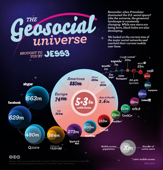
The geosocial universe, developed by JESS3 Labs in 2011, uses a visual image to show on the map the largest players in a geolocation environment, or, more precisely, the universe.
The advantages of prototyping are that it gives you time to experiment. The study of various approaches is very important for the correct presentation of data. The visual presentation of information as a pictorial picture must be interpreted by the viewer. The designer’s view of the consistency of presentation and a clear structure can be very different from the opinions of others. Therefore, the more you show your layouts to other people, the better. At such an early stage of development, it is very important to take into account reviews and comments about your layouts, as this will help you choose the best way to present information for your target audience. Thanks to the layout, you will be able to redo your work again and again, seeking the highest quality.
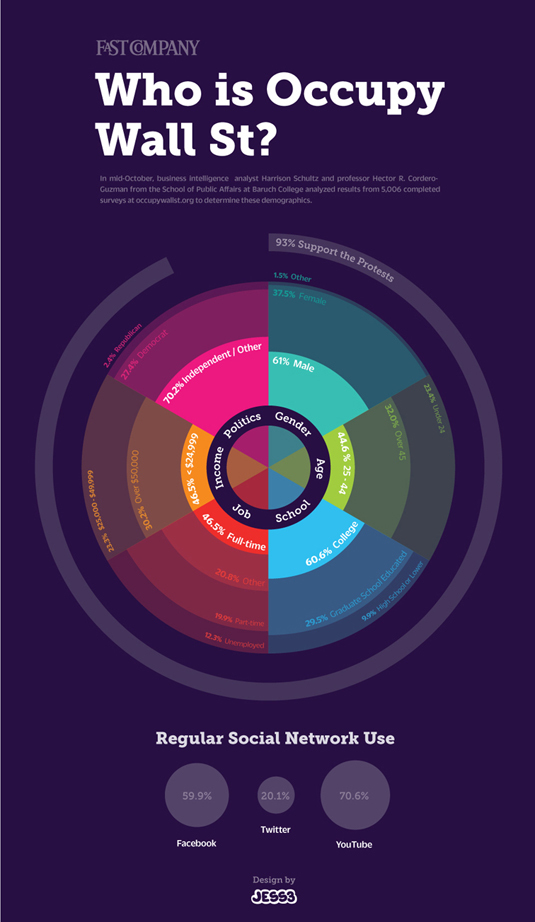
This simple and straightforward scheme classifies and displays the full line of supporters of the “Capture Wall Street” protest action.
Information designers have at their disposal a whole arsenal of various schemes. Sectors, columns, bars, and other types of charts are included in their everyday toolkit for creating information graphic images. But they are not always interchangeable - you need to know exactly when to use this or that type. It is the choice of the appropriate type of data presentation that is the ability to transmit information to the target audience. This choice often depends on how the information is organized and classified.
Perhaps when you choose one or another type of diagrams, you will be attracted by the form, not the functionality. But you should remember that when transmitting information by visual means, an emotional impact on the target audience is always more important than decoration.
Do not be afraid to use a histogram if it helps you to present data in the best possible way. These common chart types are the most effective means for correctly displaying data. In addition, they often form the basis for creating great graphic images. There are many ways to apply diagrams, and while they always remain informative and useful.
In infographics, there are two main approaches to graphic design. On the one hand, there are those who allow the facts to speak for themselves. They create magnificent works of art based on information, using combinations of colors, shapes and appropriate font design. Their history is transmitted exclusively through the presentation of data. This approach is pronounced in the works of designers such as Nicholas Felton and David McCandless.
On the other hand, there are those who use illustrations and well-designed visual images in order to respect the sequence of presentation and transmission of information to the viewer.
Elections in the United States are presented in the form of a graph, where the most discussed topics are displayed live, as well as the rating of candidates.
There will definitely be a time and place for one or the other (and even combining them). However, your choice should be based on the following indicators:
• the target audience;
• preset style;
• corporate design;
• target;
• Wednesday.
You can really share your story with visual aids, but you need to use them very carefully. The main focus remains on data and information. Graphic elements should not impede the viewer's perception or interfere with the transmission of information in any other way. If used correctly, the visual presentation of data can be both effective and informative. Incorrect use of visual tools can lead to data loss.
Once your graphic image is ready, it's time to spread it to the masses. The truth is that even if you have become the author of the most brilliant and profound infographic that the world has seen, without a clear plan for dissemination, it is doomed to be unknown.
The very first thing you should do is share your creation on social networks. You are well aware that there are paid and free ways to distribute content in social networks. You must take advantage of both. Next, you need to thoroughly examine which sites your readers visit in their free time. Contact the management of these sites and convince them that your infographics will benefit their visitors.
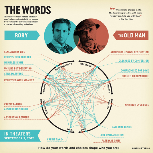
Information poster reveals the complexity of the entangled plot of a philosophical film using the conceptual graphics method.
Finally, we would like to quote some wise words from the book of the infographic of Edward Taft “Beautiful Evidence”:
Original text: Tiffany Farrant-Gonzalez and Jarred Romley.
Although the term “infographics” is relatively new, the idea of transmitting information in graphic form has been around for a very long time. For thousands of years, people have tried to explain the phenomena of the world around them by visual means. This is evidenced by the cave drawings created 30,000 years ago, the ancient Egyptian hieroglyphs, surprisingly conveying the most complex stories using simple iconography, the evolution of Chinese writing, and, finally, the very first samples of cartography and histograms.
By nature, we are endowed with the ability to see. We tend to learn and perceive something new best when the information is presented in a visual form.
Modern infographics has undergone some changes compared to its predecessors. However, the essence remains the same. The combination of clarity of presentation with the transfer of information, here lies the popularity of infographics. In an era when information surrounds us everywhere, infographics have become vital. In this article we will discuss in detail the 10 basic steps that will help you create not only meaningful, but also attractive infographics.
')
01. Let the facts speak for themselves
The picture shows a blog in the form of a tree, where different colors indicate a circle of readers.
The best story-tellers of any generation are interlocutors gifted by nature, able to control the attention of the audience. They know how to interest and inspire listeners no matter where they are: in a close friendly company around a campfire, on the stage in front of a crowd of thousands of people or on the monitor screen. Our generation of large amounts of information had no effect on the ability to tell stories. Now large amounts of information is not just a number on the monitor screen, it is a story that needs to be revealed.
To convey information to the target audience, you need to take into account three factors: reasoning, reliability and inconsistency.
If you want to attract attention, you need to argue the information. It should stand out from other available sources. Ask yourself: “Will it be interesting for the target audience?”.
Information must come from a knowledgeable and reliable source. This is extremely important in order to gain the trust of its readers. In addition, it will play a significant role when your readers decide whether to share this material with their friends on social networks.
Contradiction is never redundant. If the information you have chosen for your presentation provokes an emotional response from your readers, it means that you have reached your goal. Disputes are good, as conflicting information can cause a lengthy discussion that will allow you to expand your influence in this area and increase the reach of the infographic you created.
02. Set a goal and define an audience
When you have a topic and a set of data to get started, your brain begins to "explode" from the influx of brilliant ideas regarding the presentation of facts and the use of visual tools. However, before going forward, you need to take a step back. Who will you contact? How to ensure that the information you transmit is valuable for your already busy readers? What do you think a person who has read your infographic should think or do?
Knowledge of your audience should be in the first place when setting a goal and working on a future illustration. To succeed, thoroughly examine your customer, market and media space. So you will have the potential to make contact with a predetermined audience that will “hear” your message. After you define your audience, it will be time to set a goal and align your graphic call to action with it. Regardless of whether your goal is to sell a product or position a brand as an ideological leader, the way you send a call to action directly affects the success of the created infographics. The purpose of infographics should be to involve readers at the level of generally accepted values, and not just ordinary product advertising.
03. Come up with an interesting story
When you compile a consistent presentation of the story based on the facts, remember: the main thing is not the amount of your information, but how you use it. The success of your story will depend directly on your ability to empathize with readers. Therefore, you need to constantly think: who are they? what they believe about your topic; what they already know about it; where they read your infographics; how easily they can be distracted from the topic; how they want to look on social networks by sharing this or that material.
Here we see the rich history of Wikipedia, depicted by the methods of animation and visual presentation.
Having your own idea of your readers, do not forget that hundreds of bits of other information falls upon them from the screens of monitors. Think about how much information they can learn in those few precious minutes when you have captured their attention. Think about what you can say in this short period of time so important that it changes their view of the world. To attract the interest of readers there are several ways:
1. Enlightenment (suppose you do not know what XYZ is , and I can tell you about it).
2. Potential opportunities (let's say you think that XYZ cannot be applied here, and I will tell you why you can).
3. Fears (let's say you think that you can use XYZ here, and I will explain to you why you shouldn't).
4. Calm (suppose you think that XYZ cannot be applied here, and I will tell you why you can).
5. Finally, humor (let's say you think penguins play football badly, and here you are absolutely right).
The magic of information is that it can show us hidden patterns and systems that cannot be seen with the naked eye. It is also capable of disclosing mass-scale data, which we cannot even comprehend until they are translated into a form that is understandable. Ultimately, you have to set yourself the task to make this data open to public understanding.
04. Make it simple.
Once you analyze your data and come up with the story you want to tell, you need to start thinking about how to present the information in a visual form. Even if the original format of your data was very complex, your task is to make this information available to a wide audience.
Samsung Smart Wall enjoyed incredible success during the SXSW 2012 festival, thanks to the most complex visual installation, consisting of 23 screens, which featured the most talked about speakers, venues and topics for discussion.
Not a single spreadsheet or passage of text can help the viewer understand the essence of the matter in a way that a visual representation of information makes. Do not limit your illustration to tables, present it in a format that will reveal hidden patterns, emphasize the main points, and at the same time will look attractive.
Strive to ensure that your visual presentation has the following qualities:
• credibility: use reliable sources and be as frank as possible;
• transparency: strive for maximum clarity;
• accessibility: uncover hidden patterns and highlight key points;
• informative: extract the essence, train and inspire;
• value: your illustration should bring the viewer to the point;
• optimized: your presentation method should correspond to the interests of the environment in which the information will be placed (Internet, mobile communication, video, front panel of the car, etc.);
• Attractiveness: use fonts, colors, sizes and shapes to develop your plot.
The work of an information designer is not limited to creating a beautiful cover for communicating information. It is much more important to make information accessible. Informative graphics can be both attractive and informative. But in order to achieve real success, it is necessary to find a middle ground between creating a magnificent work of art and bringing benefits to society.
05. Structure first
A clear and understandable structure is the key to the success of informative graphics. Thanks to the basic structure, it is possible to organize information, manage the presentation and ensure the integrity of all facts. By focusing on the structure, you will achieve that the information will directly affect the image, and not on its visual design.
The main characteristics that will affect the accessibility of the structure for perception will be the following:
• the amount of information you have (too much or too little?);
• information classification - various classifications require the use of appropriate visual formats. Richard Saul Wurman outlined 5 ways to systematize information: by location, alphabetically, chronologically, by categories and hierarchically;
• the environment where the information will be placed (static, interactive or dynamic);
• the place where information will be mainly posted (on the Internet, in print, on a TV screen);
• size of information.
When developing the basic principles for building a structure, constantly ask yourself: does this structure allow us to make the information more understandable? This may seem obvious, but since the main purpose of the graphic image is to convey information, its success will depend on this circumstance. At some point you will want to put the design above functionality. But remember that even an incredibly beautiful graphic image, worthy to hang it on the wall and admire, will be just a dummy that does not make any sense. Your infographics can be considered successful if the viewer, looking at it, can understand what is being said. If the structure of the infographic is too complicated, and the viewer must make a lot of effort to understand the meaning of the information presented, then your work has failed.
At its core, a good structure should perform the following functions:
• ensure clarity;
• promote perception;
• reveal hidden patterns;
• focus on key findings.
Signs of a poor structure are that it:
• masks information;
• confuses the facts;
• interferes with comprehension.
06. Design: experiment and create more and more new images
As in web design, prototyping at such an early stage helps the designer to concentrate on the structure of the object, without being distracted by graphic design elements such as fonts and colors. Usually, when drawing up the basic structure, bright pictures, bold fonts and color schemes are discarded in order to focus on the information. Working with a limited color palette and a set of simple forms, the designer gets the opportunity to study the information and consider many different options.
The geosocial universe, developed by JESS3 Labs in 2011, uses a visual image to show on the map the largest players in a geolocation environment, or, more precisely, the universe.
The advantages of prototyping are that it gives you time to experiment. The study of various approaches is very important for the correct presentation of data. The visual presentation of information as a pictorial picture must be interpreted by the viewer. The designer’s view of the consistency of presentation and a clear structure can be very different from the opinions of others. Therefore, the more you show your layouts to other people, the better. At such an early stage of development, it is very important to take into account reviews and comments about your layouts, as this will help you choose the best way to present information for your target audience. Thanks to the layout, you will be able to redo your work again and again, seeking the highest quality.
07. Choose the right tool for the job.
This simple and straightforward scheme classifies and displays the full line of supporters of the “Capture Wall Street” protest action.
Information designers have at their disposal a whole arsenal of various schemes. Sectors, columns, bars, and other types of charts are included in their everyday toolkit for creating information graphic images. But they are not always interchangeable - you need to know exactly when to use this or that type. It is the choice of the appropriate type of data presentation that is the ability to transmit information to the target audience. This choice often depends on how the information is organized and classified.
Perhaps when you choose one or another type of diagrams, you will be attracted by the form, not the functionality. But you should remember that when transmitting information by visual means, an emotional impact on the target audience is always more important than decoration.
Do not be afraid to use a histogram if it helps you to present data in the best possible way. These common chart types are the most effective means for correctly displaying data. In addition, they often form the basis for creating great graphic images. There are many ways to apply diagrams, and while they always remain informative and useful.
08. Choose the right approach
In infographics, there are two main approaches to graphic design. On the one hand, there are those who allow the facts to speak for themselves. They create magnificent works of art based on information, using combinations of colors, shapes and appropriate font design. Their history is transmitted exclusively through the presentation of data. This approach is pronounced in the works of designers such as Nicholas Felton and David McCandless.
On the other hand, there are those who use illustrations and well-designed visual images in order to respect the sequence of presentation and transmission of information to the viewer.
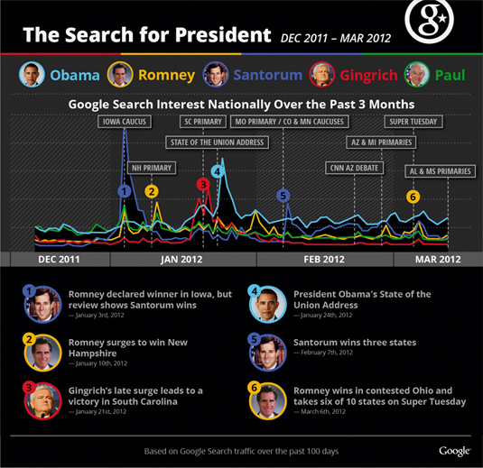
Elections in the United States are presented in the form of a graph, where the most discussed topics are displayed live, as well as the rating of candidates.
There will definitely be a time and place for one or the other (and even combining them). However, your choice should be based on the following indicators:
• the target audience;
• preset style;
• corporate design;
• target;
• Wednesday.
You can really share your story with visual aids, but you need to use them very carefully. The main focus remains on data and information. Graphic elements should not impede the viewer's perception or interfere with the transmission of information in any other way. If used correctly, the visual presentation of data can be both effective and informative. Incorrect use of visual tools can lead to data loss.
09. Distribution and PR
Once your graphic image is ready, it's time to spread it to the masses. The truth is that even if you have become the author of the most brilliant and profound infographic that the world has seen, without a clear plan for dissemination, it is doomed to be unknown.
The very first thing you should do is share your creation on social networks. You are well aware that there are paid and free ways to distribute content in social networks. You must take advantage of both. Next, you need to thoroughly examine which sites your readers visit in their free time. Contact the management of these sites and convince them that your infographics will benefit their visitors.
Information poster reveals the complexity of the entangled plot of a philosophical film using the conceptual graphics method.
10. Think of infographics as moral action.
Finally, we would like to quote some wise words from the book of the infographic of Edward Taft “Beautiful Evidence”:
“Disclosure of facts is not only a moral act, but also an indicator of active mental activity. In order for the quality, significance and integrity of the facts to remain at the proper level, readers need to insist that the authors bear spiritual and ethical responsibility for the materials they publish. In this case, the consumption of information represents the same mental and moral activity of the individual. "
Original text: Tiffany Farrant-Gonzalez and Jarred Romley.
Source: https://habr.com/ru/post/219465/
All Articles