A different look at ordering online store
In the CIS countries, at least 75-80% of orders fall on cash-and-delivery (payment on delivery). This difference between the Russian and Western consumers formed the basis for the redesign of the checkout of Sotmarket back in 2012. Then, for the first time in Russia, an online store stopped requiring authorization or registration of a client before making a purchase.
Background registration and authorization of users
Although authorization at the last step of the purchase does not carry any value to the user, this western cliché is deeply rooted in RuNet. With the average frequency of purchase (technology) every 9-10 months, people often do not remember the registration data: email. mail, login, password. The paradox is that most online stores readily accept orders over the phone, but at the same time create artificial obstacles when making a purchase online.
')
This observation formed the basis of the concept of background registration and authorization of users. Now, if the client was not registered with us, we automatically did this and sent a registration alert along with the order data, otherwise just reminded the buyer of the password to access the personal account.
Matching of accounts occurs by mobile phone numbers and email. addresses, which allows not to lose client history. The approach justified itself: the percentage of orders registered through the site increased from 28% to 52%.
Note by the author. The need for authorization and registration
Western online stores have developed and traditionally choose for themselves a case of pre-authorization / registration of users on a resource in order to save consumer time . The bottom line is that purchases in foreign companies are prepaid with plastic cards, and to facilitate this process for customers, the stores, at their first purchase, link the payment details to the newly created account. Thus, on subsequent purchases, the checkout for the user is greatly simplified.
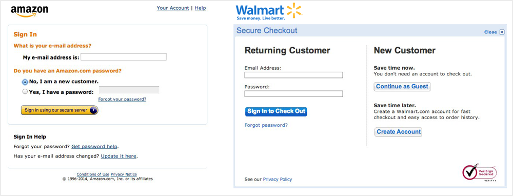
This case is relevant only in case of similarity of consumer behavior with the above. However, most of the functions of the store still need to be presented to the user without requiring authorization. For example: comparison of products, information about viewed, added to the cart or selected products. Use cookies to identify, and when authorizing, match the collected information with the existing one.
This case is relevant only in case of similarity of consumer behavior with the above. However, most of the functions of the store still need to be presented to the user without requiring authorization. For example: comparison of products, information about viewed, added to the cart or selected products. Use cookies to identify, and when authorizing, match the collected information with the existing one.
Remarketing abandoned baskets
The high number of abandoned baskets is another well-known problem of any online store. Sotmarket was no exception. The solution to this problem was to change the sorting of only three input fields.

Now immediately after entering the phone number or email. mail, subject to their validation, the order is registered as incomplete, and we get the opportunity to contact those customers who, for one reason or another, did not complete the completion of the form. As a result, the average increase in orders from unfinished to created ones is 17-18%.
Data collected in this way cannot be (read: meaningless) used to send advertisements not related to specific orders.
Note by the author. The futility of stars
Asterisks at the input fields - archaism. Try to avoid using this technique in your form; In most cases, it is possible to replace the asterisks with more “smart” prompts, with information on why this field is critical.

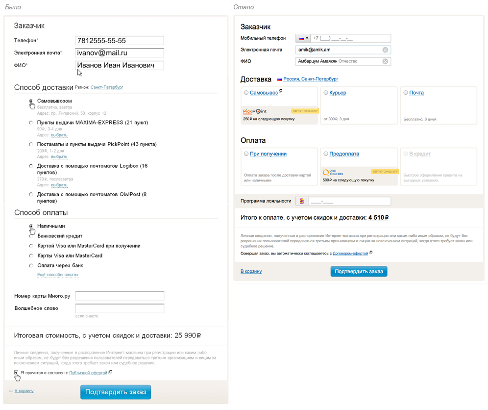
Full name one field

A small innovation was the input field name - 3 in 1, which allowed to solve several problems at once:
- unobtrusive reminder of the need to enter full name data;
- the call center manager receives correctly spaced out orders into the internal order processing system;
- the form itself maintains visual simplicity and does not look more complicated than it actually is.
Note by the author. The importance of graphic elements of the interface
Back in 2013, we began to develop our own GUI for the redesign of the Sotmarket website, which has found its application in the shopping cart and in the design of the order. The implementation of some of our own components allowed us to significantly simplify complex forms and reduce the number of errors made when filling in individual fields.
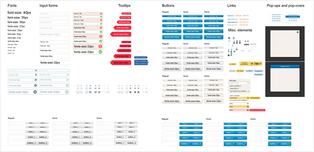
A systematic approach to working with text, buttons, fonts, colors, indents, popups and other interface elements is the key to an intuitive interface. The more often a certain element is used in design, the faster and more accurately the user interaction with it occurs.
A systematic approach to working with text, buttons, fonts, colors, indents, popups and other interface elements is the key to an intuitive interface. The more often a certain element is used in design, the faster and more accurately the user interaction with it occurs.
We increase the influence on user decision making
Changing the presentation of data in the blocks of delivery and payment, has allowed to implement another interesting concept - the translated actions on the checkout page. This approach has significantly increased the effectiveness of relevant advertising campaigns, while not complicating the interface of the page and improving its visibility.
One of the key characteristics of a good interface is its ability to focus the user's attention. No exception and ordering, where often there are complex relationships of delivery methods and payment.

In the case of choosing pickup from the point of Picpoint, the client can not choose to pay on credit .

If you choose a courier delivery DPD, the client cannot pay for the order upon receipt or on credit. At the same time, inaccessible payment methods are not hidden, they are disabled with a hint as to why this functionality cannot be used in this situation. This approach makes the interaction process more friendly.
Entering the delivery address in one field
It is difficult to overestimate the importance of convenient choice of delivery method and pickup. Using the Yandex.Maps API, we have made it much easier to enter a shipping address and select a delivery point. This solution made it possible to simultaneously solve 2 problems at once:
- on the one hand, simplify the process of filling out a form for clients; now it is necessary to fill only one input field, instead of 3-4;
- On the other hand, the number of errors / misprints when filling out the form has significantly decreased due to the prompts of addresses, which reduces the time for managers to process orders created through the site.
We paid special attention to the interface of selecting points for issuing orders, since in 70-75% of orders, self-pickup prevails, having developed two forms: on a map and a list. In both cases, you can select the metro / area / object of interest in whose zone the nearest pickup points are located. This greatly simplifies the search for the desired point of issue.

You can switch between Yandex and Google maps, which allows you to select the best detail in many regions of the Russian Federation.

It is worth noting that in small towns, where only one point of issuance of an order is accounted for by one method of self-collection, the user, bypassing the pop-up with a map and a list of addresses, can immediately select the office or postmatte he is interested in. Such an adaptation of the interface is also aimed at saving time for customers in regions where more than 80% of processed purchases fall.
Source: https://habr.com/ru/post/219291/
All Articles