Top 5 simple changes that significantly increased conversion
It is believed that in order to get a significant return on changes on the site, you need to make a deep redesign, change the concept, make a rebranding, etc. But in fact, sometimes even small changes can have a huge effect. Sometimes you can achieve a conversion by changing or moving elements of your site. When we wrote an article about A / B analysis , we came across a selection of examples that demonstrated the results of various tests. We chose several of them based on two main parameters: simplicity and efficiency.
5th place: Change the description of your activity in order to increase sales by 1.5 times.
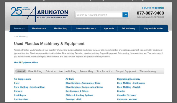
Arlington Plastics Machinery is a company that sells plastic processing equipment, extruders, etc. In September 2013, a decision was made on the need to change the site to increase the level of conversion. Then the page looked like this:
')
The page contained a list of those operations that you can carry out with plastic using equipment from Arlington, 119 methods of processing plastics are listed below. The following changes have been made:
- Added links to the 5 most popular ways of processing;
- At the same time, the machines that perform this work were listed, and not directions, i.e. the solution to the problem, not its description;
- Call for active action "call by phone ..".
As a result, the page received the following form:
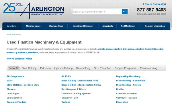
The result was a 150% increase in conversion, with a near 100% guarantee of long-term efficiency. In monetary terms, this result can be represented as an additional 15 thousand dollars for the first month of testing the page. According to rough estimates, these changes will bring 500 thousand dollars for the first year of operation.
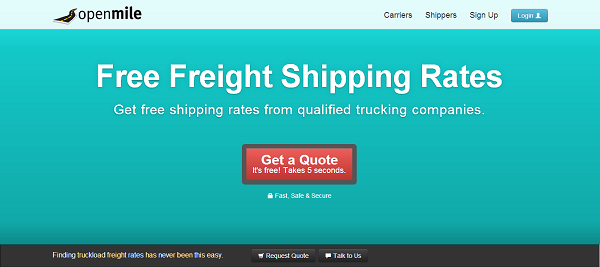
4th place: do not distract the user and get 232 percent result!
Open Mile is a US freight broker. The company decided to evaluate the possibility of increasing the effectiveness of the Landing Page, which in May 2013 could boast such an appearance:
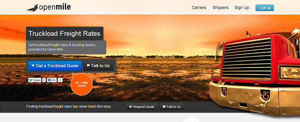
During the analysis, it was suggested that a bright picture with an open horizon distracts the user from the call to action and adversely affects the final result. As a result , it was decided to eliminate all distractions and to highlight CAT:
3rd place: be honest and increase sales by 2.68 times
Acuity Scheduling works in online planning software. Initially, three tariff plans were planned:
- Free version (freemium) with limited functionality but unlimited validity;
- Professional package - a set of the most popular features for 10 bucks a month;
- Premium - a full package of services for $ 19.

The free version meant that you use a trial version of the software in order to familiarize yourself with the interface, but if you want to use it for its intended purpose, then you will have to pay 10 dollars. In May 2013, it was proposed to change freemium to a 14-day trial version. As a result, the number of registrations for paid services in the test period increased by 268%. To date, Acuity Scheduling has returned to freemium, but offers a trial version for a premium account.
This could happen for two reasons: the changes did not justify themselves in the long term, or, more likely, such a decision was made to attract customers to the premium account.
2nd place: remove too much and you will order 4 times more often.
This participant confirmed the idea that we formulated when describing the 4th place. Anything that can distract the user from the ultimate goal should be removed, even if it is ... a security icon. Change:

on:
showed an increase in the conversion in the test period 4 times.
It was back in 2010, at the moment the domain of the site is being sold for reasons unknown to us, and the last activity on Twitter was noticed in 2011.
1st place: “Are you weak?” Increase the citation of your news on social networks 36 times (!) Due to ... moving a block of social networks.
Simply moving the “share” button caused an absolutely unpredictable effect: the records were quoted 36 times more often. Of course, this is not quite a conversion in the conventional sense, but it is an excellent result in achieving the goal.
In 2012, AMD conducted a test, trying to determine which location of the share button would be optimal from the point of view of quoting on social networks. At that time, it was located at the bottom of the page. Testing has shown that moving the button to the upper left of the site leads to an increase in citation by a factor of 36.
To date, the AMD team, for unknown reasons, has abandoned the “share” function on the pages of the site, leaving such a possibility only in a blog, where it was also transferred, but under the title of the article.
Reading this post, it is important to remember that what suits one site will not necessarily work for another. The main idea that we wanted to convey: there are no trifles when optimizing your site, just as there is no complete optimization. When it seems to you that there is nothing more to change, take a close look at the details.
Of course, most likely, the top turned out to be subjective, and you can offer your options, which quite deserve a prize place in this list.
Source: https://habr.com/ru/post/219179/
All Articles