Minimalism when creating landing page
Over the past few years, web designers have gradually come to the conclusion that “cluttering up” sites with irrelevant elements is a bad idea. Web design elements such as meaningless images, intricate navigation systems, countless social sharing buttons and so on lead users away from the main goals of a web page.
Instead of adding material, many chose to reduce the components of the project to achieve a simple form. At the same time, we should not forget that now sites are visually much simpler than our predecessors.
A few examples of minimalist landing pages
')
Let's take a look at the minimalism of the landing page of some successful web applications:


Note that these applications are quite complex, while they offer useful and in many ways innovative things for their users. Still, it is interesting that they do not have an intricate landing page.
Let's look at some examples of minimalist landing pages, to see design patterns, and learn useful ideas and tips from web developers.
Minimalism landing page: one main idea
What you immediately notice in the minimalist landing pages is that they have only one primary goal. This could be by clicking on the “Register” button, or entering an email address in a web form, or downloading something onto your computer. One clearly defined action that a web designer wants from users.
There is no complicated navigation menu. You usually will not find social media buttons on such web pages. The site design is devoid of decorative images, the sole purpose of which is just to fill the gaps.
Each design element is carefully selected. Everything is strategically designed only for this very single action from users.
Landing Page example: Dropbox

The Dropbox website is an example of how minimalist design vividly demonstrates this concept. Landing page from Dropbox has only one call to action, based on the purpose of the web page. The main purpose of the design is to get website visitors to click on the “Register” button. So, the button "Register" is the brightest element on the page. Everything else does not matter.
Of course, there are secondary alternative actions for visitors to Dropbox landing pages. These are the “Download Software”, “Sign In” buttons (if you are already a Dropbox user) or “Learn more about Dropbox”. However, these alternative buttons are designed in such a way as not to hinder the main goal in any way - by pressing the “REGISTRATION” button.
All non-essential items are deleted or muted:
-The site name (Dropbox) is not even displayed on the page;
-To explain how Dropbox works, use a simple illustration that doubles the user's attention to the "Sign Up" button;
- The slogan (“Your material, anywhere”) is short and uncomplicated.
So, the landing page from Dropbox confidently and boldly showed what actions are required from site visitors, and this was done very competently and clearly.
Landing Page Example: Mailbox
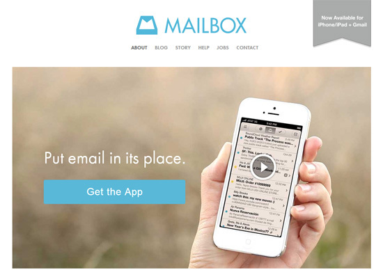
Mailbox is an application that helps its users to efficiently use email on a mobile device. This site shows us another example of a beautiful minimalist landing page design.
The primary action is to push a large, clearly highlighted button labeled "Get the app", which gives the user a Mailbox on the Apple App Store.

The icon on the displayed mobile device opens the video when clicked. It effectively illustrates what Mailbox is. Alternative actions are visible on the site’s navigation menu, but the navigation menu is not visually highlighted.
Landing Page Example: Karma
Karma is another excellent example of a beautiful minimalist landing page.
The desired action for this landing page - click on the "Buy" button. The primary action is displayed twice: one in the middle of the site and the other in its upper part. The call-to-action buttons are both green, equally labeled and visually similar, which creates a connection between them.

Secondary alternate user action - clicking on the "Learn More" button. As you can see, the transparency of the “Learn More” button reduces its visual weight and does not “steal” attention from the main “Buy” button.
A brief description above the call-to-action buttons briefly informs you of the unique value of Karma's offer: connection and sharing thanks to Wi-Fi.
The background image has its meaning. It shows how the product looks and gives an idea of its size (contextual help - the product is very useful).
Main components of minimalist landing page
The minimalist landing page consists of three main components:
1.Primary action
2. Explaining what a product / service is
3. Alternative option
Tips for creating minimalist landing page
Focus on building the right visual hierarchy.
In order to draw attention to the most important parts of the landing page, the visual hierarchy must be correct. Visual hierarchy - the location of elements in the design of the page so that first of all the most important elements are visible.
Some of the main characteristics that affect the position of a design element in the visual hierarchy of the landing page are:
-Size: large items are located higher in the visual hierarchy
-Position on the webpage: for most sites, the elements in the upper and left side of the webpage are higher in the visual hierarchy
-Color, contrast: a strong contrast between a particular element and its background, as well as between other elements in its immediate vicinity will lead to a higher position in the visual hierarchy
-Visual complexity: outwardly more complex element compared with neighboring elements gives greater visual weight
Spaces: large spaces around the element give it a high visual weight.

In the following examples of sites, you can see how the size, position, color contrast, visual complexity and spaces are used to establish the desired visual hierarchy.
Example: Numbrs
Numbrs minimalist web design is a good example for talking about the visual hierarchy.
The description of the application (1) and the primary call-to-action button (2) are the two most prominent elements of a web page.

The volume control (3) is also quite high in the visual hierarchy, and if desired, you can turn off the sound when you are on this landing page.
The site name (4) and alternative actions (5) are located lower in the visual hierarchy.
Example: Wander
Another version of the literal visual hierarchy can be seen in Wander’s minimal landing page. Here are just four elements of web design:

The top label in the visual hierarchy is information that the site is open only to registered people (1). Below the text there is a call to action - the “log in” button (2).
Significantly lower in the visual hierarchy are the secondary alternative actions of visitors to the landing page of the Wander site. Some may want to roam on Facebook (3). The Facebook button also displays the number of likes, which performs another task - proof of interest in the application among visitors to social networks.
Other visitors to the alternative action of the site can go to other social networks Wander or read the blog Tumblr (4).
Make sure that the primary action is a visible element on the site.
The first step is to clearly define what kind of primary action you want from visitors to your site. Click on a specific button? Fill out a web form? Do you like your Facebook page?
Choose the one most important primary action, and then connect all the other elements. Then the design of the web page will contribute to the implementation of the main action.
Example: enthuse.me
A good option is the landing page, where the primary action in the form of a convex button can be seen on the website enthuse.me:

Here is a good visual hierarchy, where you can immediately see that the primary action is to click on the “Start!” Button.
Example: IFTTT
Notice the obvious primary action of the landing page of the IFTTT site:

Use colors and design correctly
Web designers who create minimalist websites have only a few tools in their arsenal: design and color are the main ones.
Example: Basecamp
Basecamp is an example of a minimalist landing page that uses color and the design itself is very reasonable.

So, green is used for the primary call to action. Blue for a secondary call to action (a login button for existing users and a link to a web page describing the reasons why people use Basecamp).
Large fonts and color changes of design elements serve to draw attention to what is really important in the landing page.
Example: Path
Let's take a look at how the site Path uses color and a large font to build the corresponding visual hierarchy. The prominent green color is used in the initial call to action - filling out a web form.

Different font sizes, color and the very splitting of the text into segments and sections is of interest to the landing page.
Keep the text content tight
It is now a very well-known fact that Internet users rarely read the entire text of a website. It can be assumed that the user has even less patience when he enters a landing page that he doesn’t know.
Minimalist landing page should have a short and easy to understand text message. The less you need to read, the faster the site visitors will perform the desired action.
Example: Contently
Contently can describe your web service in just 3 words: “Tell great stories.” This is so deep, given that the web service is centered around this content! A small amount of text on the landing page reduces the likelihood of changing the site visitor’s decision to perform an action.

Example: Shipment
Another good short text option can be seen at Shipment. In these simple words - “We will take part and consider your project” - the site visitor becomes instantly aware of what the Shipment site can do for him / her.

Describe the product / service quickly
There are many ways to most effectively show how a product or service works. The key point here is the simplicity of the explanation. Let's look at several ways that illustrate this concept.
Video explanation example: Couple
The Couple app uses video to explain how their product works. They took advantage of the fact that video production can significantly increase conversion.
So, the video is gradually revealed when you click on the button with the “Play Now” icon:

After clicking on this button, YouTube videos are displayed in a modal window. The modal window is easy to close, so the user is not required to watch all the videos before committing the action.

This example shows a concept that should be applied to secondary actions: gradual disclosure. When using a video instead of showing the video immediately, it is shown only when the user clearly wants to see it. This affects the visual hierarchy of the target page, since the landing page with video has a large visual weight due to its size and color.
Example of an interactive explanation: Apple Mac Pro
Apple Mac Pro's minimalist landing page demonstrates another popular product description: an interactive product explanation.

The explanation begins with a quick animation to get attention, as well as a hint that the web page has interactive animation.
Example c photo: Wallmob
The high resolution photo on Wallmob is a model of how you can use an important image.

The background photo illustrates what Wallmob is: this is the point of sale for your mobile device.
Simplicity is the key to success
As you can see, the way to create landing pages has a simple concept: a minimalist landing page has only one main goal - a call to action. By removing all unnecessary elements, you have the opportunity to direct all your efforts to ensure that visitors to the site pay attention to things that really matter.
Instead of adding material, many chose to reduce the components of the project to achieve a simple form. At the same time, we should not forget that now sites are visually much simpler than our predecessors.
A few examples of minimalist landing pages
')
Let's take a look at the minimalism of the landing page of some successful web applications:


Note that these applications are quite complex, while they offer useful and in many ways innovative things for their users. Still, it is interesting that they do not have an intricate landing page.
Let's look at some examples of minimalist landing pages, to see design patterns, and learn useful ideas and tips from web developers.
Minimalism landing page: one main idea
What you immediately notice in the minimalist landing pages is that they have only one primary goal. This could be by clicking on the “Register” button, or entering an email address in a web form, or downloading something onto your computer. One clearly defined action that a web designer wants from users.
There is no complicated navigation menu. You usually will not find social media buttons on such web pages. The site design is devoid of decorative images, the sole purpose of which is just to fill the gaps.
Each design element is carefully selected. Everything is strategically designed only for this very single action from users.
Landing Page example: Dropbox

The Dropbox website is an example of how minimalist design vividly demonstrates this concept. Landing page from Dropbox has only one call to action, based on the purpose of the web page. The main purpose of the design is to get website visitors to click on the “Register” button. So, the button "Register" is the brightest element on the page. Everything else does not matter.
Of course, there are secondary alternative actions for visitors to Dropbox landing pages. These are the “Download Software”, “Sign In” buttons (if you are already a Dropbox user) or “Learn more about Dropbox”. However, these alternative buttons are designed in such a way as not to hinder the main goal in any way - by pressing the “REGISTRATION” button.
All non-essential items are deleted or muted:
-The site name (Dropbox) is not even displayed on the page;
-To explain how Dropbox works, use a simple illustration that doubles the user's attention to the "Sign Up" button;
- The slogan (“Your material, anywhere”) is short and uncomplicated.
So, the landing page from Dropbox confidently and boldly showed what actions are required from site visitors, and this was done very competently and clearly.
Landing Page Example: Mailbox
Mailbox is an application that helps its users to efficiently use email on a mobile device. This site shows us another example of a beautiful minimalist landing page design.
The primary action is to push a large, clearly highlighted button labeled "Get the app", which gives the user a Mailbox on the Apple App Store.

The icon on the displayed mobile device opens the video when clicked. It effectively illustrates what Mailbox is. Alternative actions are visible on the site’s navigation menu, but the navigation menu is not visually highlighted.
Landing Page Example: Karma
Karma is another excellent example of a beautiful minimalist landing page.
The desired action for this landing page - click on the "Buy" button. The primary action is displayed twice: one in the middle of the site and the other in its upper part. The call-to-action buttons are both green, equally labeled and visually similar, which creates a connection between them.

Secondary alternate user action - clicking on the "Learn More" button. As you can see, the transparency of the “Learn More” button reduces its visual weight and does not “steal” attention from the main “Buy” button.
A brief description above the call-to-action buttons briefly informs you of the unique value of Karma's offer: connection and sharing thanks to Wi-Fi.
The background image has its meaning. It shows how the product looks and gives an idea of its size (contextual help - the product is very useful).
Main components of minimalist landing page
The minimalist landing page consists of three main components:
1.Primary action
2. Explaining what a product / service is
3. Alternative option
Tips for creating minimalist landing page
Focus on building the right visual hierarchy.
In order to draw attention to the most important parts of the landing page, the visual hierarchy must be correct. Visual hierarchy - the location of elements in the design of the page so that first of all the most important elements are visible.
Some of the main characteristics that affect the position of a design element in the visual hierarchy of the landing page are:
-Size: large items are located higher in the visual hierarchy
-Position on the webpage: for most sites, the elements in the upper and left side of the webpage are higher in the visual hierarchy
-Color, contrast: a strong contrast between a particular element and its background, as well as between other elements in its immediate vicinity will lead to a higher position in the visual hierarchy
-Visual complexity: outwardly more complex element compared with neighboring elements gives greater visual weight
Spaces: large spaces around the element give it a high visual weight.

In the following examples of sites, you can see how the size, position, color contrast, visual complexity and spaces are used to establish the desired visual hierarchy.
Example: Numbrs
Numbrs minimalist web design is a good example for talking about the visual hierarchy.
The description of the application (1) and the primary call-to-action button (2) are the two most prominent elements of a web page.

The volume control (3) is also quite high in the visual hierarchy, and if desired, you can turn off the sound when you are on this landing page.
The site name (4) and alternative actions (5) are located lower in the visual hierarchy.
Example: Wander
Another version of the literal visual hierarchy can be seen in Wander’s minimal landing page. Here are just four elements of web design:

The top label in the visual hierarchy is information that the site is open only to registered people (1). Below the text there is a call to action - the “log in” button (2).
Significantly lower in the visual hierarchy are the secondary alternative actions of visitors to the landing page of the Wander site. Some may want to roam on Facebook (3). The Facebook button also displays the number of likes, which performs another task - proof of interest in the application among visitors to social networks.
Other visitors to the alternative action of the site can go to other social networks Wander or read the blog Tumblr (4).
Make sure that the primary action is a visible element on the site.
The first step is to clearly define what kind of primary action you want from visitors to your site. Click on a specific button? Fill out a web form? Do you like your Facebook page?
Choose the one most important primary action, and then connect all the other elements. Then the design of the web page will contribute to the implementation of the main action.
Example: enthuse.me
A good option is the landing page, where the primary action in the form of a convex button can be seen on the website enthuse.me:

Here is a good visual hierarchy, where you can immediately see that the primary action is to click on the “Start!” Button.
Example: IFTTT
Notice the obvious primary action of the landing page of the IFTTT site:

Use colors and design correctly
Web designers who create minimalist websites have only a few tools in their arsenal: design and color are the main ones.
Example: Basecamp
Basecamp is an example of a minimalist landing page that uses color and the design itself is very reasonable.

So, green is used for the primary call to action. Blue for a secondary call to action (a login button for existing users and a link to a web page describing the reasons why people use Basecamp).
Large fonts and color changes of design elements serve to draw attention to what is really important in the landing page.
Example: Path
Let's take a look at how the site Path uses color and a large font to build the corresponding visual hierarchy. The prominent green color is used in the initial call to action - filling out a web form.

Different font sizes, color and the very splitting of the text into segments and sections is of interest to the landing page.
Keep the text content tight
It is now a very well-known fact that Internet users rarely read the entire text of a website. It can be assumed that the user has even less patience when he enters a landing page that he doesn’t know.
Minimalist landing page should have a short and easy to understand text message. The less you need to read, the faster the site visitors will perform the desired action.
Example: Contently
Contently can describe your web service in just 3 words: “Tell great stories.” This is so deep, given that the web service is centered around this content! A small amount of text on the landing page reduces the likelihood of changing the site visitor’s decision to perform an action.

Example: Shipment
Another good short text option can be seen at Shipment. In these simple words - “We will take part and consider your project” - the site visitor becomes instantly aware of what the Shipment site can do for him / her.

Describe the product / service quickly
There are many ways to most effectively show how a product or service works. The key point here is the simplicity of the explanation. Let's look at several ways that illustrate this concept.
Video explanation example: Couple
The Couple app uses video to explain how their product works. They took advantage of the fact that video production can significantly increase conversion.
So, the video is gradually revealed when you click on the button with the “Play Now” icon:

After clicking on this button, YouTube videos are displayed in a modal window. The modal window is easy to close, so the user is not required to watch all the videos before committing the action.

This example shows a concept that should be applied to secondary actions: gradual disclosure. When using a video instead of showing the video immediately, it is shown only when the user clearly wants to see it. This affects the visual hierarchy of the target page, since the landing page with video has a large visual weight due to its size and color.
Example of an interactive explanation: Apple Mac Pro
Apple Mac Pro's minimalist landing page demonstrates another popular product description: an interactive product explanation.

The explanation begins with a quick animation to get attention, as well as a hint that the web page has interactive animation.
Example c photo: Wallmob
The high resolution photo on Wallmob is a model of how you can use an important image.

The background photo illustrates what Wallmob is: this is the point of sale for your mobile device.
Simplicity is the key to success
As you can see, the way to create landing pages has a simple concept: a minimalist landing page has only one main goal - a call to action. By removing all unnecessary elements, you have the opportunity to direct all your efforts to ensure that visitors to the site pay attention to things that really matter.
Source: https://habr.com/ru/post/218413/
All Articles