Psychological component of the speed of interaction in mobile interfaces
One of the most important components in the development of mobile interfaces is the response of the interface to user action. Users of mobile interfaces are generally not very patient when using your application. And if they have to wait too long for the content to load, they start looking around and are unlikely to continue working with the application.
So how to make your application faster? Here are some interesting techniques, understanding that you can make your application faster.
When you post a photo on Instagram, the download starts in the background as soon as the user selects the photo or immediately after the camera is clicked. The application gains an advantage, since the process of placing a photo on Instagram consists of several steps (scaling and cropping, applying filters, adding a caption, etc.).
')

Instagram shows the message “Completed” by the time I finish publishing my picture.
And until the user passes these steps, the photo will already be uploaded in the background. At the same time, no progress bars or download messages.
By the time the user has already completed the process of placing photos and returns to viewing the tape friends. Probably he wants to see there and the image that he left. At this moment, the application shows the status “Completed”. The photo upload process is over, it is immediately displayed in the ribbon along with photos of friends.
Consequently, the user always has something to do while going through a series of steps, and at this time the photo will be uploaded. When the steps are over, the photo will already be uploaded. This gives the user a feeling of speed, although the photo is not loaded faster than usual.
It is very interesting how such a simple solution to improve user experience can be the impetus for the success of the product as a whole. Before the advent of Instagram, there were other applications that also allowed sharing photos, they were very similar but usually did not upload photos before the user completed all the required steps. This is a small change that made Instagram, added a sense of the speed of the application at times and thus became a tool in attracting users from other applications.
Messaging is another user experience where speed determines the very essence of the application. Let's try to compare the approaches in Whatsapp and iMessage in how they inform their users about sending and delivering their messages.

Two Whatsapp checkboxes to confirm the sending and delivery of the message.
Whatsapp has a green check mark indicating that the message was sent and another green check mark indicating that the message has already been delivered. Whatsapp made a brilliant move, the app shows the first tick right away. The message may not be uploaded yet, but Whatsapp takes responsibility and immediately shows the user a confirmation of sending. This gives the user the feeling that Whatsapp is really fast in messaging.
iMessage, on the other hand, uses a completely different approach, which unfortunately does not create the same positive feedback.

Progress Bar iMessage displays the process of sending a message
When a user sends a message to iMessage, the blue progress bar moves across the entire screen while the message is loading. Sometimes it takes some time, depending on the speed of the connection to the network. And if you send an image, the progress bar will move even slower.
Why is this a bad user experience? The user will inevitably follow the progress of the bar, as he moves across the screen and if he moves slowly, then the feeling of speed of work will immediately be lost. In the long run, this can affect how comfortable the user is in this application. But in practice, Whatsapp and iMessage probably send texts to that photo for the same time.
Thus, how each application displays the status of a message can have a big impact on the perception of the speed of the application.
There are many options that are used by designers and developers to show - the content is loaded. As a rule, they use some type of rotation, or a progress bar to show that something is happening, and in the meantime the user should wait for the download. In this case, the user is stuck for a while and this can sometimes upset him. It's like watching an hourglass.
Recently, some applications have already begun to use an approach that gives a feeling of faster loading of content, and therefore causes less irritation among users.

Facebook Paper app shows block structure
This application (see FB Paper) shows the "structure" of the content ", even before the content is fully loaded and appears on the screen, the user can see the location and format of the content blocks. And you wait looking at something like a plan or a prototype. As a result, when the content appears, the user has a feeling of smoothness and naturalness of the whole loading process.
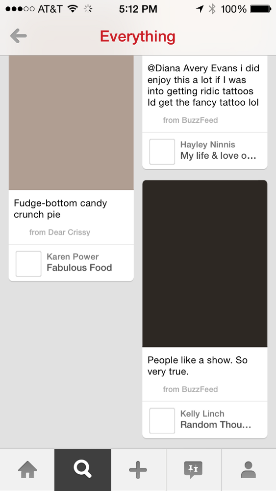
The color structure of the blocks in Pinterest
Pinterest uses a similar approach in its application and website. But they have advanced further in this. Pinterest analyzes the image in each post and understands what color prevails in it. Further, pinterest stores these values on the server and when the application loads the content, the transition between the color blocks and the actual images themselves is very smooth. In the end, it gives the feeling that the pictures are loaded much faster.
As designers and developers of mobile interfaces, we must use our entire arsenal so that the user experience we have created ensures high speed of interaction, smoothness and usability. This is becoming more and more important as mobile devices turn into wearable, that is, devices integrated into garments (most likely talking about glasses such as google glass - a sign of a translator) where the requirements and expectations of users are even more stringent.
More thoughts about product design and user experience on my @ozlubling twitter.
So how to make your application faster? Here are some interesting techniques, understanding that you can make your application faster.
When you post a photo on Instagram, the download starts in the background as soon as the user selects the photo or immediately after the camera is clicked. The application gains an advantage, since the process of placing a photo on Instagram consists of several steps (scaling and cropping, applying filters, adding a caption, etc.).
')
Instagram shows the message “Completed” by the time I finish publishing my picture.
And until the user passes these steps, the photo will already be uploaded in the background. At the same time, no progress bars or download messages.
By the time the user has already completed the process of placing photos and returns to viewing the tape friends. Probably he wants to see there and the image that he left. At this moment, the application shows the status “Completed”. The photo upload process is over, it is immediately displayed in the ribbon along with photos of friends.
Consequently, the user always has something to do while going through a series of steps, and at this time the photo will be uploaded. When the steps are over, the photo will already be uploaded. This gives the user a feeling of speed, although the photo is not loaded faster than usual.
It is very interesting how such a simple solution to improve user experience can be the impetus for the success of the product as a whole. Before the advent of Instagram, there were other applications that also allowed sharing photos, they were very similar but usually did not upload photos before the user completed all the required steps. This is a small change that made Instagram, added a sense of the speed of the application at times and thus became a tool in attracting users from other applications.
Messaging is another user experience where speed determines the very essence of the application. Let's try to compare the approaches in Whatsapp and iMessage in how they inform their users about sending and delivering their messages.
Two Whatsapp checkboxes to confirm the sending and delivery of the message.
Whatsapp has a green check mark indicating that the message was sent and another green check mark indicating that the message has already been delivered. Whatsapp made a brilliant move, the app shows the first tick right away. The message may not be uploaded yet, but Whatsapp takes responsibility and immediately shows the user a confirmation of sending. This gives the user the feeling that Whatsapp is really fast in messaging.
iMessage, on the other hand, uses a completely different approach, which unfortunately does not create the same positive feedback.
Progress Bar iMessage displays the process of sending a message
When a user sends a message to iMessage, the blue progress bar moves across the entire screen while the message is loading. Sometimes it takes some time, depending on the speed of the connection to the network. And if you send an image, the progress bar will move even slower.
Why is this a bad user experience? The user will inevitably follow the progress of the bar, as he moves across the screen and if he moves slowly, then the feeling of speed of work will immediately be lost. In the long run, this can affect how comfortable the user is in this application. But in practice, Whatsapp and iMessage probably send texts to that photo for the same time.
Thus, how each application displays the status of a message can have a big impact on the perception of the speed of the application.
There are many options that are used by designers and developers to show - the content is loaded. As a rule, they use some type of rotation, or a progress bar to show that something is happening, and in the meantime the user should wait for the download. In this case, the user is stuck for a while and this can sometimes upset him. It's like watching an hourglass.
Recently, some applications have already begun to use an approach that gives a feeling of faster loading of content, and therefore causes less irritation among users.
Facebook Paper app shows block structure
This application (see FB Paper) shows the "structure" of the content ", even before the content is fully loaded and appears on the screen, the user can see the location and format of the content blocks. And you wait looking at something like a plan or a prototype. As a result, when the content appears, the user has a feeling of smoothness and naturalness of the whole loading process.
The color structure of the blocks in Pinterest
Pinterest uses a similar approach in its application and website. But they have advanced further in this. Pinterest analyzes the image in each post and understands what color prevails in it. Further, pinterest stores these values on the server and when the application loads the content, the transition between the color blocks and the actual images themselves is very smooth. In the end, it gives the feeling that the pictures are loaded much faster.
As designers and developers of mobile interfaces, we must use our entire arsenal so that the user experience we have created ensures high speed of interaction, smoothness and usability. This is becoming more and more important as mobile devices turn into wearable, that is, devices integrated into garments (most likely talking about glasses such as google glass - a sign of a translator) where the requirements and expectations of users are even more stringent.
More thoughts about product design and user experience on my @ozlubling twitter.
Source: https://habr.com/ru/post/218025/
All Articles