Know How: P-branding as improving the appearance of the site and the desired advertising format
Hello!
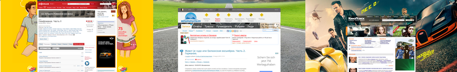
Now the Internet advertising is very fashionable, the so-called P-branding (I did not find this name either as a googling or search on Habré, but I was voiced by a colleague - a specialist of a large advertising agency on the Internet). “P” - because the content of the site is, as it were, inside an imaginary letter “P”, and on the sides and on top is a graphic substrate.
There is no need to go far for examples. This and KinoPoisk , and Bill , and other others.
')
And so, one advertiser wanted this ad format and on my brainchild, AvtoTuristu.Ru .
A programmer friend created a demo booth where by typing the values in pixels horizontally (for example, 1024.avtoturistu.ru or 1280.avtoturistu.ru) as a prefix to the domain name of the demo stand, the content of the site (that is, the interior of “P”) ) dynamically changed in width. As it was done technically - alas, I personally will not answer, but I think the pros of the layout will answer without problems. Then I found the optimal solution for my site - 1024 pixels wide; at the same time, nothing from the content overlaps each other (well, there were, of course, little things that were fixed, but not critical). Further, this parameter was fixed in the config. At the same time, we made a setting with which you can make the substrate both fixed vertically (that is, the site content scrolls down, and the sides of the substrate stand still) and not fixed (leaves up when scrolling). An example with a non-fixed substrate is here .
The upper part of the "P" can be anything. That is, it can be untouched by a fragment of the entire image-substrate 1024 horizontally and arbitrarily vertically (in my case, I created and uploaded a transparent GIF 1024x90 into a special template file). This gif is clickable. Maybe some kind of flash banner or may be absent altogether, as it is now on the poster .
While there is no advertiser or the campaign has not started, you can simply make a beautiful background for the site or just leave a solid background (as it is now in Habré). In any case, as for me - the web site’s cuteness with such a “P” branding is much higher than without it:
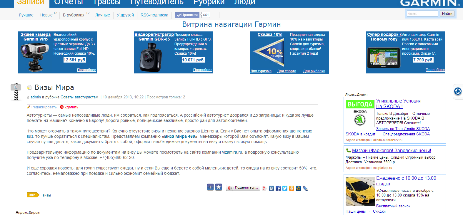
But there is also a nuance, which consists in the fact that only users with a certain screen resolution (in my case, those with a resolution> = 1024) will see the side branding. But everyone will see the top of "P". That being said, production costs ...
Now the Internet advertising is very fashionable, the so-called P-branding (I did not find this name either as a googling or search on Habré, but I was voiced by a colleague - a specialist of a large advertising agency on the Internet). “P” - because the content of the site is, as it were, inside an imaginary letter “P”, and on the sides and on top is a graphic substrate.
There is no need to go far for examples. This and KinoPoisk , and Bill , and other others.
')
And so, one advertiser wanted this ad format and on my brainchild, AvtoTuristu.Ru .
A programmer friend created a demo booth where by typing the values in pixels horizontally (for example, 1024.avtoturistu.ru or 1280.avtoturistu.ru) as a prefix to the domain name of the demo stand, the content of the site (that is, the interior of “P”) ) dynamically changed in width. As it was done technically - alas, I personally will not answer, but I think the pros of the layout will answer without problems. Then I found the optimal solution for my site - 1024 pixels wide; at the same time, nothing from the content overlaps each other (well, there were, of course, little things that were fixed, but not critical). Further, this parameter was fixed in the config. At the same time, we made a setting with which you can make the substrate both fixed vertically (that is, the site content scrolls down, and the sides of the substrate stand still) and not fixed (leaves up when scrolling). An example with a non-fixed substrate is here .
The upper part of the "P" can be anything. That is, it can be untouched by a fragment of the entire image-substrate 1024 horizontally and arbitrarily vertically (in my case, I created and uploaded a transparent GIF 1024x90 into a special template file). This gif is clickable. Maybe some kind of flash banner or may be absent altogether, as it is now on the poster .
While there is no advertiser or the campaign has not started, you can simply make a beautiful background for the site or just leave a solid background (as it is now in Habré). In any case, as for me - the web site’s cuteness with such a “P” branding is much higher than without it:
But there is also a nuance, which consists in the fact that only users with a certain screen resolution (in my case, those with a resolution> = 1024) will see the side branding. But everyone will see the top of "P". That being said, production costs ...
Source: https://habr.com/ru/post/217977/
All Articles