How to lie with the help of statistics
There are three types of lies: lies, blatant lies and statistics ( source )
There is such a wonderful genre - “ bad advice ” in which children are given advice, and children, as you know, do the opposite and everything turns out just right. Maybe with all the rest so happens?
Statistics, infographics, big data, data analysis and data science are just not busy now. Everyone knows how to do it all correctly, it remains only for someone to write how NOT to do this. In this article we will do just that.
Hazen Robert " Curve fitting ". 1978, Science.
')
The structure of the article:
- Introduction
- Sampling bias
- Properly choose the average (Well-average average)
- And 10 more unsuccessful experiments, about which we have not written
- Playing with a scale
- Choose 100%
- We hide the necessary numbers
- Visual metaphor
- An example of high-quality visualization
- Conclusion and further reading
Sampling bias
In 1948, during the presidential race in the United States on the night of the announcement of the election results Truman (Democrats) against Dewey (Republicans), the Chicago Tribune newspaper published its perhaps most famous DEWEY DEFEATS TRUMAN headline (see photo). Immediately after the closure of the polling stations, the newspaper conducted a survey, calling a huge number of voters (sufficient for the sample), and everything foreshadowed Dewey's deafening victory. In the photo we see a laughing Truman, the winner of the election of the 48th year. What went wrong?

People were called around really randomly and in sufficient numbers, but in the 48th year the phone was available only to people of a certain wealth and was rarely seen among people with low earnings. Thus, the polling method itself amends the distribution of votes. The sample did not take into account a sufficiently wide stratum of Truman voters (as a rule, Democrats have a large share of the votes among the poor), for whom the telephone was in turn unavailable. Such a sample is called sampling bias .
Folk art about this phenomenon:
According to online voting, 100% of people use the Internet.
Graduates salary
Nobody was surprised that when we hear about the salaries of university graduates, for some reason, is it always incredibly high numbers? In the US, it is now reaching even the courts , where graduates claim that salary data are artificially high.

(picture from How to Lie with Statistics )
This is a rather old problem, according to Darrell Huff, a similar question arose among Yale graduates of the 24th year. And in fact, everyone is telling the truth, but not all. Statistics were collected in the form of surveys (and in those years using paper mail). Far from all send the answer, but only a small part of all graduates; those who are doing well are responding more actively than others (which often results in a decent salary), so we see only the “good” part of the picture. This is what creates the bias of the sample and makes the results of such surveys absolutely useless.
Properly choose the average (Well-average average)
Imagine a company in which a manager receives 25 thousand, his deputy 7.6 thousand, top managers of 5.5 thousand, middle managers of 3.5 thousand, junior managers of 2.5 thousand, and ordinary employees of 1, 4 thousand (abstract funtik) per month.
And our task is to present information about the company in a positive light. We can write the average salary in a company is X, but what does mean mean ? Consider the possible options (see diagram below):

(picture from How to Lie with Statistics )
The arithmetic average of some finite set X = {x i } is such a number m equal to mean (X) from the equation:

This is the most useless information from the point of view of the employee - 3,472 is the average salary, but at the expense of what is such a high figure? Due to the high salaries of management, which creates the illusion that the employee will receive the same amount. From the point of view of the employee, this value is not particularly informative.
Of course, folk art has not bypassed this feature of the “average value” in the form of average arithmetic
Officials eat meat, I - cabbage. On average, we eat cabbage rolls.
The median of a certain distribution P (X) (X = {x i }) is such a quantity m that it satisfies the following equation:

Simply put, half of the workers get more than this value, and half less - exactly the middle of the distribution! This statistic is informative enough for the company's employees, as it allows you to determine how an employee’s salary relates to the majority of employees.
The mode of a finite set X = {x i } is the number m, which occurs in X most often. In this case, the mod may be the most informative for the person who is going to start working in this company.
Thus, depending on the situation, the average value can be understood as any of the above values (in principle, and not only from them). Therefore, it is crucially important to understand how this average value is calculated.
And 10 more unsuccessful experiments, about which we have not written
We'll drop a regular newspaper in sulfuric acid, and TV Park magazine - in distilled water! Feel the difference? Nothing happened to the magazine - paper is like new! (The entire video here .)

Our research reports that Doake's toothpaste is 23% more effective than its competitors, and all this thanks to Dr Cornish's Tooth Powder! (Which surely contained β-carotene and the secret formula of the forest - author's note.) You might be surprised, but the research did indeed lead and even released a technical report. And the experiment really showed that toothpaste is 23% more effective than competitors (so that it does not mean). But is this the whole story?
In fact, the sample for the experiment was only a dozen people (according to Darrell Huff and the book already mentioned). This is exactly the sample that is needed to get any results! Imagine that we toss a coin five times. What is the probability that an eagle will fall all five times? (1/2) 5 = 1/32. Just one thirty-two, it can't be just a coincidence if all five eagles fall out, right? Now imagine that we repeat this experiment 50 times. At least one of these attempts will be crowned with success. We will write about it in the report, and all other experiments will not go anywhere. Thus, we get only random data that fits perfectly into our task.
Playing with a scale
Suppose tomorrow we need to show at the meeting that we caught up with competitors, but the numbers do not converge a bit, what should we do? Let's move the scale a little! Even the New York Times, famous for its high-quality data processing, has released a completely confusing schedule (note the jump from 800k to 1.5m in the center of the scale).

(example from How to Display Data Badly Howard Wainer. The American Statistician, 1984.)
Choose 100%
Imagine that last year the milk cost 10 kopecks per liter and the bread was 10 kopecks per loaf. This year, milk fell in price by 5 kopecks, and bread increased by 20. Attention is the question, what do we want to prove?
Imagine that last year is 100%, the basis for calculations. Then milk fell in price by 50% percent, and bread grew by 200%, average 125%, which means that prices rose by 25% in general.

Let's try one more time, let the current year be 100%, which means milk prices were 200% last year, and bread is 50%. So, last year prices were on average 25% higher!

(graphs and example from the chapter “How to Statisticulate” How to Lie with Statistics )
We hide the necessary numbers
The best way to hide something is to divert attention. For example, consider the dependence of the number of private and public schools (in thousands of units) by year. The graph shows that the number of public schools is decreasing, and the number of private ones does not change significantly.
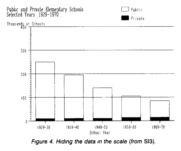
In fact, the growth in the number of private schools is hidden against the background of the number of public schools. Since they differ by an order of magnitude, in fact, any changes will not be noticeable on the scale with a sufficiently large step. Redraw the number of private schools separately; Now we clearly see a significant increase in the number of private schools, which was “hidden” in the previous chart.
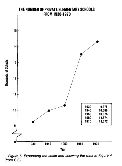
(example and graphics from How to Display Data Badly, Howard Wainer . The American Statistician, 1984.)
Visual metaphor
If you do not compare with anything, but you really want to confuse, then this is the time for incomprehensible visual metaphors. For example, if we depict, instead of length, the area on the graph, then any growth will seem much more significant.
Consider the amount of beer consumed in the United States in 1970-1978 in millions of barrels and the market share of Schlitz (see chart below). Looks good, impressive. Is not it?

And now let's get rid of unnecessary "garbage" on this chart and redraw it in the normal way. Already somehow not so impressive and seriously coming out.

(graphs and examples from John P. Boyd, lecture notes How to Graph Badly or What. NOT to Do )
The first picture does not lie, all the numbers in it are correct, only it implicitly presents the data in a completely different light.

(picture from How to Lie with Statistics).
An example of high-quality visualization
High-quality visualization primarily presents results, avoiding ambiguity, and transmits a sufficient amount of information in a compressed volume. The work of Charles-Joseph Minar is well said here :
Everything is perfect here, the viewer is not held for an idiot, and they do not spend his time stuck incensored. A wide beige strip shows the size of the army at each point of the march. In the upper right corner is Moscow, where the French army comes and where the retreat begins, shown by a black stripe. For the route of retreat for additional interest attached timeline and temperature.
The conclusion is: the amazed spectator compares the size of the army at the start with the one that came back home. The spectator is full of feelings, he has learned something new, he has felt the scale, he is mesmerized, he realized that at school he did not recognize anything.

(Charles Joseph Minard: Napoleon's Retreat From Moscow (The Russian Campaign 1812-1813), 1869.)
Conclusion and further reading
76% of all statistics taken from the head
This compilation covers a far from complete list of techniques that deliberately, as well as not consciously distort data. This article primarily demonstrates that we must closely monitor the statistical data provided to us and the conclusions made on their basis.
Short list for further reading:
How to Lie with Statistics is a wonderful little book, incredibly interesting and well written, read in one breath. Demonstrates the main "errors" that allow the media (and not only them) when working with data.
How to Display Data Badly. Howard Wainer. The American Statistician (1984) is a collection of common mistakes and general “harmful” rules, most often encountered in works with data visualization.

Source: https://habr.com/ru/post/217545/
All Articles