New design of Intel processors - made in Russia!
Intel has been working with designers for a long time and successfully, including with Russian designers. But so far, cooperation has been limited to the creation of various accessories for Intel technology and the beginning of work on the transformation of the Internet of Things into the Internet of Fashionable Things. And this, you understand, is not a topic for a post on habrahabr.
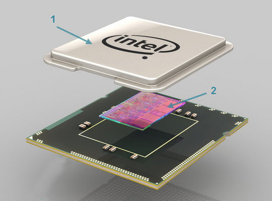
But not so long ago everything changed. The Russian studio, namely Art. Lebedev Studio, commissioned by Intel, implemented the full cycle of industrial design of a new generation of processors, which is being prepared for release this year.
Plan of the work performed.
The cooperation of the American corporation and the Russian studio in the framework of the campaign “Look inside” was carried out in two planes:
The first part of the task is the design of the processor case. Under the terms of the contract, the design should have been not only aesthetic, but also functional. As a result, a simple and elegant solution was chosen - the Intel logo on the CPU cases was supplemented with a circle in the lower right, immediately below the letter “l”. Visually, this element not only echoes the dot above i in the first symbol of the logo, but also turns the last symbol into an exclamation mark!
But this is not the main thing. A circle is not just a drawing, but an active element associated with the CPU electronics. As you know, when you turn on the system, the BIOS performs its testing (Power On Self Test), and, in the event of any problems, the sound signals to the unsuspecting user are rather unpleasant. Our solution is much more modern and friendlier to users. In the event of faults, both of the processor itself and of the rest of the system components, the circle starts to flash, and a specific fault is encoded in the duration of the blink cycle. For example, frequent, twice a second, blinking is a banal overheating of the processor. In general, this is the case when it is better to see a hundred times than to hear once.
')


Logo in blue-white and white-black scales.
Of course, someone may say that in order to visually identify a fault, you will have to disassemble the case, but do not forget that in the case of an audio signal, the case will still have to be disassembled - to correct the problem.
The second part of the assignment also represented a great scope for creativity. “It was especially interesting to work with microchips,” says Studio Director Artemy Lebedev. - “We walked towards this goal gradually. Our first project in this direction was the project of the door chain "Defendius".


Further development of our skills in working with diagrams is due to the work on the map of the Moscow metro. Is it really a bit simpler than the processor circuit?
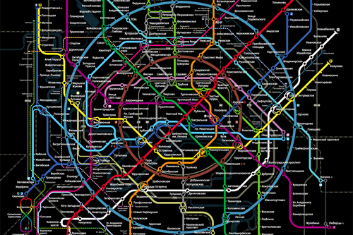
A fragment of the futuristic scheme of Metro 2100 - one of the works of the Studio.
You can see the final result of our work if you look under the covers of the chassis of the new Intel CPUs. ”
“High technologies, like design art, require the ability to look into the future and understand how the world is changing,” says Dmitry Konash, Intel regional director in the CIS countries. And the future is inevitable. Therefore, the collaboration between Intel and Lebedev Studio is planned to continue. The plans - the most difficult - the creation of an attractive boxed packaging Intel CPU.
UPD. This post was released on April 1, please do not take it too seriously. Although, you will probably agree that beauty and aesthetics are in demand in any product - and in processors as well.
But not so long ago everything changed. The Russian studio, namely Art. Lebedev Studio, commissioned by Intel, implemented the full cycle of industrial design of a new generation of processors, which is being prepared for release this year.
Plan of the work performed.
The cooperation of the American corporation and the Russian studio in the framework of the campaign “Look inside” was carried out in two planes:
- functional design of processor cases
- internal crystal design, that is, the arrangement of transistors on the circuit in order to improve ergonomics and reduce the cost of production, of course, in the framework of a given Intel CPU topology.
Dot all points under l.
The first part of the task is the design of the processor case. Under the terms of the contract, the design should have been not only aesthetic, but also functional. As a result, a simple and elegant solution was chosen - the Intel logo on the CPU cases was supplemented with a circle in the lower right, immediately below the letter “l”. Visually, this element not only echoes the dot above i in the first symbol of the logo, but also turns the last symbol into an exclamation mark!
But this is not the main thing. A circle is not just a drawing, but an active element associated with the CPU electronics. As you know, when you turn on the system, the BIOS performs its testing (Power On Self Test), and, in the event of any problems, the sound signals to the unsuspecting user are rather unpleasant. Our solution is much more modern and friendlier to users. In the event of faults, both of the processor itself and of the rest of the system components, the circle starts to flash, and a specific fault is encoded in the duration of the blink cycle. For example, frequent, twice a second, blinking is a banal overheating of the processor. In general, this is the case when it is better to see a hundred times than to hear once.
')
Logo in blue-white and white-black scales.
Of course, someone may say that in order to visually identify a fault, you will have to disassemble the case, but do not forget that in the case of an audio signal, the case will still have to be disassembled - to correct the problem.
Nanodesign
The second part of the assignment also represented a great scope for creativity. “It was especially interesting to work with microchips,” says Studio Director Artemy Lebedev. - “We walked towards this goal gradually. Our first project in this direction was the project of the door chain "Defendius".
Further development of our skills in working with diagrams is due to the work on the map of the Moscow metro. Is it really a bit simpler than the processor circuit?
A fragment of the futuristic scheme of Metro 2100 - one of the works of the Studio.
You can see the final result of our work if you look under the covers of the chassis of the new Intel CPUs. ”
“High technologies, like design art, require the ability to look into the future and understand how the world is changing,” says Dmitry Konash, Intel regional director in the CIS countries. And the future is inevitable. Therefore, the collaboration between Intel and Lebedev Studio is planned to continue. The plans - the most difficult - the creation of an attractive boxed packaging Intel CPU.
UPD. This post was released on April 1, please do not take it too seriously. Although, you will probably agree that beauty and aesthetics are in demand in any product - and in processors as well.
Source: https://habr.com/ru/post/217453/
All Articles