Simple rules for implementing gesture control in iOS, which must be followed so as not to annoy anyone

Dear iPhones, does it happen to you that you downloaded the application, and there ... everything is not right and wrong and in its place? When your user experience tells you that the application is not designed correctly: you press, for example, a button that always means “Share” in iOS, and you instead have some kind of “left” menu ... Unpleasant frustration arises, and you all, demolish the app from your smartphone.
This usually happens when:
')
- developer and tester are not iPhone users, they have no place to gain an understanding of the iOS ecosystem;
- the customer and / or developer wants to stand out, to originate, believing that the user does not have enough freshness of impressions, and ... overdo it.
This always reflects badly on the result, because the user, in a paradoxical way, at the same time waits for the wow effect, but is also conservative to the bone marrow. How not to annoy and meet the expectations of the user device company Apple, but at the same time impress it? We tried to figure it out. If you are a novice iOS developer, we think it would be useful for you to read the article, and if you are experienced and many things seem obvious to you, let's just compare our observations with you.
The most important thing in the application
Mobile applications are rated by users according to several basic criteria:
- Content is something that a user can learn, read, listen to or see thanks to your application.
- Features are what the user can do using the app.
- Design - how the application looks, what it depends on, whether the user will consider the application beautiful, original, convenient.
- Interaction is how an application responds to user actions, which control methods it allows.
The first two points are purely utilitarian sense, and here we will not discover America - the application should be just useful, and that says it all. Much has been written about the design of mobile applications and usability.
But what's next, how to wrap up utilitarian functionality beautifully, modernly, and, most importantly, get into the heart of these very mobile, digital users and integrate into the ecosystem of the iOS platform?
To meet expectations
Smartphone users begin mastering the device with standard applications: a phone, a list of contacts, notes — all of them instill the habit of acting in an application in a certain way, for example, dragging a line to the left to remove a line. When the user makes a familiar gesture and gets an unexpected result, he is uncomfortable. That is why we strongly recommend keeping traditions.
So, consider examples of familiar gestures that need to be supported in your iOS application.
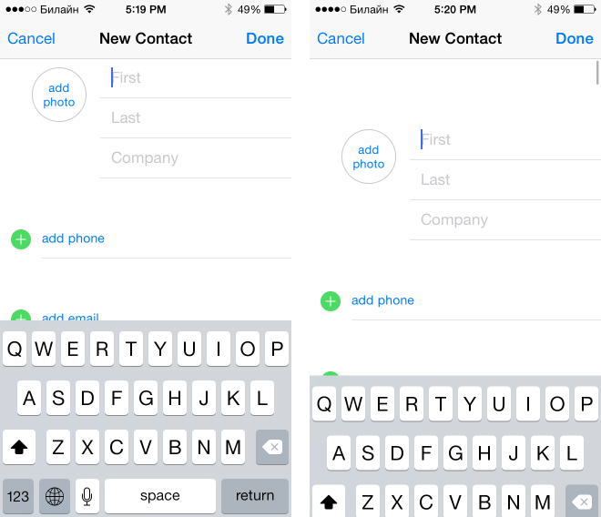
If the application has forms
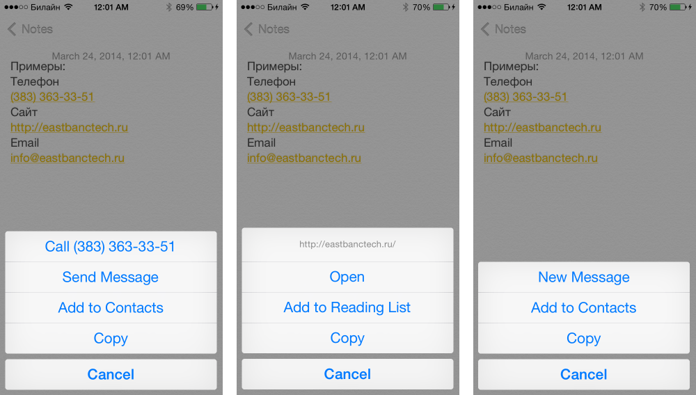
By clicking on the form field, the application displays a control for entering data (keyboard, date selection control, etc.) - this control is called the input view. Whatever input view does not display the application, the field should be able to insert text. The standard gesture for this is long tap (long press). On it opens a menu with the ability to select text, copy or paste text from the buffer.
Tip: In the field where there is no possibility to enter text from the keyboard, you can make only the options “Copy” the entire value and “Paste”. For fields with the ability to enter text, you must add the ability to highlight parts of the text before copying, cutting or pasting.
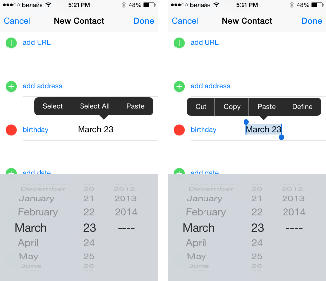
By modern standards, it is also necessary to support hiding the input view on a scroll.
If the application has lists (tables)
The most important thing to realize is the ability to scroll through the list without hanging and brakes: users love responsive applications.
By clicking on the status bar list (and generally any scroll view) should go to the top of the list. This feature is often lost when there are several scrolling areas on the screen. If the list can contain more than 20 items, be sure to check this feature before publishing the application.
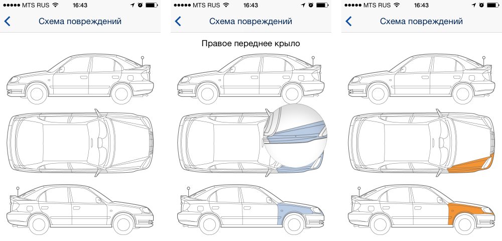
When you drag your finger from left to right or right to left according to the standard, the “delete” button (swipe to delete) appears on the list item, any application should behave the same way. It should be noted that this is removal from the list, and it does not always imply the removal of the object as a whole. For example, if you show a list of elements with a specific attribute, then deleting an element from the list may mean removing a characteristic from that element.
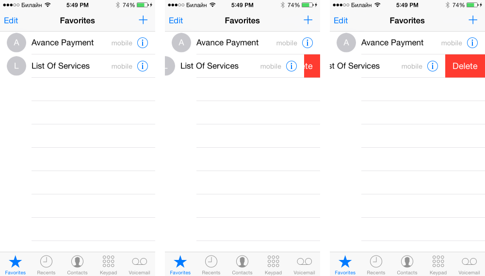
In this example, the contact will be removed from the “Favorite Contacts” list, but will remain in the general list.
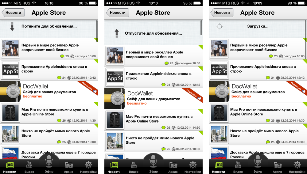
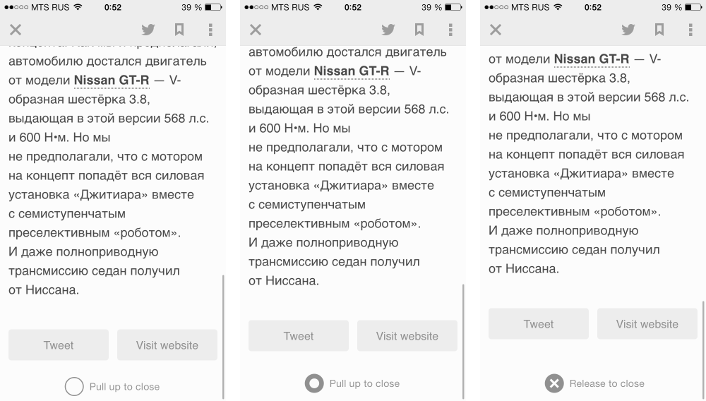
A few years ago, the first mobile application appeared, in which the “refresh” button (refresh) was replaced with a pull-to-refresh gesture (pull to refresh). The user navigates the screen from top to bottom, and a release to refresh message appears (release to refresh). After that, a download indicator appears at the top of the list, which disappears as soon as the update is completed.
Tip: If the application displays information that can be used in other applications, you need to open a menu of possible actions by long pressing. For example, you need to give the opportunity to call the phone number or add it to your contact list, open the site in the browser, the address on the map, etc.
Cancel Editing
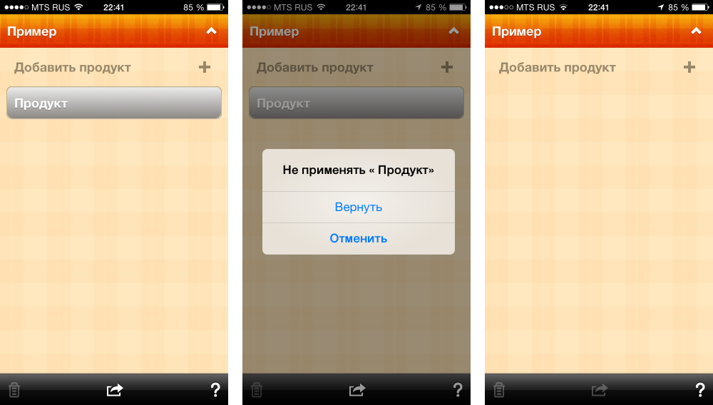
If the application is implemented to edit any information, for example, creating a shopping list, notes, etc., you need to add the ability to cancel the action by shaking the mobile device (Shake to cancel).
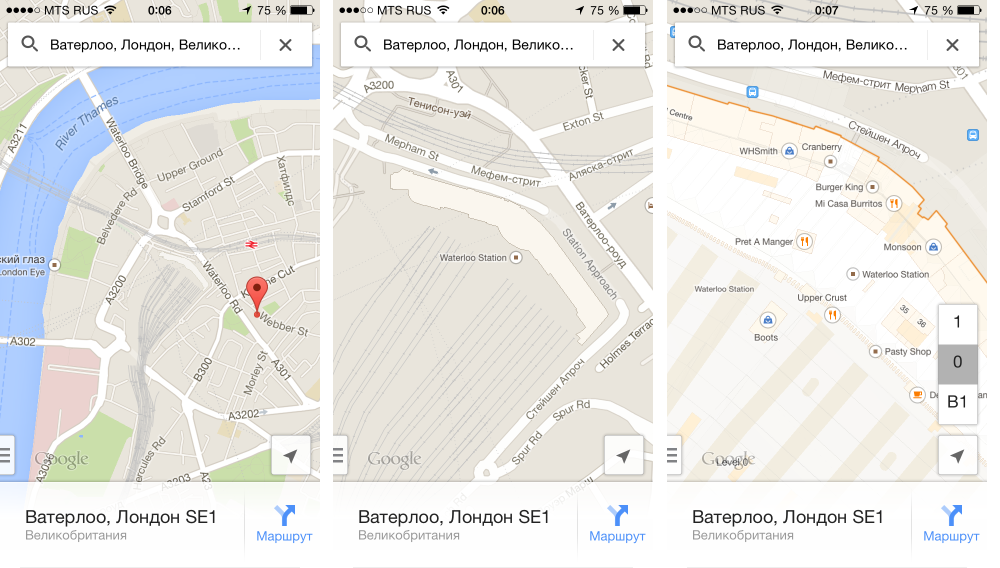
If the application displays graphical information that the user would be comfortable looking at at different scales, then you need to implement the ability to scale with the pinch gesture. An example would be applications with maps, galleries, embedded browsers, games, etc.
Impress user
And your application can already be called convenient and modern in terms of using gestures. This will satisfy many users, for example, in business applications. However, if you want to do something special, attractive and better than your competitors, you need to think about the additional features that you can offer your users. Many of the things listed below were invented for some specific applications, but because of their convenience they have become popular and are now used in many applications, and most users consider them standard.
Consider additional features on examples of popular applications.
Gallery
If the application has a gallery, you need to implement the following features:
- by clicking on the picture, it opens in a separate screen (in gallery mode);
- Clicking on the screen in the gallery mode shows / hides the control controls: the navigation bar, the Share buttons, etc.
These functions are standard and can be found in the standard Photo application. Additionally, modern applications implement the ability to exit the gallery mode by scrolling or clicking.
Similarly, in modern applications, the closure of news viewing screens is implemented.
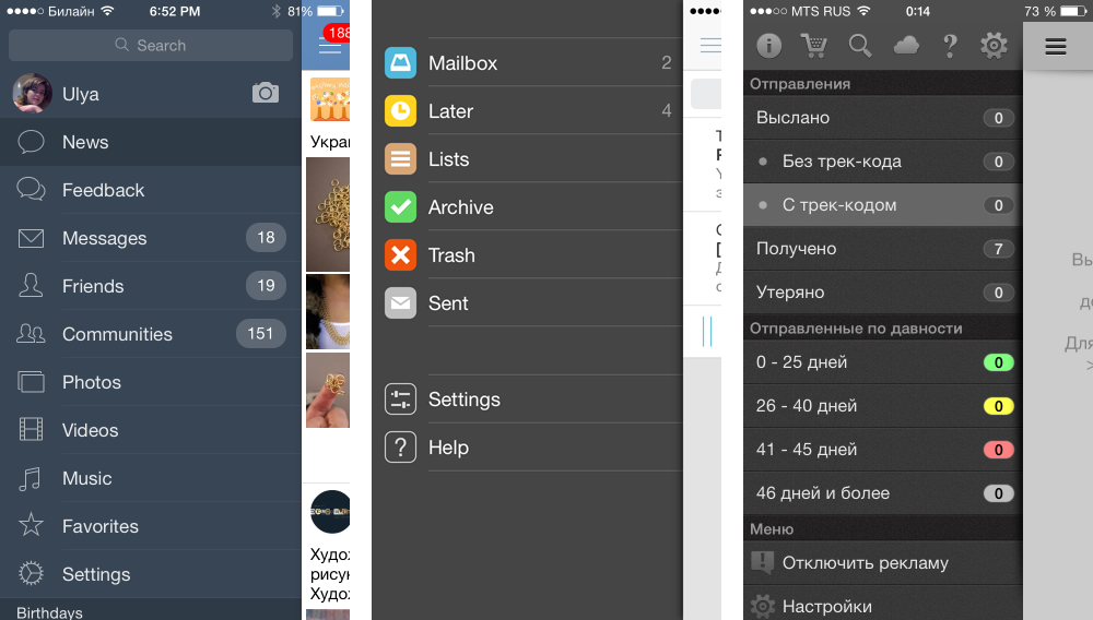
Menu
If the application has a menu that contains more than 5 items, you can put it in a separate screen, which can be accessed with the “swipe” gesture. The first such menu appeared in the Path application, and is called the Path-style menu, however, it is more familiar to users from Vkontakte, Facebook, Gmail applications, now it is used in very many applications.
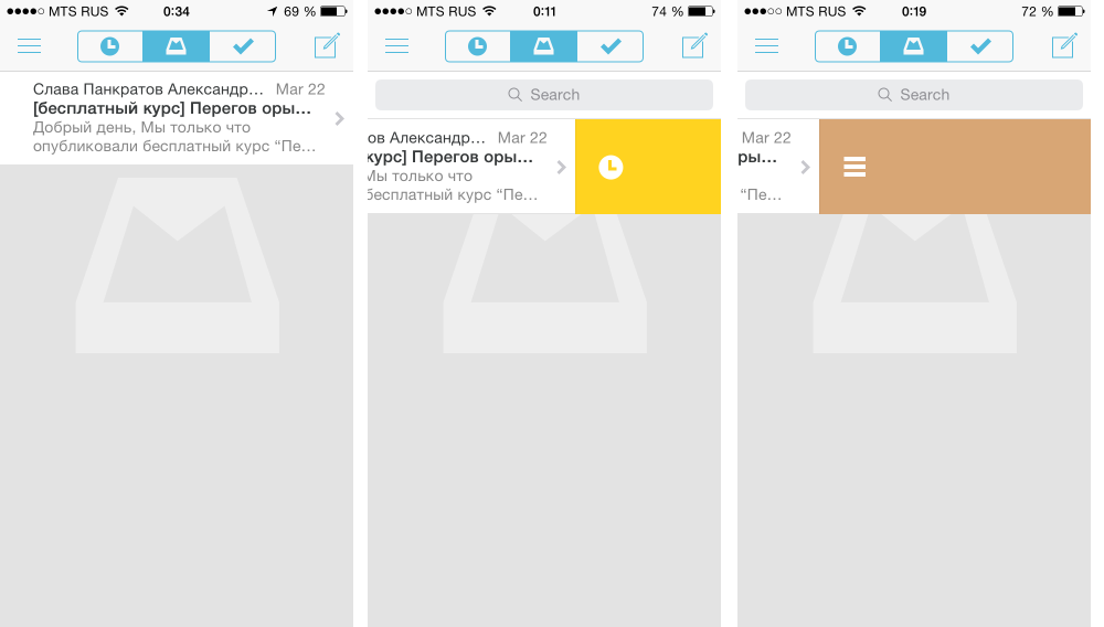
Deletion with marks
On the basis of the standard deletion function, when you swipe from left to right or right to left (swipe to delete), implementations appeared to be removed from the list with adding marks, and the amount of shift can influence which mark will be added to the element:
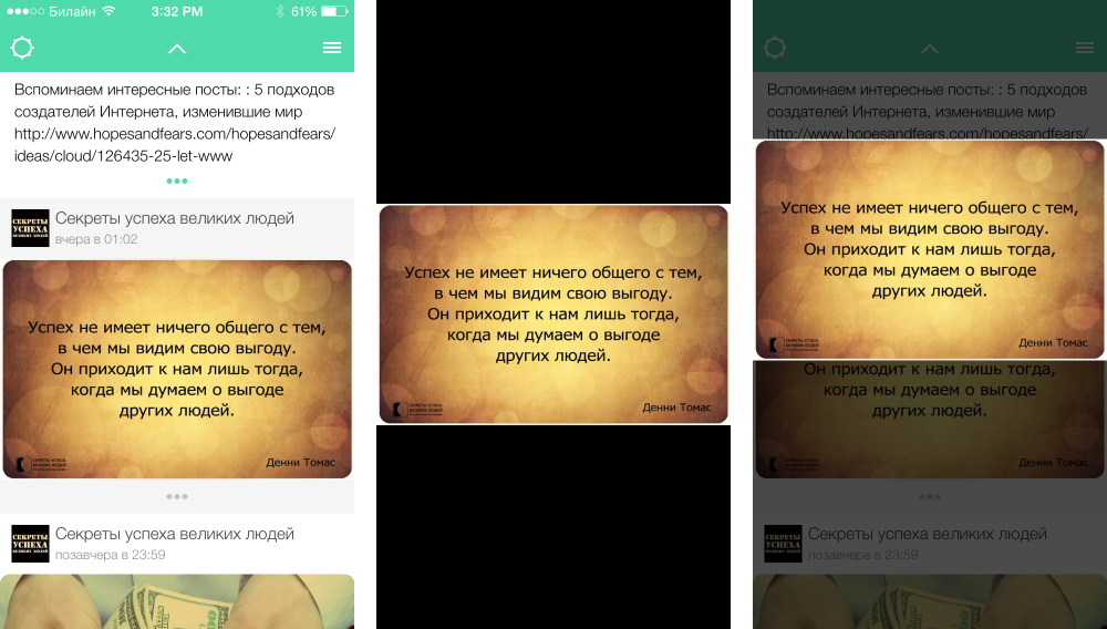
Optimize the navigation bar
To increase the usable area, many applications hide the navigation bar when scrolling upwards. This behavior is also typical of browsers that reduce the display area of the page address. When scrolling down the navigation bar expands.
To support scrolling to the top of the page by clicking on the status bar (status bar), some applications expand the area that responds to user actions by adding a button.
Sample application with a hidden navigation bar and a button to return to the top of the list.
Magnifying glass
If the application has a display of small details, it is possible in addition to scaling or instead of making a magnifying glass, like the one used to highlight text in the browser. Such an element of the interface should appear with a long press (long tap).
Gesture based applications
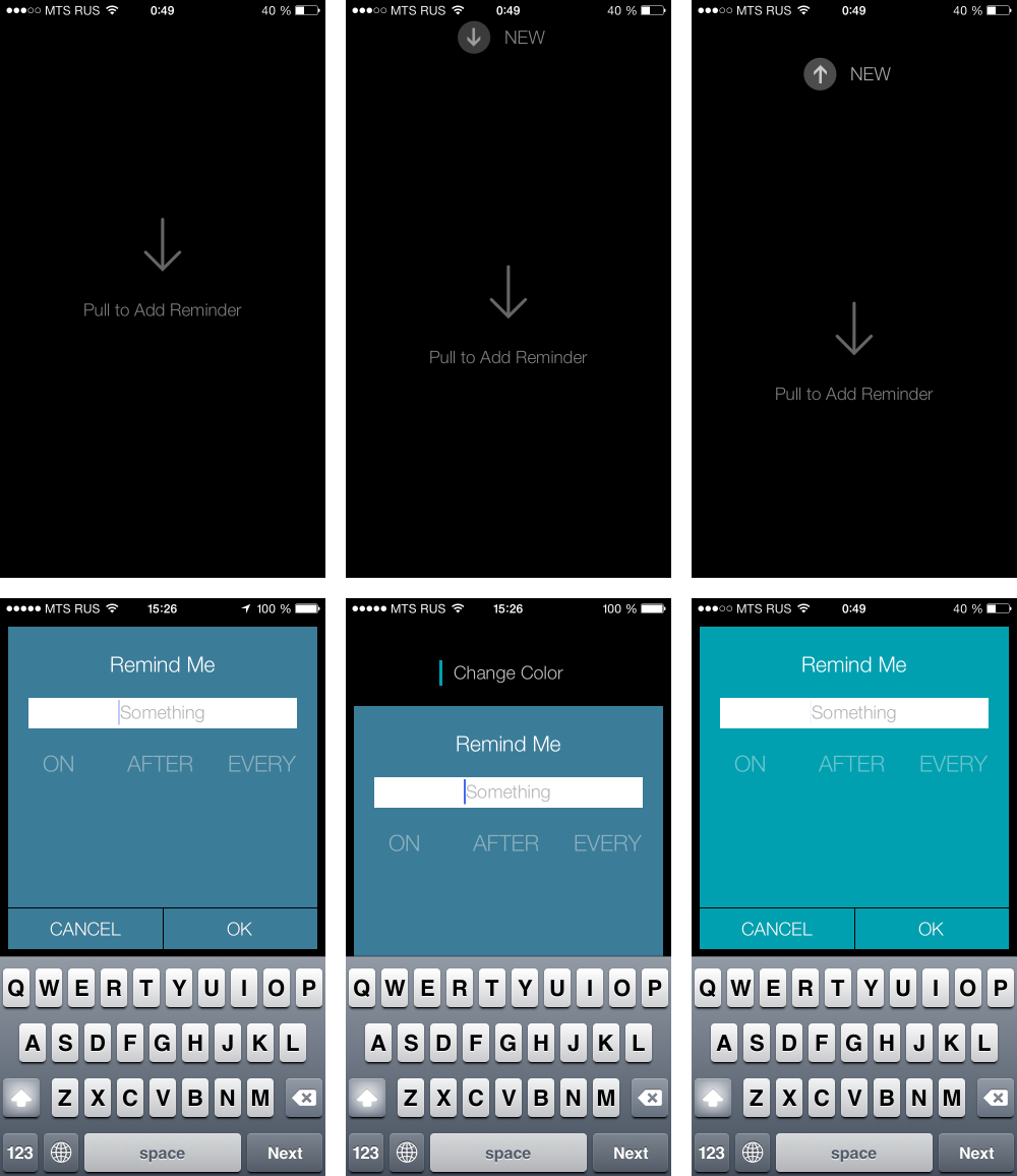
Sometimes application creators go even further and make gesture control the main feature of the application. For example, on the pull-to, the xReminder application works - creating notes, changing colors, everything is done on the basis of a single gesture. For business applications, this solution is rarely suitable, but for marketing purposes it may well justify itself.
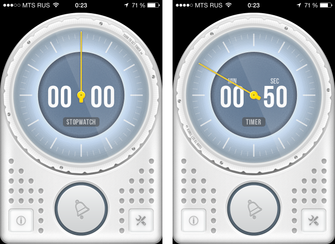
Rotation
This is quite a rare, but quite specific gesture. If the interface has an element with positioning in a circle, then you can perform it by analogy with the clock hands. For example, this is how the timer is set in the Minu Timer application.
To search for information about the implementation details of modern popular application features, you can refer to specialized resources, for example, such as idevrecipes.com or search for implementation on github, for example, github.com/acoomans/iOS-MagnifyingGlass
In the comments, we urge you to share your observations - what cool tricks have you seen? Where do you think they should be added?
Applications used for examples
Standard:
- Safari
- Notes
- Contacts
Popular:
Source: https://habr.com/ru/post/217355/
All Articles