Visualization of personal expenses
Recently, in the “Question-Answer” column, I was asked to improve my personal finances table .
This topic turned out to be so interesting that I was not too lazy to upload data on spending over the past 2 years from my internet bank, and we in the laboratory made interactive visualization on D3: http://budget.datalaboratory.ru
The visualization shows each individual transaction and the total distribution of spending over time, by category, day of the week, and time of day. When you hover, a hint pops up with the amount, category, and specific product (if you managed to remember it). Foreign currency expenses are shown by the flags of the countries at the bottom of the chart and illustrate my movements.
')
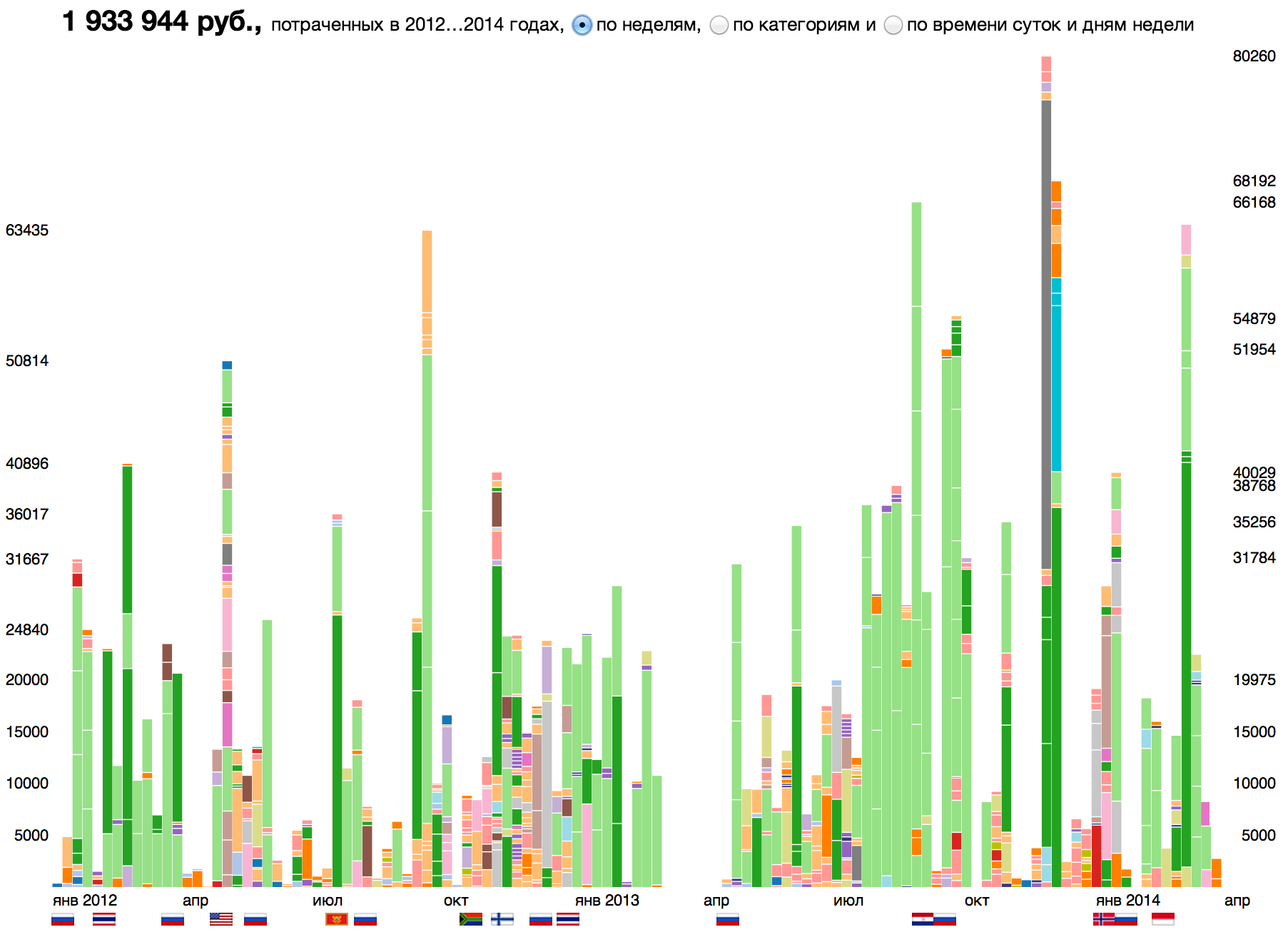
The diagram shows that last year I almost did not use the card, mostly I was withdrawing cash. That in March 2013 the map was compromised and I did not use it before returning from Thailand to Moscow. What are the main items of expenditure - transportation and food (supermarkets and restaurants). In 2012, I bought products in the "Crossroads" and "Alphabet of Taste" and brought expensive alcohol from Dyutifri, in 2013 I switched to "Scarlet Sails" (moved) and sporting goods (I got carried away by running). With travels in the States and Finland, costs have increased dramatically, while in South Africa and Montenegro they were noticeably lower. Week in New York set an absolute record for entertainment spending. In Finland and Norway, I bought Marimekko and COS dresses - these are my favorite Scandinavian brands.
Spending is filtered by category:

And also by the day of the week and time of day:
It is evident that in restaurants I usually have dinner on weekdays (I pay about 22) and have lunch on weekends, I buy food on Saturday and Sunday afternoon. It turns out that I often withdraw cash on Friday, in the interval from 13 to 14 — I don’t know how to explain it. Money for music and books iTunes and Amazon write off at midnight, so the time of the "reclaiming" could not be traced.
Although our visualization alone does not reveal patterns and does not provide advice, it is a useful tool for studying our own "monetary" habits. She opens her eyes to a hidden picture of spending.
It was interesting for me to study the history that my bank account keeps, and I thought that someone else would also want to look at their expenses in a similar format. Therefore, we decided to conduct a small experiment on Habré. If you are interested in the visualization, and you are ready to spend a couple of hours to see your picture of spending, prepare a csv file with expenses from the Internet bank (at least six months, maximum two) in the following format:
date; value; target; category; place
01/01/12 17: 53; 330 ;; movie; Russia;
13/01/12 15:21; 470; Daily bread; restaurants; Russia;
and send it to data@datalaboratory.ru with the note “Flowgram”.
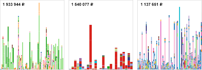
We will select 10-20 most interesting samples, visualize them and publish them on the site. All data will be placed in the public domain, but the name, if desired, can be replaced with a fictional one. If the experiment is successful, we will think about creating a micro-service for cost visualization, accessible to everyone.
Added later. Those who wanted to build their own expenses digram turned out to be slightly less than we expected. Those who sent their data will find a visualization at: budget.datalaboratory.ru
This topic turned out to be so interesting that I was not too lazy to upload data on spending over the past 2 years from my internet bank, and we in the laboratory made interactive visualization on D3: http://budget.datalaboratory.ru
The visualization shows each individual transaction and the total distribution of spending over time, by category, day of the week, and time of day. When you hover, a hint pops up with the amount, category, and specific product (if you managed to remember it). Foreign currency expenses are shown by the flags of the countries at the bottom of the chart and illustrate my movements.
')
The diagram shows that last year I almost did not use the card, mostly I was withdrawing cash. That in March 2013 the map was compromised and I did not use it before returning from Thailand to Moscow. What are the main items of expenditure - transportation and food (supermarkets and restaurants). In 2012, I bought products in the "Crossroads" and "Alphabet of Taste" and brought expensive alcohol from Dyutifri, in 2013 I switched to "Scarlet Sails" (moved) and sporting goods (I got carried away by running). With travels in the States and Finland, costs have increased dramatically, while in South Africa and Montenegro they were noticeably lower. Week in New York set an absolute record for entertainment spending. In Finland and Norway, I bought Marimekko and COS dresses - these are my favorite Scandinavian brands.
Spending is filtered by category:
And also by the day of the week and time of day:
It is evident that in restaurants I usually have dinner on weekdays (I pay about 22) and have lunch on weekends, I buy food on Saturday and Sunday afternoon. It turns out that I often withdraw cash on Friday, in the interval from 13 to 14 — I don’t know how to explain it. Money for music and books iTunes and Amazon write off at midnight, so the time of the "reclaiming" could not be traced.
Although our visualization alone does not reveal patterns and does not provide advice, it is a useful tool for studying our own "monetary" habits. She opens her eyes to a hidden picture of spending.
It was interesting for me to study the history that my bank account keeps, and I thought that someone else would also want to look at their expenses in a similar format. Therefore, we decided to conduct a small experiment on Habré. If you are interested in the visualization, and you are ready to spend a couple of hours to see your picture of spending, prepare a csv file with expenses from the Internet bank (at least six months, maximum two) in the following format:
date;value;target;category;placedate; value; target; category; place
01/01/12 17: 53; 330 ;; movie; Russia;
13/01/12 15:21; 470; Daily bread; restaurants; Russia;
and send it to data@datalaboratory.ru with the note “Flowgram”.
We will select 10-20 most interesting samples, visualize them and publish them on the site. All data will be placed in the public domain, but the name, if desired, can be replaced with a fictional one. If the experiment is successful, we will think about creating a micro-service for cost visualization, accessible to everyone.
Added later. Those who wanted to build their own expenses digram turned out to be slightly less than we expected. Those who sent their data will find a visualization at: budget.datalaboratory.ru
Source: https://habr.com/ru/post/217179/
All Articles