Twitter interface Android errors
In the last post , I analyzed Evernote for shortcomings in following the guidelines. Today I want to analyze the Twitter interface.
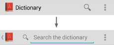 In the developer’s guide for working with the Action Bar, Google introduces such a thing as “Action View”. Search widget is one of these views. By default, it is minimized to an icon, but when expanded, the icon “up” should appear, clicking on which allows you to minimize the action back (see the “ Support for Minimized Action Views” section). On Twitter, when opening a search, there is no “up” icon

 This we have already seen in Evernote. On the screen at the same time two Action Bar when selecting text. Maybe the developers are doing this on purpose?
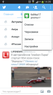
To switch between top-level views, Google offers one of three interface templates: a drop-down list in the Action Bar, a tab bar, or a sidebar. Icons in Action Bar are designed to trigger actions.
On Twitter, we have 5 top-level views: a feed (aka “Home”), messages on current topics (aka “In the know”), actions of friends (aka “Actions”), notifications and private messages. Since it becomes inconvenient to use tabs when there are more than three of them, the developers made a call to the list of personal messages and notifications as actions in the Action Bar. In the figure below, numeral 1 denotes controls that switch presentations, and numeral 2 denotes action icons.

')
 On devices with a hardware “menu” button, the Action Bar overflow indicator still appears. I could not find any direct instructions from Google. However, when you press the hardware button, the overflow menu should be shown below. Twitter shows it at the top, as when clicking on the corresponding icon.
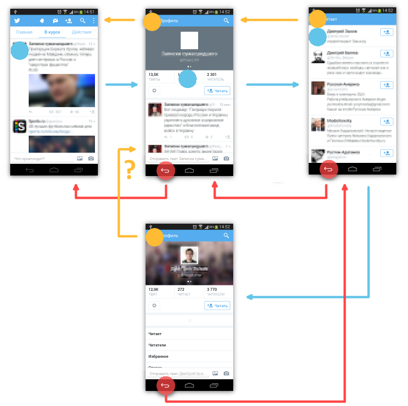
Many developers misunderstand the essence of the "up" button. Usually it is considered a back button “back”, although it is not. Twitter does not think so, but still her behavior is not obvious. Activities of the same level (for example, a user profile) when moving upwards lead to different places:
In the case of Evernote, we saw the processing of a long press on the list item in the spirit of Android 2, it showed a pop-up context menu. This behavior, though it was outdated, but familiar. Twitter implements its replacement context menu. In it, after a long press, tweet is replaced by a large panel with a few buttons. They almost completely duplicate the buttons on the tweet itself. But, worst of all, it cannot be canceled by the usual pushing of the button back, as is done with the context menu.

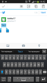
 In a window with an open tweet, a long press stops calling the "action menu", does not lead to the selection of text, but quite suddenly ... copies the text of the tweet to the clipboard. To the credit of the designers of the Twitter interface, the application does not do this silently, but shows a notification in the form of a toast at the bottom of the screen.
A long press on the action icon in the Action Bar does not lead to anything. The name of the action is not shown. Even a screenshot is nothing.
Settings are not very often used by the user and in many applications they are made haphazardly, often even using a different theme. In Twitter, the theme of setting up the settings is the same as in the rest of the application. The problem lies in other things: incomplete localization and invalid controls.
Compare the Twitter notifications and Google+ photo startup settings window:
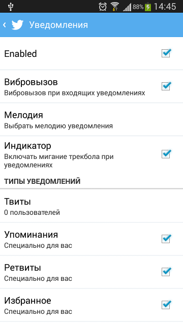

On the face of the incorrect use of the checkbox to turn off notifications. This is what Google tells us:
But it is more strange that the checkbox was applied on the element, which involves the choice of several options. When you click on the "mentions" item instead of changing the state of the checkbox, a pop-up window will appear with a choice of one of the options: "Off", "Especially for you" and "From all". In this case, it would be more logical not to simply draw the checkbox icon, as it was done on Google+ for choosing the options for “When to upload photos”
Action bar
Search
In the developer’s guide for working with the Action Bar, Google introduces such a thing as “Action View”. Search widget is one of these views. By default, it is minimized to an icon, but when expanded, the icon “up” should appear, clicking on which allows you to minimize the action back (see the “ Support for Minimized Action Views” section). On Twitter, when opening a search, there is no “up” iconDual Action Bar
This we have already seen in Evernote. On the screen at the same time two Action Bar when selecting text. Maybe the developers are doing this on purpose?Representation
To switch between top-level views, Google offers one of three interface templates: a drop-down list in the Action Bar, a tab bar, or a sidebar. Icons in Action Bar are designed to trigger actions.
On Twitter, we have 5 top-level views: a feed (aka “Home”), messages on current topics (aka “In the know”), actions of friends (aka “Actions”), notifications and private messages. Since it becomes inconvenient to use tabs when there are more than three of them, the developers made a call to the list of personal messages and notifications as actions in the Action Bar. In the figure below, numeral 1 denotes controls that switch presentations, and numeral 2 denotes action icons.
')
Overflow menu
On devices with a hardware “menu” button, the Action Bar overflow indicator still appears. I could not find any direct instructions from Google. However, when you press the hardware button, the overflow menu should be shown below. Twitter shows it at the top, as when clicking on the corresponding icon.Navigation
Many developers misunderstand the essence of the "up" button. Usually it is considered a back button “back”, although it is not. Twitter does not think so, but still her behavior is not obvious. Activities of the same level (for example, a user profile) when moving upwards lead to different places:
Long press
Tweets list
In the case of Evernote, we saw the processing of a long press on the list item in the spirit of Android 2, it showed a pop-up context menu. This behavior, though it was outdated, but familiar. Twitter implements its replacement context menu. In it, after a long press, tweet is replaced by a large panel with a few buttons. They almost completely duplicate the buttons on the tweet itself. But, worst of all, it cannot be canceled by the usual pushing of the button back, as is done with the context menu.
Separate tweet
In a window with an open tweet, a long press stops calling the "action menu", does not lead to the selection of text, but quite suddenly ... copies the text of the tweet to the clipboard. To the credit of the designers of the Twitter interface, the application does not do this silently, but shows a notification in the form of a toast at the bottom of the screen.Action icons
A long press on the action icon in the Action Bar does not lead to anything. The name of the action is not shown. Even a screenshot is nothing.
Settings
Settings are not very often used by the user and in many applications they are made haphazardly, often even using a different theme. In Twitter, the theme of setting up the settings is the same as in the rest of the application. The problem lies in other things: incomplete localization and invalid controls.
Compare the Twitter notifications and Google+ photo startup settings window:
On the face of the incorrect use of the checkbox to turn off notifications. This is what Google tells us:
Checkboxes allow the user to select multiple options from the list. Avoid using checkboxes to turn on and off individual options, use the on / off switch instead.
But it is more strange that the checkbox was applied on the element, which involves the choice of several options. When you click on the "mentions" item instead of changing the state of the checkbox, a pop-up window will appear with a choice of one of the options: "Off", "Especially for you" and "From all". In this case, it would be more logical not to simply draw the checkbox icon, as it was done on Google+ for choosing the options for “When to upload photos”
Source: https://habr.com/ru/post/216629/
All Articles