FormStamp - widget library for AngularJS
AngularJS is a rapidly growing JS framework that simplifies the development of complex and dynamic web applications. Our team uses AngularJS in a number of projects with a complex user interface, and in the process of work, we acutely felt a lack of a good library providing a set of uniform widgets, such as datetime picker, select, multiple select, and so on. Of course, we were aware of the Angular UI project, but AngularUI did not provide some widgets that we needed.
In addition, we wanted to have an analogue rail form builder, but at the front end. Form builder allows the programmer to describe the form declaratively, taking on the generation of markup and error output.
The solution to these problems was the FormStamp library that we developed, which provides:
The following principles were laid down in the development of the library:
FormStamp can be connected to your project using the Bower package system:
AngularJS's expressive declarative approach reduces the amount of code you need to write to create a UI. However, even using this approach, when creating a simple form with field completion checks and displaying error messages, you have to write a lot of repetitive code:
This problem is solved by the Form Builder component - to create a form, it is enough to specify:
Using the Form Builder, the above form with error highlighting can be created with much less code:
Explanations:
All other attributes are delegated to the form element specified in the
')
The more complex your application, the less standard elements of the form you will miss and the sooner you will need additional widgets. At the moment there are not so many widgets designed for integration with AngularJS, and of those that are, a part is a wrapper over jQuery widgets. The FormStamp library contains widgets written from scratch using the AngularJS API that solves the tasks we encountered most often in our work:
Consider working with the select widget, which is created using the
To create a combo box, the variants of which are contained in
Examples of working with other widgets and Form Builder are located on the library page .
In order to facilitate the writing of additional widgets, we began to allocate portions of the functionality into low-level directives:
For example, create a playlist for the player using
Create a directive that will wrap the
Connect SoundCloud SDK
Next, create a controller to bind these elements:
And the application itself:
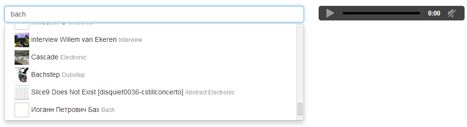
As a result, we get this player:
You can see a live example here .
In the next article we will take a closer look at creating a form using FormStamp.
Demo library
Library code
In addition, we wanted to have an analogue rail form builder, but at the front end. Form builder allows the programmer to describe the form declaratively, taking on the generation of markup and error output.
The solution to these problems was the FormStamp library that we developed, which provides:
- Form Builder - the highest level for working with forms, created by analogy with form generators from the Ruby on Rails ecosystem;
- a set of widgets covering 80% of the tasks encountered when working with forms and not solved by standard HTML5 elements;
- low-level components that allow you to collect new widgets.
The following principles were laid down in the development of the library:
- all widgets are written from scratch using AngularJS directives, which reduces the code and makes it more readable;
- full integration with AngularJS (support for ngModel, ngRequired ...);
- default styling with Bootstrap.
Installation Instructions
FormStamp can be connected to your project using the Bower package system:
bower install angular-formstamp Form builder
AngularJS's expressive declarative approach reduces the amount of code you need to write to create a UI. However, even using this approach, when creating a simple form with field completion checks and displaying error messages, you have to write a lot of repetitive code:
Code
<form class="form-horizontal" role="form" name="form" ng-app="form-demo"> <div class="form-group" ng-class="{'has-error': form.username.$invalid}"> <label for="username" class="col-sm-2 control-label">Username</label> <div class="col-sm-10"> <input type="text" class="form-control" id="username" placeholder="Username" required="required" ng-pattern="/awesome/" name="username" ng-model="username" /> <p class="alert alert-danger" ng-show='form.username.$error.pattern'> Username should be awesome </p> </div> </div> <div class="form-group" ng-class="{'has-error': form.email.$invalid}"> <label for="email" class="col-sm-2 control-label">Email</label> <div class="col-sm-10"> <input type="email" class="form-control" id="email" placeholder="Email" required="required" name="email" ng-model="email" /> <p class="alert alert-danger" ng-show='form.email.$error.email'> Email should be valid </p> </div> </div> <div class="form-group" ng-class="{'has-error': form.password.$invalid}"> <label for="password" class="col-sm-2 control-label">Password</label> <div class="col-sm-10"> <input type="password" class="form-control" id="password" placeholder="Password" required="required" name="password" ng-model="password" ng-minlength='6' /> <p class="alert alert-danger" ng-show='form.password.$error.minlength'> Password should be longer </p> </div> </div> <div class="form-group"> <label for="birthDate" class="col-sm-2 control-label">Birth Date</label> <div class="col-sm-10"> <input type="date" class="form-control" id="birthDate" placeholder="Birth Date" ng-model="birthDate" /> </div> </div> <div class="form-group"> <div class="col-sm-offset-2 col-sm-10"> <button type="submit" class="btn btn-default">Sign up</button> </div> </div> </form> This problem is solved by the Form Builder component - to create a form, it is enough to specify:
- the model with which the form is associated;
- model attributes that appear on the form;
- Types of form elements corresponding to each of the attributes displayed in the form.
Using the Form Builder, the above form with error highlighting can be created with much less code:
<fs-form-for model="samurai"> <fieldset class="form-horizontal"> <fs-input as="text" name="username" required="" label="Name"></fs-input> <fs-input as="email" name="email" required="" label="Email"></fs-input> <fs-input as="password" name="password" required="" label="Email"></fs-input> <fs-input as="fs-date" name="birthdate" required="" label="Date of Birth"></fs-input> </fieldset> </fs-form-for> Explanations:
fsFormFor- a directive that creates a form, themodelattribute indicates the model for which the form is created;fsInputis a directive describing each element in a form with the following attributes:asis the type of the form element;name- the name of the model attribute;label- the text of the label.
All other attributes are delegated to the form element specified in the
as attribute.')
Widget set
The more complex your application, the less standard elements of the form you will miss and the sooner you will need additional widgets. At the moment there are not so many widgets designed for integration with AngularJS, and of those that are, a part is a wrapper over jQuery widgets. The FormStamp library contains widgets written from scratch using the AngularJS API that solves the tasks we encountered most often in our work:
- select with the ability to filter by the entered value;
- select with support for free text (combo box);
- multiselect with the ability to filter by the entered value;
- multiselect with free text (tags input);
- radio group;
- checkbox group;
- date and / or time widgets and calendar widgets.
Consider working with the select widget, which is created using the
fsSelect directive. The directive supports the attributes freetext , items , ng-model , ng-required , ng-disabled . freetext The attribute (false by default) defines the behavior of the widget. When freetext=false widget behaves as select, that is, it allows you to select one element from the list of options. When freetext=true widget behaves like a combo box, that is, it allows you to select a value from the list of options or enter any other. items The attribute indicates which property of the scop contains a list of options displayed in the widget. With freetext=false options can be both objects and primitive types. With freetext=true options can only be strings. ng-model The attribute is a standard ngModel directive. ng-disabled The attribute indicates which scop property determines whether the widget is disabled / enabled.To create a combo box, the variants of which are contained in
$scope.arrayOfOptions , the selected option is associated with $scope.selectedOption , and the state of disabled / enabled depends on $scope.flag , we write the directive as follows: <div fs-select items=”arrayOfOptions” ng-disabled=”flag” ng-model=”selectedOption” freetext=”true”></div> Examples of working with other widgets and Form Builder are located on the library page .
Directives
In order to facilitate the writing of additional widgets, we began to allocate portions of the functionality into low-level directives:
fsList- displays a list of items, allows you to select an item in the list and move the selection from the keyboard;fsNullForm- hides the form element associated with the ngModel from the parent form;fsInput- simplifies handling of keyboard events and focus changes;fsCalendar- displays a calendar and allows you to mark the date as selected.
For example, create a playlist for the player using
fsList and fsInput . Working with the fsList done by interacting with the listInterface property on the $scope . listInterface has the following properties:selectedItemis the currently selected value. Read only.onSelect(value)- handler for the value selection event. Must be implemented by the user.move(d)is a function that moves a pointer to a specified number of elements.
Create a directive that will wrap the
audio tag from html5 in itself: app.directive("demoAudio", function() { return { restrict: "E", scope: { track: '=' }, template: "<audio controls />", replace: true, link: function($scope, $element, $attrs) { return $scope.$watch('track', function(track) { $element.attr('src', track.stream_url + "?client_id=8399f2e0577e0acb4eee4d65d6c6cce6"); return $element.get(0).play(); }); } }; }); Connect SoundCloud SDK
<script src="http://connect.soundcloud.com/sdk.js"></script> Next, create a controller to bind these elements:
function ListDemoCtrl($scope) { // SoundCloud SDK SC.initialize({ client_id: '8399f2e0577e0acb4eee4d65d6c6cce6' }); // SoundCloud $scope.$watch('search', function () { SC.get('/tracks', { q: $scope.search, license: 'cc-by-sa' }, function(tracks) { $scope.$apply(function() { $scope.tracks = tracks }) }) }); $scope.search = 'bach'; $scope.tracks = []; // fsList $scope.move = function (d) { $scope.listInterface.move(d); }; // fsList $scope.listInterface = { onSelect: function (selectedItem) { $scope.select(selectedItem) } }; $scope.select = function(selectedItem) { $scope.selectedTrack = selectedItem || $scope.listInterface.selectedItem; }; } And the application itself:
<div ng-controller="ListDemoCtrl" style="postion: relative;"> <div class="row"> <div class="col-xs-7"> <!-- fsInput --> <input class="form-control" autofocus="1" fs-input fs-up="move(-1)" fs-down="move(1)" fs-enter="select()" ng-model="search"> <!-- fsList --> <div fs-list="" items="tracks" class="no-popup"> <!-- --> <img src="{{ item.artwork_url }}" width="30" height="30"> {{item.title}} <small class="text-muted">{{item.genre}}</small> </div> </div> <div class="col-xs-5"> <!-- fsList - --> <demo-audio track="selectedTrack"></demo-audio> <pre style="margin-top: 20px;">Selected Item: {{ selectedTrack | json }}</pre> </div> </div> </div> As a result, we get this player:
You can see a live example here .
In the next article we will take a closer look at creating a form using FormStamp.
Demo library
Library code
Source: https://habr.com/ru/post/216391/
All Articles