Cross-platform application on Qt: Style Sheets
Today I would like to consider the question of customizing the interface of programs on Qt. The main option is to use Qt Style Sheets. As the name becomes obvious, this is a slightly specific analog of the cascading style sheets familiar to everyone ( CSS2 ), without which the modern Internet is unthinkable. QSS is most often used for two things: either to drill a widget to a more native form, or vice versa, to make the interface more elegant, stand out, perhaps the same on all platforms.
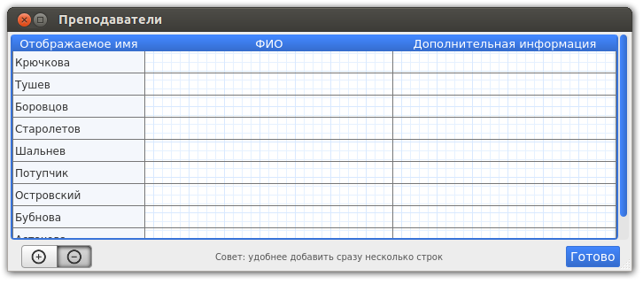
The screenshot shows one of the dialogues of our organizer for students, the entire interface of which is implemented in QSS.
In the same screenshot, we see the main interface elements, which we will customize today:
But first, let's deal with some basic things. We can apply styles both locally (to a specific widget) and globally, putting all styles in a separate file. The advantages of the second approach are obvious to everyone who has worked with CSS at least once, so we’ll stop there.
There is an excellent translation of the official documentation on the syntax of style sheets, so I note only that more often than others there are three ways of describing widgets to which the style will be applied (selectors):
Appeal by class , for example, such a rule will be applied to all buttons of your application, the background color will be changed to red:
Appeal by name , then this rule will be applied only to those buttons that have the name "okButton":
Appeal on the hierarchy of widgets on the form , then the rule will be applied only to those buttons that lie inside the frame with the name "mainFrame":
Separately, it is necessary to say about the task of styles for subelements and pseudo-states:
')
Pseudo-states are specified at the end of the selector, separated by a colon (:). For example, the following rule applies when the mouse is over a QPushButton:
Sophisticated widgets contain sub-elements , so to change the design, you can access each of them, using the "::" operator. For example, we want to change / remove the arrow indicating that the button has a menu assigned, in which case the rule will look like this:
Unfortunately, in order to describe all the possibilities, we need a full-textCSS tutorial, so go to the examples.
I have two news: one is good and the other is not. The sadness is that QSS does not support shadow rendering. Totally. Therefore, if you make the normal state of the segment buttons in general not difficult, then pressed ... in general, only pictures.
Here are the styles responsible for this disgrace:
State: pressed must be specified in order to avoid lag during its passage.
 I know only two options for displaying the pressed state without using shadows — to reflect the gradient and draw colors. Consider the second option:
The customization of the tables is done quite soundly, styles for the header are set separately, separately for the table itself. It is possible to set styles for certain columns (sections) of the header through the subelement :: section. To do this, the following pseudo-states are implemented: first,: last,: only-one,: next-selected,: previous-selected,: selected,: horizontal,: vertical and: checked.
The main custom elements are the two arrows on the edges and the handle, which you can actually grab with the mouse:
Cycle contents
PS Examples of using QSS for customizing each specific widget can be found here , a guide to possible properties, states and sub-elements here . Well, the article on Habré with an attempt to implement the Ribbon-interface, it may be interesting to read.
PPS An interesting tool for editing QSS with real-time display.
The screenshot shows one of the dialogues of our organizer for students, the entire interface of which is implemented in QSS.
In the same screenshot, we see the main interface elements, which we will customize today:
- Segment Buttons
- Ordinary buttons
- Tables
- Scrollbars
The basics
But first, let's deal with some basic things. We can apply styles both locally (to a specific widget) and globally, putting all styles in a separate file. The advantages of the second approach are obvious to everyone who has worked with CSS at least once, so we’ll stop there.
I strongly recommend using the Qt resource system, which allows you not to bother and compile images and style files directly into the binary.So, create a style file, apply it globally to the application:
QFile styleF; styleF.setFileName(":/qss/style.css"); styleF.open(QFile::ReadOnly); QString qssStr = styleF.readAll(); qApp->setStyleSheet(qssStr); There is an excellent translation of the official documentation on the syntax of style sheets, so I note only that more often than others there are three ways of describing widgets to which the style will be applied (selectors):
Appeal by class , for example, such a rule will be applied to all buttons of your application, the background color will be changed to red:
QPushButton { background-color: red; } Appeal by name , then this rule will be applied only to those buttons that have the name "okButton":
QPushButton#okButton { background-color: red; } And if there are several elements on the same form to which you want to apply the same style, you can use the setObjectName method: ui->pbRed1->setObjectName("myRedButton"); ui->pbRed2->setObjectName("myRedButton"); Appeal on the hierarchy of widgets on the form , then the rule will be applied only to those buttons that lie inside the frame with the name "mainFrame":
QFrame#mainFrame QPushButton{ background-color: red; } Separately, it is necessary to say about the task of styles for subelements and pseudo-states:
')
Pseudo-states are specified at the end of the selector, separated by a colon (:). For example, the following rule applies when the mouse is over a QPushButton:
QPushButton:hover { background-color: white } Sophisticated widgets contain sub-elements , so to change the design, you can access each of them, using the "::" operator. For example, we want to change / remove the arrow indicating that the button has a menu assigned, in which case the rule will look like this:
QPushButton#menuButton::menu-indicator { image: url(:/img/other/myindicator.png); } Unfortunately, in order to describe all the possibilities, we need a full-text
Segment buttons
I have two news: one is good and the other is not. The sadness is that QSS does not support shadow rendering. Totally. Therefore, if you make the normal state of the segment buttons in general not difficult, then pressed ... in general, only pictures.
Here are the styles responsible for this disgrace:
QPushButton#pbDelRight { image: url(:/img/buttons//pbDelRight.png); border-top-right-radius: 4px; border-bottom-right-radius: 4px; height: 26px; width: 40px; } QPushButton#pbDelRight:pressed { image: url(:/img/buttons/pbDelRightPressed.png); } QPushButton#pbDelRight:checked { image: url(:/img/buttons/pbDelRightPressed.png); } State: pressed must be specified in order to avoid lag during its passage.
OS X bug : If the buttons do not set the flat property, they will fit on each other.
Ordinary buttons
I know only two options for displaying the pressed state without using shadows — to reflect the gradient and draw colors. Consider the second option: QPushButton#pbReady { padding:4px; color: #fff; font-size: 14px; border-radius: 2px; border: 1px solid #3873d9; background-color: qlineargradient( x1: 0, y1: 0, x2: 0, y2: 1, stop: 0 #4287ff, stop: 1 #356ccc); } QPushButton#pbReady:pressed { color: #111; border: 1px solid #3873d9; background: #fff; } Tables
The customization of the tables is done quite soundly, styles for the header are set separately, separately for the table itself. It is possible to set styles for certain columns (sections) of the header through the subelement :: section. To do this, the following pseudo-states are implemented: first,: last,: only-one,: next-selected,: previous-selected,: selected,: horizontal,: vertical and: checked.
QHeaderView { background-color: #fff; font-size:13px; } QHeaderView::section:horizontal { color: #fff; border-style: solid; background-color: qlineargradient( x1: 0, y1: 0, x2: 0, y2: 1, stop: 0 #4287ff, stop: 1 #356ccc); } QTableView { border: 2px solid #3873d9; border-top-color: #4287ff; border-radius: 4px; background-color: #fff; background-image: url(:/img/other/background.png); gridline-color: #777; selection-background-color: #ccdfff; color:#333; font-size:12px; } Scrollbars
The main custom elements are the two arrows on the edges and the handle, which you can actually grab with the mouse:
QScrollBar:vertical { background: #e4e4e4; border-top-right-radius: 4px; border-bottom-right-radius: 4px; width: 12px; margin: 0px; } QScrollBar::handle:vertical { background-color: qlineargradient( x1: 0, y1: 0, x2: 1, y2: 0, stop: 0 #4287ff, stop: 1 #356ccc); border-radius: 4px; min-height: 20px; margin: 0px 2px 0px 2px; } QScrollBar::add-line:vertical { background: none; height: 0px; subcontrol-position: right; subcontrol-origin: margin; } QScrollBar::sub-line:vertical { background: none; height: 0px; subcontrol-position: left; subcontrol-origin: margin; } On OS X, starting from 10.9,magicdisappearing scrollbars are used, Qt supports them, so you should not override them.
There is a cross-platform bug with scrollbars , due to which the bottom / right edge of the scrollbar is drawn over the scrolling object, if it has a stroke through QSS.
Cycle contents
PS Examples of using QSS for customizing each specific widget can be found here , a guide to possible properties, states and sub-elements here . Well, the article on Habré with an attempt to implement the Ribbon-interface, it may be interesting to read.
PPS An interesting tool for editing QSS with real-time display.
Source: https://habr.com/ru/post/216275/
All Articles