Mobile application development: front-end surprises and backends
It all began with such prototypes "on napkins":
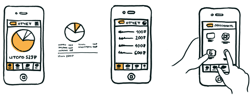
One of the main questions to the application: where and how do I spend money from my account?
We chose the most likely scenarios for working with the application and gave it to living people "from the street" to the usability laboratory. Everyone received several tasks, for example: “In a TV commercial you learned about the“ Welcome ”tariff. You need to understand whether to go to it using the application. " Or - “You are going on a business trip to Uzbekistan, how and what to connect, so that the connection is most beneficial?”.
')
Below - about what surprises from users we met during the tests, as well as a little about the complexity of working with a huge amount of data from different subsystems in the backend.
So, at some point we managed to put together a complete application in the form of sketches, like this:
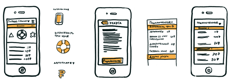
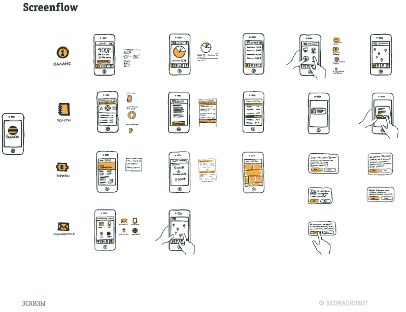
Our different divisions set their tasks: in total, 13 top-priority user scenarios turned out, which we tried to make as quick and convenient as possible. Then we made the application more approximate to reality, with a “real” design, and began tests on ordinary users.
The main task is to find situations when the user did not cope with the task or did it slowly, or not the first time. Here is an example: users went to the Services tab, but not everyone found the All Services button. We concluded that it is invisible to the user, because there is no pointer to it. Added arrow on this button.

In the first version, the action buttons were on the top navigation bar (a tick in the upper right corner), but people were lost and almost did not see them. Right - the most user-friendly version.
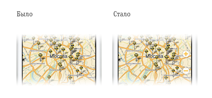
Buttons "plus or minus" on the map first was not. For users who are reclining on the couch (this is why we are recreating real interiors!), It was extremely inconvenient to change the position of the hands in order to do a multitouch. The same problem was driving: it was impossible to control the scale with one hand, so we added buttons.
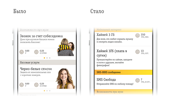
Here we have touched the structure of the presentation of services in the direction of greater categorization.
As a result of several iterations of tests, it was possible to get the final version, where users confidently solved their problems. Now let's go to the backend.
Work with this part went parallel to the design development - but in fact it started much earlier, since the volume was larger. It was necessary to build an IT-infrastructure that guarantees the work of the system under high load. We wrote software, performed a complex integration of the mobile and IT components of the VimpelCom infrastructure.
Here are the main streams:
All these are different subsystems, which for the most part have completely different architecture, infrastructure, and even transmission protocols and information storage principles. Since the user doesn’t care about this, by and large, when developing a personal account we’ve already had to work a lot with building a kind of common platform for all interactions, and when implementing a mobile application, we’ll have to substantially complete it.
To minimize communication losses, the AT Consulting and Redmadrobot project teams moved to a single office site and worked side by side for a long time.
If you remember, the old personal account had problems with the maximum number of subscribers in the system. New began to scale depending on the load in a virtual environment. The new mobile solution is also universal in terms of scaling.
It sounds quite simple, but in the early versions of the personal account (two-year or more), the integration environments and the API of the listed subsystems were the bottlenecks. For about a year and a half, we went through the entire architecture of the upper layers and were able to get rid of everything that prevents flexible work. Properly chosen direction of development led to significant changes and simplification of the architecture. Now the application is very closely integrated with the My Beeline self-service system.
The application will often authorize users for whom the phone’s balance and tablet SIM card balance, as well as the home Internet balance, for example, are treated as accounts of one account.
The basic details of access to self-service channels are the Login and Password from the Personal Account. You can get the password from the application, also using the short USSD command (* 110 * 9 #) or by other means.
In the future, we plan to integrate mobile application services into a single authorization zone on the basis of SSO (single login). In addition, we are planning to merge cabinets (for example, Hi, BBA cabinets), as well as a personal account, and in the application you will be able to “tie” others to one account of the account, in order to manage all numbers, for example, your family, by logging in using only your number. Now we are working on authorization using social networking accounts Facebook, Vkontakte.
Data centers are located in two different areas. These are the main and backup computing centers (MCC and RVC) of VimpelCom.
At each site (MCC and RBC) there are several servers for the solution. Each of them has several copies of the application. Even if the application instance “falls”, the server fails or an accident occurs in the data center, the traffic will automatically be redirected to the backup equipment without affecting the subscriber and transparently for him.
An API with various services is made in the personal account, within the framework of which all integration with the mobile application takes place. Services are built on the principle of RESTful Web Services. More precisely, according to the JAX-RS specification. Data is transmitted in JSON format, which spares the volume of mobile traffic. Also, in order to save traffic, we implemented the archiving of transmitted data. All services are implemented on the stateless principle, which allows scaling without any difficulties.
After users began to confidently solve problems in the application (usability index - 86%, subjective satisfaction - 98%), and the technical part allowed us to manage all the necessary functions by some, roughly speaking, analogue of the general API, we sent the application for review. Now it is already out. Of course, we will update it from time to time with useful features.

One of the main questions to the application: where and how do I spend money from my account?
We chose the most likely scenarios for working with the application and gave it to living people "from the street" to the usability laboratory. Everyone received several tasks, for example: “In a TV commercial you learned about the“ Welcome ”tariff. You need to understand whether to go to it using the application. " Or - “You are going on a business trip to Uzbekistan, how and what to connect, so that the connection is most beneficial?”.
')
Below - about what surprises from users we met during the tests, as well as a little about the complexity of working with a huge amount of data from different subsystems in the backend.
So, at some point we managed to put together a complete application in the form of sketches, like this:


Our different divisions set their tasks: in total, 13 top-priority user scenarios turned out, which we tried to make as quick and convenient as possible. Then we made the application more approximate to reality, with a “real” design, and began tests on ordinary users.
Testing
- At the entrance there are beta applications on the phone and tasks on the cards. A special agency recruits people according to criteria (age, gender, internet skills, etc.) - we just give the same profile that we think will fit the audience of the application - and the one to whom we apply this application (from new people) . These are men and women aged 18-30, using mobile Internet, who have changed the tariff, connected services or replenished their balance via the Internet at least once in the last 6 months.
- The agency prepares a screener (a questionnaire with a bunch of questions that are asked to a potential respondent) and starts the selection. If the respondent follows the criteria and is ready to take part in the research, then he is assigned the time when he comes to our laboratory - Mobiolab.
- Users come to the site. The laboratory has rooms that recreate the atmosphere of different places, for example, a cafe, an office area, a living room, and so on. Specifically, this application was tested in the "home" zone, right behind the coffee and delicious cookies.
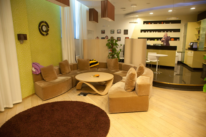
Laboratory "House" zone
- The test itself goes like this: the user reads the task and starts to perform it. The moderator sits next to each other and records all actions and comments of the respondent in the study report. It fixes where and what mistakes were made, the time it took to solve the problem. If for the web-version of the personal account we used eytreker and other equipment, then everything is decided by the moderator’s actions if necessary by HD-shooting - there is enough data. Yes, we also displayed the image from the phone on the plasma screen, so as not to peek over the entire crowd to the user.
- Then we connect all protocols, we consider efficiency and productivity, we describe errors and we look how it is possible to remove a problem. After all the tasks are completed, we ask questions about the product, what we liked, what we didn't. Write down all the comments.
The main task is to find situations when the user did not cope with the task or did it slowly, or not the first time. Here is an example: users went to the Services tab, but not everyone found the All Services button. We concluded that it is invisible to the user, because there is no pointer to it. Added arrow on this button.
Sample Test Cards
Situation : half of the respondents noticed huge numbers in the center of the screen when they first started the application, but did not understand that this was a balance. To check the balance went to the tab “Services”. After the question “Do you think that the numbers are shown on the main page?” Answered that this is something incomprehensible, and it is not clear why this is shown here.
Causes :
• The first thing users see is huge numbers. But to understand what it is, they can not, because the description is made in small print under the sum.
• There is no letter of balance (“p”, “rub”, and so on).
These recommendations:
• Show the phrase “Balance on dd.mm.yy” above the balance.
• Add the letter of the balance “p” or “rub.”
Situation : some respondents made mistakes when searching for information about connected services, because clicked on the non-clickable “You connected” block on the main page of the application.
Recommendations : make the element “You are connected” on the main page clickable and, when clicked, display the list of active services.
More change examples

In the first version, the action buttons were on the top navigation bar (a tick in the upper right corner), but people were lost and almost did not see them. Right - the most user-friendly version.

Buttons "plus or minus" on the map first was not. For users who are reclining on the couch (this is why we are recreating real interiors!), It was extremely inconvenient to change the position of the hands in order to do a multitouch. The same problem was driving: it was impossible to control the scale with one hand, so we added buttons.

Here we have touched the structure of the presentation of services in the direction of greater categorization.
As a result of several iterations of tests, it was possible to get the final version, where users confidently solved their problems. Now let's go to the backend.
Main complexity of backend development
Work with this part went parallel to the design development - but in fact it started much earlier, since the volume was larger. It was necessary to build an IT-infrastructure that guarantees the work of the system under high load. We wrote software, performed a complex integration of the mobile and IT components of the VimpelCom infrastructure.
Here are the main streams:
- Communication with self-service system. They authorize and manage services.
- Billing systems provide financial information.
- CRM serves subscribers calls
- Content management systems also have two-way communication with the application.
- And, finally, integrated payment systems.
All these are different subsystems, which for the most part have completely different architecture, infrastructure, and even transmission protocols and information storage principles. Since the user doesn’t care about this, by and large, when developing a personal account we’ve already had to work a lot with building a kind of common platform for all interactions, and when implementing a mobile application, we’ll have to substantially complete it.
To minimize communication losses, the AT Consulting and Redmadrobot project teams moved to a single office site and worked side by side for a long time.
If you remember, the old personal account had problems with the maximum number of subscribers in the system. New began to scale depending on the load in a virtual environment. The new mobile solution is also universal in terms of scaling.
It sounds quite simple, but in the early versions of the personal account (two-year or more), the integration environments and the API of the listed subsystems were the bottlenecks. For about a year and a half, we went through the entire architecture of the upper layers and were able to get rid of everything that prevents flexible work. Properly chosen direction of development led to significant changes and simplification of the architecture. Now the application is very closely integrated with the My Beeline self-service system.
Authorization Difficulties
The application will often authorize users for whom the phone’s balance and tablet SIM card balance, as well as the home Internet balance, for example, are treated as accounts of one account.
The basic details of access to self-service channels are the Login and Password from the Personal Account. You can get the password from the application, also using the short USSD command (* 110 * 9 #) or by other means.
In the future, we plan to integrate mobile application services into a single authorization zone on the basis of SSO (single login). In addition, we are planning to merge cabinets (for example, Hi, BBA cabinets), as well as a personal account, and in the application you will be able to “tie” others to one account of the account, in order to manage all numbers, for example, your family, by logging in using only your number. Now we are working on authorization using social networking accounts Facebook, Vkontakte.
Data centers
Data centers are located in two different areas. These are the main and backup computing centers (MCC and RVC) of VimpelCom.
At each site (MCC and RBC) there are several servers for the solution. Each of them has several copies of the application. Even if the application instance “falls”, the server fails or an accident occurs in the data center, the traffic will automatically be redirected to the backup equipment without affecting the subscriber and transparently for him.
How it is designed to work in realtime
An API with various services is made in the personal account, within the framework of which all integration with the mobile application takes place. Services are built on the principle of RESTful Web Services. More precisely, according to the JAX-RS specification. Data is transmitted in JSON format, which spares the volume of mobile traffic. Also, in order to save traffic, we implemented the archiving of transmitted data. All services are implemented on the stateless principle, which allows scaling without any difficulties.
Release
After users began to confidently solve problems in the application (usability index - 86%, subjective satisfaction - 98%), and the technical part allowed us to manage all the necessary functions by some, roughly speaking, analogue of the general API, we sent the application for review. Now it is already out. Of course, we will update it from time to time with useful features.
Source: https://habr.com/ru/post/215793/
All Articles