Sketch.app site design. Part 2.1: we suggest beauty
The first part is about prototypes.

I have a very long description of the process, so we’ll not limit ourselves to two parts.
So, we continue with our headphones. To begin, let's understand how to make a grid in the Sketch ...
')
You can adjust the grid from two places. Display - from the program settings:

The sizes and the number of columns / cells - from the menu on the toolbar:
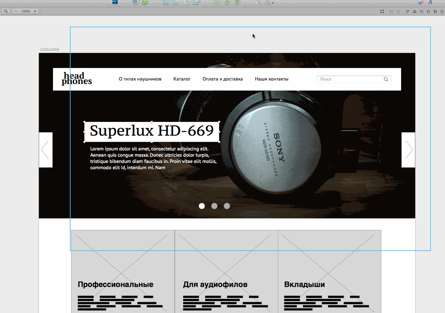
Let's take 12 columns with a column width of 60pcs and a distance of 30pcs between the columns. The main text will be 16px in size, which means the baseline is 24pcs (“one and a half” interval). But we will make the horizontal guides half as much (12pcs) - this is more convenient for me.

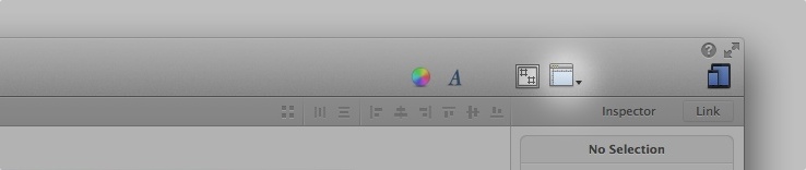
Let us keep the main font by default - let Helvetica. For headers, take PT Serif. Align the menu and write the name of our store. Well, let the "Headphones" be. To align the layers go to the upper right corner:

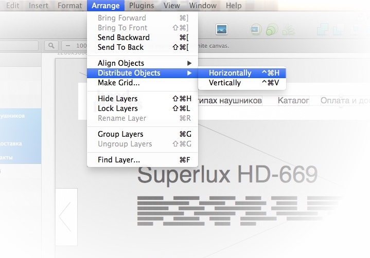
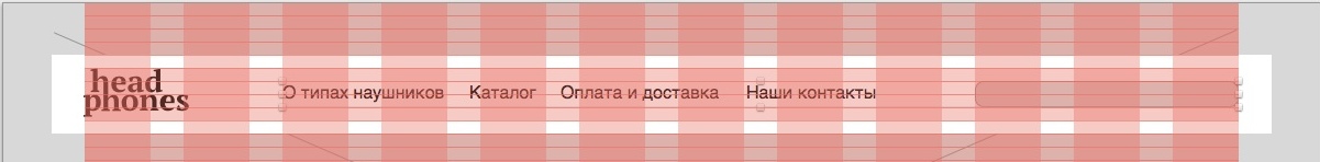
In the menu we align on the grid the extreme right and left links. And for even distribution of points between them there is the Arrange-> Distribute Objects-> Horizontally command.
The menu turned out to be too wide (the distance between the points is larger than from the menu to the search), so I moved the right link a bit and once again aligned everything:
before

after
The search field is made 24px high and “pressed into” the substrate.

(We paint in light gray and add two internal shadows. In the Sketch, you can add as many shadows as you like inside and outside, as well as strokes or fills.)

Italics Helvetica does not look very beautiful, change to PT Sans, for example.
before

after

We will keep the style for the future - we still have fields in the filter.


Text style in the menu also save. It’s not necessary to write your name: parameters are written under the style, that's why everything is well understood.


Then select the remaining menu items and attach a style to each.
Free images can be found on flickr. To do this, select the “Creative Commons License” option in the “advanced search”

I had to scroll for a long time, but still I found a more or less suitable photo.
We select a rectangle stub, then we import the picture over (necessarily over). Select a stub along with a photo and click the magic button “create mask”.

Now you need to deal with the text on the slides. Let's just make it white.

It looks good, but there is a problem: if there is a bright photo on the slide, the text will again be unreadable. Therefore, we return the text to black and make a white backing for sure. And let's replace at the same time already BLOKK with PT Sans. And along the way, do not forget about the grid.

Some 20 pixels indent from the edge of the substrate is somehow a bit too much, we will do it at 15. Attention: from the top and bottom we count the indents from the height of lower-case letters (x-height), and do not take into account remote elements. This is to ensure that the line of text is balanced in the center of the substrate.

Sketch has a good distance meter, but with text objects it doesn't work very well - the text always has an inner padding. (To quickly resize objects, use Cmd + → / Cmd + ← (width) or Cmd + ↓ / Cmd + ↑. If you hold Shift in parallel, the size will increase by 10pcs.)
Now do the same with the description of the slide and the price tag

If you are uncomfortable every time a few clicks to wade through the groups to select the desired layer, hold down Cmd and click immediately on the object. The second option is to choose “click through”

Draw leaflets. Let's do a little easier than the prototype. Leave only the arrows, but make them large enough so as not to have to aim. To begin with we draw oblique lines, then we make them a rounded stroke. Next we group and call “<>”, for example.

With points all the same simple. Fill the selected color, leaving the rest only a stroke.

Let's maximize the height of the slides so that they look better.

All for now. In the next chapter we will deal with the content part.
Original three weeks old
I have a very long description of the process, so we’ll not limit ourselves to two parts.
So, we continue with our headphones. To begin, let's understand how to make a grid in the Sketch ...
')
Modular grid
You can adjust the grid from two places. Display - from the program settings:
The sizes and the number of columns / cells - from the menu on the toolbar:
Let's take 12 columns with a column width of 60pcs and a distance of 30pcs between the columns. The main text will be 16px in size, which means the baseline is 24pcs (“one and a half” interval). But we will make the horizontal guides half as much (12pcs) - this is more convenient for me.
menu
Let us keep the main font by default - let Helvetica. For headers, take PT Serif. Align the menu and write the name of our store. Well, let the "Headphones" be. To align the layers go to the upper right corner:
In the menu we align on the grid the extreme right and left links. And for even distribution of points between them there is the Arrange-> Distribute Objects-> Horizontally command.
The menu turned out to be too wide (the distance between the points is larger than from the menu to the search), so I moved the right link a bit and once again aligned everything:
before
after
The search field is made 24px high and “pressed into” the substrate.
(We paint in light gray and add two internal shadows. In the Sketch, you can add as many shadows as you like inside and outside, as well as strokes or fills.)
Italics Helvetica does not look very beautiful, change to PT Sans, for example.
before
after
We will keep the style for the future - we still have fields in the filter.
Text style in the menu also save. It’s not necessary to write your name: parameters are written under the style, that's why everything is well understood.
Then select the remaining menu items and attach a style to each.
slides
Free images can be found on flickr. To do this, select the “Creative Commons License” option in the “advanced search”
I had to scroll for a long time, but still I found a more or less suitable photo.
We select a rectangle stub, then we import the picture over (necessarily over). Select a stub along with a photo and click the magic button “create mask”.
Now you need to deal with the text on the slides. Let's just make it white.
It looks good, but there is a problem: if there is a bright photo on the slide, the text will again be unreadable. Therefore, we return the text to black and make a white backing for sure. And let's replace at the same time already BLOKK with PT Sans. And along the way, do not forget about the grid.
Some 20 pixels indent from the edge of the substrate is somehow a bit too much, we will do it at 15. Attention: from the top and bottom we count the indents from the height of lower-case letters (x-height), and do not take into account remote elements. This is to ensure that the line of text is balanced in the center of the substrate.
Sketch has a good distance meter, but with text objects it doesn't work very well - the text always has an inner padding. (To quickly resize objects, use Cmd + → / Cmd + ← (width) or Cmd + ↓ / Cmd + ↑. If you hold Shift in parallel, the size will increase by 10pcs.)
Now do the same with the description of the slide and the price tag
If you are uncomfortable every time a few clicks to wade through the groups to select the desired layer, hold down Cmd and click immediately on the object. The second option is to choose “click through”
Draw leaflets. Let's do a little easier than the prototype. Leave only the arrows, but make them large enough so as not to have to aim. To begin with we draw oblique lines, then we make them a rounded stroke. Next we group and call “<>”, for example.
With points all the same simple. Fill the selected color, leaving the rest only a stroke.
Let's maximize the height of the slides so that they look better.
All for now. In the next chapter we will deal with the content part.
Original three weeks old
Source: https://habr.com/ru/post/215683/
All Articles