Serious design of a serious store. Part 2. Online Store Modules
Last time we wrote a rather popular article: “ Serious design of a serious store. Part 1. Research ", this article is its logical continuation. In this article and in the subsequent we will describe almost 60 functional modules of top online stores of the world, as well as analyze in detail the interface of many pages.
I propose to immediately divide the online store into two parts: external and internal. The outer part is seen by everyone, this is the place where purchases are made, but few people think about the inner part, where these purchases are processed, except for accomplished owners of online stores. Even developers very rarely know what should be there. But no major online store can exist without a serious internal accounting system!
To properly design the person or you need to start with a goal. So, the main goal of the external part of any online store is to maximize the conversion. Why did I write the word “conversion”, and not “sales”? I did it not by chance. A sale, in this case, consists of several important components: 1. Marketing, primarily external (I will prepare a separate series of articles on marketing online stores); 2. The external part of the site (the essence of this article, it is this part strongly influences the conversion); 3. The internal part of the site (partly the essence of this article, partly the correct organization of business processes). Thus, the external part strongly influences the conversion, but sales depend not only on the quality website for the client. If you ever make your online store, I recommend you to think hard about the 3 points above.
')
In general, the external part of all major online stores is similar to each other, at least according to the purpose of those or other parts of the site. There are quite a few different ways to increase conversion and other tools for related purposes. Shops often choose only between the options for implementing these methods. But, even taking into account the fact that there are a lot of standard things here, it’s still systematizing for units. I will try to break down all this information into logical blocks and submit it systematically. At the moment, I counted more than 50 functional modules, which greatly affect the conversion. But in general, there are more than 1000 smaller ways to increase this important indicator, and every year, with each new research, this number is growing rapidly.
One of the most important functions of any online store is a product catalog. It is through it that most users pass before making a purchase decision. We will work on emotional purchases separately, and now our goal is to make a convenient catalog for those who are not ready to immediately make purchases and want to walk around the store.
Each store catalog is quite unique: both product groups and the goods themselves. Therefore, any design team immediately has a question: “how exactly is this to be grouped !?”. It is usually impossible to simply take a supplier catalog or a single catalog from a customer and without changes to the site. Most often, they are quite confusing and incomprehensible, and we need to make sure that any user intuitively understands where the goods are located.
First you need to find out from the customer how many commodity items in the catalog and get his grouping of these goods. Most often, in small and medium-sized stores, the catalog does not exceed 10 thousand items, if the customer has more than 10 thousand items, this is already a big store and this will affect the choice of a technical platform in the future.
Having figured out the quantity, you need to understand how and where the goods are stored? If it is 1C or another accounting system, we will need to integrate the integration of this accounting system with an online store and automate the unloading of goods. If the goods are stored in the exel-file, it will need to examine and bring all the goods into a single form (headers, data for each product), and then lay down the function of automatic processing of the price list and data analysis from it. So the customer with each update of the price list will load it into the store, all information will be instantly updated after that. In severe cases, there is no accounting system, no price list, and only manual information processing remains, but this is permissible when goods are up to 100 pieces and the information does not change often, otherwise it is better to focus on storing information in a good accounting system. Of the three options for storing goods, the accounting system is the most efficient for further work, so if possible, you need to bring the customer to him.
After receiving information from the customer, all products must be divided into logical groups to which users are accustomed. It is very important not to force users to think about where the goods are! Ideally, the grouping of goods from some popular price-aggregator or a large online store is ideally taken as a basis; they have already “invented a bicycle”. Separately, I recommend thinking about the simple names of product groups, design is largely copywriting. More than 3 levels of the catalog should not be done.
Do not forget about the dynamic product groups that can appear and disappear throughout the year. For example, special groups that can be created for holidays: goods by March 8, February 23, or by the new year. They ideally also show in the catalog and in a special way to allocate, to increase sales of certain goods for the holidays, so you need to provide a place for this in the interface.
Further, these product groups need to be embedded in the site interface. If we do not have many categories, in particular, no more than 7, then you can make a horizontal menu, as in the ROZETKA online store. If there are more items, then it’s better to do a vertical menu on the left, like on Amazon.com. In any case, the menu will be a drop-down, ideally a two-level, in rare cases a three-level. By the way, ROZETKA has added new product groups in recent years and now they have 8 items in the horizontal menu of the catalog, which negatively affects the user's attention, the last product categories on the right give the user much less attention and this has a negative effect on the conversion.
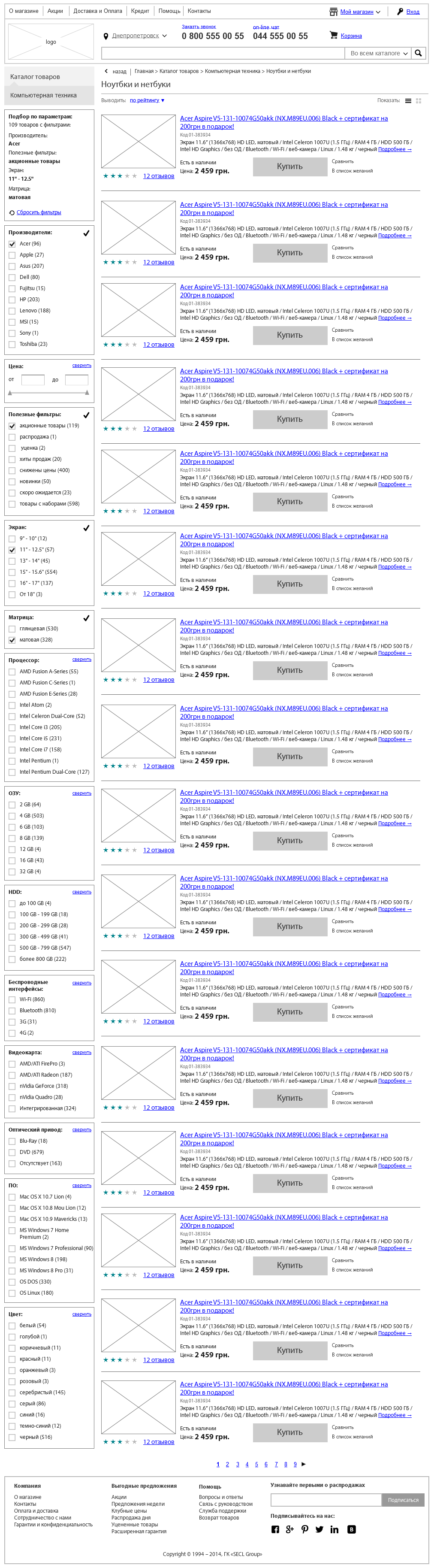
The appearance of each product in the catalog must be unified. But at the same time each product has its own set of parameters. Immediately the following question arises: “what to show in a brief preview of the product in the catalog?”. There may be several options, the easiest to show a photo, name, price and buy button (which is replaced by the button “Report about availability” if the product is not in stock). But today this may not be enough, there are a lot of goods and looking through the catalog, the user must make a superficial conclusion, which products may be of interest to him and which ones may not. Therefore, it is often in the product catalog that additionally display the rating, the number of reviews, the main parameters of the product, in order not to overload the interface, it is proposed to compare the product, add to desires, and there may also be a special selection of promotional items or new products. More information can be shown when you hover on the product preview. It is very important not to overload the interface with information, it should be enough to interest, but not necessarily show everything that is needed for the purchase, the interested person will go to the item card or, in extreme cases, send the item in comparison.
If there are more than 20-25 products in the catalog, at the bottom of the list you need to make a page switch (pagination) and put into the interface a function to control the quantity of goods on one page (10, 20, 50, 100). It is better not to show more than 100 products on one page, it will take a long time to load, and the user's browser can “hang”.
In addition, the catalog should have auxiliary navigation tools: faceted navigation, close product groups, promotional materials, navigation through the labels, help with tips, reviews and articles, popular products, the ability to browse the catalog with a tile or a list with advanced information and other important items. The user should not have any questions in the catalog, he should make him either buy immediately or go to the product page.
For the owner of the store should be created tools to stimulate sales and tools of electronic merchandising, which will allow you to sell the highest value goods. We can and should manage the attention of the buyer.
The basis of the online store navigation is, of course, the menu, catalog and search. First you need to decide on the main menu: in the stores almost always the main menu is a catalog of goods. If it is possible to group all products in 5-7 main groups, it is better to make the menu horizontal, if there are more groups than 7, then it is better to make the menu vertical in the left part of the site. Almost every store has main groups and subgroups, so our menu will be drop-down. More than 3 levels of the drop-down menu should not be done, and ideally limited to even two levels.
In addition to the main menu, there is almost always an auxiliary one in the stores. It can be used for two purposes: an auxiliary menu with information about the store (About the Company, Delivery and Payment, Articles, etc.) - usually located above the search, at the very top of the site, or a context menu with subcategories of the catalog - usually in the interface left.
Another important element that simplifies interaction with the site is bread crumbs. A person should always see where he is and what structure preceded the site before this page. Path (bread crumbs) ideally solve this problem. In the interface, the path is usually located under the main menu with left alignment. If the sections are nested, you can place a triangle icon next to each step of the path and make a drop-down list when you click on it. Also, you can add a “Back to search” link if a person came to the page with search results (facets) and when you click on this link, it will be returned to the results, where all the parameters it selected earlier are saved.
With a large number of items in the lists (products, articles, etc.) it is better to use pagination. Each page should have a static url, this will benefit indexing. In addition, it is good to give the user the opportunity to choose how many items to show on one page. Alternatively, you can dynamically load data when scrolling down, but this can overload the user's browser and is bad for indexing by search engines.
In many online stores, in the product cards there are tags. They can play the role of auxiliary navigation and can also be used for SEO purposes. Usually tags are written in a string, separated by commas and should not be more than 5-7.
Do not forget about the site map. The section that is needed primarily for indexing by search engines. Users already almost do not use it. In the interface, it makes the usual inconspicuous link in the footer site. The page itself is a structured list of links to all pages of the site. Up to 300 links are placed on one page, under which pagination. The section should be automatically generated.
Quite an important tool that allows users to navigate in large directories. In the modern world there are a lot of different products with a huge number of parameters. In one product group there can be 1000 products in which the buyer, most often, is not very well versed. However, each customer has certain expectations, his own set of parameters, which he wants to see in the product. Faceted navigation will allow the buyer to filter all products by the parameters that he wants.
To begin with, all product groups that are sold in a store need to be divided into different subgroups by parameters. For each product group they will be different, and for some groups, for example, household appliances, there may be many, more than 10.
The simplest filtering can be: by price, by brand, by size, by weight, by color, etc. These are general parameters applicable to different product groups. There are also unique, for individual groups.
In the interface, faceted navigation is usually located on the left side of the screen, and to the right of it the goods themselves. All homogeneous parameters are visually grouped, for example, you can group the diagonal of the screen. Next to each parameter there should be a figure with the quantity of goods, and the parameters in which there are no products at all now should be made inaccessible for pressing.
The interface itself needs to be done with dynamic data loading, i.e. the page should not be reloaded when selecting a parameter, only products. This is convenient for the user, but there is also a minus: SEO is not taken into account. You can go in an alternative way and reload the page for each parameter, with a dynamically generated unique URL and titile of this document, then this page can be indexed by search engines and go to it from output by long words, such as "Sony TVs, 50-55 diagonal and 3D ", which is usually not usually promote the store, they may be too much. The second option, by the way, is implemented in the outlet.
Another mechanism that is based on the psychological characteristics of customer behavior. People care what others buy. Consumer goods have more confidence in consumer goods. To use this feature, special labels and whole blocks “Popular goods” were invented. Approximately the same function is carried by new products, only for regular customers of the store.
First of all, a block with popular products should be placed on the main page of the online store. If you go back to my analysis of competitors, then almost all the major projects on the main page have popular products and new items. Firstly, the products are simply not becoming so popular, most likely, these are either advertised products, either high-quality or cheap ones, it is not very important for us for what reason they became popular, it is important for us to attract the attention of a new visitor and bring him to purchase, and the probability purchases of such goods above. Secondly, it will be consumer goods, at least in its niche, and therefore the likelihood that they will fit the target audience is great. Thirdly, the buyer has more confidence in products that others have approved. In this block, you can place from 5-7 goods to 15-21, more definitely not worth it. There must be a link to the full list of popular products. This unit can be automatically adjusted and personalized, especially easy to do for regular customers, because we know their purchase history, website behavior, interests, and a lot of other information. Ideally, every visitor should see popular products from interesting categories, favorite brands and under his wallet.
In the product catalog, popular products are usually labeled “Top Sales”, and new ones are labeled “New.” This is one of the main selections, along with the third type of selection "Action". Labels have a different shape and color content so that users can easily distinguish them visually. They are usually located in the upper right corner of the product preview, right on his photo. In the item card in the same place. Naturally, this happens automatically after the manager has entered the appropriate settings in the administrative part of the store.
Today, almost in any off-line store they think how to lay out the goods in order to maximize sales: children's products are lower to the level of their eyes, popular trademarks in the center, to stimulate sales, you can even make a separate branded rack. All of these tools are available today and online stores, and to be more precise - they are even more than off-line.
First you need to collect and store statistics on all products. The store is important: margin, popularity, conversion, etc. This data can be collected and analyzed automatically. Based on the data obtained, you can dynamically adjust the directory to the user. For example, if a user selects the category “monitors” in the catalog, then he should be the first to see the products with the highest margin for the store, which also have high conversion rates. So the store will be able to maximize sales and net profit.
You can brand individual product cards or even whole categories to stimulate sales of a particular brand. In some cases, the entire site background is branded.
In merchandising, you can go further and adjust product groups based on information about the field and the age of the user, if we have this data, and the store knows exactly what to show to one or another age group. Here again, you can divide people into different groups and think over certain rules for each of them.
For statistics gathering it is worth making integration with Google Analytics.
I approached another important sales tool through which more and more users pass. The websites of online stores are becoming more complex, the quantity of goods is increasing, people are becoming more and more lazy. This function alone can increase the conversion at times.
In the interface, you need to make the search large, visually select it, place it in the header of the site at the very center. If you examine all the successful online stores, it turns out that the search for them occupies one of the central places on the entire site. It looks very simple: the line for entering information and the “Find” button, less often there is a choice of a search category, a hint with an example of a request under the form, a virtual keyboard.
When you enter a query, prompts from the product database should be automatically loaded, you can even with small icons of brand logos or small photos of products, they will help the user to assimilate the information. There should not be more than 10 drop-down tips in total. Google or Yandex drop-down tips are well implemented. In the store, the quality of the implementation should be no worse. It should be remembered that many users begin to enter requests without changing the keyboard layout; the online store must also understand such requests. Hints themselves should not contain any other information, except for goods, do not distract the user's attention.
At the very top, right under the header, you need to remind the word that displays the results and tips that users who entered the same query were looking for, just below the number of these results, even lower categories and subcategories with photos (icons) that correspond to the user's query and the ability to go into these categories. It is also worth giving the opportunity to refine the categories for search through checkboxes. For example, a person searches for the word “ASUS” and means a monitor and a router, but this manufacturer has other types of products that are not interesting to him, so this function will not be superfluous. Under the categories themselves are the search results with products that can be viewed in different versions: with a detailed description or just a tile. Products should be displayed in the same way as in the catalog, with the possibility of their quick purchase directly from the search.
Sometimes the search results can be many, then the directory can be displayed on the left, as a whole column. Next to each category name and subcategory you need to write in brackets how many products in this category fall under the user's request. Under the catalog on the left you can display other types of information that were found: articles, news, reviews, comments, etc. But other types of information should not attract attention, let them be just a link with the ability to go to a separate page and work there with these unimportant elements for sales.
In addition, the search results should be able to sort: by price, by popularity, by date of receipt, by year of release, etc.
On one page, we traditionally show a limited number of products and give the user the ability to manage the number of displayed products, as in a catalog. At the end of the page pagination. You can make dynamic loading of content when scrolling down the page, so the page will never end. But in the version with dynamic loading, there is a danger of the browser hanging on old computers.
At the very end, you can ask users a question, are they satisfied with the search results? If not, offer consultant assistance (chat) or use the question-answer section, which should contain a description of how to use the search for inexperienced people.
Good design is not limited to the site interface, and good designers do not accept information from the customer as an unconditional and unchanging reality. Therefore, I want to touch on another important topic, which, incidentally, has little to do with logic or business logic, but it is extremely important for sales and conversion, and therefore we need to take care of this. This important topic is contacts.
For convenience and trust to the online store of contacts should be many and different. The main contacts that are selling (phone or several phones, as well as online chat) should be on every page, ideally in the header of the site. In order not to overload the information, in the header you need to show the main phone for the city of the buyer, but at the same time it should be implemented in the interface as a drop-down list, when clicked on that, a person can still see the phones of different operators. When you first select a phone site automatically remembers it for this user.
The site should have the telephone of the main office, ideally, this is the direct city number of the state capital. Necessarily hotline 0 800, phone numbers of individual regions, email, On-line chat, feedback form, maybe Skype, office and warehouse address, you can make a drop-down list with addresses by cities, if the contacts are divided into different cities. Ideally, on the contact page, paint individual departmental phones: sales, warehouse, management, HR, etc. The address must be on the contact page and in the basement of the site, it is credible. You can also show a beautiful photo of the office and employees.
We should also consider on-line chat separately. Many online stores use third-party services for this purpose, which is cheap, but not very optimal. I would advise you to make your on-line chat and link the communication history to a specific user, directly to the CRM or analytical system. To do this, when entering the user's chat, you can be asked to log in or at least fill in the name and email. The chat itself should open in a separate window. In simple form, the chat has a chat window, a text entry form and a send button. After completion of the chat buyer must necessarily ask to evaluate the consultant from the store. For the administrator, everything will be a little more difficult, at least the opportunity to see information about the client, his order history, activity and much more. I will talk about the internal structure of the online store in other parts of the article, now we are only talking about the external user part, so we move on.
If the budget does not allow you to make your chat, you can use the free service. I recommend SiteHeart.
A relatively new feature that has begun to appear on online shopping sites in the past few years. In the interface, it is usually represented by a button, along with the “On-line chat” button, which, when clicked, opens an audio link to an online store. It is better to have a button in the header of the site. To use the function, the user only needs a browser and a microphone.
From a software point of view, it will be quite long and expensive to make this function from scratch, so here I recommend using a third-party service. There are a lot of them, both Russian-speaking and English-speaking. I can recommend the Russian-language service Zingaya. All calls from the site simply redirect to the main phone and then everything is as usual: the direction of the call to the manager, Call tracking, etc.
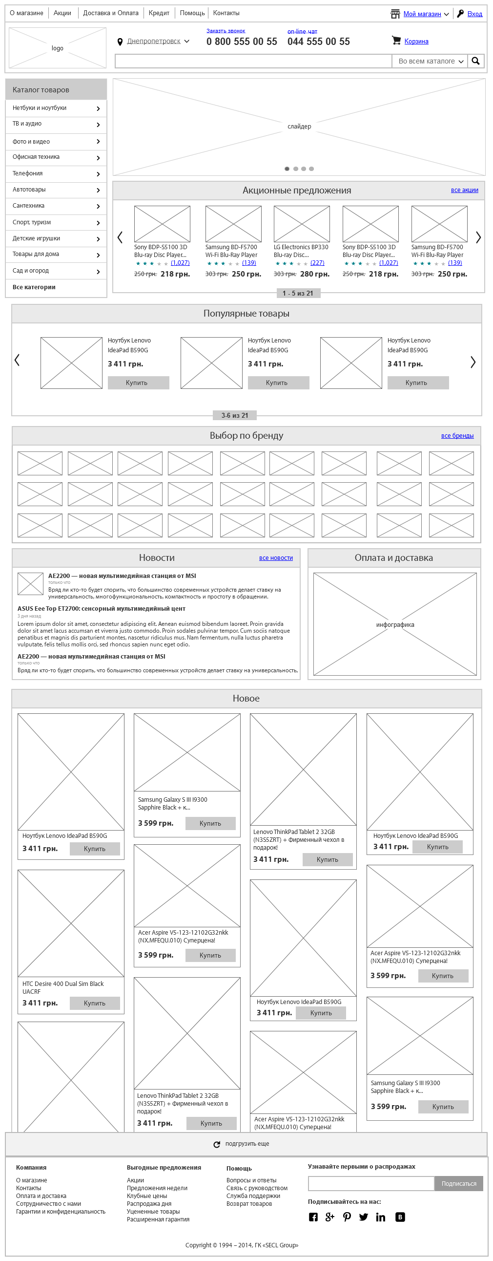
At the end of the study of all these blocks, we can get the following main page of the online store:
For this part so far everything, in the next we will tell you about the product card, product demonstration, monitor the price and availability, one-click purchase, credit purchase, reviews, product valuations, modifications, desires and many other useful modules. Stay with us!
Interesting from our company:
E-commerce courses. Very soon, in our business school Digitov, practical courses will start from the authors of the article: Designing serious websites , Marketing for an online store, and Everything about creating an online store . Hurry up to sign up for a course and get a discount!
Book on e-commerce. We finish writing a book on creating and promoting online stores. Those interested can leave a request and get the first copies of the book. To do this, you need to send an email with the subject “The book on e-commerce” to email: info@secl.com.ua and immediately after the book is released we will send detailed information.
New articles. To receive our new articles before others or simply not to miss new publications - subscribe to the SECL Group fan pages: Facebook , VK , and Twitter .
Original article: http://secl.com.ua/article_serjoznoye_proyektirovaniye_serjoznogo_magazina_moduli_internet_magazina.html
Author:
Nikita Semenov
The president
SECL GROUP / Internet Sales Technologies
I propose to immediately divide the online store into two parts: external and internal. The outer part is seen by everyone, this is the place where purchases are made, but few people think about the inner part, where these purchases are processed, except for accomplished owners of online stores. Even developers very rarely know what should be there. But no major online store can exist without a serious internal accounting system!
Outer part
To properly design the person or you need to start with a goal. So, the main goal of the external part of any online store is to maximize the conversion. Why did I write the word “conversion”, and not “sales”? I did it not by chance. A sale, in this case, consists of several important components: 1. Marketing, primarily external (I will prepare a separate series of articles on marketing online stores); 2. The external part of the site (the essence of this article, it is this part strongly influences the conversion); 3. The internal part of the site (partly the essence of this article, partly the correct organization of business processes). Thus, the external part strongly influences the conversion, but sales depend not only on the quality website for the client. If you ever make your online store, I recommend you to think hard about the 3 points above.
')
In general, the external part of all major online stores is similar to each other, at least according to the purpose of those or other parts of the site. There are quite a few different ways to increase conversion and other tools for related purposes. Shops often choose only between the options for implementing these methods. But, even taking into account the fact that there are a lot of standard things here, it’s still systematizing for units. I will try to break down all this information into logical blocks and submit it systematically. At the moment, I counted more than 50 functional modules, which greatly affect the conversion. But in general, there are more than 1000 smaller ways to increase this important indicator, and every year, with each new research, this number is growing rapidly.
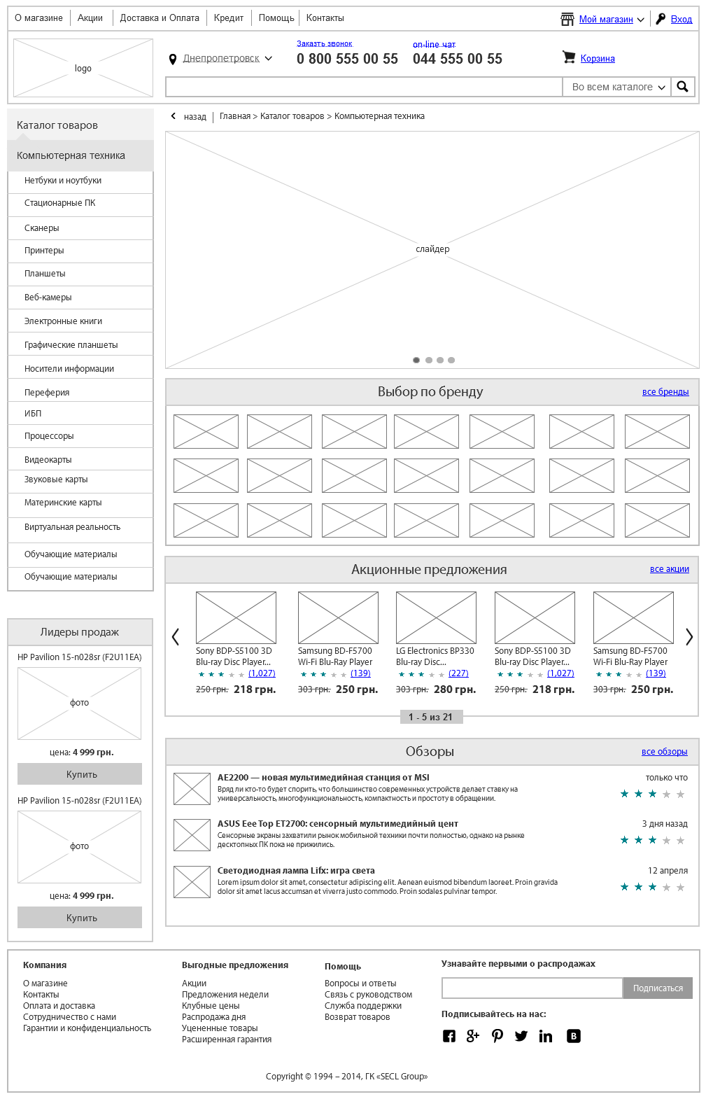
Catalog
One of the most important functions of any online store is a product catalog. It is through it that most users pass before making a purchase decision. We will work on emotional purchases separately, and now our goal is to make a convenient catalog for those who are not ready to immediately make purchases and want to walk around the store.
Each store catalog is quite unique: both product groups and the goods themselves. Therefore, any design team immediately has a question: “how exactly is this to be grouped !?”. It is usually impossible to simply take a supplier catalog or a single catalog from a customer and without changes to the site. Most often, they are quite confusing and incomprehensible, and we need to make sure that any user intuitively understands where the goods are located.
First you need to find out from the customer how many commodity items in the catalog and get his grouping of these goods. Most often, in small and medium-sized stores, the catalog does not exceed 10 thousand items, if the customer has more than 10 thousand items, this is already a big store and this will affect the choice of a technical platform in the future.
Having figured out the quantity, you need to understand how and where the goods are stored? If it is 1C or another accounting system, we will need to integrate the integration of this accounting system with an online store and automate the unloading of goods. If the goods are stored in the exel-file, it will need to examine and bring all the goods into a single form (headers, data for each product), and then lay down the function of automatic processing of the price list and data analysis from it. So the customer with each update of the price list will load it into the store, all information will be instantly updated after that. In severe cases, there is no accounting system, no price list, and only manual information processing remains, but this is permissible when goods are up to 100 pieces and the information does not change often, otherwise it is better to focus on storing information in a good accounting system. Of the three options for storing goods, the accounting system is the most efficient for further work, so if possible, you need to bring the customer to him.
After receiving information from the customer, all products must be divided into logical groups to which users are accustomed. It is very important not to force users to think about where the goods are! Ideally, the grouping of goods from some popular price-aggregator or a large online store is ideally taken as a basis; they have already “invented a bicycle”. Separately, I recommend thinking about the simple names of product groups, design is largely copywriting. More than 3 levels of the catalog should not be done.
Do not forget about the dynamic product groups that can appear and disappear throughout the year. For example, special groups that can be created for holidays: goods by March 8, February 23, or by the new year. They ideally also show in the catalog and in a special way to allocate, to increase sales of certain goods for the holidays, so you need to provide a place for this in the interface.
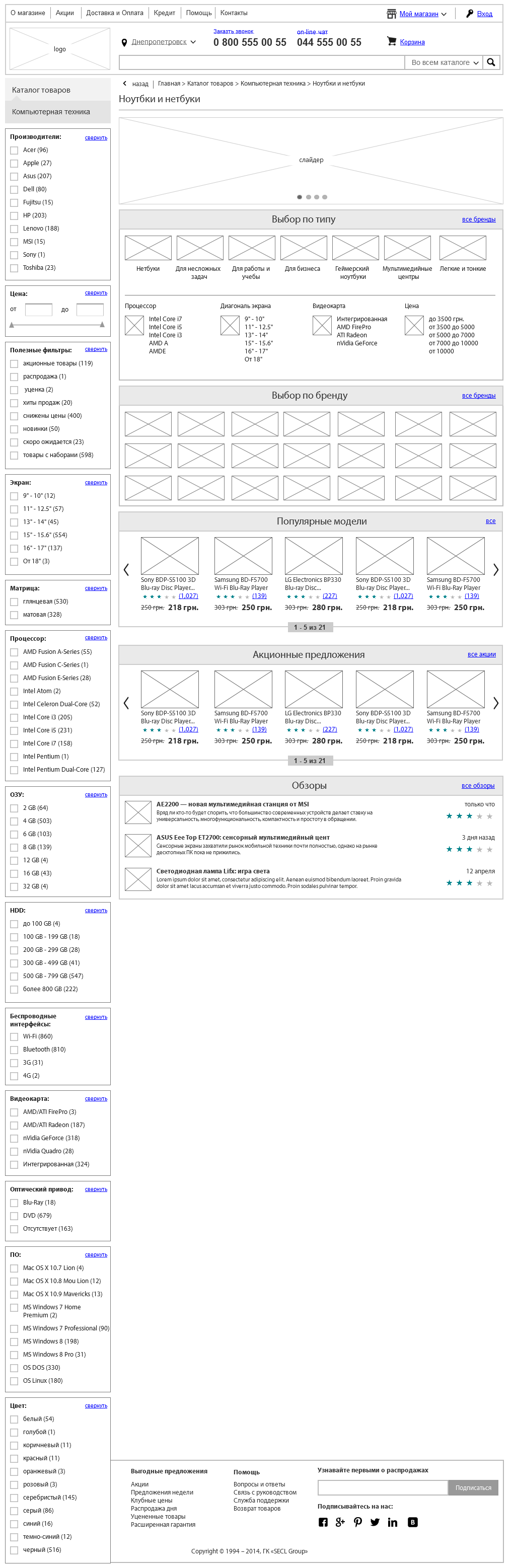
Further, these product groups need to be embedded in the site interface. If we do not have many categories, in particular, no more than 7, then you can make a horizontal menu, as in the ROZETKA online store. If there are more items, then it’s better to do a vertical menu on the left, like on Amazon.com. In any case, the menu will be a drop-down, ideally a two-level, in rare cases a three-level. By the way, ROZETKA has added new product groups in recent years and now they have 8 items in the horizontal menu of the catalog, which negatively affects the user's attention, the last product categories on the right give the user much less attention and this has a negative effect on the conversion.
The appearance of each product in the catalog must be unified. But at the same time each product has its own set of parameters. Immediately the following question arises: “what to show in a brief preview of the product in the catalog?”. There may be several options, the easiest to show a photo, name, price and buy button (which is replaced by the button “Report about availability” if the product is not in stock). But today this may not be enough, there are a lot of goods and looking through the catalog, the user must make a superficial conclusion, which products may be of interest to him and which ones may not. Therefore, it is often in the product catalog that additionally display the rating, the number of reviews, the main parameters of the product, in order not to overload the interface, it is proposed to compare the product, add to desires, and there may also be a special selection of promotional items or new products. More information can be shown when you hover on the product preview. It is very important not to overload the interface with information, it should be enough to interest, but not necessarily show everything that is needed for the purchase, the interested person will go to the item card or, in extreme cases, send the item in comparison.
If there are more than 20-25 products in the catalog, at the bottom of the list you need to make a page switch (pagination) and put into the interface a function to control the quantity of goods on one page (10, 20, 50, 100). It is better not to show more than 100 products on one page, it will take a long time to load, and the user's browser can “hang”.
In addition, the catalog should have auxiliary navigation tools: faceted navigation, close product groups, promotional materials, navigation through the labels, help with tips, reviews and articles, popular products, the ability to browse the catalog with a tile or a list with advanced information and other important items. The user should not have any questions in the catalog, he should make him either buy immediately or go to the product page.
For the owner of the store should be created tools to stimulate sales and tools of electronic merchandising, which will allow you to sell the highest value goods. We can and should manage the attention of the buyer.
Navigation
The basis of the online store navigation is, of course, the menu, catalog and search. First you need to decide on the main menu: in the stores almost always the main menu is a catalog of goods. If it is possible to group all products in 5-7 main groups, it is better to make the menu horizontal, if there are more groups than 7, then it is better to make the menu vertical in the left part of the site. Almost every store has main groups and subgroups, so our menu will be drop-down. More than 3 levels of the drop-down menu should not be done, and ideally limited to even two levels.
In addition to the main menu, there is almost always an auxiliary one in the stores. It can be used for two purposes: an auxiliary menu with information about the store (About the Company, Delivery and Payment, Articles, etc.) - usually located above the search, at the very top of the site, or a context menu with subcategories of the catalog - usually in the interface left.
Another important element that simplifies interaction with the site is bread crumbs. A person should always see where he is and what structure preceded the site before this page. Path (bread crumbs) ideally solve this problem. In the interface, the path is usually located under the main menu with left alignment. If the sections are nested, you can place a triangle icon next to each step of the path and make a drop-down list when you click on it. Also, you can add a “Back to search” link if a person came to the page with search results (facets) and when you click on this link, it will be returned to the results, where all the parameters it selected earlier are saved.
With a large number of items in the lists (products, articles, etc.) it is better to use pagination. Each page should have a static url, this will benefit indexing. In addition, it is good to give the user the opportunity to choose how many items to show on one page. Alternatively, you can dynamically load data when scrolling down, but this can overload the user's browser and is bad for indexing by search engines.
In many online stores, in the product cards there are tags. They can play the role of auxiliary navigation and can also be used for SEO purposes. Usually tags are written in a string, separated by commas and should not be more than 5-7.
Do not forget about the site map. The section that is needed primarily for indexing by search engines. Users already almost do not use it. In the interface, it makes the usual inconspicuous link in the footer site. The page itself is a structured list of links to all pages of the site. Up to 300 links are placed on one page, under which pagination. The section should be automatically generated.
Faceted navigation
Quite an important tool that allows users to navigate in large directories. In the modern world there are a lot of different products with a huge number of parameters. In one product group there can be 1000 products in which the buyer, most often, is not very well versed. However, each customer has certain expectations, his own set of parameters, which he wants to see in the product. Faceted navigation will allow the buyer to filter all products by the parameters that he wants.
To begin with, all product groups that are sold in a store need to be divided into different subgroups by parameters. For each product group they will be different, and for some groups, for example, household appliances, there may be many, more than 10.
The simplest filtering can be: by price, by brand, by size, by weight, by color, etc. These are general parameters applicable to different product groups. There are also unique, for individual groups.
In the interface, faceted navigation is usually located on the left side of the screen, and to the right of it the goods themselves. All homogeneous parameters are visually grouped, for example, you can group the diagonal of the screen. Next to each parameter there should be a figure with the quantity of goods, and the parameters in which there are no products at all now should be made inaccessible for pressing.
The interface itself needs to be done with dynamic data loading, i.e. the page should not be reloaded when selecting a parameter, only products. This is convenient for the user, but there is also a minus: SEO is not taken into account. You can go in an alternative way and reload the page for each parameter, with a dynamically generated unique URL and titile of this document, then this page can be indexed by search engines and go to it from output by long words, such as "Sony TVs, 50-55 diagonal and 3D ", which is usually not usually promote the store, they may be too much. The second option, by the way, is implemented in the outlet.
Popular goods
Another mechanism that is based on the psychological characteristics of customer behavior. People care what others buy. Consumer goods have more confidence in consumer goods. To use this feature, special labels and whole blocks “Popular goods” were invented. Approximately the same function is carried by new products, only for regular customers of the store.
First of all, a block with popular products should be placed on the main page of the online store. If you go back to my analysis of competitors, then almost all the major projects on the main page have popular products and new items. Firstly, the products are simply not becoming so popular, most likely, these are either advertised products, either high-quality or cheap ones, it is not very important for us for what reason they became popular, it is important for us to attract the attention of a new visitor and bring him to purchase, and the probability purchases of such goods above. Secondly, it will be consumer goods, at least in its niche, and therefore the likelihood that they will fit the target audience is great. Thirdly, the buyer has more confidence in products that others have approved. In this block, you can place from 5-7 goods to 15-21, more definitely not worth it. There must be a link to the full list of popular products. This unit can be automatically adjusted and personalized, especially easy to do for regular customers, because we know their purchase history, website behavior, interests, and a lot of other information. Ideally, every visitor should see popular products from interesting categories, favorite brands and under his wallet.
In the product catalog, popular products are usually labeled “Top Sales”, and new ones are labeled “New.” This is one of the main selections, along with the third type of selection "Action". Labels have a different shape and color content so that users can easily distinguish them visually. They are usually located in the upper right corner of the product preview, right on his photo. In the item card in the same place. Naturally, this happens automatically after the manager has entered the appropriate settings in the administrative part of the store.
Electronic merchandising (product ranking)
Today, almost in any off-line store they think how to lay out the goods in order to maximize sales: children's products are lower to the level of their eyes, popular trademarks in the center, to stimulate sales, you can even make a separate branded rack. All of these tools are available today and online stores, and to be more precise - they are even more than off-line.
First you need to collect and store statistics on all products. The store is important: margin, popularity, conversion, etc. This data can be collected and analyzed automatically. Based on the data obtained, you can dynamically adjust the directory to the user. For example, if a user selects the category “monitors” in the catalog, then he should be the first to see the products with the highest margin for the store, which also have high conversion rates. So the store will be able to maximize sales and net profit.
You can brand individual product cards or even whole categories to stimulate sales of a particular brand. In some cases, the entire site background is branded.
In merchandising, you can go further and adjust product groups based on information about the field and the age of the user, if we have this data, and the store knows exactly what to show to one or another age group. Here again, you can divide people into different groups and think over certain rules for each of them.
For statistics gathering it is worth making integration with Google Analytics.
Search
I approached another important sales tool through which more and more users pass. The websites of online stores are becoming more complex, the quantity of goods is increasing, people are becoming more and more lazy. This function alone can increase the conversion at times.
In the interface, you need to make the search large, visually select it, place it in the header of the site at the very center. If you examine all the successful online stores, it turns out that the search for them occupies one of the central places on the entire site. It looks very simple: the line for entering information and the “Find” button, less often there is a choice of a search category, a hint with an example of a request under the form, a virtual keyboard.
When you enter a query, prompts from the product database should be automatically loaded, you can even with small icons of brand logos or small photos of products, they will help the user to assimilate the information. There should not be more than 10 drop-down tips in total. Google or Yandex drop-down tips are well implemented. In the store, the quality of the implementation should be no worse. It should be remembered that many users begin to enter requests without changing the keyboard layout; the online store must also understand such requests. Hints themselves should not contain any other information, except for goods, do not distract the user's attention.
At the very top, right under the header, you need to remind the word that displays the results and tips that users who entered the same query were looking for, just below the number of these results, even lower categories and subcategories with photos (icons) that correspond to the user's query and the ability to go into these categories. It is also worth giving the opportunity to refine the categories for search through checkboxes. For example, a person searches for the word “ASUS” and means a monitor and a router, but this manufacturer has other types of products that are not interesting to him, so this function will not be superfluous. Under the categories themselves are the search results with products that can be viewed in different versions: with a detailed description or just a tile. Products should be displayed in the same way as in the catalog, with the possibility of their quick purchase directly from the search.
Sometimes the search results can be many, then the directory can be displayed on the left, as a whole column. Next to each category name and subcategory you need to write in brackets how many products in this category fall under the user's request. Under the catalog on the left you can display other types of information that were found: articles, news, reviews, comments, etc. But other types of information should not attract attention, let them be just a link with the ability to go to a separate page and work there with these unimportant elements for sales.
In addition, the search results should be able to sort: by price, by popularity, by date of receipt, by year of release, etc.
On one page, we traditionally show a limited number of products and give the user the ability to manage the number of displayed products, as in a catalog. At the end of the page pagination. You can make dynamic loading of content when scrolling down the page, so the page will never end. But in the version with dynamic loading, there is a danger of the browser hanging on old computers.
At the very end, you can ask users a question, are they satisfied with the search results? If not, offer consultant assistance (chat) or use the question-answer section, which should contain a description of how to use the search for inexperienced people.
Contacts
Good design is not limited to the site interface, and good designers do not accept information from the customer as an unconditional and unchanging reality. Therefore, I want to touch on another important topic, which, incidentally, has little to do with logic or business logic, but it is extremely important for sales and conversion, and therefore we need to take care of this. This important topic is contacts.
For convenience and trust to the online store of contacts should be many and different. The main contacts that are selling (phone or several phones, as well as online chat) should be on every page, ideally in the header of the site. In order not to overload the information, in the header you need to show the main phone for the city of the buyer, but at the same time it should be implemented in the interface as a drop-down list, when clicked on that, a person can still see the phones of different operators. When you first select a phone site automatically remembers it for this user.
The site should have the telephone of the main office, ideally, this is the direct city number of the state capital. Necessarily hotline 0 800, phone numbers of individual regions, email, On-line chat, feedback form, maybe Skype, office and warehouse address, you can make a drop-down list with addresses by cities, if the contacts are divided into different cities. Ideally, on the contact page, paint individual departmental phones: sales, warehouse, management, HR, etc. The address must be on the contact page and in the basement of the site, it is credible. You can also show a beautiful photo of the office and employees.
On-line chat
We should also consider on-line chat separately. Many online stores use third-party services for this purpose, which is cheap, but not very optimal. I would advise you to make your on-line chat and link the communication history to a specific user, directly to the CRM or analytical system. To do this, when entering the user's chat, you can be asked to log in or at least fill in the name and email. The chat itself should open in a separate window. In simple form, the chat has a chat window, a text entry form and a send button. After completion of the chat buyer must necessarily ask to evaluate the consultant from the store. For the administrator, everything will be a little more difficult, at least the opportunity to see information about the client, his order history, activity and much more. I will talk about the internal structure of the online store in other parts of the article, now we are only talking about the external user part, so we move on.
If the budget does not allow you to make your chat, you can use the free service. I recommend SiteHeart.
Call from the site
A relatively new feature that has begun to appear on online shopping sites in the past few years. In the interface, it is usually represented by a button, along with the “On-line chat” button, which, when clicked, opens an audio link to an online store. It is better to have a button in the header of the site. To use the function, the user only needs a browser and a microphone.
From a software point of view, it will be quite long and expensive to make this function from scratch, so here I recommend using a third-party service. There are a lot of them, both Russian-speaking and English-speaking. I can recommend the Russian-language service Zingaya. All calls from the site simply redirect to the main phone and then everything is as usual: the direction of the call to the manager, Call tracking, etc.
At the end of the study of all these blocks, we can get the following main page of the online store:
For this part so far everything, in the next we will tell you about the product card, product demonstration, monitor the price and availability, one-click purchase, credit purchase, reviews, product valuations, modifications, desires and many other useful modules. Stay with us!
Interesting from our company:
E-commerce courses. Very soon, in our business school Digitov, practical courses will start from the authors of the article: Designing serious websites , Marketing for an online store, and Everything about creating an online store . Hurry up to sign up for a course and get a discount!
Book on e-commerce. We finish writing a book on creating and promoting online stores. Those interested can leave a request and get the first copies of the book. To do this, you need to send an email with the subject “The book on e-commerce” to email: info@secl.com.ua and immediately after the book is released we will send detailed information.
New articles. To receive our new articles before others or simply not to miss new publications - subscribe to the SECL Group fan pages: Facebook , VK , and Twitter .
Original article: http://secl.com.ua/article_serjoznoye_proyektirovaniye_serjoznogo_magazina_moduli_internet_magazina.html
Author:
Nikita Semenov
The president
SECL GROUP / Internet Sales Technologies
Source: https://habr.com/ru/post/214997/
All Articles