Magic Circle: CSS Puzzle
Good day, dear habravchane. Recently, Hugo Giraudel , he's a CSS goblin, SASS hacker and Margin psycho, has published a very interesting CSS puzzle for his blog.
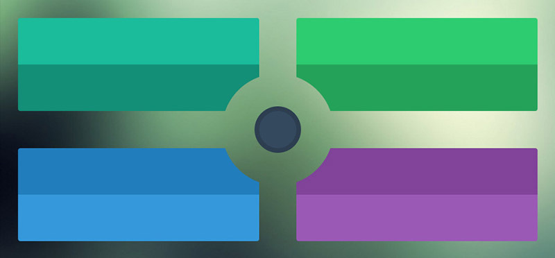
Will you be able to complete this with the following rules?
')
In order not to be very lazy - the frame is already there .
Made?
Basic HTML:
I will not fill the place in this post with banal styles that reflect and position the blocks. I will designate only the appearance of a circle in the very center identical in all examples:
You must set the correct radial gradients with color and transparency to all footer elements for the upper blocks and all header elements for the lower blocks. At first glance, this is the most trivial solution, but it has a zest, which is to use CSS calc () to give responsiveness:
I think this is the most inventive solution. For the header and footer elements in accordance for each of the blocks, set the margin in the desired direction. Then for each section and header with footer we create pseudo-elements:
Pay attention to: before for .box-alpha, which has no width or height. We recall how we all used to make arrows or triangles on CSS using the border. The same principle here.

My favorite solution, which demonstrates a thorough understanding of the finest nuances in CSS. As well as in the previous variant for elements we create pseudo-element and we set the correct padding. An element of each block, a part of which must be cut to a quarter of a circle, is completely transparent. The background is given by the huge external shadow of the pseudo-element.
But the most elegant here is not a shadow at all. And the use of a negative margin: -5em . When absolute positioning is right, bottom, the element will have margin-right values: -5em and margin-bottom: -5em, respectively.
The original decision of Hugo on SASS can be found here . It uses box-shadow as in the third example. Remembering at the end of my yesterday's translation “Only the developers of the 90s remember this,” I would like to say that in 15 years we will also smile at these wild methods that are given in this post.
Thank you all for your attention.
Will you be able to complete this with the following rules?
')
- The circle in the center must be transparent so that the background is visible
- The distance between the left and right blocks, as between the top and bottom should be the same
- If there are descendants in the block, the content should be displayed.
- The DOM should look like this: ul> li> section> header + footer
- Cannot use javascript and images
- I will add from myself: you can not use CSS Shape and Clip Path
In order not to be very lazy - the frame is already there .
Made?
Basic HTML:
<ul class="boxes"> <li class="box box-alpha"> <section class="box-content"> <header class="box-header"></header> <footer class="box-footer"></footer> </section> </li> <li class="box box-beta"> <section class="box-content"> <header class="box-header"></header> <footer class="box-footer"></footer> </section> </li> <li class="box box-gamma"> <section class="box-content"> <header class="box-header"></header> <footer class="box-footer"></footer> </section> </li> <li class="box box-delta"> <section class="box-content"> <header class="box-header"></header> <footer class="box-footer"></footer> </section> </li> </ul> I will not fill the place in this post with banal styles that reflect and position the blocks. I will designate only the appearance of a circle in the very center identical in all examples:
.boxes:after { background: none repeat scroll 0 0 #34495E; border: 0.5em solid #2C3D50; border-radius: 50%; content: " "; height: 5.5em; left: 50%; margin-left: -2.75em; position: absolute; top: 10.75em; width: 5.5em; } First method: radial gradient
You must set the correct radial gradients with color and transparency to all footer elements for the upper blocks and all header elements for the lower blocks. At first glance, this is the most trivial solution, but it has a zest, which is to use CSS calc () to give responsiveness:
.box-alpha .box-footer { background: radial-gradient(circle at calc(100% + 2em) 7em , rgba(0, 0, 0, 0) 6em, #148F77 6em) repeat scroll 0 0 rgba(0, 0, 0, 0); } .box-beta .box-footer { background: radial-gradient(circle at -2em 7em , rgba(0, 0, 0, 0) 6em, #25A25A 6em) repeat scroll 0 0 rgba(0, 0, 0, 0); } .box-gamma .box-header { background: radial-gradient(circle at calc(100% + 2em) -2em , rgba(0, 0, 0, 0) 6em, #217DBB 6em) repeat scroll 0 0 rgba(0, 0, 0, 0); } .box-delta .box-header { background: radial-gradient(circle at -2em -2em , rgba(0, 0, 0, 0) 6em, #804399 6em) repeat scroll 0 0 rgba(0, 0, 0, 0); } Second way: frame for pseudo-elements
I think this is the most inventive solution. For the header and footer elements in accordance for each of the blocks, set the margin in the desired direction. Then for each section and header with footer we create pseudo-elements:
.box-alpha .box-content:before { border-color: #148F77 rgba(0, 0, 0, 0) rgba(0, 0, 0, 0) #148F77; bottom: -7.5em; right: -7.5em; } .box-content:before { border: 10em solid #FF0000; content: ""; display: block; height: 0; position: absolute; width: 0; } .box-alpha .box-content:after { border-color: #148F77; bottom: -10em; right: -10em; } .box-content:after { border: 2em solid #FF0000; border-radius: 30em; content: ""; display: block; height: 12em; position: absolute; width: 12em; z-index: 0; } ... Pay attention to: before for .box-alpha, which has no width or height. We recall how we all used to make arrows or triangles on CSS using the border. The same principle here.
The third way: shadows and negative indents
My favorite solution, which demonstrates a thorough understanding of the finest nuances in CSS. As well as in the previous variant for elements we create pseudo-element and we set the correct padding. An element of each block, a part of which must be cut to a quarter of a circle, is completely transparent. The background is given by the huge external shadow of the pseudo-element.
.block__element--cut:before { border-radius: 50%; content: ""; height: 8em; margin: -5em; position: absolute; width: 8em; z-index: -1; } .block:nth-child(1) .block__element--cut:before { bottom: 0; box-shadow: 0 0 0 40em #0F414C; right: 0; } .block:nth-child(2) .block__element--cut:before { bottom: 0; box-shadow: 0 0 0 40em #673A01; left: 0; } .block:nth-child(3) .block__element--cut:before { box-shadow: 0 0 0 40em rgba(187, 169, 255, 0.65); right: 0; top: 0; } .block:nth-child(4) .block__element--cut:before { box-shadow: 0 0 0 40em rgba(176, 214, 95, 0.65); left: 0; top: 0; } But the most elegant here is not a shadow at all. And the use of a negative margin: -5em . When absolute positioning is right, bottom, the element will have margin-right values: -5em and margin-bottom: -5em, respectively.
The original decision of Hugo on SASS can be found here . It uses box-shadow as in the third example. Remembering at the end of my yesterday's translation “Only the developers of the 90s remember this,” I would like to say that in 15 years we will also smile at these wild methods that are given in this post.
Thank you all for your attention.
Source: https://habr.com/ru/post/214917/
All Articles