REG.RU rebranding: easier, more convenient, more efficient

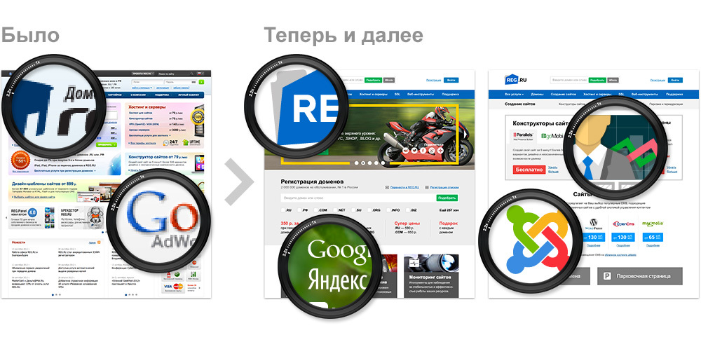
As a leader among Russian domain registrars and hosting providers, REG.RU not only anticipates changes in the market, but in many respects sets the vector for its development. The company has a wide portfolio of various services (from domain registration and hosting services to SEO promotion services and contextual advertising), which makes REG.RU the starting point for business development on the Internet.
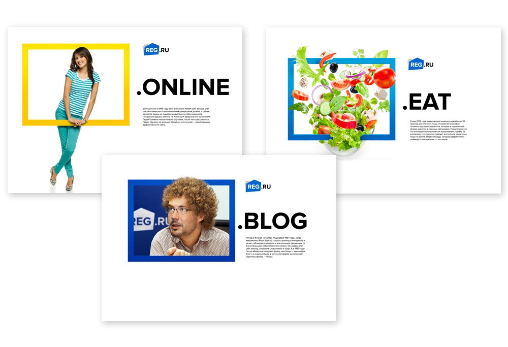
One of the main goals of the rebranding was to reveal to the public our main values: simplicity, convenience, visibility and efficiency. The changes affected all the components of REG.RU corporate identification, but, of course, the most striking and visible elements of the rebranding were the updated website design, the logo and corporate identity of the company. About them, and will be discussed in the post.
How has the site REG.RU changed
')
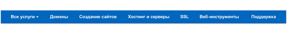
New navigation concept
When developing a new navigation system, we were guided by one goal - to lead the user from idea to launching his own business on the Web. Now, the basis of the site structure and the presentation of information in the main menu is a clear sequence of the user’s transition from basic services to services, which allow him to develop his business and improve the efficiency of business processes.
For example, the sequence of user actions may be as follows:
“Insight” (appearance of the idea) - development of the project concept and name selection - domain name registration for the project site - website creation - hosting selection and order - confirmation of the resource reliability with the help of an SSL certificate - connection of necessary services for promoting and developing business on the Web.
New graphical site concept
On the one hand, the basis for changes in site design are the principles already voiced above: simplicity, convenience, visibility and efficiency, and on the other, a change in the paradigm of consumption of services in the market. So, according to the latest data , the lion’s share of traffic is generated by mobile devices, and every year these numbers will grow.
The elements of the site are enlarged, which greatly simplifies viewing it from mobile devices and allows you to focus on the really important information without being lost in the data array.
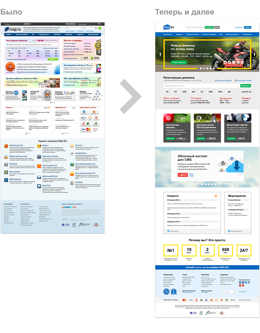
In addition, the emergence of high pixel density monitors, such as Retina, dictates new graphics rules. We used technologies that make the site equally well displayed on screens of any type (both ordinary and with high pixel density).
All the updated pages of the site use SVG graphics as the main one, and bitmaps are used only as background blocks. This allowed to reduce the weight and increase the speed of loading pages on the REG.RU site, as well as to avoid image deformation when the site page scale increases.
How has the REG.RU logo changed
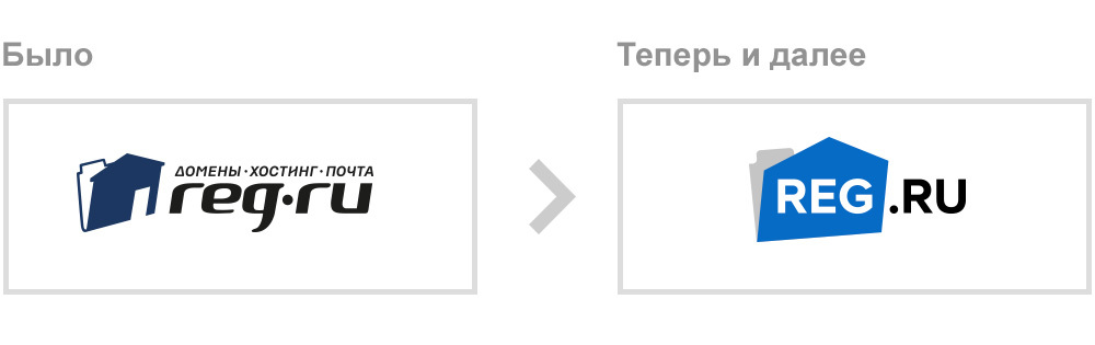
Our task was to simplify the logo as much as possible, getting rid of many small details, but at the same time preserving brand awareness.
The basis of the new logo is an important element, preserved from the previous logo - “Folder-house”, which contains several metaphors at once. For example, home as part of the word “domain” or home as the historical definition of “home page” sites, and folder as a key graphic element denoting group storage of digital information. In this case, the angle of inclination decreased, which gave the element greater stability.
The inscription REG migrated to the main element of the logo, laying a new basis for the perception of the brand. REG is the basic element, which is complemented by the designation of the regional domain zone to the complete mark of the logo.
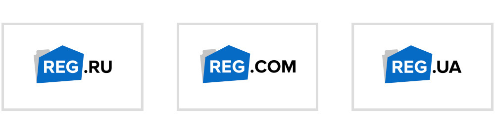
Font style also acquired simpler forms, losing small details and excesses. The inscription “Domains-Hosting-Mail” migrated from the mandatory part of the logo to an additional one and will now be used if necessary, depending on the context.
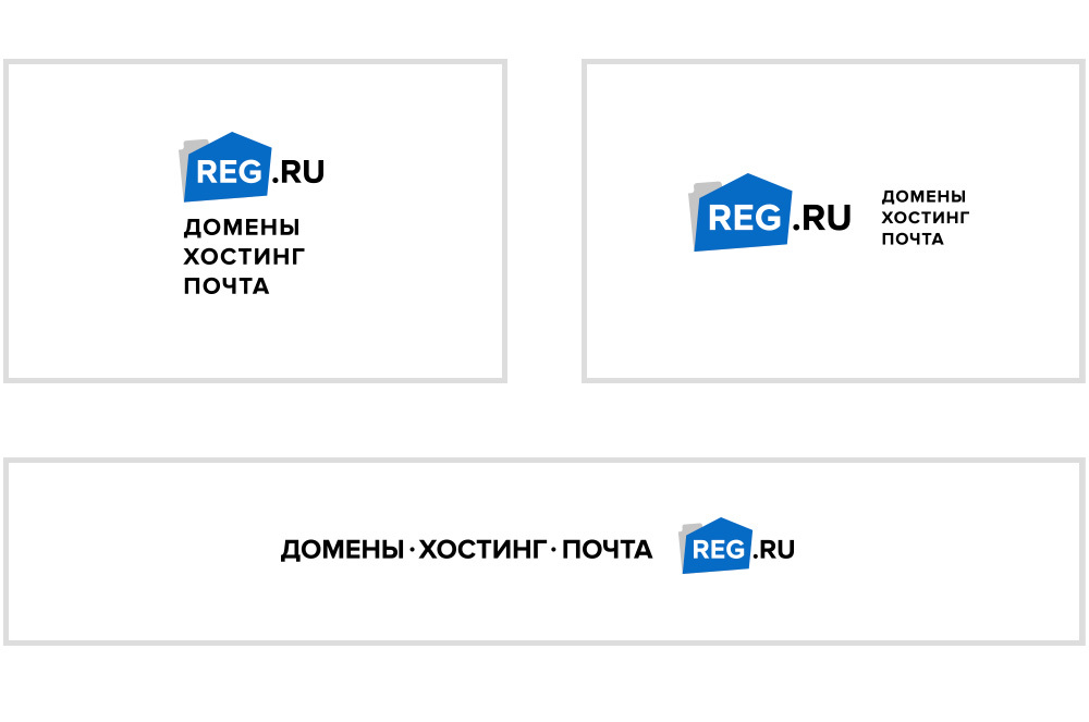
As a result, the REG.RU logo acquired a higher readability, while the modern outline expanded the possibilities for its wider use.
How has our corporate identity changed

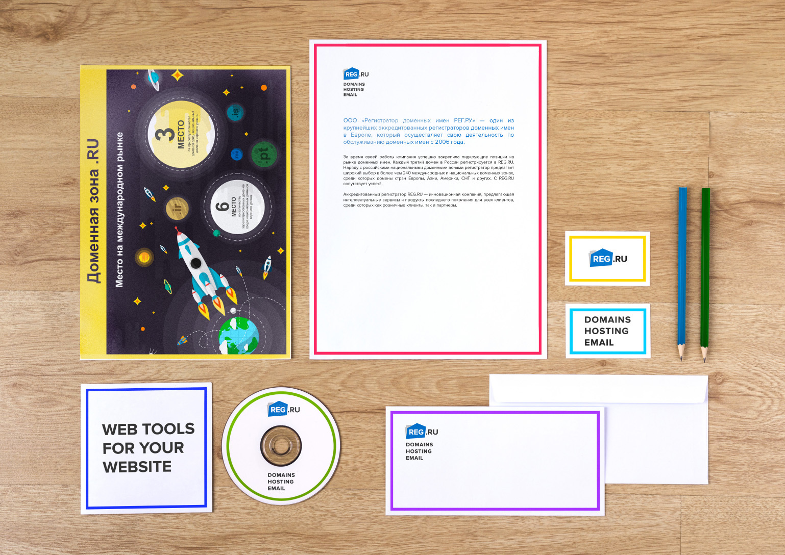


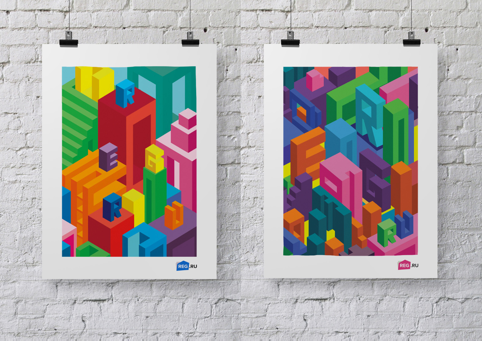
Thanks to the efforts of our developers and designers, the visual component of the REG.RU brand is a reflection of the company's position in the market and our corporate values. REG.RU - it's easy, convenient, clear and effective.
Source: https://habr.com/ru/post/214731/
All Articles