New Yandex.Disk interface. How did we do it and why in general do it
Today, Yandex.Disk has completely updated its web interface . And he got not only a new look - he changed the concept and logic that stand behind him. Moreover, many parts of this are the beginning of important changes for the interfaces of Yandex as a whole. We are moving towards ceasing to be an assembly of different sites under a single logo, and become to some extent a single web application.
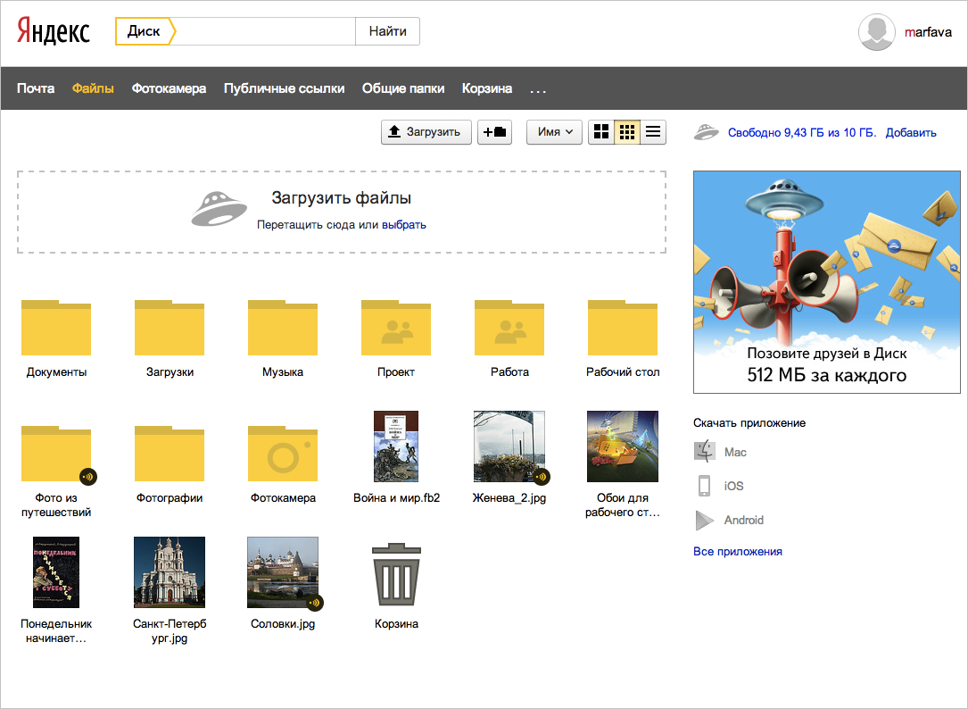
In the first version of Yandex.Disk, the logic of its web interface was not much different from the one used by other cloud storages: these were the same folders and files, but inside our Mail. Now the content and its presentation is important.
')
My name is Sergey Tomilov, I was one of those who worked on a new design. Today I want to tell you about how the work went, what difficulties we had, what the concept behind all this was and how it influenced the design.
Today, many people, not even the most advanced, often have several devices on which they open the same services. Their technical implementation for laptops, tablets or smartphones may be different, but the meaning remains common. And what people are dealing with is less and less files and formats, and more and more content. You store not just files in .jpg, .epub and .mp3, but photos, books and music. And on each device they will be photos, books, and music.
Therefore, it is already clear that ordinary people in cloud storages also want to work not with the file structure, but with the content. They need help building a structure for their content. Of course, we are not the first and not the only ones who came up with it. For example, in iOS, everything captured on camera is itself decomposed into albums with videos and photos, by years and places. Although simultaneously stored in the general stream.
So we approached the formulation of our idea. We do not want the disc to be a combine that blends everything into one entity. He should help the person to structure the content and be able to work with any of its types, as an application. But to formulate a concept is one thing, but to realize everything in a beautiful and convenient interface is another.
Now I want to talk about what path we have gone. Redesign is the first step to a new drive. Work on it has been going on for almost a year. We tried different options, conducted experiments, rolling out the beta on Yandex employees. We have tried to facilitate the interface, focusing on the most important.
First of all, the Disk has already grown from the subsection of Yandex.Mail. It was time to make him a full service.
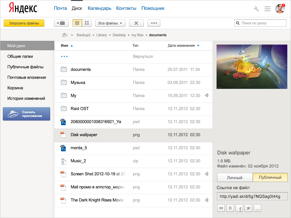
The idea of content division appeared already then, but, frankly, vaguely. And it is noticeable that in such a design it will be crowded, and we plan to develop it for a long time. It is necessary to create an interface in which growth points will be laid right away. By the way, the concept of the right panel with the properties of the selected object appeared immediately and reached the final.
The importance of full-text search on a disk containing several hundred files is difficult to overestimate, so we assigned a noticeable place to it. He moved to his usual place - in the header of the service.

Crashing the interface into parts turned out to be too strong, and the search line attracted too much attention. But the Disc has already begun to look like an application (especially on tablets), and below it appeared a panel of content slices, which we have in the plans and which I will discuss below.
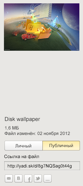
The panel on the right began to contain all the main possibilities of actions with files and got a place for large previews. The duplication of the buttons above and below has disappeared - they all fit on it. As a result, I also simplified the creation of public links - now you can share the file immediately after downloading it. To send a link to a social network, you do not need to make two clicks - immediately click on the icon of the desired social network.
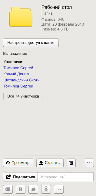
In the first versions of the previews of the pictures in the folders themselves, I wanted to make them proportional, but then I decided to make life easier for everyone, and they became square.
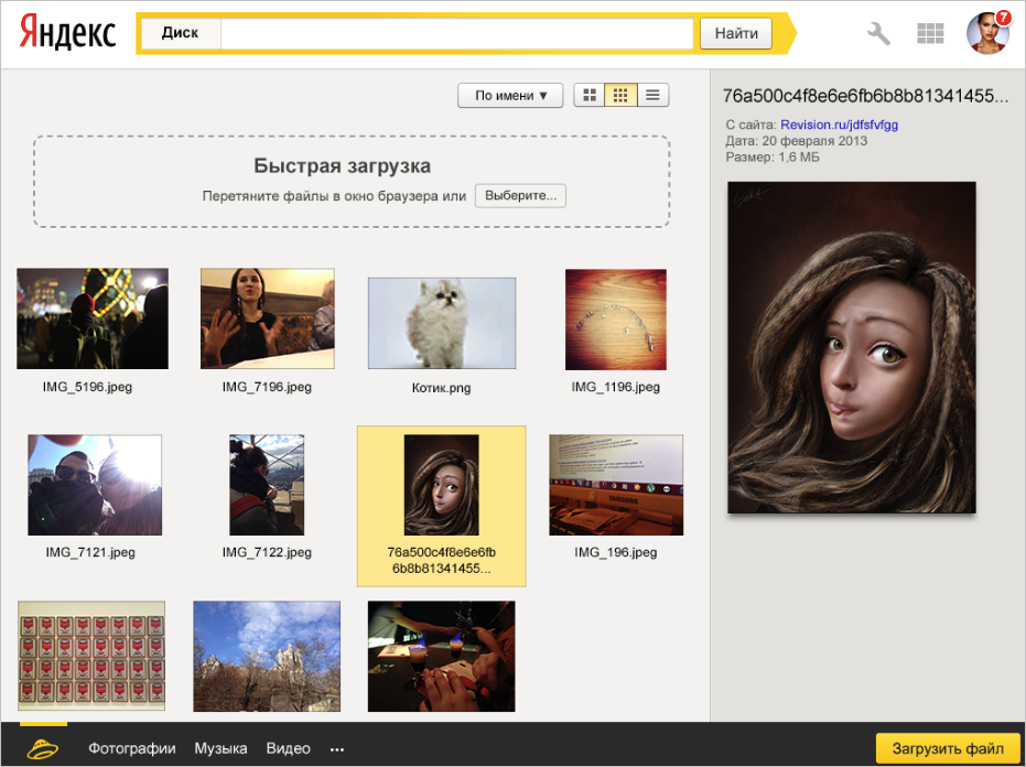
While working on how different types of content would be presented on the web, it was necessary to keep in mind various important points. For example, the list of pictures should switch between them by clicking on the image itself - just as users are used to it on sites. And the disappearance of the viewing window should not be a surprise for a person - it should close easily and clearly.
Along with the design change, we tried to integrate into the Disk interfaces all those actions that are familiar to the user in the OS. You can upload and move files by dragging and dropping into the desired folder. To make it easier to drag, we added a folder tree to the right.
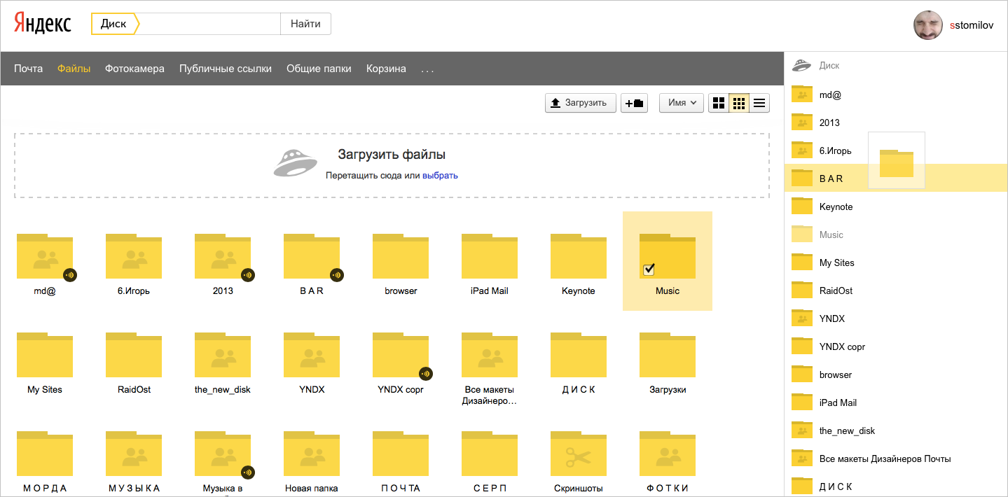
Also, group operations appeared in the Disk web interface. To select multiple objects, you can use the standard keyboard shortcuts: shift +, ctrl (cmd) +.
Rolling out a beta on Yandex employees, we almost did not receive any negative feedback. But unexpectedly, parts of our colleagues did not like the folder icon very much, the third one in the picture.
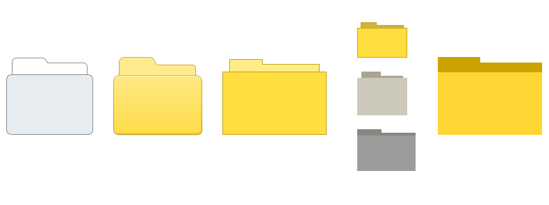
There were a lot of comments like this: "THIS FOLDER CUTS TO MY EYES", "This is Windows 3.1", "Oh, what a misery." The folder and the truth in the living product has been overly detailed and has undergone further modifications. The most noticeable you see.
But besides this, we received from our colleagues a large number of reviews, which allowed us to finish a lot to the public launch. For example, I believed that people interact with the site of the Disk, as with any usual site - that is, a set of web pages with links. But we looked at the numbers and were surprised that people actually use the disc according to OS rules. With internal dough, we found a serious omission in design. In his old version there was a tree of folders and people moved them. So there was a tree to move files and the ability to delete files and folders by dragging them to the word "Trash" in the navigation bar.
In fact, the story that, in order to solve people's problems, it is necessary to structure information and content, is not new for Yandex. For almost 17 years, our search has found, ranked, and showed people what they were looking for. And makes it so that they were comfortable to navigate in the found. Yandex is one of those companies in the world that can find answers to its questions for a person. And these are not html pages or even sites, but addresses, news, images, objects on maps, recipes, etc. All this knowledge and understanding of people will find application in the new Disk.
Firstly, it concerns the structuring of objects. To do this, we came up with content sections in the Disk, which will determine their type, depending on it, structure and “run” for each of its web applications. That is, photos get great previews, music - player, archives - a structure in which you can work with familiar folders, video files - a player that allows you to view the object directly on the web. The first content sections will appear in the future for the most popular type of objects - photos.
Also in Disk, the filtering of folders and files for some common features has changed. For example, you can go to public folders, public links, attachments from Mail. We have just begun work in this direction and will move on.
This logic of work already applies to the Yandex.Disk client. For example, you take screenshots, and they add up to the Screenshots folder; Connect a camera or phone, and the photos are sent to the Camera folder.
Secondly, the global discs with Yandex will be developed. Already, objects from it can be attached to letters in Ya.Pochte, listened to added songs in the Ya.Muzyka application, save albums from Ya.Fotok into it. In addition, Disk technologies provide synchronization in our Browser, whose users can immediately save from it directly to their “cloud”. And there will be even more such connections.
Not everything is implemented now. The experiments are not over yet. For example, even now we are rolling out a new interface in two different ways: in one of them the navigation through the types of objects will be at the top, in the other - at the bottom. Inside the team, not everyone believes in the viability of the lower black panel, so we decided to conduct an experiment. Within a couple of weeks after the first results, we will transform the Disk. And, it seems I can show how it will be in the near future (everyone likes pictures from the future).
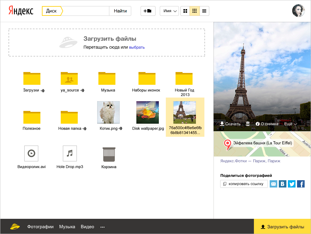
But in the end, a lot can change. We have just begun work on updating Yandex.Disk, but we think that it is better to see the reaction of people earlier in order to make the service the way they need it.
In the first version of Yandex.Disk, the logic of its web interface was not much different from the one used by other cloud storages: these were the same folders and files, but inside our Mail. Now the content and its presentation is important.

')
My name is Sergey Tomilov, I was one of those who worked on a new design. Today I want to tell you about how the work went, what difficulties we had, what the concept behind all this was and how it influenced the design.
Concept
Today, many people, not even the most advanced, often have several devices on which they open the same services. Their technical implementation for laptops, tablets or smartphones may be different, but the meaning remains common. And what people are dealing with is less and less files and formats, and more and more content. You store not just files in .jpg, .epub and .mp3, but photos, books and music. And on each device they will be photos, books, and music.
Therefore, it is already clear that ordinary people in cloud storages also want to work not with the file structure, but with the content. They need help building a structure for their content. Of course, we are not the first and not the only ones who came up with it. For example, in iOS, everything captured on camera is itself decomposed into albums with videos and photos, by years and places. Although simultaneously stored in the general stream.
So we approached the formulation of our idea. We do not want the disc to be a combine that blends everything into one entity. He should help the person to structure the content and be able to work with any of its types, as an application. But to formulate a concept is one thing, but to realize everything in a beautiful and convenient interface is another.
Process
Now I want to talk about what path we have gone. Redesign is the first step to a new drive. Work on it has been going on for almost a year. We tried different options, conducted experiments, rolling out the beta on Yandex employees. We have tried to facilitate the interface, focusing on the most important.
First of all, the Disk has already grown from the subsection of Yandex.Mail. It was time to make him a full service.

The idea of content division appeared already then, but, frankly, vaguely. And it is noticeable that in such a design it will be crowded, and we plan to develop it for a long time. It is necessary to create an interface in which growth points will be laid right away. By the way, the concept of the right panel with the properties of the selected object appeared immediately and reached the final.

The importance of full-text search on a disk containing several hundred files is difficult to overestimate, so we assigned a noticeable place to it. He moved to his usual place - in the header of the service.

Crashing the interface into parts turned out to be too strong, and the search line attracted too much attention. But the Disc has already begun to look like an application (especially on tablets), and below it appeared a panel of content slices, which we have in the plans and which I will discuss below.
The panel on the right began to contain all the main possibilities of actions with files and got a place for large previews. The duplication of the buttons above and below has disappeared - they all fit on it. As a result, I also simplified the creation of public links - now you can share the file immediately after downloading it. To send a link to a social network, you do not need to make two clicks - immediately click on the icon of the desired social network.

In the first versions of the previews of the pictures in the folders themselves, I wanted to make them proportional, but then I decided to make life easier for everyone, and they became square.

While working on how different types of content would be presented on the web, it was necessary to keep in mind various important points. For example, the list of pictures should switch between them by clicking on the image itself - just as users are used to it on sites. And the disappearance of the viewing window should not be a surprise for a person - it should close easily and clearly.
Along with the design change, we tried to integrate into the Disk interfaces all those actions that are familiar to the user in the OS. You can upload and move files by dragging and dropping into the desired folder. To make it easier to drag, we added a folder tree to the right.

Also, group operations appeared in the Disk web interface. To select multiple objects, you can use the standard keyboard shortcuts: shift +, ctrl (cmd) +.
Rolling out a beta on Yandex employees, we almost did not receive any negative feedback. But unexpectedly, parts of our colleagues did not like the folder icon very much, the third one in the picture.

There were a lot of comments like this: "THIS FOLDER CUTS TO MY EYES", "This is Windows 3.1", "Oh, what a misery." The folder and the truth in the living product has been overly detailed and has undergone further modifications. The most noticeable you see.
But besides this, we received from our colleagues a large number of reviews, which allowed us to finish a lot to the public launch. For example, I believed that people interact with the site of the Disk, as with any usual site - that is, a set of web pages with links. But we looked at the numbers and were surprised that people actually use the disc according to OS rules. With internal dough, we found a serious omission in design. In his old version there was a tree of folders and people moved them. So there was a tree to move files and the ability to delete files and folders by dragging them to the word "Trash" in the navigation bar.
Further steps
In fact, the story that, in order to solve people's problems, it is necessary to structure information and content, is not new for Yandex. For almost 17 years, our search has found, ranked, and showed people what they were looking for. And makes it so that they were comfortable to navigate in the found. Yandex is one of those companies in the world that can find answers to its questions for a person. And these are not html pages or even sites, but addresses, news, images, objects on maps, recipes, etc. All this knowledge and understanding of people will find application in the new Disk.
Firstly, it concerns the structuring of objects. To do this, we came up with content sections in the Disk, which will determine their type, depending on it, structure and “run” for each of its web applications. That is, photos get great previews, music - player, archives - a structure in which you can work with familiar folders, video files - a player that allows you to view the object directly on the web. The first content sections will appear in the future for the most popular type of objects - photos.
Also in Disk, the filtering of folders and files for some common features has changed. For example, you can go to public folders, public links, attachments from Mail. We have just begun work in this direction and will move on.
This logic of work already applies to the Yandex.Disk client. For example, you take screenshots, and they add up to the Screenshots folder; Connect a camera or phone, and the photos are sent to the Camera folder.
Secondly, the global discs with Yandex will be developed. Already, objects from it can be attached to letters in Ya.Pochte, listened to added songs in the Ya.Muzyka application, save albums from Ya.Fotok into it. In addition, Disk technologies provide synchronization in our Browser, whose users can immediately save from it directly to their “cloud”. And there will be even more such connections.
Not everything is implemented now. The experiments are not over yet. For example, even now we are rolling out a new interface in two different ways: in one of them the navigation through the types of objects will be at the top, in the other - at the bottom. Inside the team, not everyone believes in the viability of the lower black panel, so we decided to conduct an experiment. Within a couple of weeks after the first results, we will transform the Disk. And, it seems I can show how it will be in the near future (everyone likes pictures from the future).

But in the end, a lot can change. We have just begun work on updating Yandex.Disk, but we think that it is better to see the reaction of people earlier in order to make the service the way they need it.
Source: https://habr.com/ru/post/214679/
All Articles