Apple CarPlay Application Design

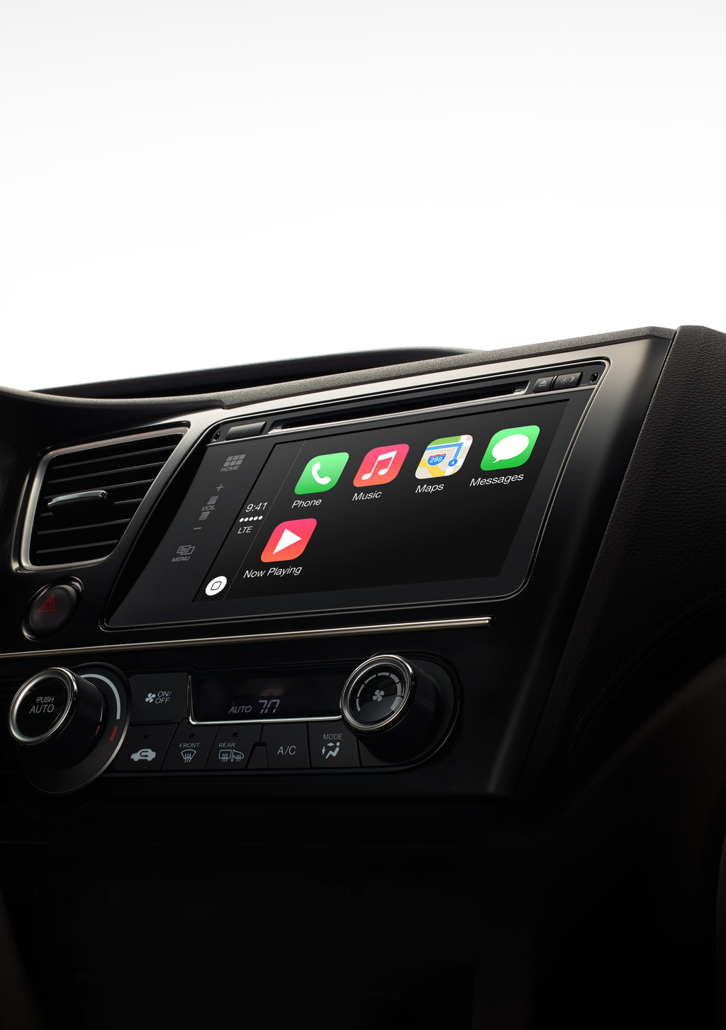
On the eve of Apple, in an unusual manner for itself, it pleased everyone with the teaser CarPlay aka 'iOS in the car'. If you missed everything, then according to official statements, this is “a smarter and safer way to use your iPhone in a car. CarPlay takes everything you would want from an iPhone while driving, and puts it directly into the car's built-in display. You can create routes, make calls, send and receive messages, and listen to music so as not to be distracted from the road. Just stick your iPhone in the car and go. ” (Important: stick the iPhone only in special connectors and only in the supported car brands - redmadrobot )
While the novelty is in the status of Coming Soon, let's do some kind of reverse engineering and assume that it is waiting for developers of mobile applications who are planning to adapt them to CarPlay. Today about the interface.
Physical size
')
Diagonal 1.7-2 times more than the iPhone. The exact resolution is unknown - apparently, it can vary in different car models.
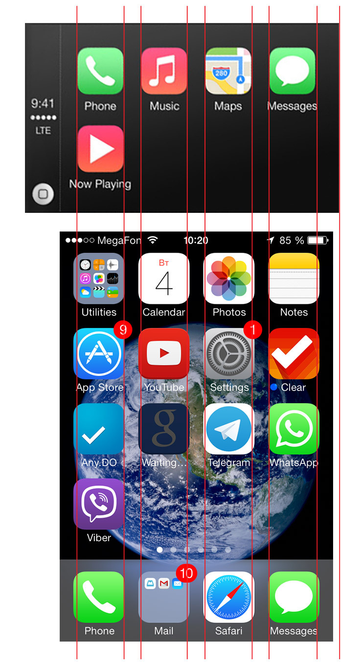
By relative size, it looks like retina-icons on a non-retina-screen, i.e. 2 times larger than on the iPhone. This is due to the context of safe use on the go - hitting the buttons should be easy, as they say, without aiming.
Control methods
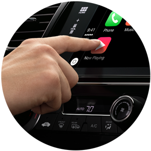
Touch screen. Only relevant for vehicles equipped with such.
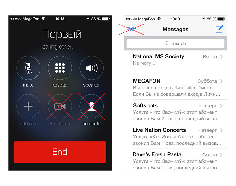
Voice control. Good old Siri, who does not speak Russian yet.
External hardware buttons. Even older and kind buttons, remotes and joysticks. Of course, imposes imprint on the requirements for interfaces.
Screen proportions

If you imagine that this is a smartphone screen in landscape orientation, it will be between the iPhone 4 and 5 in size. The aspect ratio is approximately 5: 3.

The distance between the controls is greater than that of the iPhone. Fitts law in action.
In general, it resembles the half of the iPhone screen in the portrait, only on the left is the Status bar.
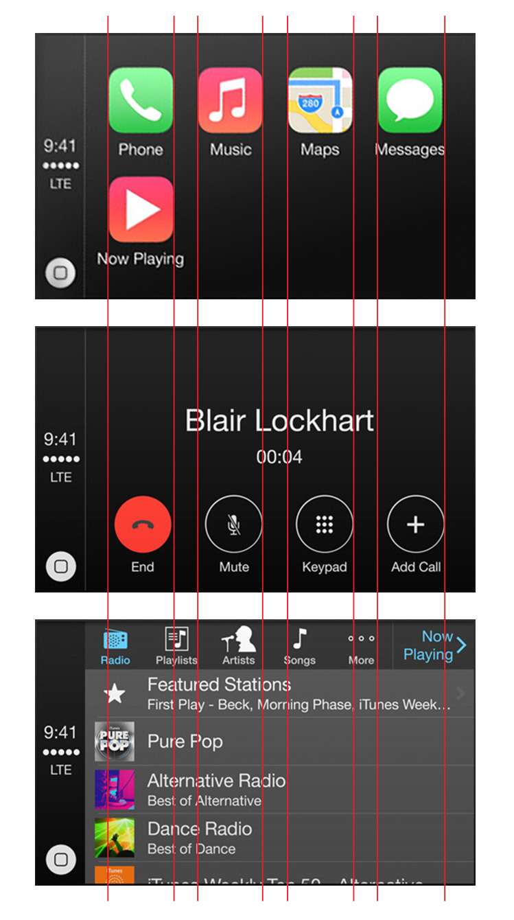
Controls
Most likely, the minimum size of a taped ('touched' - approx. Shazam) element is the 'home' button on the status bar. Recommended - application icon.

The size of the elements is obviously due to the importance of the action. Important ones are larger: take a call, launch cards, etc.
Navigation


Navigation bar and Tab bar are combined. In this orientation there is no room for an additional horizontal panel.
Minimum "design"
Everything is built on lists, because cars without touch screens must be taken into account - the case when the control will be carried out with hardware buttons.
No scroll with a few “leaflets”, no blurring, everything should be contrast and not eat away the eyes at night.
Minimum of functions
If some functions are not needed, they can be removed without puzzling over adaptation. Less is more.
Summary
If you liked to make apps for iOS, because there are only 2 devices with which everything is clear, then we perfectly understand your feelings now - yes, now there will be not 7, but many. If it is a little calming, then CarPlay will not be available soon in Russia.
In the meantime, watch a special soothing video from Volvo and plan on buying “test devices”:
Source: https://habr.com/ru/post/214631/
All Articles