Font boosting in mobile browsers
I want to talk about what font boosting in mobile browsers is, what an unexpected problem it can lead to in web development and how to deal with this problem.
Consider a real-life example:
Why does the change in the color of the element leads to an increase in its size ? The reason for this strange behavior is the font boosting.
Font boosting is a special technique by which mobile browsers adjust the font size to the resolution of the mobile device. This technique is needed because many web pages, designed for desktop browsers, contain text elements that are wider than the width of the mobile screen. To view these elements, the visitor is forced to either use horizontal scrolling, or to fit the element in the screen size, reducing the scale of the page. However, when zooming out, the font size also decreases, making the text sometimes completely unreadable. So, font boosting specifically increases the font size, so that after fitting the block to the width of the screen, this font size will correspond to the originally intended one.
The degree of font size increase with font booting depends on the width of the element - the wider the element, the more it should be reduced to fit into the screen size, and, accordingly, the more the font size should be increased to compensate for this decrease.
The implementation of font boosting in Google Chrome for Mobile has two features that can lead to hard-to-find errors in web development:
We illustrate this feature with an example:
Knowing these features, you can understand the reason for the strange behavior of Google Chrome for Mobile in Example 1:
There are two ways to prevent such font size jumps:
As a result, further zooming out of the page will become impossible, and font boosting, designed to compensate for this reduction, will not naturally start.
However, this method is not always applicable, especially if we are developing a javascript library and do not have full control over the final page.
As a result, by the time we begin to carry out any meaningful actions with the element, the font size jump in it will already take place and will not disturb us.
I hope that if someone from the habraude suddenly encounters unpredictable jumps in font sizes in mobile browsers, this note will save a certain amount of time and nerves. Make code, not war.
Consider a real-life example:
Example 1:
- There is a newly created element with
display: inline-block.- We measure its width using the
offsetWidthproperty.- Change its color.
- And, suddenly, in Google Chrome for Mobile, after a color change, the width of the element increases dramatically, ceasing to correspond to that measured by only two lines above!
Show code<!DOCTYPE html> <html> <head> <meta http-equiv = "content-type" content = "text/html; charset=utf-8" /> <title> Font boosting Google Chrome for Mobile</title> <script type = "text/javascript"> window.onload = function () { var spnSpan1 = document.getElementById ("span-1"); alert (" : "+ spnSpan1.offsetWidth +"px"); //59px spnSpan1.style.color = "red"; alert (" : "+ spnSpan1.offsetWidth +"px"); //186px (WTF?!) } </script> </head> <body> <p> <span id = "span-1" style = "display: inline-block;"></span> </p> <!-- . , . --> <p> abc abc abc abc abc abc abc abc abc abc abc abc abc abc abc abc abc abc abc abc abc abc abc abc abc abc abc abc abc abc abc abc abc abc abc abc abc abc abc abc abc abc abc abc abc abc abc abc abc abc abc abc abc abc abc abc abc abc abc abc abc abc </p> </body> </html>
See an example on-line .
')
(To view examples from this article, use Google Chrome for Mobile or regular Google Chrome in smartphone emulation mode , for example, Apple iPhone 5 or Samsung Galaxy Note II).
Why does the change in the color of the element leads to an increase in its size ? The reason for this strange behavior is the font boosting.
What is font boosting
Font boosting is a special technique by which mobile browsers adjust the font size to the resolution of the mobile device. This technique is needed because many web pages, designed for desktop browsers, contain text elements that are wider than the width of the mobile screen. To view these elements, the visitor is forced to either use horizontal scrolling, or to fit the element in the screen size, reducing the scale of the page. However, when zooming out, the font size also decreases, making the text sometimes completely unreadable. So, font boosting specifically increases the font size, so that after fitting the block to the width of the screen, this font size will correspond to the originally intended one.
The degree of font size increase with font booting depends on the width of the element - the wider the element, the more it should be reduced to fit into the screen size, and, accordingly, the more the font size should be increased to compensate for this decrease.
Font boosting problems
The implementation of font boosting in Google Chrome for Mobile has two features that can lead to hard-to-find errors in web development:
- Font boosting of an element does not occur immediately after its creation, but after the next “redrawing” ( reflow ) of the page. In turn, reflow, as is known, occurs after the page loads, after the completion of the page modifying script, and also when accessing properties tied to the page geometry, for example,
offsetWidth. - Font boosting an element with a
display: inline-blockhappens not just after reflow of the page, but after reflow and changing some property of the element itself (for example, color).
We illustrate this feature with an example:
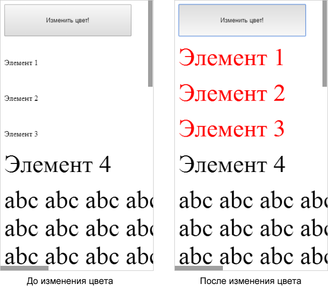
Example 2:
There are 4 elements, the first three of which are givendisplay: inline-block, and the 4th is not. As a result, for the 4th element, the size increases immediately after the page loads, and for the 1-3 elements - only after changing their color.Show code<!DOCTYPE html> <html> <head> <meta http-equiv = "content-type" content = "text/html; charset=utf-8" /> <title> Font boosting Google Chrome for Mobile</title> <script type = "text/javascript"> window.onload = function () { /* */ var spnSpan1 = document.getElementById ("span-1"); var spnSpan2 = document.getElementById ("span-2"); var spnSpan3 = document.getElementById ("span-3"); var btnGo = document.getElementById ("btnGo"); /* , */ btnGo.onclick = function () { spnSpan1.style.color = "red"; spnSpan2.style.color = "red"; spnSpan3.style.color = "red"; } } </script> </head> <body> <div> <input type = "button" id = "btnGo" value = " !" /> <!-- "display: inline-block", , ! --> <p> <span id = "span-1" style = "display: inline-block;"> 1</span> </p> <p > <span id = "span-2" style = "display: inline-block;"> 2</span> </p> <p> <span id = "span-3" style = "display: inline-block;"> 3</span> </p> <!-- "display: inline-block", --> <p> <span id = "span-4"> 4</span> </p> <!-- . , . --> <p> abc abc abc abc abc abc abc abc abc abc abc abc abc abc abc abc abc abc abc abc abc abc abc abc abc abc abc abc abc abc abc abc abc abc abc abc abc abc abc abc abc abc abc abc abc abc abc abc abc abc abc abc abc abc abc abc abc abc abc abc </p> </div> </body> </html>
See an example on-line .
Knowing these features, you can understand the reason for the strange behavior of Google Chrome for Mobile in Example 1:
- When we measure the
offsetWidthnewly created element, we get the value before font boosting. - At the same time, this measurement activates the reflow of the page.
- Finally, changing the color of the element triggers font boosting, and the font size increases. And along with the increase in the font size, the
offsetWidthincreases, becoming noticeably larger than that measured by two lines above.
What to do?
There are two ways to prevent such font size jumps:
Method 1 -
cancel font boosting. To do this, set the width of the web page (and, more precisely, the width of its viewport ) equal to the width of the screen, adding the tag: <meta name = "viewport" content = "width=device-width, initial-scale=1"> As a result, further zooming out of the page will become impossible, and font boosting, designed to compensate for this reduction, will not naturally start.
Example 3Show code<!DOCTYPE html> <html> <head> <meta http-equiv = "content-type" content = "text/html; charset=utf-8" /> <!-- --> <meta name = "viewport" content = "width=device-width, initial-scale=1"> <title>№1 Font boosting Google Chrome for Mobile</title> <script type = "text/javascript"> window.onload = function () { var spnSpan1 = document.getElementById ("span-1"); /* , font boosting , . */ alert (" : "+ spnSpan1.offsetWidth +"px"); //186px spnSpan1.style.color = "red"; alert (" : "+ spnSpan1.offsetWidth +"px"); //186px } </script> </head> <body> <p> <span id = "span-1" style = "display: inline-block;"></span> </p> <p> abc abc abc abc abc abc abc abc abc abc abc abc abc abc abc abc abc abc abc abc abc abc abc abc abc abc abc abc abc abc abc abc abc abc abc abc abc abc abc abc abc abc abc abc abc abc abc abc abc abc abc abc abc abc abc abc abc abc abc abc abc abc </p> </body> </html>
See an example on-line .
However, this method is not always applicable, especially if we are developing a javascript library and do not have full control over the final page.
Method 2 -
force font boosting immediately after creating an element. For this you need:- Call the reflow page. To call reflow you can, for example, measure
document.body.offsetWidth. - If an element has a
display: inline-block, then also change its color and then return it.
As a result, by the time we begin to carry out any meaningful actions with the element, the font size jump in it will already take place and will not disturb us.
Example 4Show code<!DOCTYPE html> <html> <head> <meta http-equiv = "content-type" content = "text/html; charset=utf-8" /> <title>№2 Font boosting Google Chrome for Mobile</title> <script type = "text/javascript"> window.onload = function () { var spnSpan1 = document.getElementById ("span-1"); /* font boosting . */ doReflow (); doFontBoosting (spnSpan1); /* , . */ alert (" : "+ spnSpan1.offsetWidth +"px"); //186px spnSpan1.style.color = "red"; alert (" : "+ spnSpan1.offsetWidth +"px"); //186px } function doReflow () { document.body.offsetWidth; } function doFontBoosting (elElement) { var strColor = elElement.style.color; elElement.style.color = (strColor == "red" ? "blue" : "red"); elElement.style.color = strColor; } </script> </head> <body> <p> <span id = "span-1" style = "display: inline-block;"></span> </p> <p> abc abc abc abc abc abc abc abc abc abc abc abc abc abc abc abc abc abc abc abc abc abc abc abc abc abc abc abc abc abc abc abc abc abc abc abc abc abc abc abc abc abc abc abc abc abc abc abc abc abc abc abc abc abc abc abc abc abc abc abc abc abc </p> </body> </html>
See an example on-line .
Conclusion
I hope that if someone from the habraude suddenly encounters unpredictable jumps in font sizes in mobile browsers, this note will save a certain amount of time and nerves. Make code, not war.
Source: https://habr.com/ru/post/214559/
All Articles