Application of the Pareto chart to analyze the reasons for the backlog
How can the project be behind year?
... one day at a time
... Fred Brooks
The idea to write a post appeared due to the fact that lately one has to deal with the following case study: Project managers try to maintain processes, adhere to the requirements of methodologies, collect metrics, maintain high motivation on the project. But the time comes for the next verification of the work results (milestones, deliverables) and it turns out that the degree of completion of the project is lagging behind the planned one, which will inevitably lead to a break in the deadlines. And the project manager, trying to eliminate the threat as early as possible, voices it to the team, and then simply tries to speed up the process with parting words and private monitoring, which rarely works without determining the causes.
As a possible way of identifying the causes of the problem (in the case provided, this is a time overrun), I would like to recall one of the fairly simple project monitoring tools - the Pareto chart. The diagram allows you to determine the priorities that need to be solved to resolve the problem. It is worth noting that with all the quality control tools we have got accustomed to the Pareto diagram for several reasons:
')
1. Ease of use;
2. The speed of calculation and the absence of the need to use any additional software. Enough bug tracking system and Excel;
3. The ability to process data in hindsight. It means that if it was not known about any factor, then it can always be entered at the time of the analysis;
4. Visibility of the data.
Below is a detailed description of the construction of the Pareto graph to determine the reasons for the backlog of the development plan.
So, at the first stage, you need to decide on the data and their classification. Suppose that the project wasted time was spent on how to perform tasks, and fix bugs. Then, for analysis, it is enough to unload the following information from the bugtracking system: a list of the features made and closed bugs. Separately, highlight the tasks for which time was wasted and determine its causes. As an example, suppose that the following factors were identified with the team:
- Incorrect assessment of the task;
- Time overrun due to the appearance of bugs when closing a task.
Next, you need to separately identify the factors of occurrence of bugs. As an example, we also give the following possible reasons:
- The appearance of a bug due to lack of time to test the task;
- The appearance of a bug due to the impossibility of testing features (it was not possible to simulate the situation);
- The bug appeared due to an error in the implementation of the feature (or an unintended case by the programmer).
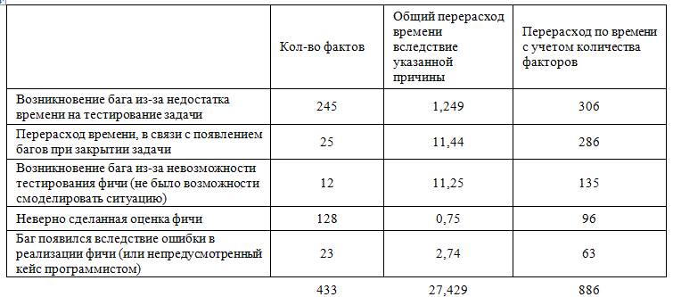
At the second stage it is necessary to count the number of violations. For our example, we reflect the results in Figure 1:
Figure 1. The number of facts

At the third stage, one should calculate the time overrun by each given fact (Figure 2).
Figure 2. Calculate time overruns

For the full picture in our example, we derive these two factors as significant. The number of facts shows the frequency of occurrence, time spent - the degree of influence. Therefore, we combine both values and determine the time overrun, taking into account the number of factors. For the prostate calculation in our example, simply multiply the indicators (Figure 3).
Figure 3. Time overruns based on a number of factors.
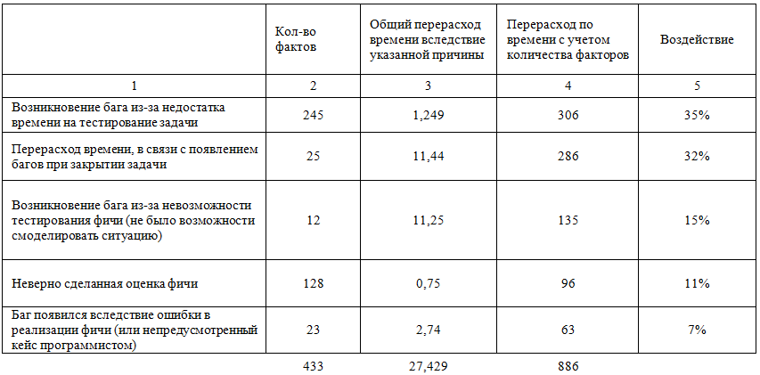
Next, determine the impact factors. To do this, we assume the percentage ratio of time overruns, taking into account the number of factors (4) in relation to the total number of these factors (total for column 4). Sort the column in descending order (Figure 4).
Figure 4. Impact factors.
The next step is to determine the total impact of the factors. For the first factor with the maximum value will be its value, for each subsequent - the previous one, plus itself (Figure 5).
Figure 5. The cumulative impact of factors.

At the last stage - plotting. The coordinate axis is under construction. The vertical axis is interest, the horizontal axis is the interval corresponding to the number of causes of the problem. In the example above, the result is built in excel (Figure 6).
Figure 6. Pareto chart

The graph clearly shows the degree of impact of each cause and according to the 80/20 law (total impact), we can identify the main factors that influenced the result. In the example above, it is caused by 3 reasons:
1. The emergence of a bug due to lack of time to test the task;
2. Time overrun due to the appearance of bugs when closing a task;
3. The emergence of a bug due to the impossibility of testing features (it was not possible to simulate the situation).
The result: as practice has shown, the usual verbal questioning of the team’s assumptions about the reasons for lagging does not always coincide with the results obtained on the result of the Pareto plot, since the significance of the factors is difficult to determine “by eye”. In addition, the 80/20 rule allows the manager to focus on eliminating the resultant factors.
Ps. I hope that the post was useful, and the description is not unnecessarily detailed.
Source: https://habr.com/ru/post/213183/
All Articles