10 anti-navigation patterns in Android

In this article, we will look at 10 anti-navigation patterns in Android, which many newbies (and not only) in creating interfaces for Android applications allow.
')

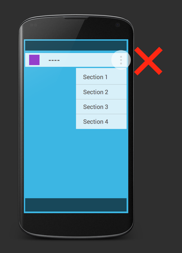
We encountered several applications in which the main navigation (for example: the main screen, the store, my orders, etc.) was placed in the action bar overflow. This is not the best place for this type of navigation. The main reason for not using overflow for basic navigation is that now many applications that listen to the recommendations for creating a user interface do not. For this purpose, it is recommended to use navigation drawer or tabs. Another reason is that old devices do not have an action bar overflow and in order to open the menu, you need to click on the hardware menu button.

There are many UI navigation templates in Android. For example, navigation drawer, action bar spinner and tabs. There is a strict order in which these templates should be used. Looking at the application, you can immediately determine some kind of information hierarchy, something like a tree. At the root - the main screen, the second level - categories, and in each category there may be subcategories, etc. And to organize this information using these templates. Using them incorrectly (for example, tabs for top-level navigation, action bar spinner for the next level, and navigation drawer for the deepest level) can confuse the user. This is the wrong way to organize navigation:
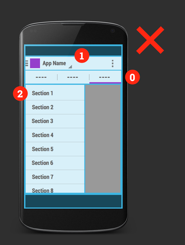
The correct option is:
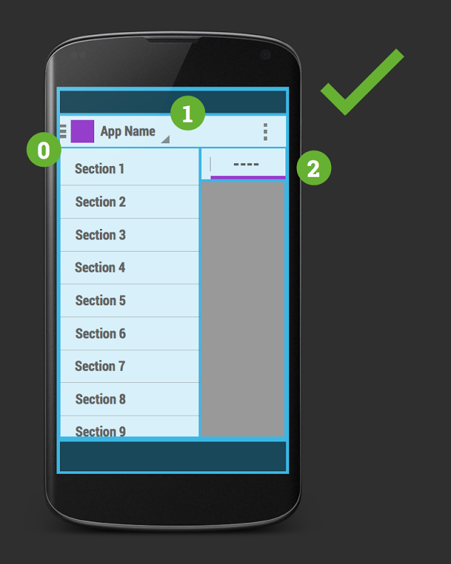
The navigation drawer should always represent the topmost level, the action bar spinner is the second level, and finally the tabs should be on the third level of navigation. And if you do not use action bar spinner and you only have a drawer and tabs (like Google Play Music), then the main navigation should be done in the navigation drawer and only then in the tabs.
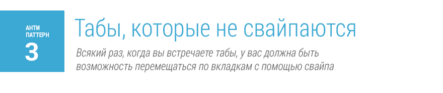
Tabs in Android have their own specific gesture - swipe left or right. When you see tabs, you need to be sure that using horizontal scrolling gestures, you can move between tabs. In this case, if we have page content that is scrolled with horizontal swipes, this creates a conflict of gestures.

To fix this, you can divide the content into several screens or change the horizontal navigation to vertical:

However, when the content is part of a tab - for example, when using a gallery of pictures or a map that can be dragged in different directions, this is generally perceived as normal. But it’s better to avoid it, and you may need to think about a better navigation architecture.

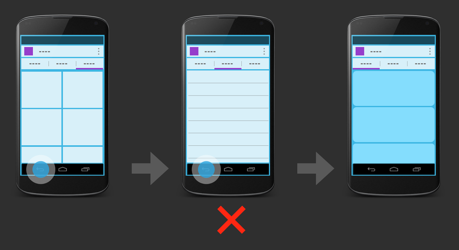
Tabs should not have too much navigation. You can use such things as changing the sort order of items or scrolling content. But it is strongly not recommended to use any hierarchical navigation. For example, in this example, when you select one of the GridView elements, the content appears directly in the current tab and when you click the back button, the GridView reappears.
This is an example of navigation in the tabs. The first reason is that for the platform this is an abnormal behavior of the application. The second reason - it is not known what will happen if you switch to another tab. The previous tab will be in an unclear state for the user. Also, the action that should occur by clicking on the back button is not defined.
Another anti-pattern example is permanent tabs. These are such tabs that provide global navigation throughout the application. There is also an unspecified issue for the back button. And so a navigation drawer was created that allows you to change the context.
The correct version of the example:

Navigating tabs should not be saved in the action history. In our example, when you click on the "back" button, a transition to the previous tab occurs. Instead, move to the previous screen.
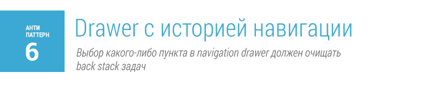
Similar anti-pattern and navigation drawer. A good example of proper design is the Google+ app. When you navigate through the item in the navigation drawer, you open a separate application. Therefore, when you open the next item in the navigation drawer, the back stack of tasks should be cleared and when you click the back button, the application should close. Or, if it is not obvious to the user, you can show the main screen of the application.
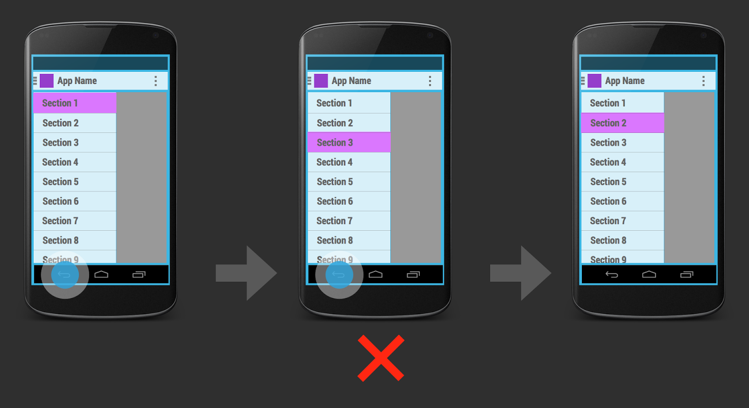
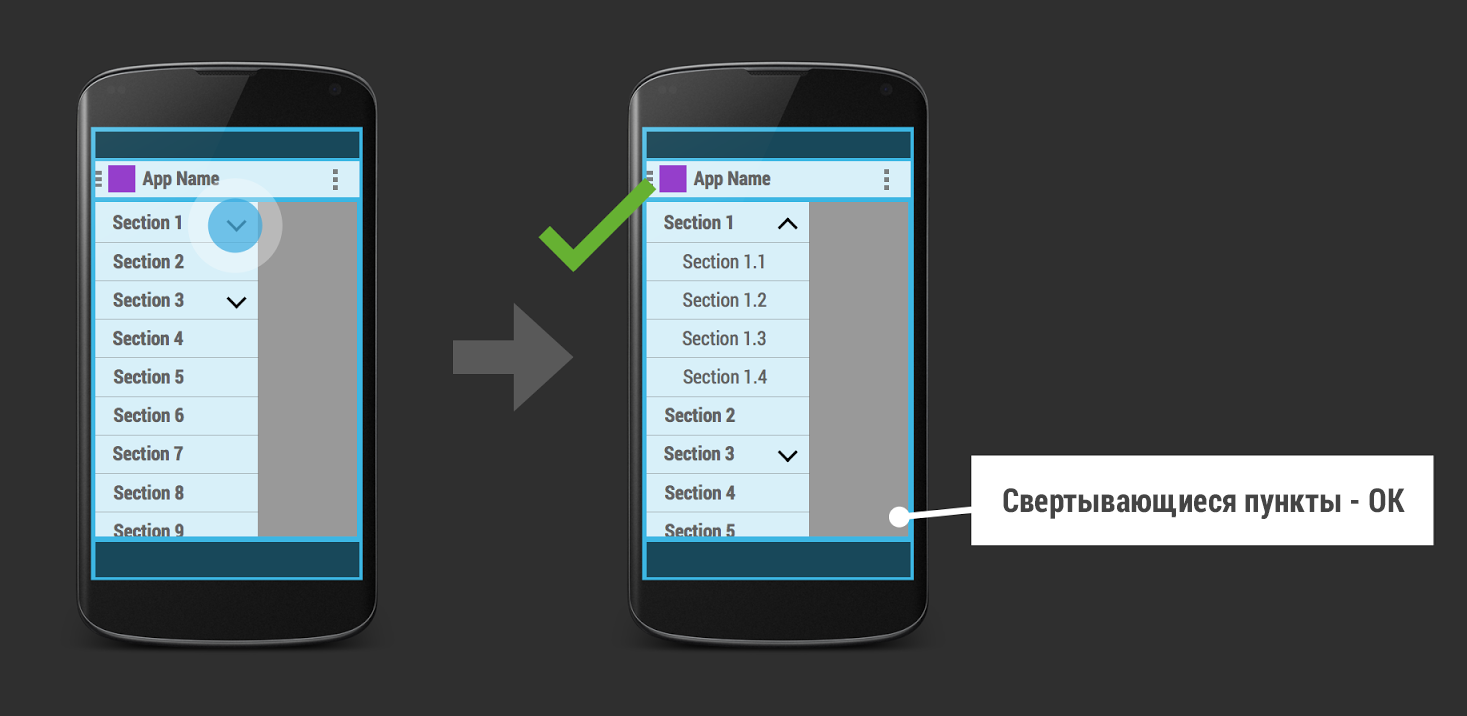
Navigation drawer was created for clear and stable navigation between individual parts of the application. You should avoid multi-level navigation drawer.
But coagulable subparagraphs are quite acceptable:
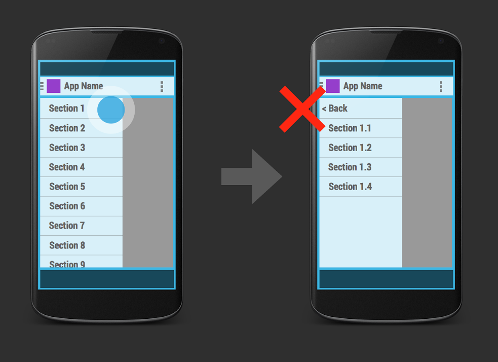
Another solution to this problem is when you select an item in the navigation drawer, a sub-navigation screen opens:
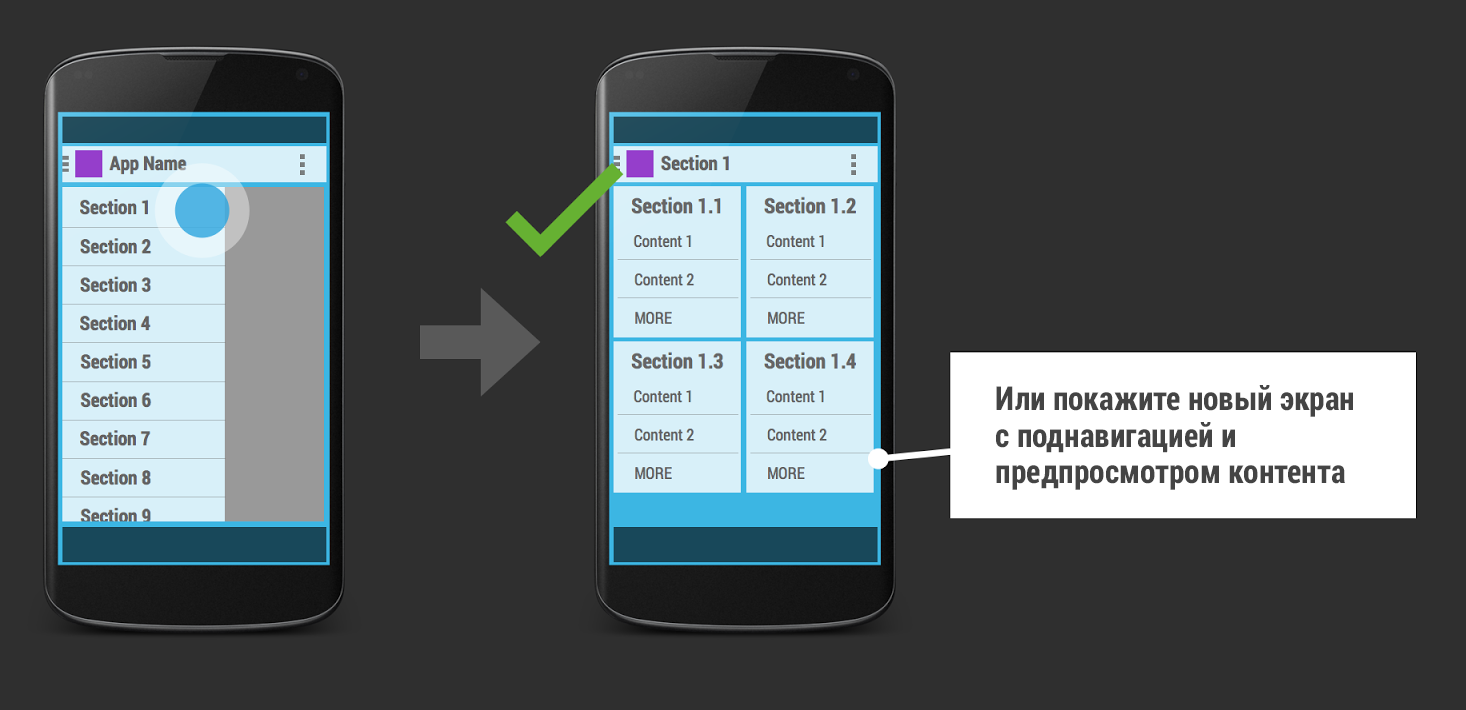

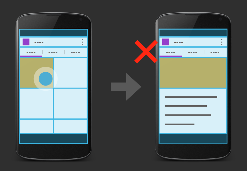
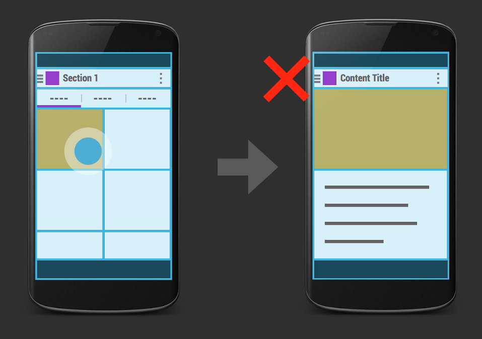
Here the word "transitions" means both the animation and the transition between the screens. For example, if you open a navigation drawer and click on the item “Section 1”, a new screen should not open with the “back” button in the action bar:
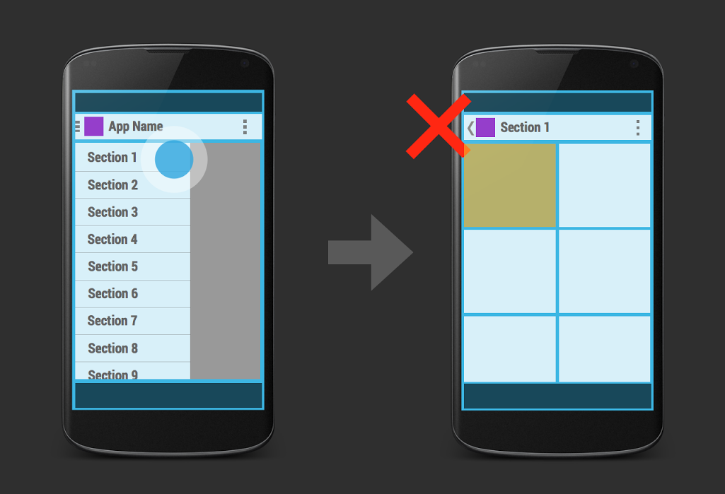
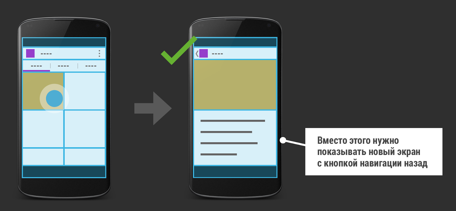
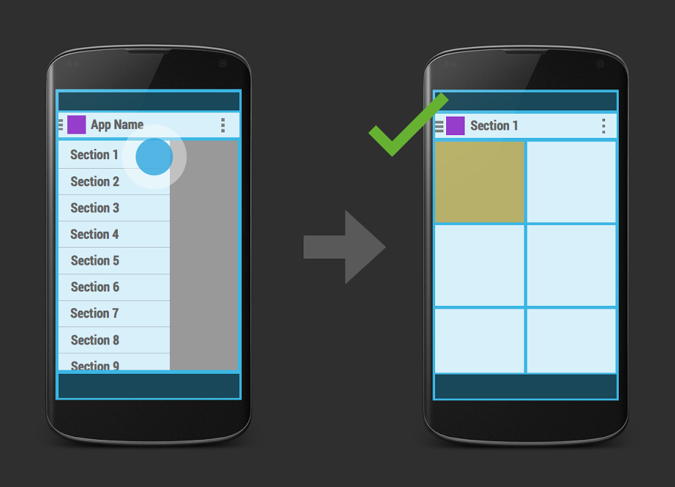
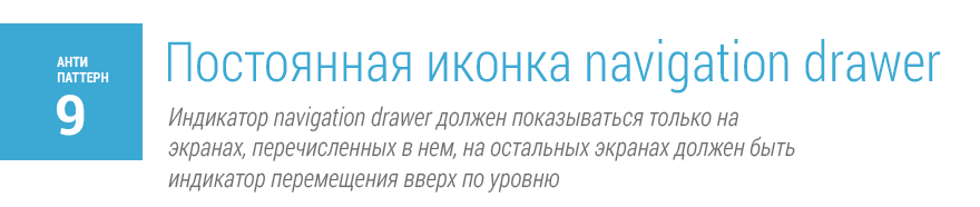
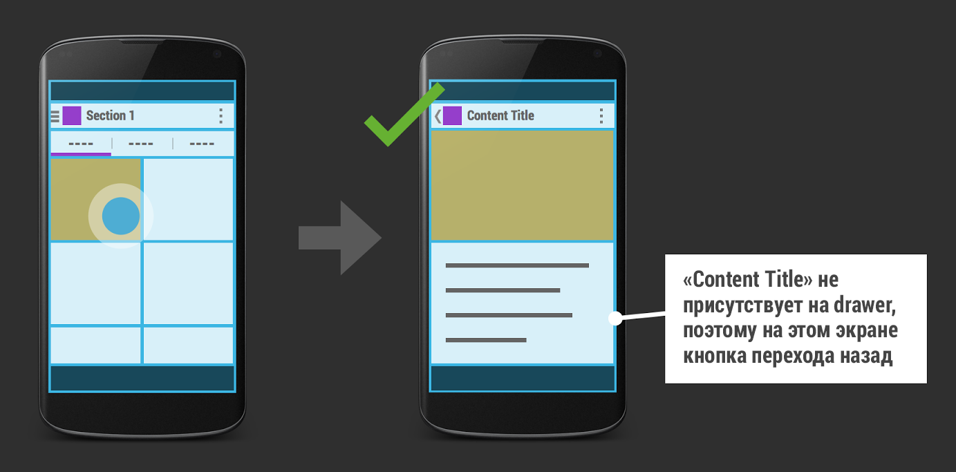
According to the rules, each screen present in the navigation drawer should contain a drawer indicator. The example uses the back button instead of the navigation drawer icon. The correct option is:
Also important is the animation of the appearance of the screen. When you select an item in the navigation drawer, there should be no animation of the appearance of a new screen. The normal behavior in this case is the “leaving” of the navigation drawer and a simple smooth increase in the transparency of the screen.
Even developers may have a question - what is better to use: different activations or fragments for sections in a navigation drawer. There is no absolutely correct answer to this question. It depends a lot on the situation. But basically, the solution comes from how complex the various parts of the application are.
According to the rules, as mentioned above, each screen present in the navigation drawer must contain a drawer indicator. In our example, on a certain open screen with a detailed content (in the illustration) there should not be an navigation drawer icon.
Instead, you need to use the jump to button on the previous level of the application in the action bar. The correct option is:

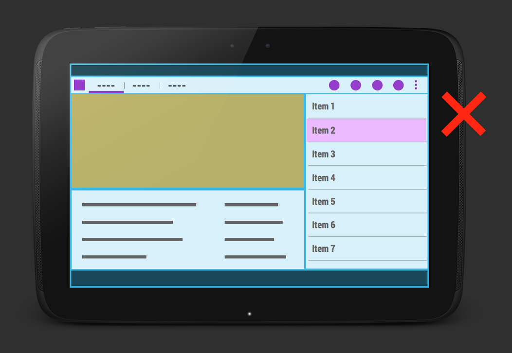
The last anti-pattern is the use of right-hand navigation. It is strictly not recommended to use right-hand navigation in your applications. When using the “headers-details” model, the headers should always be on the right, and detailed information on the item should be on the left, since almost all of us read from left to right and only for languages where right-to-left writing is possible to make right-hand navigation.
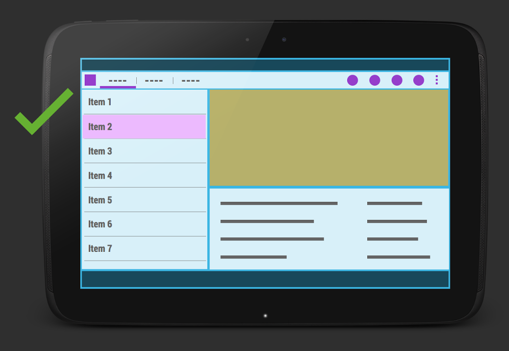
The correct option is:
I hope these anti-patterns will help you to better think about the navigation and the structure of the application. Some of them do not always have to be done strictly, so first you can look at existing applications to implement user-friendly user interface templates.
Source: https://habr.com/ru/post/213097/
All Articles