Report on the course "Data Visualization"
On January 25 and 26, the Data Laboratory conducted the first training course “Data Visualization”. We felt like pioneers, there are no analogues of our program in Russia yet. I will tell you how we built the curriculum, how we organized the process and what results we achieved.
We had enough, perhaps even too much material for a two-day course. My work and laboratory projects, cool visualizations from the Internet and Taffee books, many examples of the D3 gallery . It was necessary not only to “throw out” all the information on the audience, but to help them extract important and useful knowledge from each example.
I am well acquainted with thematic educational programs: I took a course “Data Science” on a course, listened to lectures and taught at the infographic intensive course in the British, even attended a one-day course with Edward Taft, but nowhere did the presentation of information satisfy me 100%. In a previous post, I parse a lecture from Data Science and comment on the example given there.
')
First of all, I formulated a few simple ideas that I was going to convey to the audience. The main task of visualization is to display the structure and features of the data. How to do it? Examine and feel the data. Strive for clarity. Do not be afraid to experiment with formats. To replenish the library of visualization techniques and freely combine them with each other.
To destroy the fear of non-standard formats and inspire experimentation, I carefully selected a few examples, including the ill-fated car schedule from the course curriculum, and sorted them out in detail in the first theoretical block. Here, by the way, the transformed automobile schedule:

Replacing the points with the images of cars, we immediately showed several measurements of the data: model and make, color, comparative size, body type, etc. As a result, each measurement is displayed visually, in order to compare data and draw conclusions, the graph does not need to be deciphered, a legend is not required.
The desire to experiment and listen to the data is not enough. We must learn to look for good examples and extract useful techniques from them in order to use them in our visualizations. The second theoretical block was devoted to this. We reviewed dozens of examples - diagrams and graphs, timelines and maps, and discussed the techniques that are found on them.
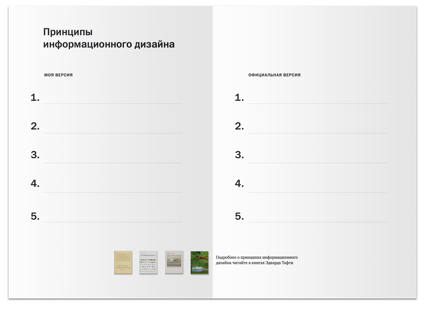
I borrowed a few tricks from Julie Dirksen 's The Art of Teaching . Instead of giving out ready-made instructions, I asked the children to independently draw conclusions based on the examples they saw, after which we collectively discussed and corrected their ideas. In addition, I built a system of "white spots", which the students filled out on the basis of the lecture material. Here is a fragment of the handout on the principles of information design:
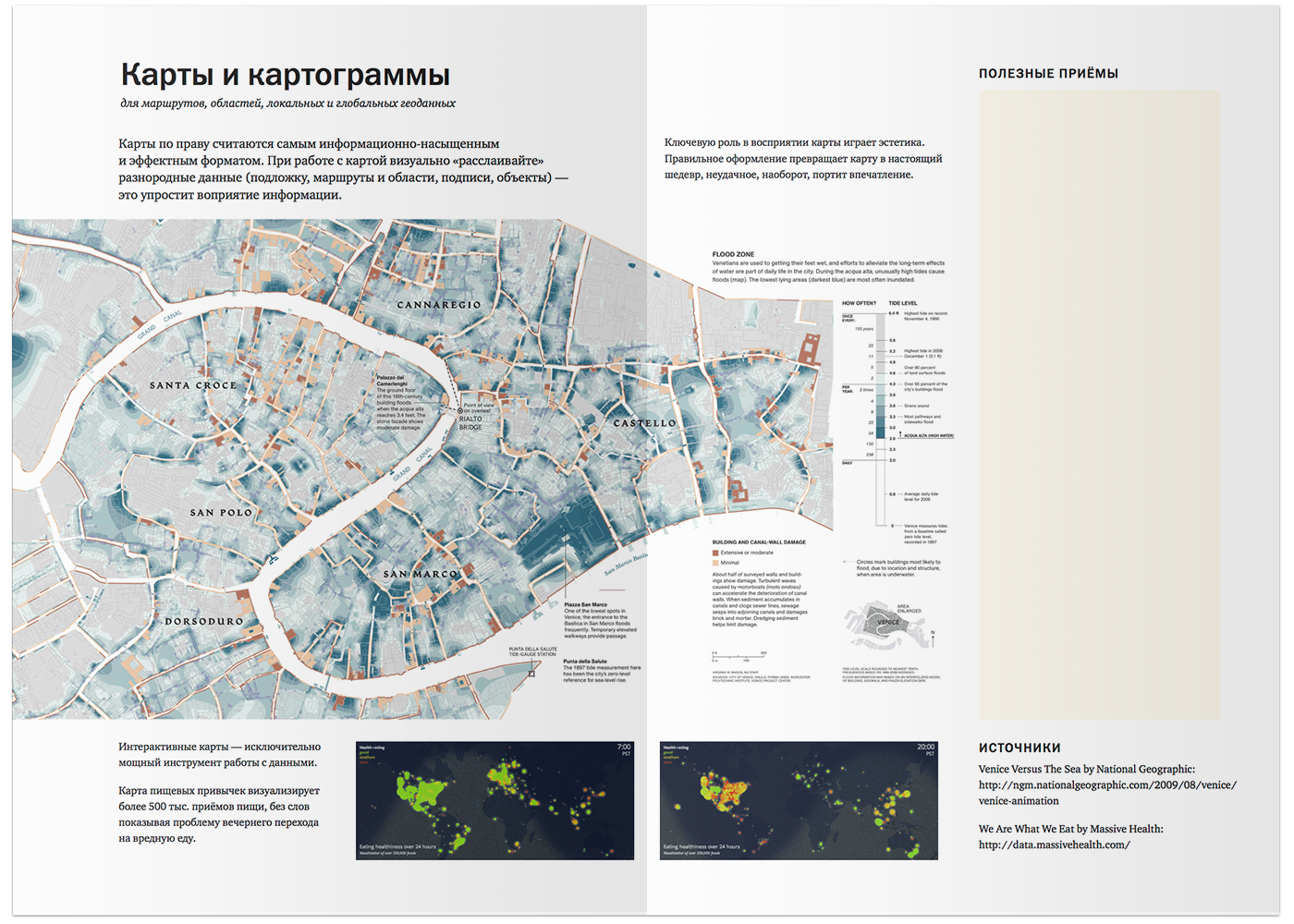
And this is a reversal dedicated to cartograms - in the margins there is a place for listing memorized techniques.
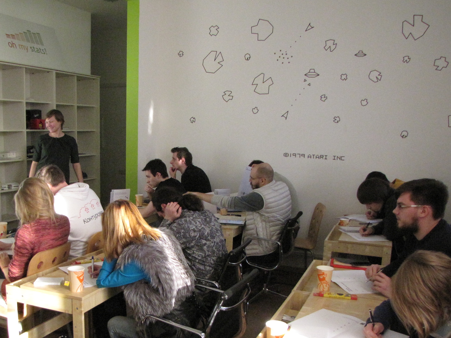
The first day ended with a practical block, the guys received assignments and put knowledge into practice. Joint analysis of the results summed up the first day and drew attention to the errors: their own and others.

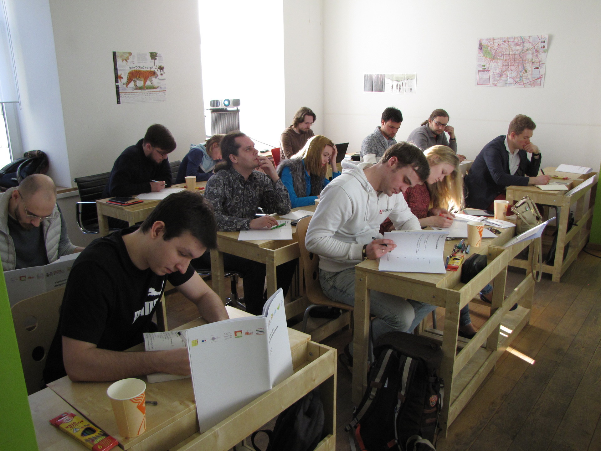
The next day, the guys mastered D3.js under the leadership of Dima Tikhvin devgru . For almost 10 hours, the participants wrote the code in a new language.

With all the tasks handled. In particular, they programmed various boas:

In the practical assignment with the map, we used the wonderful SVG-cartogram of our habr-comrade KoGor .
The results were published in the Mike Bostock Blocks, here are some of them:
bl.ocks.org/glassira/8632425 - Maria Osipova from the Development Bank of the Regions
bl.ocks.org/roveo/8632288 - Mikhail Akimov's Boa from Innova
bl.ocks.org/mokhova/8632539 - Mimidav Katya Mokhovoy from SKB Kontur
bl.ocks.org/anonymous/8635290 - interactive crash map for Denis Petrov from the Ural Mining University
bl.ocks.org/kutovova/8635261 - a similar example of Vladimir Kutovogo from SKB Kontur
bl.ocks.org/kclosu/8634593 - map of accidents and deaths of Ksenia Sukmanova from the Office of the President
The best reward at the end of the course for us were kind words and gratitude of the participants.

All those interested in habrovchan who read the post to the end, we invite you to our April course, which will be held April 12, 13 and 15. We reworked the program and diversified theoretical blocks with practice on d3, starting from the first day. We hope that it will be easier to absorb the material. In addition, we completed two intensive training days with independent work and joint analysis of homework. This is a great opportunity in hot pursuit to apply new knowledge on real work tasks and discuss the results with teachers. So the theoretical value of the course will be complemented by practical benefits.
We had enough, perhaps even too much material for a two-day course. My work and laboratory projects, cool visualizations from the Internet and Taffee books, many examples of the D3 gallery . It was necessary not only to “throw out” all the information on the audience, but to help them extract important and useful knowledge from each example.
I am well acquainted with thematic educational programs: I took a course “Data Science” on a course, listened to lectures and taught at the infographic intensive course in the British, even attended a one-day course with Edward Taft, but nowhere did the presentation of information satisfy me 100%. In a previous post, I parse a lecture from Data Science and comment on the example given there.
')
First of all, I formulated a few simple ideas that I was going to convey to the audience. The main task of visualization is to display the structure and features of the data. How to do it? Examine and feel the data. Strive for clarity. Do not be afraid to experiment with formats. To replenish the library of visualization techniques and freely combine them with each other.
To destroy the fear of non-standard formats and inspire experimentation, I carefully selected a few examples, including the ill-fated car schedule from the course curriculum, and sorted them out in detail in the first theoretical block. Here, by the way, the transformed automobile schedule:
Replacing the points with the images of cars, we immediately showed several measurements of the data: model and make, color, comparative size, body type, etc. As a result, each measurement is displayed visually, in order to compare data and draw conclusions, the graph does not need to be deciphered, a legend is not required.
The desire to experiment and listen to the data is not enough. We must learn to look for good examples and extract useful techniques from them in order to use them in our visualizations. The second theoretical block was devoted to this. We reviewed dozens of examples - diagrams and graphs, timelines and maps, and discussed the techniques that are found on them.
I borrowed a few tricks from Julie Dirksen 's The Art of Teaching . Instead of giving out ready-made instructions, I asked the children to independently draw conclusions based on the examples they saw, after which we collectively discussed and corrected their ideas. In addition, I built a system of "white spots", which the students filled out on the basis of the lecture material. Here is a fragment of the handout on the principles of information design:
And this is a reversal dedicated to cartograms - in the margins there is a place for listing memorized techniques.
The first day ended with a practical block, the guys received assignments and put knowledge into practice. Joint analysis of the results summed up the first day and drew attention to the errors: their own and others.
The next day, the guys mastered D3.js under the leadership of Dima Tikhvin devgru . For almost 10 hours, the participants wrote the code in a new language.
With all the tasks handled. In particular, they programmed various boas:
In the practical assignment with the map, we used the wonderful SVG-cartogram of our habr-comrade KoGor .
The results were published in the Mike Bostock Blocks, here are some of them:
bl.ocks.org/glassira/8632425 - Maria Osipova from the Development Bank of the Regions
bl.ocks.org/roveo/8632288 - Mikhail Akimov's Boa from Innova
bl.ocks.org/mokhova/8632539 - Mimidav Katya Mokhovoy from SKB Kontur
bl.ocks.org/anonymous/8635290 - interactive crash map for Denis Petrov from the Ural Mining University
bl.ocks.org/kutovova/8635261 - a similar example of Vladimir Kutovogo from SKB Kontur
bl.ocks.org/kclosu/8634593 - map of accidents and deaths of Ksenia Sukmanova from the Office of the President
The best reward at the end of the course for us were kind words and gratitude of the participants.
All those interested in habrovchan who read the post to the end, we invite you to our April course, which will be held April 12, 13 and 15. We reworked the program and diversified theoretical blocks with practice on d3, starting from the first day. We hope that it will be easier to absorb the material. In addition, we completed two intensive training days with independent work and joint analysis of homework. This is a great opportunity in hot pursuit to apply new knowledge on real work tasks and discuss the results with teachers. So the theoretical value of the course will be complemented by practical benefits.
Detailed program and feedback from participants of the first course: brainwashing.pro/dataviz
Source: https://habr.com/ru/post/212867/
All Articles