How do we use the data processing infrastructure at Sports.ru and Tribuna.com?
A year ago, we abandoned all public meters in favor of private services and our own data processing infrastructure. Collecting 10 million hits per day at the Olympics, we felt the limit of Google Analytics kindness, for which free service is no longer possible. But now we have our own lunapark with convolution and graphs, so we can easily reduce the intensity of GA use, while retaining only audit functions. How we collect data and how we use it in our work - in a sheet with funny pictures inside.

This is not to say that we knew what we were doing at the beginning. We assumed that the data would add a little more meaning to our intuitive creativity. And we really wanted a lot of beautiful graphs and more understanding than our users live. We didn’t expect that we would build a full data processing system in a year, and the company would start breathing in the rhythm of Data Driven.
And we really had a place to turn: every day, 700 News and 500 texts appear on Sports.ru and Tribuna.com sites (of which 97% are custom), and under them there are 30 thousand comments, 120 thousand ratings and 2 thousand statuses. This whole shaft of content settles not only on sites with their 750 thousand unik and 5 million hits per day, but also scatters through 100 thousand tags on 160 mobile applications (where 200 thousand unik make 8 million hits per day) and on 1200 subject groups in social networks.
')
So, these are our normal numbers. Paranormal numbers become in the tight days of sporting events, as they are now happening in Sochi. Every Olympic day we break the 1 million unik mark. Instant traffic can jump 10 times, and the total volume of hits per day grows 1.5-2 times.
We knew that we would have to process a lot of data: in the first months of operating the data processing infrastructure, we accumulated 500 gigabytes of raw material and aggregates. But to immediately fit into your Hadoop cluster or computing processor would be too risky, and we didn’t have such an opportunity - so we got out.

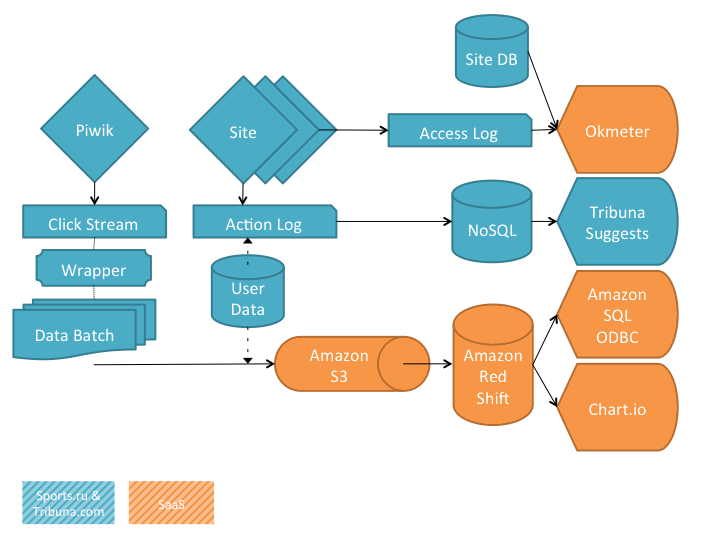
We did everything simply: data about page impressions is collected using the Piwik open-source counter, more precisely using its front-end part — on the backend we have a nginx cluster, whose nodes access access.log from this counter. Raw data from the logs is uploaded via Amazon S3 to Amazon Redshift , where client sessions are calculated from ClickStream hits. Additionally, Redshift unloads data from the site’s SQL storage necessary to enrich the structures being created. A plan of SQL queries has been developed over the created structures, which is used for generating graphs and reports in Chart.io , as well as for Adhoc data analysis.
In addition, we register individual user actions in the NoSQL repository to quickly calculate the matrix of recommendations for our users, process access.log access to the site pages using Okmeter agents, and use them to analyze user content from the SQL repositories. As a result, we did not do the whole complex part of BigData (data storage, complex calculations, plotting graphs and reports) in the form of our own equipment farm and software collection, but completely carried it out to SaaS. We left only the collection of raw data and the final consumption of aggregates.
We hope to tell the details of the technical implementation of the entire analytical infrastructure in a separate post, but now we want to share with you how we managed to improve our product and business by adding only a small portion of data.

We now know very much about our readers and not only what they tell us during registration — which teams and athletes like or dislike - but also what we learn about them from the behavioral profile: from which fan sites or search queries users They come to Sports.ru and Tribuna.com, with what tags they read and comment, which posts and comments are added, and which are negative, which is interesting to friends. Forming the matrix of preferences of each visitor, we impose on it a matrix of recommendations and give each relevant tips.

To make a big PCO with monitors, graphics and nice bearded guys is the most obvious thing that comes to mind after the launch of the data processing infrastructure. We did the charts, but we didn’t involve the monitors and the bearded ones: we definitely do not need emergency response teams.
But we hung up some business metrics alerts using Okmeter. Although this service is designed more to monitor technical metrics (uptime, traffic, system indicators, etc.), its functionality allows you to build metrics from any data from any SQL storage. During the six months of operation, the service twice notified us that comments had ceased to appear on the site: on New Year's Eve, and when the curve banner appeared on the site, blocking Javascript on pages.
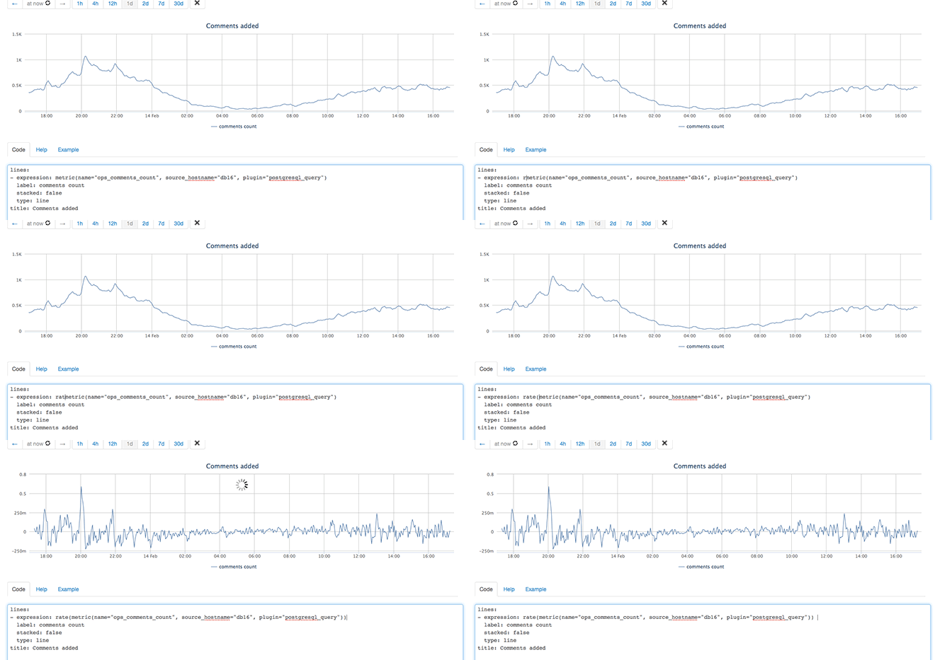
But the coolest in Okmeter is the Play mode, in which you can work with the graph (add metrics, functions on data, change display parameters) in real time.


We, of course, spy on what our users are writing, how they react to materials, news, looking for popular comments and photos, and the best thing is taking them to the work of the editorial board. The user community, in a sense, is a Petri dish, in which cool jokes and biting replicas are born (we notice these facts by a sharp surge of pluses or minuses), we also test our editorial and social hypotheses, and distribute the best to all our channels: applications, social networks, tag flows.
At first glance, this activity is similar to the insolent exploitation of the population and overt crowdsourcing, and this is true. But! The same mechanism allows young and unknown authors of the Tribune to become popular. We notice really bright characters and take them into circulation in the social editorial office: we post posts to the main page, we scatter links by stream, we give them tips on design and submission.

With the BigData infrastructure, we finally have a tool with which we can reliably answer the questions: “Why did this happen?”, “How can the product be improved?”, “What color does the button work best here?” And so on. P. Every day we use the magic of numbers to estimate, search for dependencies and correlations.
For example, we recently launched a personalized coercion to register: in various ways we learn about which team a visitor is interested in, select a popular player from this team, post a photo of this athlete on an invitation to register, and show this visitor a special block. We have already figured out that such a personalized treatment works many times more efficiently than cute cats or Guus Hiddink. But to choose the text for such an invitation, we decided to simple ABCD-test. This is how the test variants look at experimental Alexandra Amisulashvili from Krylya Sovetov:

Try to guess for yourself the best option and compare it with our results (a sample of 100,000 impressions was made).

You can measure the effectiveness of email newsletters without special skills and funds. We use the data infrastructure for the campaign: a sample of users to send them personalized messages. We identify users who have not visited the site for several weeks to tell them via email that we have something interesting, while they were not. We remind players of their Fantasy team or the prediction tournament they have scored. We invite fans to thematic forums of interest.

Once a week, heads of all departments of Sports.ru and Tribuna.com gather for a retrospective of the past week and discuss plans for the current one. Each participant talks about his field of activity, based on the data in the report, which is generated weekly from the data collected in our infrastructure. We discuss the traffic structure, sales, competitors and the market as a whole, editorial and SMM activities, development, product, finance, IT. The value of these meetings is solely in the synchronization of knowledge and priorities at the level of the whole company - no bureaucratic reporting under the peak.
... And this is only a small part of what we already have in BigData. We showed you our infrastructure through a keyhole with only one purpose - to inspire you to process data in your project. This is really not as scary and expensive as it seems at first glance: we did without capital expenditures in the equipment at the start, although we spent 4 man-months of development. We spend no more than 60 thousand rubles a month for renting servers and paying for external services. And we assure you - the epiphany is worth it.
Dare!
UPD: continuation and technical part of the post here http://habrahabr.ru/company/sports_ru/blog/216229/

“I don’t notice the code at all. I see blondes, brunettes, redheads. By the way, do you want a drink? ”
This is not to say that we knew what we were doing at the beginning. We assumed that the data would add a little more meaning to our intuitive creativity. And we really wanted a lot of beautiful graphs and more understanding than our users live. We didn’t expect that we would build a full data processing system in a year, and the company would start breathing in the rhythm of Data Driven.
And we really had a place to turn: every day, 700 News and 500 texts appear on Sports.ru and Tribuna.com sites (of which 97% are custom), and under them there are 30 thousand comments, 120 thousand ratings and 2 thousand statuses. This whole shaft of content settles not only on sites with their 750 thousand unik and 5 million hits per day, but also scatters through 100 thousand tags on 160 mobile applications (where 200 thousand unik make 8 million hits per day) and on 1200 subject groups in social networks.
')
Sorry, I could not resist, but throwing numbers - my horse!

So, these are our normal numbers. Paranormal numbers become in the tight days of sporting events, as they are now happening in Sochi. Every Olympic day we break the 1 million unik mark. Instant traffic can jump 10 times, and the total volume of hits per day grows 1.5-2 times.
We knew that we would have to process a lot of data: in the first months of operating the data processing infrastructure, we accumulated 500 gigabytes of raw material and aggregates. But to immediately fit into your Hadoop cluster or computing processor would be too risky, and we didn’t have such an opportunity - so we got out.

At the beginning of last year, we did not even know half of the words on this scheme.
We did everything simply: data about page impressions is collected using the Piwik open-source counter, more precisely using its front-end part — on the backend we have a nginx cluster, whose nodes access access.log from this counter. Raw data from the logs is uploaded via Amazon S3 to Amazon Redshift , where client sessions are calculated from ClickStream hits. Additionally, Redshift unloads data from the site’s SQL storage necessary to enrich the structures being created. A plan of SQL queries has been developed over the created structures, which is used for generating graphs and reports in Chart.io , as well as for Adhoc data analysis.
In addition, we register individual user actions in the NoSQL repository to quickly calculate the matrix of recommendations for our users, process access.log access to the site pages using Okmeter agents, and use them to analyze user content from the SQL repositories. As a result, we did not do the whole complex part of BigData (data storage, complex calculations, plotting graphs and reports) in the form of our own equipment farm and software collection, but completely carried it out to SaaS. We left only the collection of raw data and the final consumption of aggregates.
Who is boiling?

We hope to tell the details of the technical implementation of the entire analytical infrastructure in a separate post, but now we want to share with you how we managed to improve our product and business by adding only a small portion of data.
Recommendations for users

We now know very much about our readers and not only what they tell us during registration — which teams and athletes like or dislike - but also what we learn about them from the behavioral profile: from which fan sites or search queries users They come to Sports.ru and Tribuna.com, with what tags they read and comment, which posts and comments are added, and which are negative, which is interesting to friends. Forming the matrix of preferences of each visitor, we impose on it a matrix of recommendations and give each relevant tips.
Business Metrics Monitoring

To make a big PCO with monitors, graphics and nice bearded guys is the most obvious thing that comes to mind after the launch of the data processing infrastructure. We did the charts, but we didn’t involve the monitors and the bearded ones: we definitely do not need emergency response teams.
But we hung up some business metrics alerts using Okmeter. Although this service is designed more to monitor technical metrics (uptime, traffic, system indicators, etc.), its functionality allows you to build metrics from any data from any SQL storage. During the six months of operation, the service twice notified us that comments had ceased to appear on the site: on New Year's Eve, and when the curve banner appeared on the site, blocking Javascript on pages.
But the coolest in Okmeter is the Play mode, in which you can work with the graph (add metrics, functions on data, change display parameters) in real time.

The service is made by great guys from Russia, while it is closed for registration, but you can ask for an invite on the site okmetric.com
Distribution and production of content


We, of course, spy on what our users are writing, how they react to materials, news, looking for popular comments and photos, and the best thing is taking them to the work of the editorial board. The user community, in a sense, is a Petri dish, in which cool jokes and biting replicas are born (we notice these facts by a sharp surge of pluses or minuses), we also test our editorial and social hypotheses, and distribute the best to all our channels: applications, social networks, tag flows.
At first glance, this activity is similar to the insolent exploitation of the population and overt crowdsourcing, and this is true. But! The same mechanism allows young and unknown authors of the Tribune to become popular. We notice really bright characters and take them into circulation in the social editorial office: we post posts to the main page, we scatter links by stream, we give them tips on design and submission.
Adhoc analysis

We don’t have a lot of funny pictures about analytics, so we start posting cats
With the BigData infrastructure, we finally have a tool with which we can reliably answer the questions: “Why did this happen?”, “How can the product be improved?”, “What color does the button work best here?” And so on. P. Every day we use the magic of numbers to estimate, search for dependencies and correlations.
For example, we recently launched a personalized coercion to register: in various ways we learn about which team a visitor is interested in, select a popular player from this team, post a photo of this athlete on an invitation to register, and show this visitor a special block. We have already figured out that such a personalized treatment works many times more efficiently than cute cats or Guus Hiddink. But to choose the text for such an invitation, we decided to simple ABCD-test. This is how the test variants look at experimental Alexandra Amisulashvili from Krylya Sovetov:

Try to guess for yourself the best option and compare it with our results (a sample of 100,000 impressions was made).
CTR results to them. A. Amisulashvili

Mailing Lists

You can measure the effectiveness of email newsletters without special skills and funds. We use the data infrastructure for the campaign: a sample of users to send them personalized messages. We identify users who have not visited the site for several weeks to tell them via email that we have something interesting, while they were not. We remind players of their Fantasy team or the prediction tournament they have scored. We invite fans to thematic forums of interest.
Business analytics

Peek at the full weekly Sports.ru report

Once a week, heads of all departments of Sports.ru and Tribuna.com gather for a retrospective of the past week and discuss plans for the current one. Each participant talks about his field of activity, based on the data in the report, which is generated weekly from the data collected in our infrastructure. We discuss the traffic structure, sales, competitors and the market as a whole, editorial and SMM activities, development, product, finance, IT. The value of these meetings is solely in the synchronization of knowledge and priorities at the level of the whole company - no bureaucratic reporting under the peak.
... And this is only a small part of what we already have in BigData. We showed you our infrastructure through a keyhole with only one purpose - to inspire you to process data in your project. This is really not as scary and expensive as it seems at first glance: we did without capital expenditures in the equipment at the start, although we spent 4 man-months of development. We spend no more than 60 thousand rubles a month for renting servers and paying for external services. And we assure you - the epiphany is worth it.
Pfff! A post about BigData and not a single mention of MapReduce or at least the word PETABITE. Cats dump from here

Dare!
UPD: continuation and technical part of the post here http://habrahabr.ru/company/sports_ru/blog/216229/
Source: https://habr.com/ru/post/212863/
All Articles