Brief instruction on working with a web-designer (for a project manager)

The article will provide recommendations for working with WEB-designers. The implementation of these recommendations will give a significant improvement in the quality of work, an increase in labor productivity and will save nerve cells.
In each of the items will be live examples and links to useful, free tools.
')
Ideally, in the comments you leave your tips, comments on the article, links and examples.
I am not a designer, I am a customer and from this side I will give advice. If you have a question about whether my competence is enough to highlight this problem, you can look at the reviews about me as a customer on free-lance.ru .
Prologue
WEB-design is the result of designer and customer collaboration. It is especially important to understand that this is exactly teamwork. If everyone does their part perfectly well, then the overall result of the work will be the same excellent.
I consider that my part of the project’s responsibility as a customer is:
- think through and articulate the essence of the idea
- independently prepare the content and name of all blocks
- think about the design of which pages we need
- think about the layout of each page
- consider the priority and importance of blocks on the page
- give clear, intelligible, reasonable feedback
In practice, I often came across the fact that the customer shifted his part of the task on the shoulders of the designer. As a rule, of course, nothing good comes out of it, because no one gets into the essence of your idea or task better than you, no one thinks through the logic of each element better and so on. Do not be lazy, make a good TZ and you will get a great design. “You want to do well, do it yourself.”
The most important aspects of TK for the designer and recommendations for their preparation are described below.
Perfect TK
The ideal is of course just a beautiful headline to attract attention. Rather, it is suitable "One of the options for a good TK."
Idea
Briefly, in a few sentences, it is necessary to describe the essence of your idea and task. Do not try to write difficult and ornate, as long as it is clear. Additionally, try to answer the following questions:
- Who is the user of this site?
- From which devices will the site be used?
- What sensations should he evoke?
Example: We are going to create a new design for the existing site of the dental clinic. The design should be modern, clean, fresh, with a flat effect. The idea of the site is not to sell the clinic service, but to help solve the patient's problem. Exact strict user criteria does not exist. It is worth considering that some of the users will come from mobile devices, so that, no small functional elements, and so on.
Page block diagram

A designer who delves into your idea, analyzes the existing content, asks about how the site will evolve, makes a grouping of your services and so on ... well, these guys certainly exist, but in practice they almost never come across, and if they do, then their price is really high.
I recommend you to think through all these things yourself, entrusting the designer only the transformation of your idea and your vision from the frame into a beautiful picture.
A block diagram is not what a particular page looks like; it is where an object or group of objects is located and the type of these objects. In fact - this is design, if we consider it from the word “creation”. And what they mean by design in practice is drawing.
Creating a flowchart for each page will of course take time, but it will save you later and make it easier for the designer to draw all the elements.
Sometimes it may seem that this may limit the imagination of the designer, but in fact not. This will only increase the degree of his freedom. He will begin to think precisely about what he should think about, and not to solve tasks unusual for him.
Flowcharting Tools
There are many convenient tools for constructing a flowchart, one of my colleagues in MS Paint creates real masterpieces (I will be happy with the new tools in the comments), here are my favorites:
Typical inner page
I recommend paying special attention to the typical inner page. Try to provide on it all possible options and combinations of content that you are going to use. Ask the designer to show how it will look like bold text and italics, tables, lists, headers H1-H5, quotation, numbered list, inserted images, and so on. Many people will thank you in the future.
Examples of block diagrams:
moqups.com/idoziru/Ok2mhYsJ
ninjamock.com/s/kdwizs
Color palette
The most wrong way would be to try to invent a palette in your head. Next on the wrong way will be when you describe the desired palette with the words of the designer. The fact is that each has its own purple color.
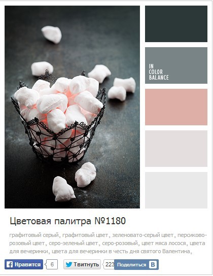
Any graphic information, it is better to transfer graphically. Otherwise it turns into “Guess the melody”, and the melody is shown on your fingers.
I (and my clients) like to do so. They find a photo that, in their opinion, matches the color scheme to their idea.
An excellent resource that helps out in such cases http://color.romanuke.com
Examples of good sites and bad ones.
It should show the designer examples of sites whose design you would like to advise as an inspiration for the designer. Try to briefly describe what each of them likes. Similarly, give examples of “bad” sites.
Example: toster.ru - I like the solution with the menu attached to the left, it seems that this application. habrahabr.ru - like simplicity and “air”. proactivweb.ru - like the brightness and the letter “M” at the metro station. apple.com - I don’t like the menu to appear after 3 seconds. The menu itself is also not like, especially pseudo-pieces.
Editing
It does not happen (I personally did not have it) that the first time and everything turned out perfectly and immediately. I will say even more, do not try to do perfectly right away. Make “strong” and “good”, run the project faster and get statistics. Otherwise, you will get stuck in an attempt to do perfectly right away, in the end you will not do it.
Edits should be given specific. Accurately show in the screenshot which element or place you are talking about. Explain to the designer why you decided to make this edit. If the question “why does my editing make the design better?” You answer “I like it that way more”, then you shouldn’t do this editing as long as it’s useless.

Edits should be recorded, sent to the designer and, if necessary, explained by voice. This greatly increases the chance that he will understand you and do as you see it.
Try to make technical changes, but do not interfere with the design. After all, you pay money for the fact that the designer sees better what color and where is more suitable for you. Otherwise, you risk getting a design that you completely did. And you are a bad designer, otherwise you would not hire anyone.
An example of editing to a page in one of the iterations here .
Advice: it is best to watch the sent image in the browser, because it is for him that all this is done.
What to do when the design is done
Made design is just the beginning of work. This layout will still have to use a coder, a programmer, perhaps another designer, yourself. It is worthwhile to foresee this and make a layout so that it is convenient for them to use everything.
Ask the designer to prepare the layout in accordance with the rules specified on the site ilovepsd.ru (By the way, a great site, many thanks to its creators, always helps out)
- In addition to the PSD layout itself, always take away the fonts that the designer used.
- Always try to open the layout you sent before writing that everything is “OK”. The simplest thing that can be - different versions of programs.
- Check your block diagram again and check the revision list. Is everything done?
- Check if there are multiple mappings for all active elements.
- Look at the pages, imagine how it will look with a longer title, or a longer author's last name, and so on.
What else do you need to know
Content VS Lorem Ipsum
If you have the opportunity to design with the content that will be on the site, always do so. This reduces the number of errors.
Start from the main page
Try to start from the main page - it is the most difficult and important.
Source: https://habr.com/ru/post/212499/
All Articles