Developer - to designers. Frome Hart Tou Hart
Hey-ho everyone!
The other day, he played with himself in the game "Reception at the psychotherapist." I realized that if a kind doctor in a cozy atmosphere, in a quiet, insinuating voice, offers to lie down on the sofa, relax and tell him about what I care about, I will begin a story full of emotions about ...
But if you try to remove unnecessary emotions from a psychotherapist from this confession, you may end up with a small collection of tips for designers who are creating or planning to start creating designs for mobile applications while avoiding mental streams of hatred on their heads by the developers.
At once I will state that everything is written from the developer’s position under iOS, but almost all points are true for any mobile developers and developers as such.
So, the usual story: the designer drew another cool design in a trendy flat style with blur, the customer gushes from delight, and sends the design to the developer. And now the developer opens the psd file and ... gushes away, far from being delighted.
In general, the developer as such is the final link in the development of a software product, therefore all errors and omissions of design and creation of designcorrect the technical task compiler and designer, to whom the developer sent their raw work back indicating where and what should be corrected as soon as possible, because the deadlines are burning. corrects the developer of course, because otherwise the project is likely to be bent, and not having time to really begin. In this regard, it is easiest to jump off the designer, because “I don’t know anything, the client has approved, and indeed, it’s mean and low to make a fuss because of some trifles.” And in fact, if you make a couple of missed buttons yourself on the basis of the material you have, the crown will not fall down, and you will save your nerves. But then you realize that 10 minutes is there, an hour is here - and you do the work of a designer who has long received his money and is sitting on the window sill, looks at the rain, drinks coffee and thinks about the concept of a new masterpiece design. But as I wanted this time everything was perfect ...
Of course, it makes no sense to remind people about the basics of their profession, but life has taught me to do meaningless things, so I’ll remind you. Each individual element is a new layer, and a component element is a group of layers! And they should be called meaningful names, by the way. Well, corny. But for some reason, designs, which are a random mix of layers with names like “layer copy 1 copy”, come across all the same. Yes, guys, I understand, this is all due to the fact that you also have deadlines and you are in a hurry. But think about the fact that each minute you save on putting things in order is two spent by the developer to sort through your layers. Respect the work of others, please.
Incredible luck - there are only two resolutions for iPhones, if with an ipad, then three (hello, androids!). And if the design is supposed only for the iPhone, then it is enough to draw it with dimensions of 640 x 1136, and the developer further adapts it according to the knurled pattern and for the screen of old models. But my colleague literally the other day showed a design made to a width of 666 pixels. Designer from hell, not otherwise.
In addition, there are such standard elements as the upper navigation bar, the lower bar of the tabs (technical Russian - Navigation bar and Tabbar, respectively), which should preferably be drawn in standard sizes that can be easily found on the Internet, for example, here . The only thing to keep in mind is that if the dimensions are specified in points (pts), then they must be multiplied by two, because the Retina displays have one pixel per pixel.
')
The most favorite reason to hate.
Intuitively, the button has at least two states - normal and pressed. Where the button can be pressed with the cursor, there is also the state of the induced cursor. Maybe I'm just a loser, but in all the designs I had to deal with in several years of work, for the buttons the pressed state was drawn 5% of the time. Yes, the operating system itself by default slightly changes the appearance of the button, if it is not explicitly specified, but often it all looks extremely miserable. And it becomes the cause of claims to, oddly enough, the developer, not the designer.
Earlier, when a convex design was in fashion, I got used to making background images for a pressed button from the background for a normal state by reversing the layer gradient. I copied the group of layers responsible for the button, opened the button's background style and put one tick - absolutely not difficult. Yes, dear designers, absolutely not difficult.
Now, by the way, with the advent of the era of flat design, without having a subtle sense of beauty on your own it is difficult to make a pressed button, you have to swear. When you swear, the lack of a sense of beauty is only a plus.
And the last thing that I would like to say about the buttons (and not only), it is rather not advice, but a request. A plea if you will. Do not over complicate. Understandably, the customer and only the customer will be the ultimate authority in design approval. But it is in your power to try to make the design, which he eventually likes, to be simple and elegant. They are so malleable in the hands of a skilled psychologist, these customers. Even more so, the casualness is now in trends.
Show which buttons for the developer to enjoy, and which on the contrary, I tried on the picture:
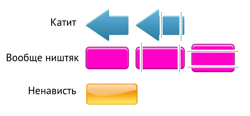
I had to upload it to googledrive, for Habrastorage 2.0, for the life of me, did not show me a link to the kind of file that was successfully uploaded
If it is assumed that all buttons of the same type will be the same size, then any fruit of your highly artistic research will come down. But this rarely happens, because some explanatory text is likely to hang on the button, on different buttons - text of different lengths, but it can also be in different languages. So a friendly button should have such a space that can stretch horizontally without serious consequences. If the height of the buttons should also vary, then this painlessly stretching space should also be available for the vertical direction. Otherwise, the poor developer will have to cut the background images for all occasions. Or, for example, draw buttons on the fly, by graphic libraries. This, of course, is a true way, and the final build will be a few hundred kilobytes less in volume, but, for example, I am not so severe that I like this approach.
I apologize for the emotions, eccentricities and the lack of interesting pictures. All good, and let's respect each other and each other's work.
UPD Users denisbalyko and designiac indicate that the article does not contain an important link on the topic - ilovepsd.ru . A very useful resource primarily for designers who want to achieve respect, the author seems to be Nikolai Bering burning . Here is his post on Habré
The other day, he played with himself in the game "Reception at the psychotherapist." I realized that if a kind doctor in a cozy atmosphere, in a quiet, insinuating voice, offers to lie down on the sofa, relax and tell him about what I care about, I will begin a story full of emotions about ...
The phrase of the extreme degree of emotionality, but without obscene language
<huge_red_book_> a story about how I, as an iOS application developer, sometimes want to take the author of the design that I have to use, but hit him with the full swing of a phallic paddle in the face, knock him down, and jump on his back in heavy shoes, jump, jump ... </ huge_red_book_>
But if you try to remove unnecessary emotions from a psychotherapist from this confession, you may end up with a small collection of tips for designers who are creating or planning to start creating designs for mobile applications while avoiding mental streams of hatred on their heads by the developers.
Plain story
At once I will state that everything is written from the developer’s position under iOS, but almost all points are true for any mobile developers and developers as such.
So, the usual story: the designer drew another cool design in a trendy flat style with blur, the customer gushes from delight, and sends the design to the developer. And now the developer opens the psd file and ... gushes away, far from being delighted.
In general, the developer as such is the final link in the development of a software product, therefore all errors and omissions of design and creation of design
Perfect script
The main
Of course, it makes no sense to remind people about the basics of their profession, but life has taught me to do meaningless things, so I’ll remind you. Each individual element is a new layer, and a component element is a group of layers! And they should be called meaningful names, by the way. Well, corny. But for some reason, designs, which are a random mix of layers with names like “layer copy 1 copy”, come across all the same. Yes, guys, I understand, this is all due to the fact that you also have deadlines and you are in a hurry. But think about the fact that each minute you save on putting things in order is two spent by the developer to sort through your layers. Respect the work of others, please.
Dimensions
Incredible luck - there are only two resolutions for iPhones, if with an ipad, then three (hello, androids!). And if the design is supposed only for the iPhone, then it is enough to draw it with dimensions of 640 x 1136, and the developer further adapts it according to the knurled pattern and for the screen of old models. But my colleague literally the other day showed a design made to a width of 666 pixels. Designer from hell, not otherwise.
In addition, there are such standard elements as the upper navigation bar, the lower bar of the tabs (technical Russian - Navigation bar and Tabbar, respectively), which should preferably be drawn in standard sizes that can be easily found on the Internet, for example, here . The only thing to keep in mind is that if the dimensions are specified in points (pts), then they must be multiplied by two, because the Retina displays have one pixel per pixel.
')
Buttons
The most favorite reason to hate.
Intuitively, the button has at least two states - normal and pressed. Where the button can be pressed with the cursor, there is also the state of the induced cursor. Maybe I'm just a loser, but in all the designs I had to deal with in several years of work, for the buttons the pressed state was drawn 5% of the time. Yes, the operating system itself by default slightly changes the appearance of the button, if it is not explicitly specified, but often it all looks extremely miserable. And it becomes the cause of claims to, oddly enough, the developer, not the designer.
Earlier, when a convex design was in fashion, I got used to making background images for a pressed button from the background for a normal state by reversing the layer gradient. I copied the group of layers responsible for the button, opened the button's background style and put one tick - absolutely not difficult. Yes, dear designers, absolutely not difficult.
Now, by the way, with the advent of the era of flat design, without having a subtle sense of beauty on your own it is difficult to make a pressed button, you have to swear. When you swear, the lack of a sense of beauty is only a plus.
And the last thing that I would like to say about the buttons (and not only), it is rather not advice, but a request. A plea if you will. Do not over complicate. Understandably, the customer and only the customer will be the ultimate authority in design approval. But it is in your power to try to make the design, which he eventually likes, to be simple and elegant. They are so malleable in the hands of a skilled psychologist, these customers. Even more so, the casualness is now in trends.
Show which buttons for the developer to enjoy, and which on the contrary, I tried on the picture:
I had to upload it to googledrive, for Habrastorage 2.0, for the life of me, did not show me a link to the kind of file that was successfully uploaded
If it is assumed that all buttons of the same type will be the same size, then any fruit of your highly artistic research will come down. But this rarely happens, because some explanatory text is likely to hang on the button, on different buttons - text of different lengths, but it can also be in different languages. So a friendly button should have such a space that can stretch horizontally without serious consequences. If the height of the buttons should also vary, then this painlessly stretching space should also be available for the vertical direction. Otherwise, the poor developer will have to cut the background images for all occasions. Or, for example, draw buttons on the fly, by graphic libraries. This, of course, is a true way, and the final build will be a few hundred kilobytes less in volume, but, for example, I am not so severe that I like this approach.
Afterword
I apologize for the emotions, eccentricities and the lack of interesting pictures. All good, and let's respect each other and each other's work.
UPD Users denisbalyko and designiac indicate that the article does not contain an important link on the topic - ilovepsd.ru . A very useful resource primarily for designers who want to achieve respect, the author seems to be Nikolai Bering burning . Here is his post on Habré
Source: https://habr.com/ru/post/212225/
All Articles