How to write your component for iOS
Controls - one of the most important components of any application. In essence, they are graphical components that allow users to interact in one way or another with the application and its data. This lesson is about creating a custom control that can later be used in any application.
Apple provides the developer with about 20 different UI components, including
UITextField , UIButton and UISwitch . Using all the power of standard controls, you can create many different interface options. Be that as it may, sometimes there is a need for something that cannot be realized by standard components.I will give an example. Let's say you are developing an application that makes a list of real estate in sale. It allows the user to view search results in a specific price range. Alternatively, you can use two
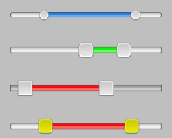
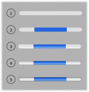
UISlider , one of which sets the minimum price, the other - the maximum, as shown in the screenshot:')

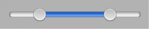
Although this option will work, it does not illustrate well the concept of the price range. It would be much better to use one slider with two sliders responsible for the minimum and maximum:
Such an element is much more convenient to use, the user immediately understands that he sets the range of values, and not fixed numbers. Unfortunately, this slider is not included in the set of standard elements. To implement its functionality, it is necessary to develop a custom control.
You can make this slider subclass
UIView . And if in the context of one particular application, such a solution is justified, then its reuse in other developments will require some effort. A much better idea would be to make this component universal, available for use in any application. This is the meaning of custom controls.As already mentioned, custom components are controls that you create; they are not part of the
UIKit Framework . As well as the standard components, they must be fully versatile and customizable for any needs. Recently, a whole community of developers has been formed, who spread their components to open access.This tutorial will show you how to develop your own
RangeSlider control, which solves the above problem. Such issues as extending existing components, developing an API, and even putting your creation into public access will be affected.So, enough theory! It's time to start customizing!
Start
This section is devoted to the development of the basic structure of the component, which will be enough to display a simple slider on the screen. Launch Xcode and select File -> New -> Project . In the window that appears, select iOS -> Application -> Single View Application and click Next . On the next screen, enter CERangeSlider as the project name and fill in the remaining fields:

In this project, Storyboards are not used, as we operate with just one screen. You can use any other class as a prefix - most importantly, do not forget that the corresponding changes will occur in the application code. In the fields "Organization Name" and "Company Identifier" you can enter your own values. When done, click Next . Select the project storage location and click Create .
The first decision that you will need to make when creating a custom control is which existing class you will inherit or extend. It is important that the class inherit
UIView .If you look closely at the various components of
Apple UIKit , you will notice that many elements such as UILabel and UIWebView directly inherit UIView . But be that as it may, there are such elements that inherit UIControl , as shown in this figure: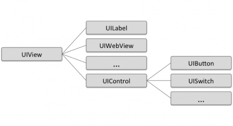
Note: A detailed hierarchy of interface elements can be found here: UIKit Framework Reference .
The
UIControl class implements the Target-Action pattern, which is essentially a way of notifying component changes. Also, UIControl has several properties related to controlling the state of an object. To create our component you will use just such a template, so that UIControl will serve as an excellent start.Right-click on the CERangeSlider group in the Project Navigator and select New File , then iOS -> Cocoa Touch -> Objective-C class and click Next . Name the class CERangeSlider , and in the "subclass of" field , enter UIControl . Click Next and Create to select the storage location for the class.
Although writing code in itself is a pleasant process, you most likely want to watch how the item is displayed on the screen. Before you start writing code, add your component to the View Controller .
Open CEViewController.m and insert the following line:
#import "CERangeSlider.h" Further in the same file add a variable:
@implementation CEViewController { CERangeSlider* _rangeSlider; } Replace the standard
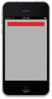
viewDidLoad following code block: - (void)viewDidLoad { [super viewDidLoad]; // Do any additional setup after loading the view, typically from a nib. NSUInteger margin = 20; CGRect sliderFrame = CGRectMake(margin, margin, self.view.frame.size.width - margin * 2, 30); _rangeSlider = [[CERangeSlider alloc] initWithFrame:sliderFrame]; _rangeSlider.backgroundColor = [UIColor redColor]; [self.view addSubview:_rangeSlider]; } This code creates an object of your class with the required dimensions and adds it to the screen. The background color of the component is set to red so that it is visible on the main background of the application. If the color is not indicated, the component will remain transparent, and you will long be puzzled over where it went. :]
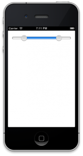
Build and run the application; You will need to see the following screen:
Before you add visual elements to a project, you will need to create several properties to keep track of the various information stored in the component. This will serve as the basis for creating a future API.
Note: Your component's API defines the methods and properties that you intend to expose to other developers. Further in the article you will read about the structure of the API - for now stay in touch!
Add standard component properties
Open CERangeSlider.h and add the following properties between
@interface and @end: @property (nonatomic) float maximumValue; @property (nonatomic) float minimumValue; @property (nonatomic) float upperValue; @property (nonatomic) float lowerValue; These four properties are enough to describe the state of the component — the maximum and minimum values of the range, and the current lower and upper thresholds.
Well-designed controls should contain standard settings, otherwise they will look a bit strange when drawn on the screen. Open CERangeSlider.m , locate the
initWithFrame: method generated by Xcode , and replace it with the following code: - (id)initWithFrame:(CGRect)frame { self = [super initWithFrame:frame]; if (self) { // Initialization code _maximumValue = 10.0; _minimumValue = 0.0; _upperValue = 8.0; _lowerValue = 2.0; } return self; } Now it's time to work with the interactive elements of the component: sliders and a progress bar on which they are located.
Images vs. CoreGraphics
There are two ways to display items on the screen:
- Use as part of the image component,
- Use a combination of layers and Core Graphics .
Each of the methods has its pros and cons.
- Using images is the easiest option, at least if you can draw. If you intend to give other developers the opportunity to replace these images with their own, then you can set them as
UIImageproperties. - The use of images provides the component with sufficient flexibility. Third-party developers can change everything, up to each pixel - but on the other hand, it requires certain drawing skills - and changing something through the code is very difficult.
The application code is fully responsible for displaying the component by Core Graphics , as a result of which much more effort is required from the programmer. But this method allows you to build a more flexible API. Using Core Graphics , you can set virtually any component property — its colors, thickness, curvature — and indeed, any parameter that is responsible for rendering. This approach allows developers using your control to easily customize it.
In this tutorial we will use the second approach - Core Graphics .
Note: Curiously, Apple prefers using graphic resources in its components. Most likely, this is due to the fact that they have set the standard dimensions for each element and do not allow its complete customization.
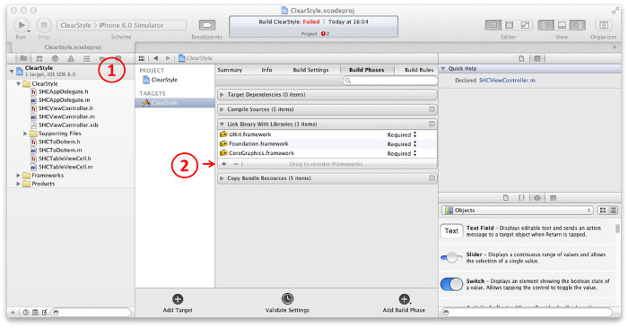
In Xcode, go to the project settings window. Then select the Build Phases tab and the Link Binary With Libraries section. Add to the list QuartzCore.framework . The classes and methods of this framework will be used to manually draw the component.
This screenshot clearly shows how to find and add QuartzCore.framework if you mess up:
Open CERangeSlider.m and add the following line:
#import <QuartzCore/QuartzCore.h> Add the following variables to the same file immediately after
@implementation : @implementation CERangeSlider { CALayer* _trackLayer; CALayer* _upperKnobLayer; CALayer* _lowerKnobLayer; float _knobWidth; float _useableTrackLength; } These three layers -
_trackLayer , _upperKnobLayer and _lowerKnobLayer will be used to display the various elements of your component. The two variables _knobWidth and _useableTrackLength are used to set the parameters of these elements.In CERangeSlider.m, find the
initWithFrame: and add the following code to the if (self) { } block: _trackLayer = [CALayer layer]; _trackLayer.backgroundColor = [UIColor blueColor].CGColor; [self.layer addSublayer:_trackLayer]; _upperKnobLayer = [CALayer layer]; _upperKnobLayer.backgroundColor = [UIColor greenColor].CGColor; [self.layer addSublayer:_upperKnobLayer]; _lowerKnobLayer = [CALayer layer]; _lowerKnobLayer.backgroundColor = [UIColor greenColor].CGColor; [self.layer addSublayer:_lowerKnobLayer]; [self setLayerFrames]; This block of code creates three layers and adds them to the main one as children. Now in the same file add the following methods:
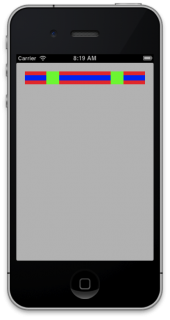
- (void) setLayerFrames { _trackLayer.frame = CGRectInset(self.bounds, 0, self.bounds.size.height / 3.5); [_trackLayer setNeedsDisplay]; _knobWidth = self.bounds.size.height; _useableTrackLength = self.bounds.size.width - _knobWidth; float upperKnobCentre = [self positionForValue:_upperValue]; _upperKnobLayer.frame = CGRectMake(upperKnobCentre - _knobWidth / 2, 0, _knobWidth, _knobWidth); float lowerKnobCentre = [self positionForValue:_lowerValue]; _lowerKnobLayer.frame = CGRectMake(lowerKnobCentre - _knobWidth / 2, 0, _knobWidth, _knobWidth); [_upperKnobLayer setNeedsDisplay]; [_lowerKnobLayer setNeedsDisplay]; } - (float) positionForValue:(float)value { return _useableTrackLength * (value - _minimumValue) / (_maximumValue - _minimumValue) + (_knobWidth / 2); } setLayerFrames sets sizes for both sliders and progress bars based on the current values of the slider. positionForValue binds the value to screen coordinates, using a simple proportion to scale the distance between the maximum and minimum values of the component.Compile and run the application. Your slider is starting to take shape! It should look something like this:
Although your component has acquired a form, the work is just beginning - after all, each control should provide the user with the ability to manage it. In your case, the user should be able to move each slider, setting the required range. You will track these changes and update both the properties of the component and its appearance based on their values.
Add the interactivity component
The code responsible for user interaction with the component should track which slider is being moved, and accordingly update the appearance. The best place to do this will be the layers of our component.
Add a new file to the CERangeSlider group: New File -> iOS -> Cocoa Touch -> Objective-C class , make it a subclass of
CALayer and name it CERangeSliderKnobLayer .Open the newly created CERangeSliderKnobLayer.h and replace its contents with the following:
#import <QuartzCore/QuartzCore.h> @class CERangeSlider; @interface CERangeSliderKnobLayer : CALayer @property BOOL highlighted; @property (weak) CERangeSlider* slider; @end This code adds two properties, one of which indicates whether the slider is highlighted and the other points to the parent slider. Now open CERangeSliderKnobLayer.m and add
#import : #import "CERangeSliderKnobLayer.h" Then change the
_upperKnobLayer and _lowerKnobLayer in the @implementation block: CERangeSliderKnobLayer* _upperKnobLayer; CERangeSliderKnobLayer* _lowerKnobLayer; These layers are now objects of the newly created class CERangeSliderKnobLayer .
In the same CERangeSlider.m, find the
initWithFrame: and replace the upperKnobLayer and lowerKnobLayer initialization code with the following code block: _upperKnobLayer = [CERangeSliderKnobLayer layer]; _upperKnobLayer.slider = self; _upperKnobLayer.backgroundColor = [UIColor greenColor].CGColor; [self.layer addSublayer:_upperKnobLayer]; _lowerKnobLayer = [CERangeSliderKnobLayer layer]; _lowerKnobLayer.slider = self; _lowerKnobLayer.backgroundColor = [UIColor greenColor].CGColor; [self.layer addSublayer:_lowerKnobLayer]; This code uses the class we just created to initialize the layers and sets their
slider property to self . Run your project and make sure that everything looks the same as in the screenshot: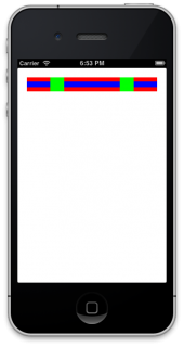
Now that your layers are in place, you need to implement the ability to move the sliders.
Add click handlers
Open CERangeSlider.m and add the following code under the variable declaration block:
CGPoint _previousTouchPoint; This variable will be used to track click coordinates. And how do you plan to track various press and release events for your component?
UIControl provides several methods for tracking clicks. UIControl UIControl can override these methods to implement their own logic. In your control, you override the following three methods: beginTrackingWithTouch , continueTrackingWithTouch and endTrackingWithTouch .Add the following method to CERangeSlider.m :
- (BOOL)beginTrackingWithTouch:(UITouch *)touch withEvent:(UIEvent *)event { _previousTouchPoint = [touch locationInView:self]; // hit test the knob layers if(CGRectContainsPoint(_lowerKnobLayer.frame, _previousTouchPoint)) { _lowerKnobLayer.highlighted = YES; [_lowerKnobLayer setNeedsDisplay]; } else if(CGRectContainsPoint(_upperKnobLayer.frame, _previousTouchPoint)) { _upperKnobLayer.highlighted = YES; [_upperKnobLayer setNeedsDisplay]; } return _upperKnobLayer.highlighted || _lowerKnobLayer.highlighted; } This method is called when the user first touches the component. It translates a click event into the component's coordinate system. He then checks each slider to determine if the click falls within the scope of one of them. As a result, the method informs its parent class about whether to track the current click.
Push tracking continues if one of the sliders is highlighted. Calling the
setNeedsDisplay method allows setNeedsDisplay to make sure that the layers have been updated - then you will understand why this is important.Now that you have a first-click handler, you need to handle events when the user's finger moves across the screen. Add the following method to CERangeSlider.m :
#define BOUND(VALUE, UPPER, LOWER) MIN(MAX(VALUE, LOWER), UPPER) - (BOOL)continueTrackingWithTouch:(UITouch *)touch withEvent:(UIEvent *)event { CGPoint touchPoint = [touch locationInView:self]; // 1. determine by how much the user has dragged float delta = touchPoint.x - _previousTouchPoint.x; float valueDelta = (_maximumValue - _minimumValue) * delta / _useableTrackLength; _previousTouchPoint = touchPoint; // 2. update the values if (_lowerKnobLayer.highlighted) { _lowerValue += valueDelta; _lowerValue = BOUND(_lowerValue, _upperValue, _minimumValue); } if (_upperKnobLayer.highlighted) { _upperValue += valueDelta; _upperValue = BOUND(_upperValue, _maximumValue, _lowerValue); } // 3. Update the UI state [CATransaction begin]; [CATransaction setDisableActions:YES] ; [self setLayerFrames]; [CATransaction commit]; return YES; } Let us analyze this code, comment by comment:
- First, you calculate
delta- the number of pixels on which the finger was moved. Then you convert them depending on the minimum and maximum values of the component. - Here you change the upper and lower bound depending on where the user moved the slider. Note that you use the
BOUNDmacro, which is more readable than theMIN/MAX. - This block of code sets the
disabledActionsflag inCATransaction. This allows you to make sure that changes to the borders of each layer are applied immediately and are not animated. At the end, thesetLayerFramesmethod issetLayerFrames, moving the slider to the right place.
You have implemented a slider move - but you still need to handle the end of the interaction with the component. Add the following method to CERangeSlider.m :
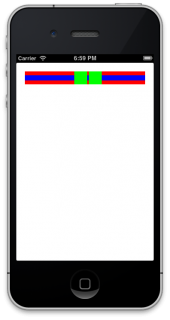
- (void)endTrackingWithTouch:(UITouch *)touch withEvent:(UIEvent *)event { _lowerKnobLayer.highlighted = _upperKnobLayer.highlighted = NO; [_lowerKnobLayer setNeedsDisplay]; [_upperKnobLayer setNeedsDisplay]; } This code returns both sliders to the inactive state. Start your project and play a little with your new slider! It should look the same as in the screenshot:
You may notice that it is possible to move a finger beyond the boundaries of a component and then return to its boundaries without interrupting the execution of the method. This is a very important feature of usability of devices with small screens and stylus with low accuracy (if you do not understand, then we are talking about fingers). :]
Change Notifications
So, we have an interactive control with which the user can set the upper and lower limits of the range. But how to associate these changes with the rest of the code so that they can be used by the application? There are many different options that can be used for change notifications: NSNotification , Key-Value-Observing (KVO) , delegation pattern, Target-Action pattern, and others.
If you look at the
UIKit components, you will see that they do not use NSNotification or KVO , so for compatibility with UIKit we have to abandon these two options. The other two templates - delegation and Target-Action - are very often used in UIKit .I will give a detailed analysis of both templates:
- Using delegation, you create a protocol containing a variety of methods used for different notifications. A component has a property, commonly referred to as delegate, that accepts any class that implements this protocol. The classic example is UITableView, which provides the UITableViewDelegate protocol. Note that controls can have only one delegate object. A delegated method can take any number of parameters, so you can pass as much information as you need.
- The Target-Action pattern is implemented by the
UIControlbase class. When the state of the component changes, the target (target) is notified of the action (action) , which is described by one of the enum values ofUIControlEvents. You can provide multiple targets to control all actions, and although it is possible to add your own events (UIControlEventApplicationReserver), their number is limited to four. These actions cannot transmit any information along with the event. Therefore, they cannot be used to transmit additional data.
The main differences between the two patterns are as follows:
- The Target-Action template broadcasts its changes, while delegation is limited to a single object.
- You independently implement the protocols when using delegation, that is, you can determine what specific information you want to send. Target-Action does not allow the transfer of additional data.
Your component does not have as many possible states or possible events to be notified of. The only thing that plays a role is the maximum and minimum values of the slider.
In this situation, using the template Target-Action is most justified. This is one of the reasons why we inherited
UIControlat the very beginning of the lesson.The slider readings are updated inside the method
continueTrackingWithTouch:withEvent:, so this is where the notification mechanism should be implemented. Open CERangeSlider.m , find the method continueTrackingWithTouch:withEventand add the following code before return YES: [self sendActionsForControlEvents:UIControlEventValueChanged]; This is all that is required of you in order to notify the desired goal of change. Well, that was easier than expected!
Open CEViewController.m and add the following code to the end of the method
viewDidLoad: [_rangeSlider addTarget:self action:@selector(slideValueChanged:) forControlEvents:UIControlEventValueChanged]; This code runs the method
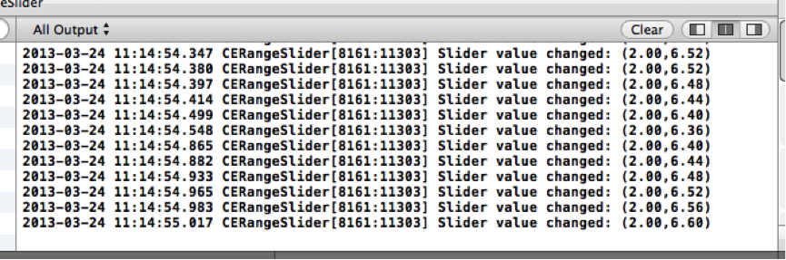
slideValueChangedeach time the slider sends an event UIControlEventValueChanged.Now add the following method to CEViewController.m :
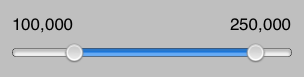
- (void)slideValueChanged:(id)control { NSLog(@"Slider value changed: (%.2f,%.2f)", _rangeSlider.lowerValue, _rangeSlider.upperValue); } This method sends all slider values to the log as proof that everything works as it should. Launch the application and move the sliders. You will see the coordinates values displayed in the log:
You are probably already tired of the multi-colored interface, similar to a terrible fruit salad. It's time to give the component the right look!
Change the appearance of a component using Core Graphics
To begin, let's update the appearance of the progress bar, on which sliders move. In the CERangeSlider group add a new class CERangeSliderTrackLayer , which is a subclass of CALayer .
Open CERangeSliderTrackLayer.h and replace its contents with the following:
#import <QuartzCore/QuartzCore.h> @class CERangeSlider; @interface CERangeSliderTrackLayer : CALayer @property (weak) CERangeSlider* slider; @end This code adds a link to the slider on the model of what we did for the slider layer. Open CERangeSlider.m and add the following
#import: #import "CERangeSliderTrackLayer.h" Just below find the variable
_trackLayerand change its type to the class you just created: CERangeSliderTrackLayer* _trackLayer; Now find the method
initWithFrame:and update the layer creation code: _trackLayer = [CERangeSliderTrackLayer layer]; _trackLayer.slider = self; [self.layer addSublayer:_trackLayer]; _upperKnobLayer = [CERangeSliderKnobLayer layer]; _upperKnobLayer.slider = self; [self.layer addSublayer:_upperKnobLayer]; _lowerKnobLayer = [CERangeSliderKnobLayer layer]; _lowerKnobLayer.slider = self; [self.layer addSublayer:_lowerKnobLayer]; This code allows you to make sure that a new stripe is used, and the vivid colors no longer apply to the background. :] It
remains to do a little more - remove the red background from the component. Open CEViewController.m , find the following line of code in the method
viewDidLoadand delete it: _rangeSlider.backgroundColor = [UIColor redColor]; Build and run the application ... What do you see?

Nothing?That's great!
You ask - what's great about it? All the fruits of hard work are gone! Do not worry - you just removed the bright colors that were applied to the layers used. Your component is still in place - but now it is transparent.
Since most developers like when the components can be customized to the style of each particular application, we will add several properties that are responsible for the appearance of our slider. Open CERangeSlider.h and add the following code:
@property (nonatomic) UIColor* trackColour; @property (nonatomic) UIColor* trackHighlightColour; @property (nonatomic) UIColor* knobColour; @property (nonatomic) float curvaceousness; - (float) positionForValue:(float)value; The purpose of the various color properties is quite obvious. As for
curvaceousness- learn a little later. And finally positionForValue:. We have already managed to implement this method, and now we are making it available to various layers.You need to add initial values for color properties. Open CERangeSlider.m and add the following code to the method
initWithFrame:,under the code block responsible for initializing the remaining variables: _trackHighlightColour = [UIColor colorWithRed:0.0 green:0.45 blue:0.94 alpha:1.0]; _trackColour = [UIColor colorWithWhite:0.9 alpha:1.0]; _knobColour = [UIColor whiteColor]; _curvaceousness = 1.0; _maximumValue = 10.0; _minimumValue = 0.0; Now open CERangeSliderTrackLayer.m and add the following
#import: #import "CERangeSlider.h" This layer displays a bar on which both sliders are located. At the moment, it inherits a class
CALayerthat makes it possible to use only solid color.In order to draw the strip correctly, you need to implement the method
drawInContext:and use the CoreGraphics API for rendering.Note: If you want to learn more about Core Graphics, then the Core Graphics 101 tutorial series course is recommended , since a detailed review of Core Graphics is beyond the scope of this lesson.
Add the following method to CERangeSliderTrackLayer.m under
@implementation: - (void)drawInContext:(CGContextRef)ctx { // clip float cornerRadius = self.bounds.size.height * self.slider.curvaceousness / 2.0; UIBezierPath *switchOutline = [UIBezierPath bezierPathWithRoundedRect:self.bounds cornerRadius:cornerRadius]; CGContextAddPath(ctx, switchOutline.CGPath); CGContextClip(ctx); // 1) fill the track CGContextSetFillColorWithColor(ctx, self.slider.trackColour.CGColor); CGContextAddPath(ctx, switchOutline.CGPath); CGContextFillPath(ctx); // 2) fill the highlighed range CGContextSetFillColorWithColor(ctx, self.slider.trackHighlightColour.CGColor); float lower = [self.slider positionForValue:self.slider.lowerValue]; float upper = [self.slider positionForValue:self.slider.upperValue]; CGContextFillRect(ctx, CGRectMake(lower, 0, upper - lower, self.bounds.size.height)); // 3) add a highlight over the track CGRect highlight = CGRectMake(cornerRadius/2, self.bounds.size.height/2, self.bounds.size.width - cornerRadius, self.bounds.size.height/2); UIBezierPath *highlightPath = [UIBezierPath bezierPathWithRoundedRect:highlight cornerRadius:highlight.size.height * self.slider.curvaceousness / 2.0]; CGContextAddPath(ctx, highlightPath.CGPath); CGContextSetFillColorWithColor(ctx, [UIColor colorWithWhite:1.0 alpha:0.4].CGColor); CGContextFillPath(ctx); // 4) inner shadow CGContextSetShadowWithColor(ctx, CGSizeMake(0, 2.0), 3.0, [UIColor grayColor].CGColor); CGContextAddPath(ctx, switchOutline.CGPath); CGContextSetStrokeColorWithColor(ctx, [UIColor grayColor].CGColor); CGContextStrokePath(ctx); // 5) outline the track CGContextAddPath(ctx, switchOutline.CGPath); CGContextSetStrokeColorWithColor(ctx, [UIColor blackColor].CGColor); CGContextSetLineWidth(ctx, 0.5); CGContextStrokePath(ctx); } In this image you can see how all blocks of code are combined, separated by comments:
Numbered sections correspond to numbered comments:
- After the strip shape is drawn, its background is filled.
- The selected range is highlighted.
- Additional lighting is added to give the strip a volume.
- The shadow is drawn.
- Drawn volumetric edges of the strip.
Now that everything is in steps, you can see how the various properties of CERangeSlider affect its appearance.
Run the application.It should look like this:

Play around with the values of the properties we entered to see how they affect the appearance of the slider. If you are still curious about what the property is doing
curvaceousness, now is the time to try it!To draw the sliders, we will use a similar approach. Open CERangeSliderKnobLayer.m and add the following
#import: #import "CERangeSlider.h" Add the following method:
- (void)drawInContext:(CGContextRef)ctx { CGRect knobFrame = CGRectInset(self.bounds, 2.0, 2.0); UIBezierPath *knobPath = [UIBezierPath bezierPathWithRoundedRect:knobFrame cornerRadius:knobFrame.size.height * self.slider.curvaceousness / 2.0]; // 1) fill - with a subtle shadow CGContextSetShadowWithColor(ctx, CGSizeMake(0, 1), 1.0, [UIColor grayColor].CGColor); CGContextSetFillColorWithColor(ctx, self.slider.knobColour.CGColor); CGContextAddPath(ctx, knobPath.CGPath); CGContextFillPath(ctx); // 2) outline CGContextSetStrokeColorWithColor(ctx, [UIColor grayColor].CGColor); CGContextSetLineWidth(ctx, 0.5); CGContextAddPath(ctx, knobPath.CGPath); CGContextStrokePath(ctx); // 3) inner gradient CGRect rect = CGRectInset(knobFrame, 2.0, 2.0); UIBezierPath *clipPath = [UIBezierPath bezierPathWithRoundedRect:rect cornerRadius:rect.size.height * self.slider.curvaceousness / 2.0]; CGGradientRef myGradient; CGColorSpaceRef myColorspace; size_t num_locations = 2; CGFloat locations[2] = { 0.0, 1.0 }; CGFloat components[8] = { 0.0, 0.0, 0.0 , 0.15, // Start color 0.0, 0.0, 0.0, 0.05 }; // End color myColorspace = CGColorSpaceCreateDeviceRGB(); myGradient = CGGradientCreateWithColorComponents (myColorspace, components, locations, num_locations); CGPoint startPoint = CGPointMake(CGRectGetMidX(rect), CGRectGetMinY(rect)); CGPoint endPoint = CGPointMake(CGRectGetMidX(rect), CGRectGetMaxY(rect)); CGContextSaveGState(ctx); CGContextAddPath(ctx, clipPath .CGPath); CGContextClip(ctx); CGContextDrawLinearGradient(ctx, myGradient, startPoint, endPoint, 0); CGGradientRelease(myGradient); CGColorSpaceRelease(myColorspace); CGContextRestoreGState(ctx); // 4) highlight if (self.highlighted) { // fill CGContextSetFillColorWithColor(ctx, [UIColor colorWithWhite:0.0 alpha:0.1].CGColor); CGContextAddPath(ctx, knobPath.CGPath); CGContextFillPath(ctx); } } Again analyze the results of this method:
- As soon as the shape of the sliders is ready, their background is filled.
- Next, draw the borders of the slider.
- A light gradient is added.
- And the last thing - if the slider is highlighted - it remains so, if you move it - it becomes gray.
Run the application again:
You see that drawing a component with Core Graphics is worth the effort. Using this framework allows you to create a much more customizable and flexible control than with the use of graphic resources.
We process changes of properties of a component
So what do we have to do? The component looks quite catchy, the appearance is fully customizable and it supports the Target-Action pattern .
Think about what will happen if one of the slider properties is changed in the application code after it is drawn on the screen. For example, you may want to change the range of values of the slider or change the backlight slider. At the moment, support for these features is not implemented. You need to add this to your code.
To determine which component properties are set externally, you will need to write your setter method . Your first guess will most likely be this code:
- (void)setTrackColour:(UIColor *)trackColour { if (_trackColour != trackColour) { _trackColour = trackColour; [_trackLayer setNeedsDisplay]; } } When a property changes
trackColor, this block of code notifies the slider bar layer that it needs to be updated. But, given the fact that eight variables are used in the slider API, rewriting the same code so many times is not the best solution.Looks like being able to use macros! Open CERangeSlider.m and add the following code above the initWithFrame method :
#define GENERATE_SETTER(PROPERTY, TYPE, SETTER, UPDATER) \ - (void)SETTER:(TYPE)PROPERTY { \ if (_##PROPERTY != PROPERTY) { \ _##PROPERTY = PROPERTY; \ [self UPDATER]; \ } \ } This code block defines a macro that takes four parameters and uses them to generate a synthesized property and its setter method . Under this code, add another block:
GENERATE_SETTER(trackHighlightColour, UIColor*, setTrackHighlightColour, redrawLayers) GENERATE_SETTER(trackColour, UIColor*, setTrackColour, redrawLayers) GENERATE_SETTER(curvaceousness, float, setCurvaceousness, redrawLayers) GENERATE_SETTER(knobColour, UIColor*, setKnobColour, redrawLayers) GENERATE_SETTER(maximumValue, float, setMaximumValue, setLayerFrames) GENERATE_SETTER(minimumValue, float, setMinimumValue, setLayerFrames) GENERATE_SETTER(lowerValue, float, setLowerValue, setLayerFrames) GENERATE_SETTER(upperValue, float, setUpperValue, setLayerFrames) - (void) redrawLayers { [_upperKnobLayer setNeedsDisplay]; [_lowerKnobLayer setNeedsDisplay]; [_trackLayer setNeedsDisplay]; } We generate setter methods for all variables in one fell swoop. The method
redrawLayersis called for the variables associated with the appearance of the component, and setLayerFramesfor those responsible for the markup.This is all that is required for the slider to react adequately to changes in its properties.
Anyway, you need to add some more code in order to test new macros and be sure that everything works as it should. Open CEViewController.m and add the following code to the end of the method
viewDidLoad: [self performSelector:@selector(updateState) withObject:nil afterDelay:1.0f]; This line will call the method
updateStateafter the second delay. Add this method to CEViewController.m : - (void)updateState { _rangeSlider.trackHighlightColour = [UIColor redColor]; _rangeSlider.curvaceousness = 0.0; } This method changes the color of the bar from blue to red, and the shape of the sliders to square. Run the project and see how the slider changes its shape from this:
to this:

Note: The code that you just added clearly illustrates one of the most interesting (and, by the way, often forgotten by developers) sides of the development of custom components - their testing.
When you develop your control, check all possible values of its properties and their influence on the appearance of the component - your responsibility. A good way would be to add several buttons and sliders, each of which is responsible for some property of the component. This way, it will be possible to test the control without being distracted by changing the code.
What's next?
Now your slider is fully functional and ready to use in any applications! One of the key advantages of custom components is the possibility of using them in various applications by various developers.
Well, are you ready for the premiere of your slider?
Not really.It remains to complete several tasks:
Documentation. Favorite occupation of each programmer. :] Although you think that your code is perfect and does not require additional documentation, the opinion of other developers may be completely different. A good practice is to have documentation for everything that is open to other developers. At a minimum, this is a description of all publicly available classes and their properties. For example, your CERangeSlider requires the following documents - an explanation of purpose variables
max, min, upper, lower.Reliability. What happens if you set a value
upperValuegreater thanmaximumValue? Of course, you yourself will never do this - it is at least silly. But you can not guarantee that someone else will try! You need to make sure that the component is always working properly - regardless of the level of developer nonsense.API structure . The previous item on reliability is closely related to a much broader topic - the structure of the API. Creating a flexible, intuitive and reliable structure will help the component to become widely used and popular. In my company, ShinobiControls , we can spend hours discussing every small detail of our API! The API structure is a very deep topic that goes beyond the scope of this lesson. If this topic has become interesting to you, I recommend reading Matt Gemmell's 25 rules of API design .
There are many places where you can start distributing your component. Here are a few options:
- GithubGitHub has become one of the most popular platforms for hosting open source components. Now on GitHub presented countless different controls for iOS. What is especially good about GitHub is that it allows you to quickly and conveniently view the component's code, use it in other projects, and leave various comments.
- CocoaPods . To allow people to easily add your component to your project, you can add it to CocoaPods, the extension manager for iOS and OSX.
- Cocoa Controls . , . GitHub, .
- Binpress . , . , — ? , , - API.
I hope you were interested in developing a custom control, and perhaps you were inspired by the idea of creating your own component.
The source code for the project is published on GitHub with a commit history corresponding to the development stages. If you get lost, you can easily continue working from the last completed stage! :]
You can download the whole project via this link .
Source: https://habr.com/ru/post/212111/
All Articles