How to create a web page. Part 2 - Bootstrap
Introduction
Dear reader, this article is the second part of a series of articles on layout.
In the first part, we designed the Corporate Blue template from the Pcklaboratory studio using standard tools in pure HTML and CSS. In this article we will try to impose the same template, but using the CSS framework Bootstrap 3 .
The advantage of using CSS frameworks is that the layout designer does not need to think about the many nuances of typesetting that the creators of frameworks have already thought about. Such nuances include cross-browser compatibility, support for various screen resolutions and much more. The coder only indicates that, how and when it is necessary to show, the framework does the rest itself. This approach can greatly accelerate the site layout. The benefits of Bootstrap include its popularity. This means that another coder will find it easier to maintain your code.
')
The disadvantage of using frameworks is the fact that the page will have to completely “carry” the extra framework styles, even if it uses only a small part of them. The framework is an excellent tool for prototyping and creating pages for which design is secondary, such as administration pages. If you have a very specific design, then it can be more difficult to impose it with the help of the framework than with native tools. However, this is also possible.
About using Bootstrap
There are currently several ways to work with Bootstrap styles.
Without using LESS
For newbies, Bootstrap itself recommends the following approach: you need to download the compiled Bootstrap from the site and put it into your project without changing anything. Then you need to create your own empty CSS file and connect it after bootstrap.css.
<link href="css/bootstrap.min.css" rel="stylesheet"> <link href="css/styles.css" rel="stylesheet"> After that, in order to change the styles of Bootstrap you need to interrupt them in your styles.css in approximately the following form:
a { color: #beceda; } The obvious disadvantage of this approach is that you have to manually search for the necessary styles that you want to kill and this will not always be trivial, since Some Bootstrap parameters are applied to many selectors in a modified form, for example, through formulas. A little help here can be provided by the Customize tool, it will help you to compile your changes correctly, but only once. If in the future you want to change a parameter, you will have to re-enter the modified values for all fields to compile your styles.
Using LESS
This method assumes that all Bootstrap variables are stored in .less files. The developer works with these variables and, if necessary, manually or automatically compiles them into CSS files, and HTML itself includes only compiled CSS files. This option will be considered in the article as the most flexible.
There are many ways to compile LESS files and Bootstrap leaves this to the discretion of the developer. Bootstrap itself uses Grunt for compilation, you may prefer the plug-in for JetBrains products, and we, since the article is aimed at beginners, will look in the direction of simpler solutions. These solutions are WinLess for Windows, SimpLESS for Mac or Koala for Linux. All these programs do roughly the same thing: they receive a folder with LESS files as input and listen to changes in them. As soon as you make changes to any file, it is immediately compiled into the specified CSS file. Thus, you do not need to start the compilation by hand after each change. You change the LESS file, save it and immediately see the changes on the site in the already compiled, compressed form.
Project creation
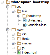
The first step is to create a simple file structure for our project.
- Create a folder with the name of the project, for example whitesquare-bootstrap.
- You need to create two subfolders in it: src for source files and www for the target site files.
- In the www folder, create an empty images folder and an empty index.html file.
- Then you need to download the Bootstrap itself and copy the contents of the archive into the www folder of our project.
- Since we decided to use LESS in our project, we’ll have to download the Bootstrap source code and copy the less folder into the src folder of our project.
- Next to the less / bootstrap folder that appears, create two empty styles.less and variables.less files. In them we will interrupt the variables of Bootstrap and describe our styles. This approach will then quickly update Bootstrap.
- Then you need to configure the compilation of LESS files in CSS. Let's see how this is done in WinLess. First click “Add folder” and specify the path to the folder with LESS files:
C: \ whitesquare-bootstrap \ src \ less
Then you will have a list of all the files in this folder. You can remove all the checkmarks. We are interested in the last two styles.less and variables.less files. Click on them with the right button and select “Select output file” from the context menu and select the path where the CSS files will be compiled:
.. \ .. \ www \ css \ styles.css
.. \ .. \ www \ css \ variables.css
After that, any changes to these LESS files while saving will lead to recompilation of the CSS files.
Preliminary inspection
After creating the file structure, open the psd file in Photoshop. It is important to carefully inspect the template and evaluate it. We need to understand the following things:
- How will the images be cut?
- What components will be used?
- What will be the main styles?
- What kind of page layout will we get?
Only after you mentally answer these questions, you can proceed to the layout. Let's look at these questions in order.
General images
At this stage, you need to cut and save only common images that will be on all pages of the site and do not apply to content. In our case, it will be a light gray background of the page, a header background, a map image, two logos and social networking buttons.
Save the map image:
images / map.png
Save the logos as follows:
images / logo.png
images / footer-logo.png
Repeated background images must be cut with a minimum piece sufficient to form a full image by repeating vertically and horizontally.
/images/bg.png
/images/h1-bg.png
Social networking icons with the same size can be conveniently saved to one file and used as sprites for faster loading. In more detail about image splicing is described in the first part. The result is two files:
/images/social.png
/images/social-small.png
Components
The main difference between the layout using Bootstrap from the layout using native means is that Bootstrap introduces such a thing as components. Components are often used ready-made HTML blocks with predefined styles. Sometimes components use javascript. A coder can use both a ready-made component and define its appearance for it. To do this, often you just need to change the value of variables in Bootstrap. If you need more flexible changes, the coder can always change the HTML and CSS at his discretion.
If you look at our template, you can see that we need the following components:
- For layout with columns - grid system (row, col)
- For search - inline form (form-inline), grouped controls (input-group), button (btn)
- For navigation, the navigation bar (navbar) and the navigation itself (nav)
- To display a submenu - a grouped list (list-group)
- For a map block - a visual panel (panel)
- To display a large central unit - jumbotron
- To display photo frames - thumbnails
In more detail on each component we will stop when we meet it in the layout.
Basic styles
In Bootstrap, all default styles are already set, we only need to kill them, if they differ from our design. We do this in the src / less / variables.css file.
First of all, you need to add variables that are not in the Bootstrap settings in order to be able to use them in the future. We have only a specific design font.
@brand-font: 'Oswald',sans-serif; If you want to use a template for Russian sites, you can try replacing the Oswald font with the closest Cuprum, which supports Cyrillic.
Now let's replace the Bootstrap settings with our own:
/* */ @body-bg: #f8f8f8; /* */ @ brand-primary: #29c5e6; /* */ @panel-bg: #f3f3f3; /* */ @panel-inner-border: #e7e7e7; /* */ @border-radius-base: 0; /* */ @btn-primary-bg: @brand-primary; /* 992px, 960px*/ @container-md: 960px; /* 1200px, 960px*/ @container-lg: @container-md; /* Tahoma*/ @font-family-base: Tahoma, sans-serif; /* */ @font-size-base: 12px; /* */ @text-color: #8f8f8f; /* */ @input-bg: @panel-bg; /* */ @input-border: @panel-inner-border; /* */ @input-color: #b2b2b2; All variables that are in Bootstrap can be viewed at http://getbootstrap.com/customize/
After we are done with the variables, let's start writing our design styles in the styles.less file. First we connect the Bootstrap itself and our variables:
@import "bootstrap/bootstrap.less"; @import "variables.less"; Not all styles set by Bootstrap by default can be changed by variables, let's do it manually:
p { margin: 20px 0; } .form-control { box-shadow: none; } .btn { font-family: @brand-font; } Here we have removed the shadow of the form elements, and the text in the buttons indicated a specific font page.
Then we describe the page background and the top bar:
body { border-top: 5px solid #7e7e7e; background-image: url(../images/bg.png); } Further in the text will not be specified in which file styles are written. Just remember that we save all variables in the variables.less file, and CSS styles will be stored in styles.less.
HTML Frame
We begin the layout of the site traditionally with an HTML frame. Paste the simplest template from the Getting started page into the index.html file, removing all unnecessary:
<!DOCTYPE html> <html> <head> <title>Whitesquare</title> <meta name="viewport" content="width=device-width, initial-scale=1.0"> <link href="css/styles.css" rel="stylesheet"> <!--[if lt IE 9]> <script src="https://oss.maxcdn.com/libs/html5shiv/3.7.0/html5shiv.js"></script> <script src="https://oss.maxcdn.com/libs/respond.js/1.3.0/respond.min.js"></script> <![endif]--> </head> <body> </body> </html> This block creates the HTML5 document structure. In the title indicate the name of our page - Whitesquare. Meta tag viewport indicate that the width of the page on mobile devices will be equal to the width of the screen and the initial scale will be 100%. Then the style file is included. And for versions of Internet Explorer less than ninth, we include scripts that allow us to correctly display our layout.
Layout
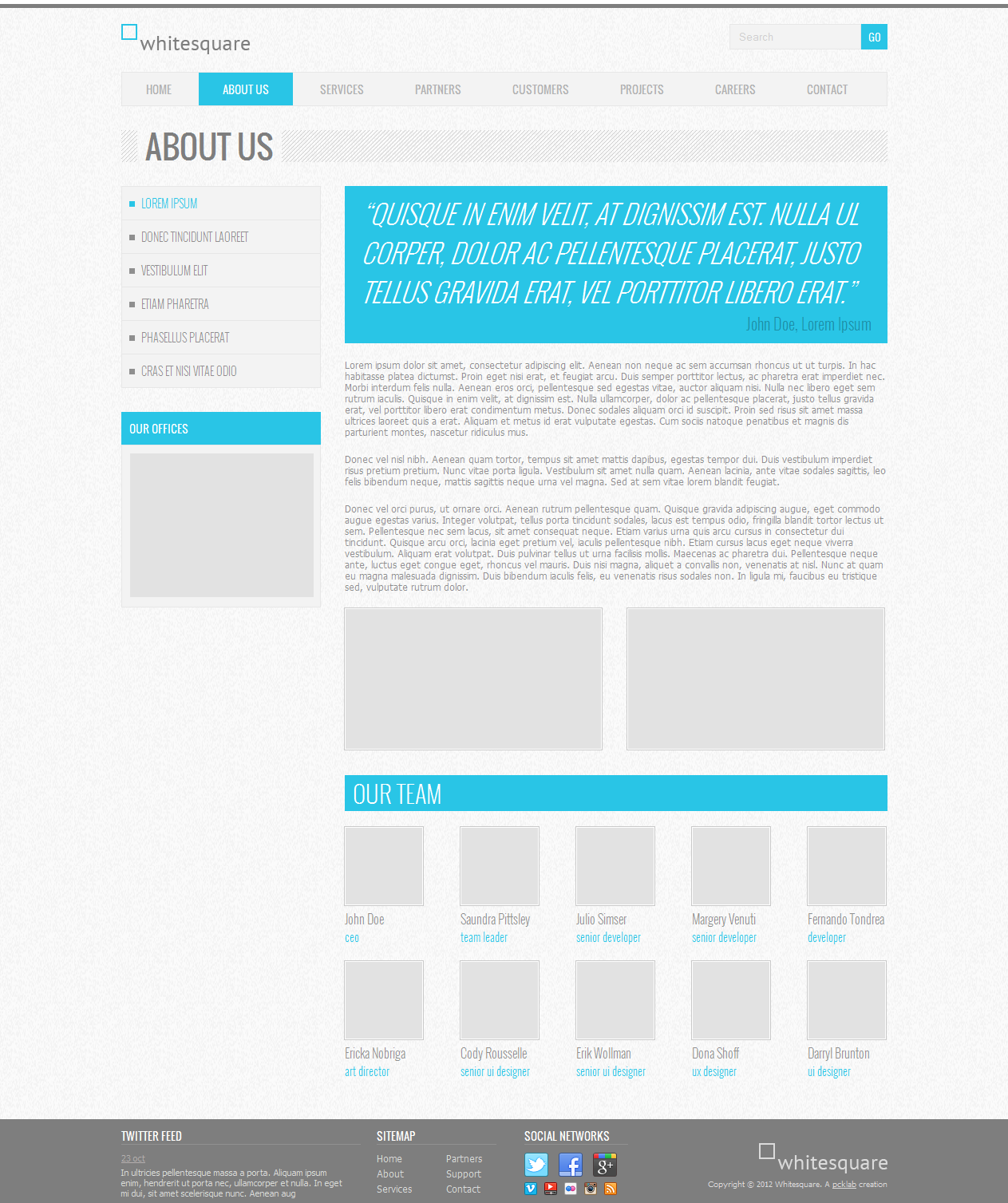
In this case, we see that the site consists of two parts: the main container with the contents, which is centered on the screen and the stretching footer. The main container consists of two columns: the main content and the sidebar. Above them is the header (header), navigation (nav) and the name of the page (.heading).
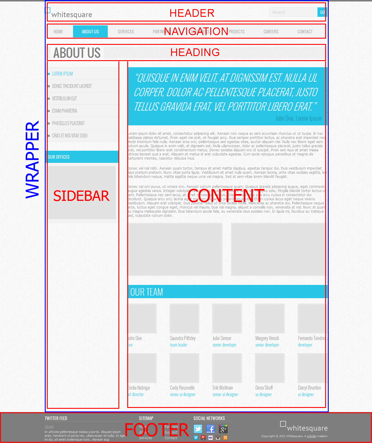
Let's add the following code to the body:
<body> <div class="wrapper container"> <header></header> <nav></nav> <div class="heading"></div> <div class="row"> <aside class="col-md-7"></aside> <section class="col-md-17"></section> </div> </div> <footer></footer> Here we meet the first component of Bootstrap - column . The parent element of the columns is assigned the class “row”, and the column classes begin with the prefix “col-”, then the screen size (xs, sm, md, lg), and ends with the relative width of the column.
A column can be simultaneously assigned different classes with values for screens, for example class = "col-xs-12 col-md-8". These classes simply set the column width in percent for a particular screen size. If a column of a specific screen is not specified, then the class for the minimally defined screen will be applied, and if it is not specified, then no width will be applied and the block will occupy the maximum possible width.
Our classes “col-md-7” and “col-md-17” indicate that the blocks are columns of width 7 and 17 relative to the parent container. By default, the sum of the widths of the columns in Bootstrap is 12, however we have doubled this number to achieve the flexibility we need.
@grid-columns: 24; Next, we describe the necessary indents:
body { … .wrapper { padding: 0 0 50px 0; } header { padding: 20px 0; } } We put this construction inside the body. The LESS syntax allows you to put rules into each other, which are then compiled into such constructs:
body .wrapper {…} body header {…} This approach allows you to see the structure of HTML right inside the CSS and gives a certain "scope" to the rules.
Logo

Insert the logo in the header tag:
<header> <a href="/"><img src="" alt="Whitesquare logo"></a> </header> No additional styles required.
Search

In order to create a search, we need the following Bootstrap components: an inline form , grouped controls, and a button .
In the header tag, create an inline shape that is right justified. Fields of this form must have the form-control class and label.
We put the component “grouped controls” in the form. Grouping controls allows you to remove the indent between text input and the button and, as it were, merge them into a single element.
It is a div with the “input-group” class and fields, and the button of such a component is placed in a block with the “input-group-btn” class.
Since we don’t need to show the label for the search field, we’ll hide it with the "sr-only" class. This is necessary for special screen readers.
The “btn-primary” class is added to the button, meaning that it is the primary button of this form.
<header> … <form name="search" action="#" method="get" class="form-inline form-search pull-right"> <div class="input-group"> <label class="sr-only" for="searchInput">Search</label> <input class="form-control" id="searchInput" type="text" name="search" placeholder="Search"> <div class="input-group-btn"> <button type="submit" class="btn btn-primary">GO</button> </div> </div> </form> </header> All we have to do is set the width of the search form in styles.
body { … .wrapper { … header { … .form-search { width: 200px; } } } } Menu

To display the menu, take the “ navigation pane ” component and put the “ navigation ” component in it, which is a list with links. For navigation, the class “navbar-nav” is added, which applies special navigation styles inside the navigation bar.
<nav class="navbar navbar-default"> <ul class="nav navbar-nav"> <li><a href="/home/">Home</a></li> <li class="active"><a href="/about/">About us</a></li> <li><a href="/services/">Services</a></li> <li><a href="/partners/">Partners</a></li> <li><a href="/customers/">Customers</a></li> <li><a href="/projects/">Projects</a></li> <li><a href="/careers/">Careers</a></li> <li><a href="/contact/">Contact</a></li> </ul> </nav> In order to bring this menu to our design, we set the following values to variables:
/* */ @navbar-height: 37px; /* */ @nav-link-padding: 10px 30px; /* */ @navbar-default-bg: @panel-bg; /* */ @navbar-default-link-color: #b2b2b2; /* – */ @navbar-default-link-hover-color: @navbar-default-link-color; /* – */ @navbar-default-link-active-bg: @brand-primary; /* */ @navbar-default-link-active-color: #fff; In addition to customizable options, we’ll describe additional styles — the uppercase text and our specific font:
body { … .wrapper { … .navbar a { text-transform: uppercase; font: 14px @brand-font; } } } Page title

The title of the page is placed in a div with the heading class.
<div class="heading"> <h1>About us</h1> </div> And has the following styles:
body { … .wrapper { … .heading { height: 40px; background: transparent url(../images/h1-bg.png); margin: 30px 0; padding-left: 20px; h1 { display: inline-block; color: #7e7e7e; font: normal 40px/40px 'Oswald', sans-serif; background: url(../images/bg.png); margin: 0; padding: 0 10px; text-transform: uppercase; } } } } Here we draw a gray strip background on the div, and in it we embed an inline h1 with the necessary font and background color of the page to create the impression of a transparent background for h1.
Submenu

When creating a submenu, we will not use the “navigation” component, since it doesn't suit us very well according to the styles; the “ grouped list ” component is more suitable for us. Each element of such a component has a class "list-group-item".
Submenus must be placed in the aside tag. The list of links is created similarly to the main menu
<aside class="col-md-7"> <ul class="list-group submenu"> <li class="list-group-item active">Lorem ipsum</li> <li class="list-group-item"><a href="/donec/">Donec tincidunt laoreet</a></li> <li class="list-group-item"><a href="/vestibulum/">Vestibulum elit</a></li> <li class="list-group-item"><a href="/etiam/">Etiam pharetra</a></li> <li class="list-group-item"><a href="/phasellus/">Phasellus placerat</a></li> <li class="list-group-item"><a href="/cras/">Cras et nisi vitae odio</a></li> </ul> </aside> In the component settings, we’ll point out that all grouped lists should be shown with the background and frame of the panel component:
@list-group-bg: @panel-bg; @list-group-border: @panel-inner-border; And we apply the following styles to the submenu:
body { … .wrapper { … .submenu { margin-bottom: 30px; li { display: list-item; font: 300 14px @brand-font; list-style-position: inside; list-style-type: square; padding: 10px; text-transform: uppercase; &.active { color: @brand-primary; } a { color: @text-color; text-decoration: none; &:hover { color: @text-color; } } } } } } First, we return the standard styles to the list items, since Bootstrap interrupted them on their own. Add indent bottom. For submenus, a thinner font and square markers are used. And for links we set colors, upper case and remove underscores. Ampersand in the code “& .active” with the LESS syntax during compilation will be replaced with the parent selector: “.submenu li.active”.
Sidebar content
In the sidebar content, in addition to the submenu, there is also an image with the location of offices.
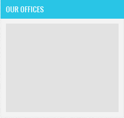
To display it, the “ panel ” component will suit us, or rather its “main panel” (panel-primary) variation for coloring the header. This component contains a heading block (panel-heading) and a panel maintenance block (panel-body). We add the img-responsive class to the map image, which allows the picture to shrink with a small screen width.
<aside class="col-md-7"> … <div class="panel panel-primary"> <div class="panel-heading">Our offices</div> <div class="panel-body"> <img src="/images/map.png" class="img-responsive" alt="Our offices"> </div> </div> </aside> In the Bootstrap variables, we have already set the color for the panel background (panel-bg), and now we’ll point out that the “primary” panel will have a gray frame of the default panel, rather than blue, as the default:
@panel-primary-border: @panel-inner-border; Now in the styles of the site you need to change the standard settings of the panels, which do not change through variables:
.panel { box-shadow: none; .panel-heading { font: 14px @brand-font; text-transform: uppercase; padding: 10px; } .panel-body { padding: 10px; } } Here we removed the shadows from the panels, set our indents and set our font for the header.
Quote
The content layout will start by adding a quote.

This page element is most similar to the Jumbotron component. Add it to the content column:
<section class="col-md-17"> <div class="jumbotron"> <blockquote> <p> “Quisque in enim velit, at dignissim est. nulla ul corper, dolor ac pellentesque placerat, justo tellus gravida erat, vel porttitor libero erat.” </p> <small>John Doe, Lorem Ipsum</small> </blockquote> </div> </section> Using variables for the jumbotron component, we will set the text white color and brand blue background:
@jumbotron-bg: @brand-primary; @jumbotron-color: #fff; And we will describe our styles:
body { … .wrapper { … .jumbotron { border-radius: 0; padding: 0; margin: 0; blockquote { border-left: none; p { font: 300 italic 33px @brand-font; text-transform: uppercase; margin-bottom: 0; } small { text-align: right; color: #1D8EA6; font: 300 20px @brand-font; &:before { content: ''; } } } } } } In them, we remove the rounding of corners, component indents, and quotes set by Bootstrap by default. Also add our font styles.
Content
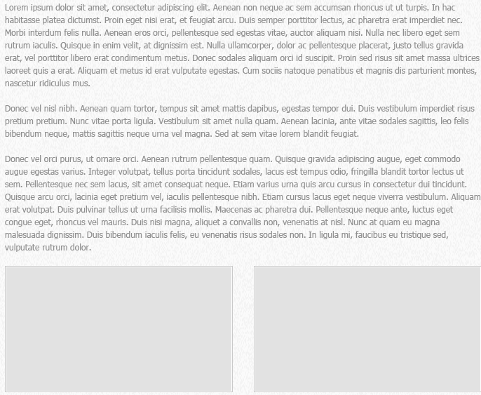
We have already added all styles for text content. Therefore, it remains to add only three paragraphs with the text itself.
<p>Lorem ipsum dolor sit amet…</p> <p>Donec vel nisl nibh…</p> <p>Donec vel nisl nibh…</p> The next step is to add two images that are at the end of the text content. This is done using two columns:
<div class="row"> <div class="col-md-12"> <img src="/images/about-1.png" alt="" class="thumbnail"> </div> <div class="col-md-12"> <img src="/images/about-2.png" alt="" class="thumbnail"> </div> </div> The “thumbnail” class turns images into a “ thumbnail ” component. He will do for us all the work on image styling. The only thing left for us is to set our own indent and border color in the variables for this component:
@thumbnail-padding: 1px; @thumbnail-border: #c9c9c9; “Our team” block
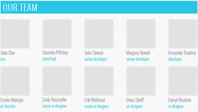
When creating this block, we first add the title:
<h2>Our team</h2> with style:
body { … .wrapper { … h2 { background: none repeat scroll 0 0 #29C5E6; color: #fff; font: 300 30px @brand-font; padding: 0 10px; text-transform: uppercase; } } } And then we add a block with the class “team”, which consists of two lines containing employee cards. Each card is a column. The card has a width equal to the four columns of our grid. All cards except the first in the line have an indent on the left, which is created by the class “col-md-offset-1”. The contents of the card consists of an image and description (.caption)
<div class="team"> <div class="row"> <div class="col col-md-4"> <img src="/images/team/Doe.jpg" alt="John Doe" class="thumbnail"> <div class="caption"> <h3>John Doe</h3> <p>ceo</p> </div> </div> <div class="col col-md-4 col-md-offset-1"> <img src="/images/team/Pittsley.jpg" alt="Saundra Pittsley" class="thumbnail"> <div class="caption"> <h3>Saundra Pittsley</h3> <p>team leader</p> </div> </div> … </div> <div class="row"> <div class="col col-md-4"> <img src="/images/team/Nobriga.jpg" alt="Ericka Nobriga" class="thumbnail"> <div class="caption"> <h3>Ericka Nobriga</h3> <p>art director</p> </div> </div> <div class="col col-md-4 col-md-offset-1"> <img src="/images/team/Rousselle.jpg" alt="Cody Rousselle" class="thumbnail"> <div class="caption"> <h3>Cody Rousselle</h3> <p>senior ui designer</p> </div> </div> … </div> </div> After creating the markup, set these elements to the following styles:
body { … .wrapper { … .team { .row { margin-top: 20px; .col { white-space: nowrap; .thumbnail { margin-bottom: 5px; } } .col-md-offset-1 { margin-left: 3.7%; } .caption { h3 { font: 300 16px @brand-font; margin: 0; } p { font: 300 14px @brand-font; color: @brand-primary; margin: 0; } } } } } } In addition to the indents and font styles that are set here, we changed the class “col-md-offset-1”. He had to set an indent of 3.7%, since The standard indent was too large.
Footer
The footer consists of four large blocks: Twitter feed, sitemap, social links and a copyright logo.

First, create a footer container with these blocks:
<footer> <div class="container"> <div class="row"> <div class="col-md-8 twitter"></div> <div class="col-md-4 sitemap"></div> <div class="col-md-6 social"></div> <div class="col-md-6 footer-logo"></div> </div> </div> </footer> And we apply to it:
footer { background: #7e7e7e; color: #dbdbdb; font-size: 11px; .container { height: 110px; padding: 10px 0; } } The footer tag sets the gray area across the entire width of the screen, and the container inside it displays the area in the center on large screens and sets the height and indent of the footer. We use columns to align the blocks inside the footer.
Twitter feed
Impose the contents of the Twitter feed:

<div class="col-md-8 twitter"> <h3>Twitter feed</h3> <time datetime="2012-10-23"><a href="#">23 oct</a></time> <p> In ultricies pellentesque massa a porta. Aliquam ipsum enim, hendrerit ut porta nec, ullamcorper et nulla. In eget mi dui, sit amet scelerisque nunc. Aenean aug </p> </div> Styles:
body { … footer { … .container { … h3 { border-bottom: 1px solid #919191; color: #ffffff; font-size: 14px; line-height: 21px; font-family: @brand-font; margin: 0 0 10px; text-transform: uppercase; } p { margin: 5px 0; } .twitter { p { padding-right: 15px; } time a { color: #b4aeae; text-decoration: underline; } } } } } For all footer headers, set fonts and indents, as well as underline through the bottom frame. For paragraphs we specify indentation. The link that displays the date, set the color and underscore.
Site Map
Sitemap consists of two equal columns with links:
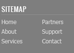
<div class="col-md-4 sitemap"> <h3>Sitemap</h3> <div class="row"> <div class="col-md-12"> <a href="/home/">Home</a> <a href="/about/">About</a> <a href="/services/">Services</a> </div> <div class="col-md-12"> <a href="/partners/">Partners</a> <a href="/customers/">Support</a> <a href="/contact/">Contact</a> </div> </div> </div> Links set color, font and indent between them.
body { … footer { … .container { … a { color: #dbdbdb; } .sitemap a { display: block; font-size: 12px; margin-bottom: 5px; } } } } Social links

Insert a set of links in the block with the class «social».
<div class="col-md-4 social"> <h3>Social networks</h3> <a href="http://twitter.com/" class="social-icon twitter"></a> <a href="http://facebook.com/" class="social-icon facebook"></a> <a href="http://plus.google.com/" class="social-icon google-plus"></a> <a href="http://vimeo.com/" class="social-icon-small vimeo"></a> <a href="http://youtube.com/" class="social-icon-small youtube"></a> <a href="http://flickr.com/" class="social-icon-small flickr"></a> <a href="http://instagram.com/" class="social-icon-small instagram"></a> <a href="/rss/" class="social-icon-small rss"></a> </div> And we stylize them:
body { … footer { … .container { … .social { .social-icon { width: 30px; height: 30px; background: url(../images/social.png) no-repeat; display: inline-block; margin-right: 10px; } .social-icon-small { width: 16px; height: 16px; background: url(../images/social-small.png) no-repeat; display: inline-block; margin: 5px 6px 0 0; } .twitter { background-position: 0 0; } .facebook { background-position: -30px 0; } .google-plus { background-position: -60px 0; } .vimeo { background-position: 0 0; } .youtube { background-position: -16px 0; } .flickr { background-position: -32px 0; } .instagram { background-position: -48px 0; } .rss { background-position: -64px 0; } } } } } Here we applied the technique of sprites - when one image file is used for different pictures. All links are divided into large icons (.social-icon) and small (.social-icon-small). We have given these classes a mapping as an inline block with fixed dimensions and the same background. And then with the help of CSS this background was shifted so that the corresponding image was displayed on each link.
Copyright
A block with copyright and logo is a picture with a link and a paragraph with text below it.
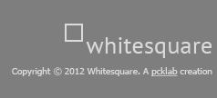
<div class="col-md-8 footer-logo"> <a href="/"><img src="" alt="Whitesquare logo"></a> <p> Copyright © 2012 Whitesquare. A <a href="http://pcklab.com">pcklab</a> creation </p> </div> Styles are made similar to the previous blocks with the only difference that the block is nailed to the right edge and the alignment inside it is also on the right edge:
body { … .footer { … .container { … .footer-logo { float: right; margin-top: 20px; font-size: 10px; text-align: right; a { text-decoration: underline; } } } } } At this layout is finished. The finished project can be downloaded here .
Source: https://habr.com/ru/post/211032/
All Articles