Text in perspective
Wandering around the net, I have often seen the most amazing solutions based on CSS. And each time it is more and more believed that the possibilities of CSS are endless :)
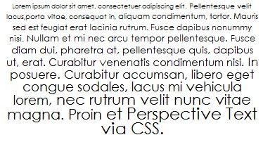
Today I saw this picture:
Really an interesting effect? Let's try to reveal the secret of its implementation.
In order to make the effect of “perspective” text, we need only 3 elements - a div , p and span block. Recall that span is a string element (by default), so we can “brush” any word / line as we like. But we do not need to do anything fantastic :) Span we will use to break the text we want to convert into lines. And the p element will frame our text.
We dealt with the text, but how can we specify a different font size for each line? We will cheat a little and we will not close the span tag after each line, but we will make it so that each line is as if nested in another. And we put the closing tag from each line at the very end of the text. The main thing here is not to shortcut in the number of opening and closing tags. And then the code will look like this:
What does this give us? Recall that child elements inherit the properties of the parent element, with each subsequent nested element assigning a value relative to its previous block, and not the very first one. A vivid example is for example the following: when we use nested blocks with a width in percent, for example, 70%. Each nested block will have a width of 70% relative to the previous block, thus the most recent nested block will be the smallest.
I think you have already understood our further actions :) We will do this with the size of the font, indicating it as a percentage.
Styles for our elements will look like this:
It is important to clarify that the text size must be specified in em and must be more than 1 em - otherwise the effect will be different. You also need to remember about the distance between the lines (line-height), so that the lines do not run over each other as the font increases.
')
That's the whole secret :) And then only your imagination :)
You can see an example here.
There you will find links to download the code.
via Mike's Experiments
Today I saw this picture:
Really an interesting effect? Let's try to reveal the secret of its implementation.
In order to make the effect of “perspective” text, we need only 3 elements - a div , p and span block. Recall that span is a string element (by default), so we can “brush” any word / line as we like. But we do not need to do anything fantastic :) Span we will use to break the text we want to convert into lines. And the p element will frame our text.
We dealt with the text, but how can we specify a different font size for each line? We will cheat a little and we will not close the span tag after each line, but we will make it so that each line is as if nested in another. And we put the closing tag from each line at the very end of the text. The main thing here is not to shortcut in the number of opening and closing tags. And then the code will look like this:
Lorem ipsum dolor sit amet, consectetuer adipiscing elit.Pellentesque velit lacus,porta vitae, consequat in,aliquam condimentum, tortor. Mauris sed est feugiaterat lacinia rutrum. Fusce dapibus nonummy nisi.Nullam et mi nec arcu tempor pellentesque. Fuscediam dui, pharetra at, pellentesque quis, dapibusut, erat. Curabitur venenatis condimentum nisi.In posuere. Curabitur accumsan, libero egetcongue sodales, lacus mi vehicula lorem,nec rutrum velit nunc vitae magna. Proinet Perspective Text via CSS.
What does this give us? Recall that child elements inherit the properties of the parent element, with each subsequent nested element assigning a value relative to its previous block, and not the very first one. A vivid example is for example the following: when we use nested blocks with a width in percent, for example, 70%. Each nested block will have a width of 70% relative to the previous block, thus the most recent nested block will be the smallest.
I think you have already understood our further actions :) We will do this with the size of the font, indicating it as a percentage.
Styles for our elements will look like this:
#text {
margin : auto;
width : 40em;
font-size : 50%;
line-height : 1.6em;
max-width : 90%;
text-align : center;
}

#text p span {
font-size : 1.1em;
display:block;
clear:both;
}
It is important to clarify that the text size must be specified in em and must be more than 1 em - otherwise the effect will be different. You also need to remember about the distance between the lines (line-height), so that the lines do not run over each other as the font increases.
')
That's the whole secret :) And then only your imagination :)
You can see an example here.
There you will find links to download the code.
via Mike's Experiments
Source: https://habr.com/ru/post/21087/
All Articles