Designer review Android 4.4 KitKat. Part 2
In the first part of the article , all the main interface changes that the lock screen and desktops underwent, compared to previous versions of Android , were described in detail.
The second part of the article describes the updated stock programs and some other design innovations that were added to Android 4.4 Kit Kat. Next - a lot of pictures.
')
Stock applications
"Safe" photo editor
The updated photo editor interface looks and works fine on both smartphones and tablets. In addition, it improved the work with effects and settings. You can save presets for later quick photo editing.
But the main feature is the so-called "security" of editing. That is, now the settings when editing are saved over the photo. You can continue to edit the image or restore the original photo at any time, dropping all the installed filters.
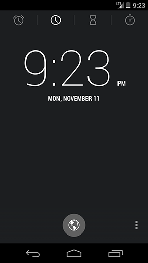
Clock
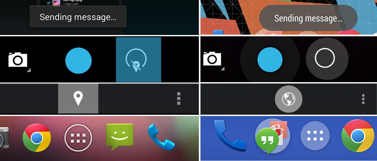
Most of the Clock application has remained unchanged: all the same red accent color, all-caps typography and minimalistic interface. Although there are well noticeable differences.
Firstly, the alarm clocks are now placed in a separate tab. And the icon for adding time for a new location has changed from a “marker pin” to the icon of the globe on a white translucent round substrate.

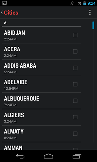
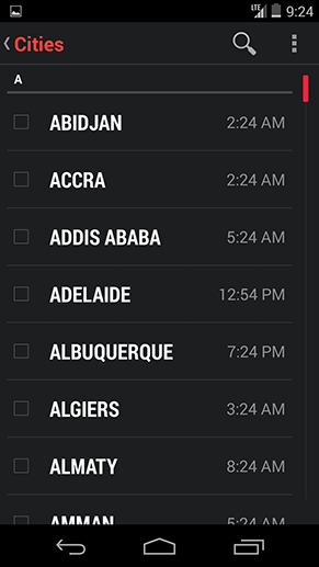
On the left - Android 4.3 Jelly Bean, on the right - Android 4.4 Kit Kat
The screen for adding a new location for the clock has also undergone minor cosmetic changes. The search button was brought to the Action Bar, which, of course, more clearly and conveniently.
On the left - Android 4.3 Jelly Bean, on the right - Android 4.4 Kit Kat
Secondly, the Action Bar is no longer displayed on the screen with the alarms set. And the delete icons are immediately rendered on the listview so that you can quickly delete unnecessary alarms. The “plus sign” of adding a new alarm clock is now also on a white translucent round substrate and moved to the Split Action Bar.
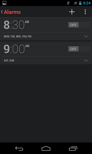

On the left - Android 4.3 Jelly Bean, on the right - Android 4.4 Kit Kat
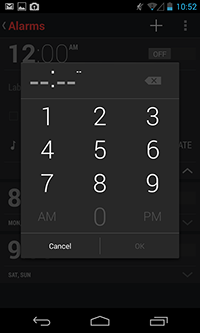
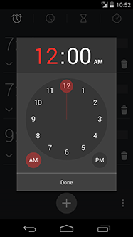
Dialog box setting a new alarm done in Google Keep and Google Calendar. In the 12-hour time format, the interface is more convenient to use than on the previous version of Android. But in the 24-hour, he turns to mush.
Apparently this style of time piker will soon be added to the system guidelines as a standard element. Moreover, its psd-source can already be found in the updated Adobe Photoshop Stencils and Sources file from Google.
On the left - Android 4.3 Jelly Bean, in the center - Android 4.4 Kit Kat, on the right - Android 4.4 Kit Kat
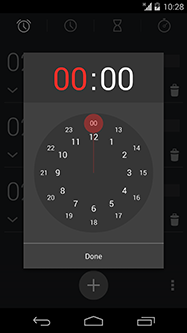
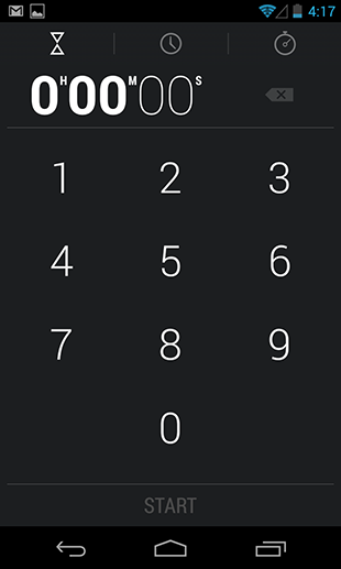
And finally, Google slightly finished the stopwatch and timer. The updated stopwatch screen got rid of the signatures of seconds and minutes, the content was centered and removed the Bold face from the dial, replacing it with Thin ( as on the lock screen ).


On the left - Android 4.3 Jelly Bean, on the right - Android 4.4 Kit Kat
The timer screen has undergone similar changes. But the signatures for hours, seconds, minutes, naturally, remained.
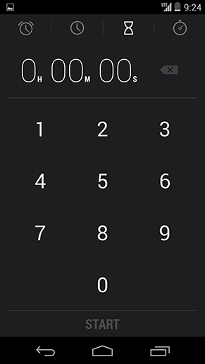
On the left - Android 4.3 Jelly Bean, on the right - Android 4.4 Kit Kat
And one more “subtle” change - if you have an alarm clock set, then you can disable it in advance from the notification panel.
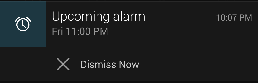
Android 4.4 Kit Kat Notification Bar for Clock
"Caller"
The “dialer” in Kit Kat has been completely redone - this is not only a new design (interface inspired by cards, a transition from a dark theme to a light one), but also a couple of very useful functions.
Unlike Android 4.3, where, after launching the application, the user met the screen with a numeric keypad for dialing, in Android 4.4 you get to the screen with your favorite / frequent contacts and the last calls. You can switch to dialing a number by pressing the central button in the Split Action Bar.
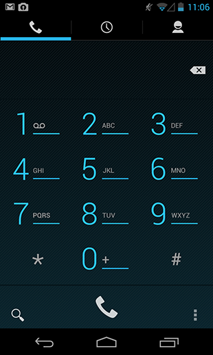

On the left - Android 4.3 Jelly Bean, on the right - Android 4.4 Kit Kat
In Kit Kat, the search allows you to search for contacts not only by phone's address book, but also by place names. And he understands the error. If you type "chnrse", the search will recognize that you meant "chinese", and will provide relevant results on request.

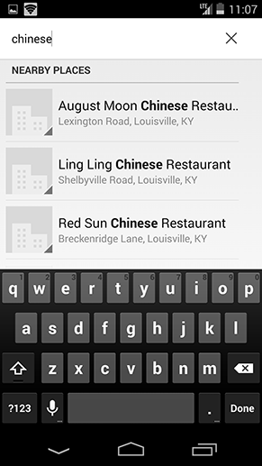
On the left - Android 4.3 Jelly Bean, on the right - Android 4.4 Kit Kat
The same “magic” works here, as in the case when someone calls you from an unfamiliar number. "Dialer" is looking for a phone in its database of places and, if it finds one, replaces an unknown number with the name of the company.
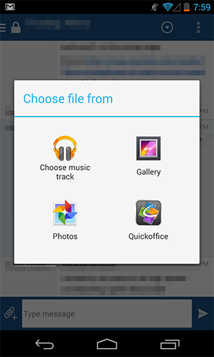
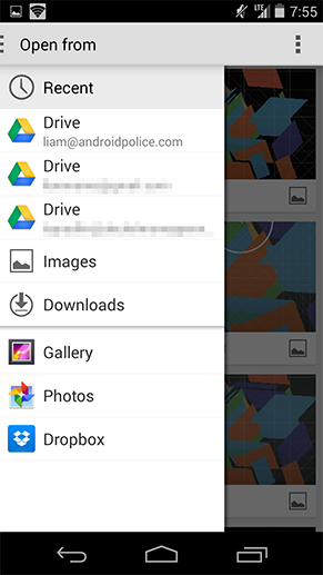
Unified File Picker
The file picker in Kit Kat is one of the unsung heroes, so to speak. In Jelly Bean, if you wanted to send a document, you were presented with a dialog box with a list of applications that have access to the files. Kit Kat uses a convenient and easy-to-navigate file piker for these purposes. This application aggregates all your phone files from third-party applications, cloud storage, galleries, photos, SD-card or internal memory.
On the left - Android 4.3 Jelly Bean, on the right - Android 4.4 Kit Kat
The interface of the application is very simple: you can display files in the form of a list or cards, supports sorting by name, modification date, file size. The only downside is that for some reason Google has not given the opportunity to use piker as a regular file browser, since the application simply does not have icons for launching.
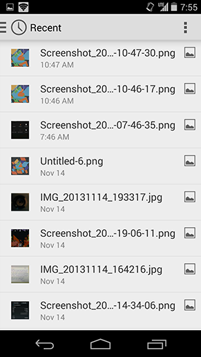

Android 4.4 Kit Kat File Picker
Downloads
The Android 4.3 download application was, frankly, terrible. It was just a list of downloaded files with the ability to sort by size.
In Android 4.4, the downloads are completely redone. And in the light of the active unification of interfaces in Google, now the application looks exactly the same as the file piker. And this is good for users, because, in fact, applications are about the same thing.


On the left - Android 4.3 Jelly Bean, on the right - Android 4.4 Kit Kat
Complete Action Dialog Box
The “Complete Action” dialog box was also slightly finished. Instead of a tile view of icons in Kit Kat, a list is used, which is much more convenient for quick reading. The line with your last choice is immediately highlighted with an active one, that is, one tap is saved.
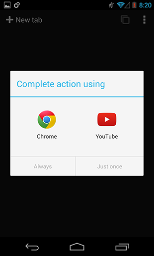
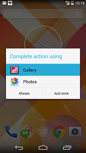
On the left - Android 4.3 Jelly Bean, on the right - Android 4.4 Kit Kat
Google keyboard
The main change here is the change of the blue accent color of the keyboard to white. However, after a while, Google gave the opportunity to choose the color in the advanced settings. From there, you can add the Google Keyboard application icon to the program menu.
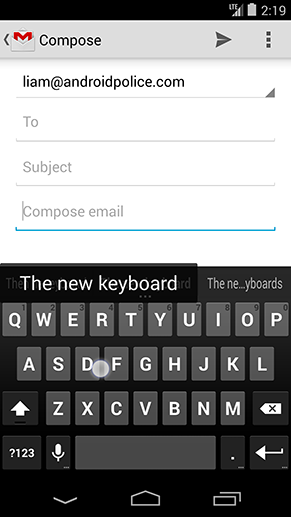
Android 4.4 Kit Kat Google Keyboard
People
People, like most of the interfaces in Kit Kat, got rid of Holo Blue. Now it has a light gray theme, the favorites and groups tabs are reversed, and the avatars in the contact list are left aligned. Also between the elements of the list added a small indent. For the rest - the application remains unchanged.

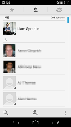
On the left - Android 4.3 Jelly Bean, on the right - Android 4.4 Kit Kat
Other design innovations
Immersive mode
Immersive mode in Kit Kat is a modified full-screen application mode. It allows the running application to completely hide the Status Bar and Navigation Bar. But more importantly, to call them back, you need to svapnut from the top or bottom edge of the screen.
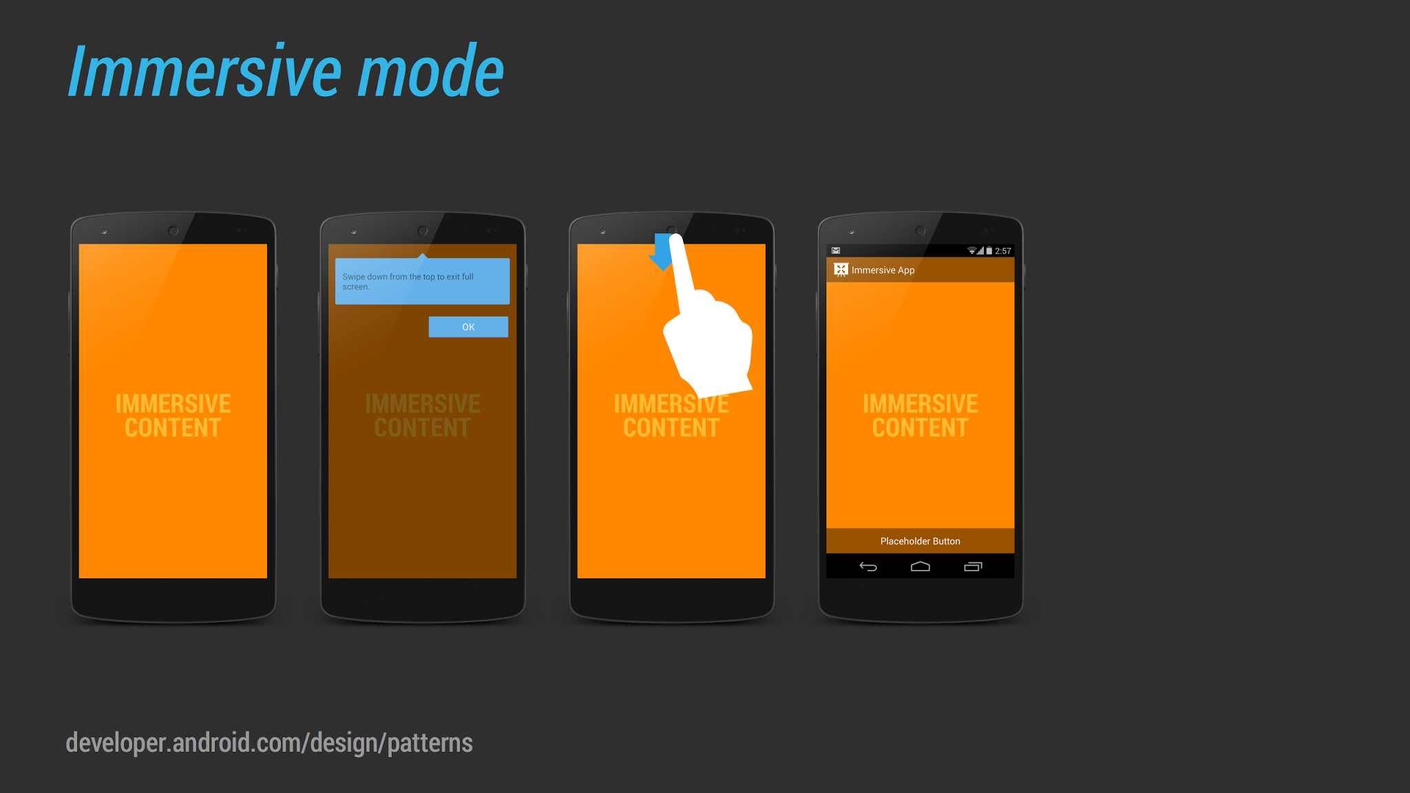
In previous versions of Android, developers had access to a similar mode called Leanback Mode. This mode is used, for example, in the YouTube app. The Status Bar and Navigation Bar also disappear when viewing video in full screen, but tapping the screen returns them. That is, the difference between Immersive mode and Leanback Mode is that the user can now interact with content in full screen mode. This will be useful, for example, for reader or magazine applications.
[Play Books] Immersive Mode
Circles are new squares.
The obvious design step when creating Kit Kat is an attempt to make Android more "soft and friendly." Holo Blue with a dark background (except for settings) has disappeared, application icons are larger, and most of the square interface elements are now round.
On the left - Android 4.3 Jelly Bean, on the right - Android 4.4 Kit Kat
Although this is not a Kit Kat feature, but Android is gradually moving from the square icons of the Overflow Menu (“three points”), to the “three circles”. This can be seen in the updated Google Search or Play Store.
Drag-to-select
New paradigm from Google in Android 4.4 - drag-to-select for spiners and menus. This saves one tap when interacting with the interface.

Left - Gmail, right - Google+
One more thing
And a few more innovations in a short line:
- New section in Your Branding design guidelines for customizing your application
- Modified touch feedback
- New Translucent Bars mode, which allows your application to use translucent system panels (like on the desktop with GEL)
- New gesture Double touch drag (you can see, for example, in Google Maps)
- The ability to record video from the screen of a mobile device
- New APIs for animating interface elements
In the version of Android 4.4.1 and 4.4.2 in the design plan, nothing has changed. Google finished the camera on the Nexus 5 and corrected the bugs, respectively.
Based on material from Android Police
Source: https://habr.com/ru/post/210562/
All Articles